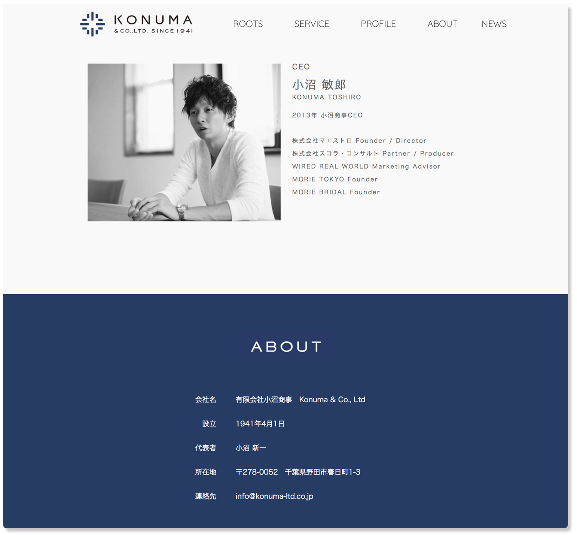
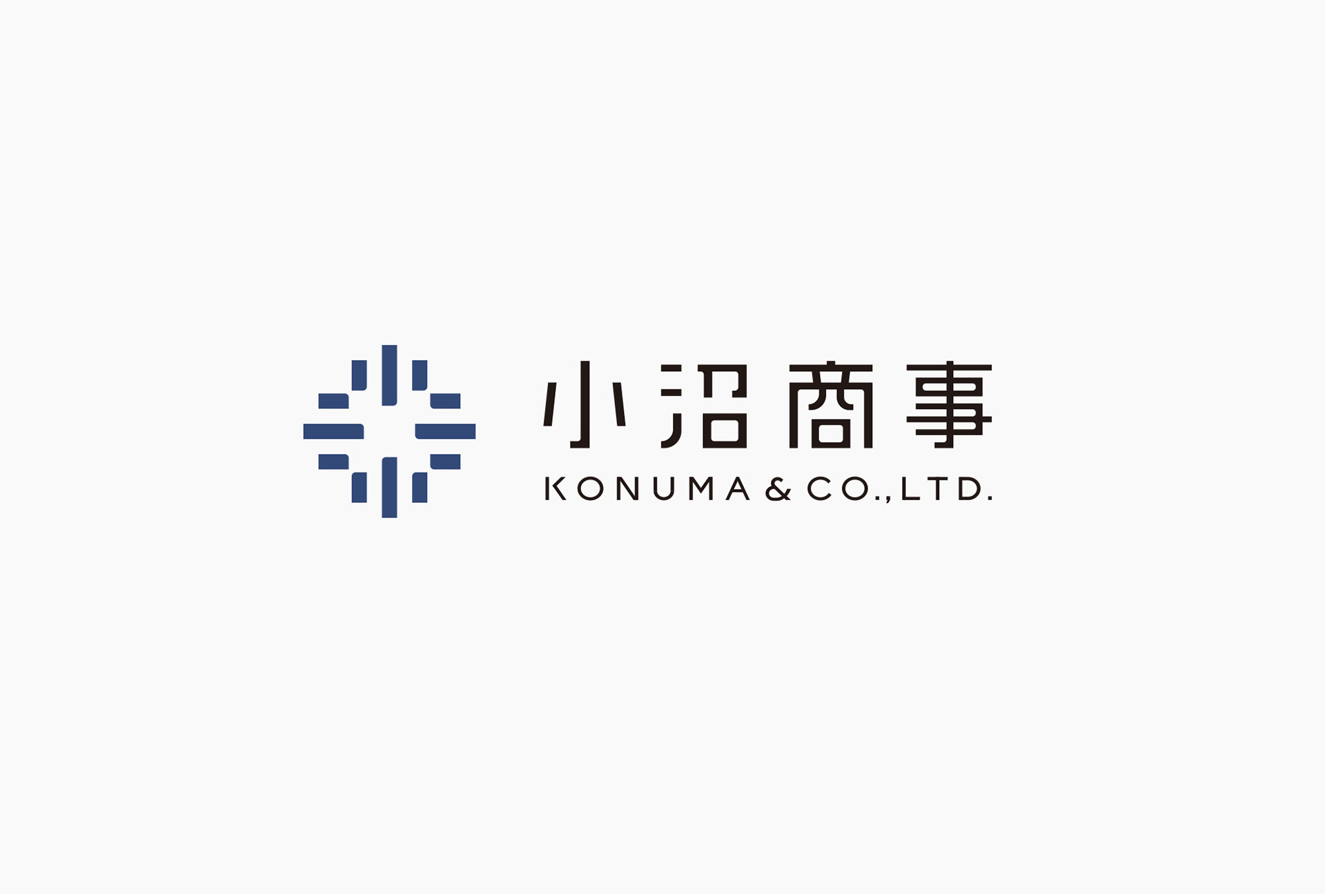
江戸時代から続く大工家系の中で棟梁でもあった小沼與三吉氏が、昭和16年に創業した小沼商事。建築職人の集団を原点としながら、時の流れとともにかたちを変え、現在では建築設計、経営戦略アドバイザリーという2つの領域でサービスを提供しています。
tegusuでは、同社のCI開発におけるコンセプト設計、シンボルロゴの設計、名刺やWEBなどへのイメージ展開を担当しました。
Konuma & Co., Ltd was founded in 1941 by Yosakichi Konuma, who came from a family of carpenters that dates back to the Edo Period. He was also a master carpenter. Originally the company was made up of a group of builders, but it changed its form as time went by. Currently, the company provides services in two fields, which are architectural design and management strategy advisory.
tegusu handled concept design in CI development, symbol logo design, development of images on business cards and the website.

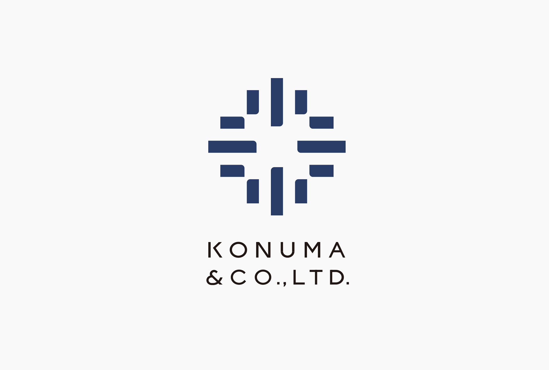
コンセプトは「整理し、組み立て、具現化する」
建築設計と経営アドバイス、2つの事業に共通するキーワードを抽出し、会社の理念として一文にまとめました。
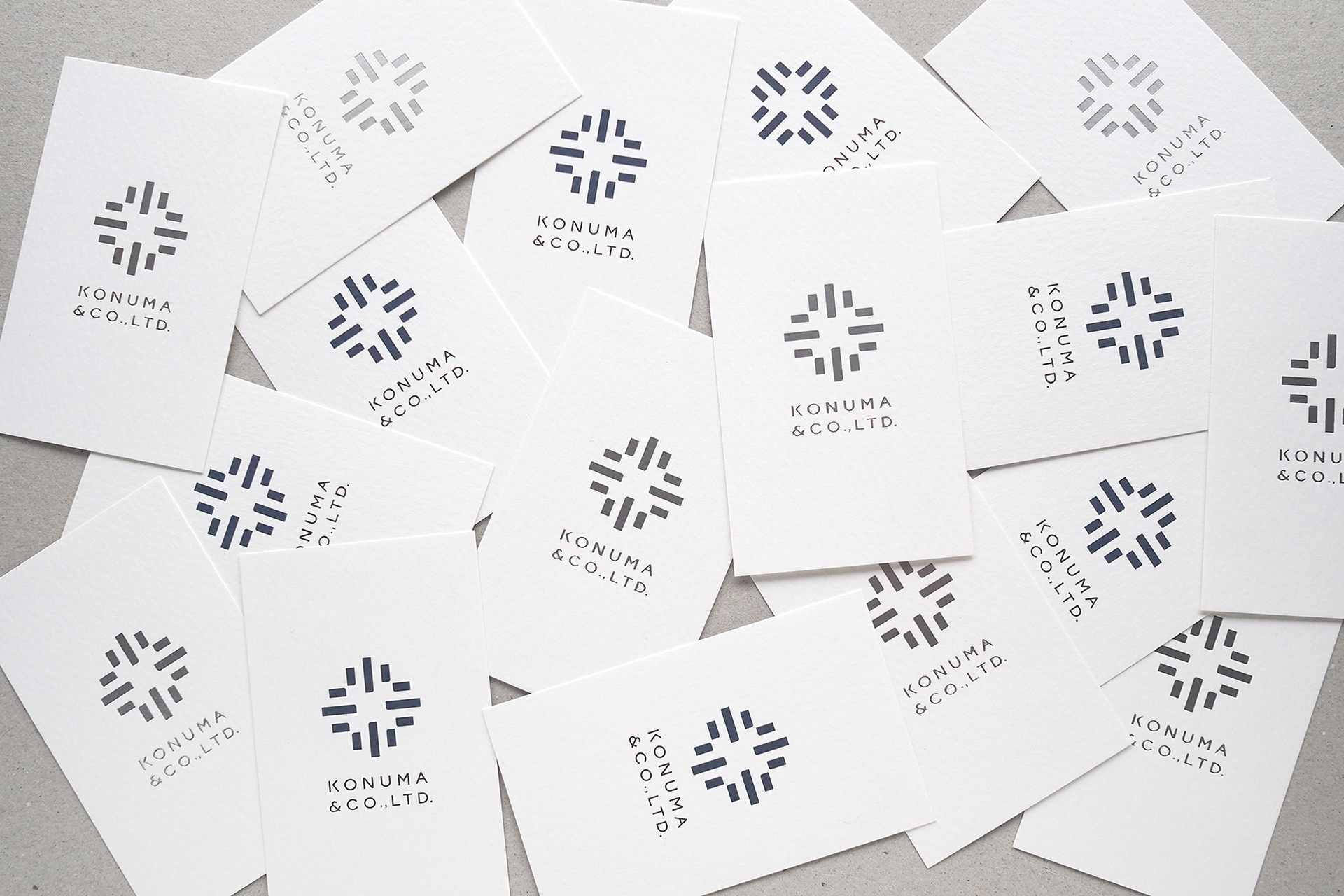
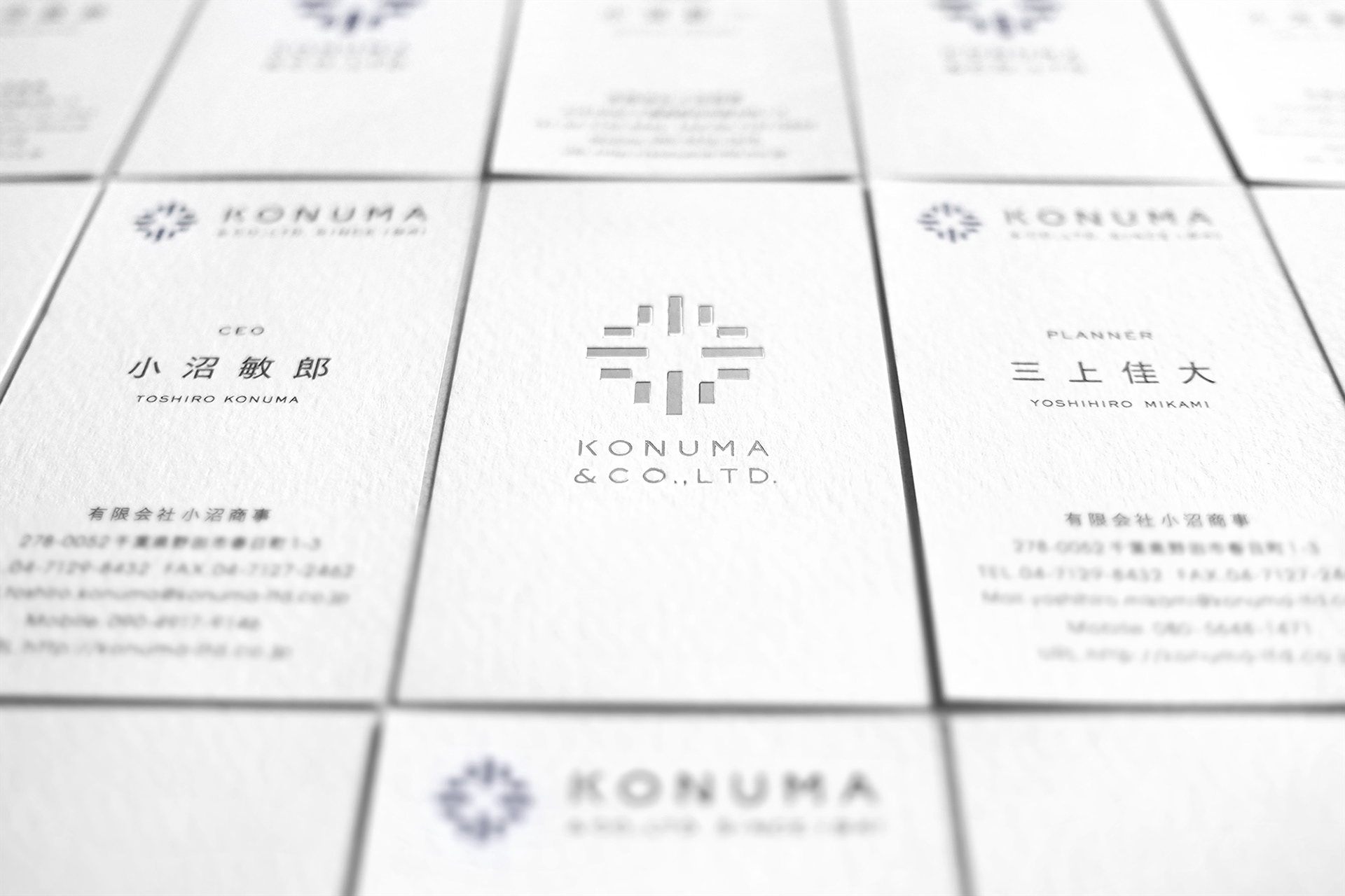
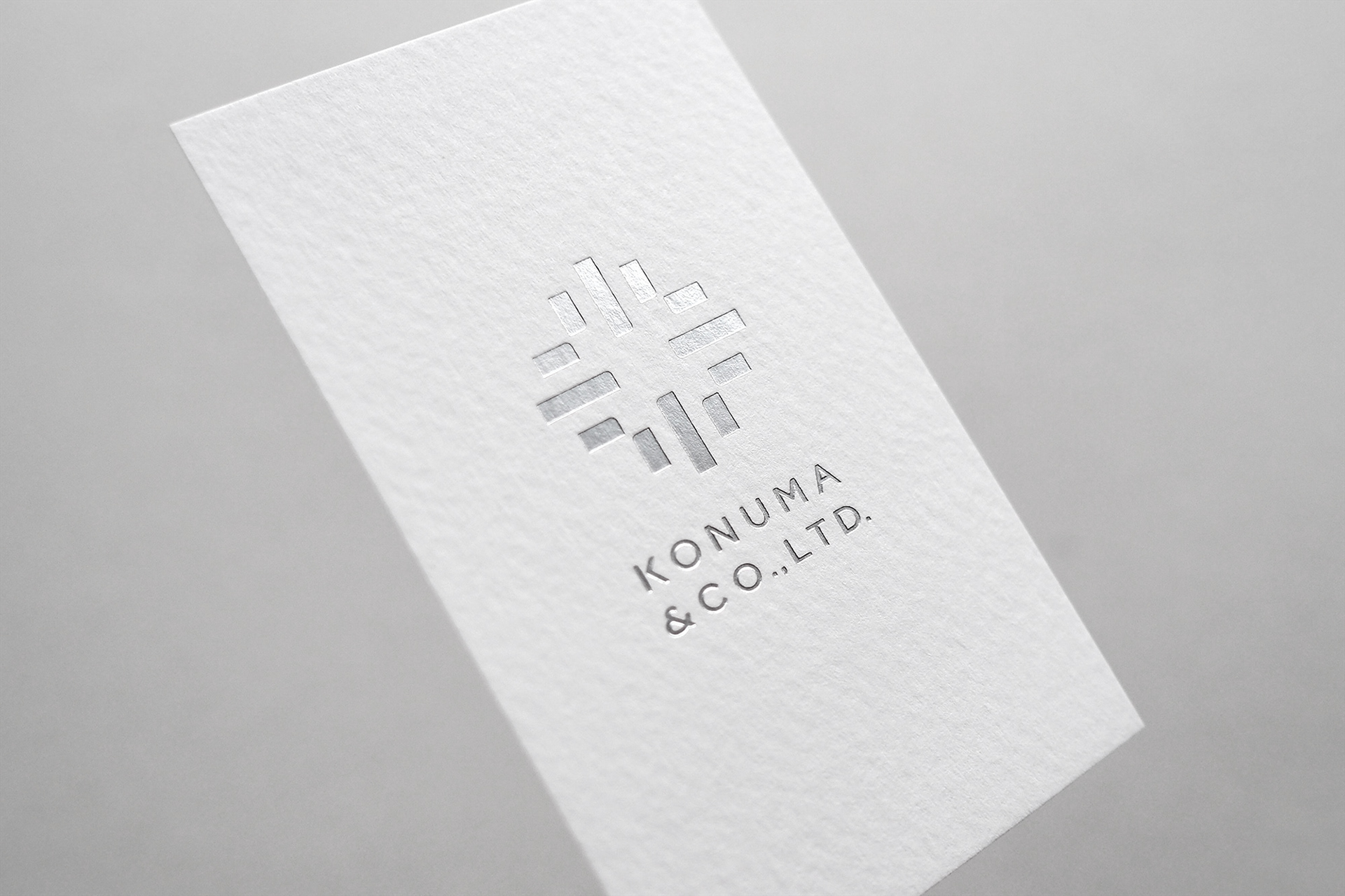
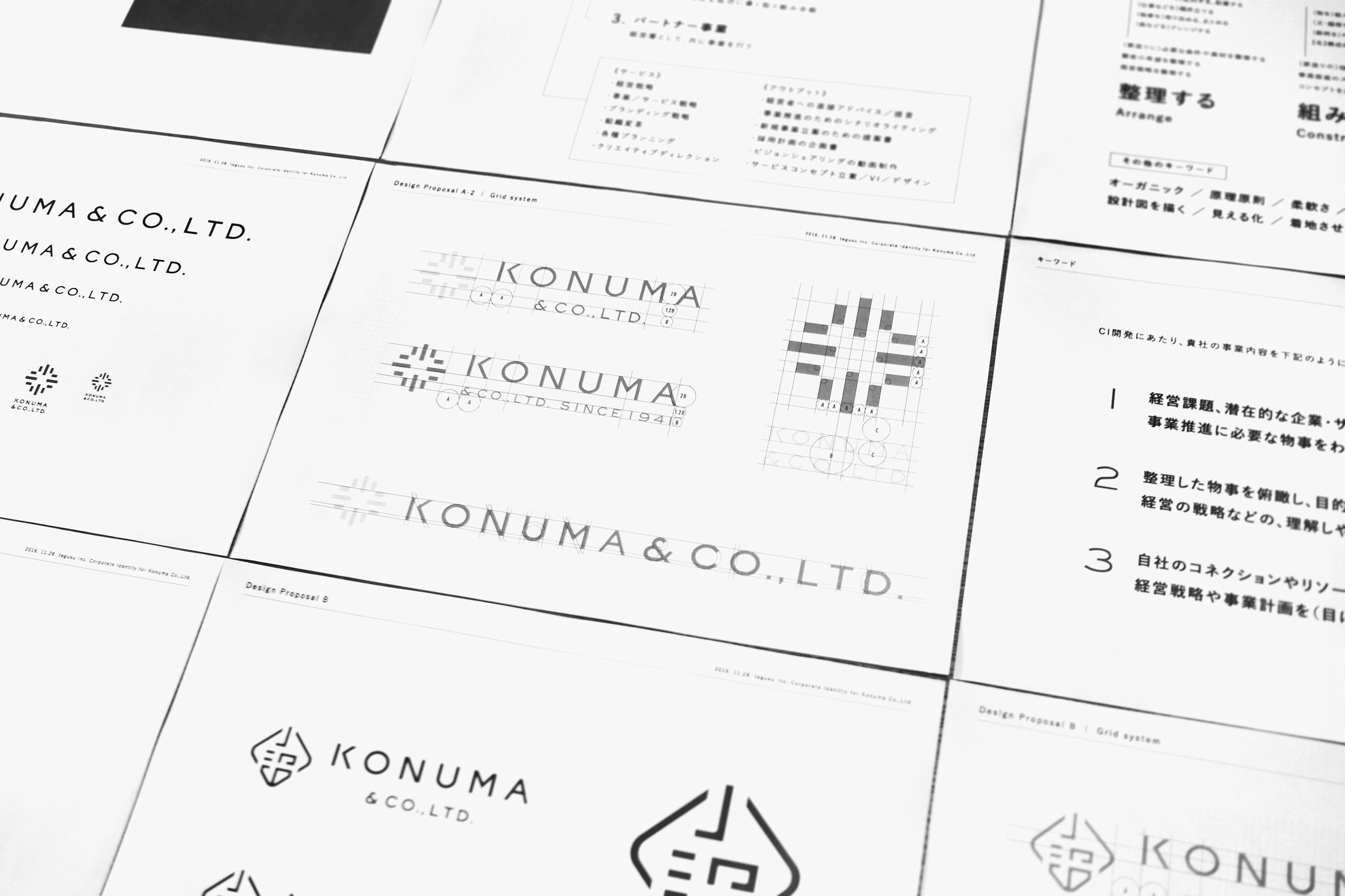
●整理=条件の整理、順序の整理、目的の整理。●組み立て=構造の組み立て、コンセプト・戦略の組み立て ●具現化=理想の具現化、概念に形を与えていく作業。この三つの指針は、シンボルの設計プロセスにも取り入れています。屋号の頭文字である漢字の「小」の造形的な特徴のみを捉えて単純化し(整理)、外側に90度ずつ回転させ(組み立て)、「花」や「輝き」を想起させる形を生み出しています(具現化)。建築、経営アドバイスの両事業において、潜在的な魅力を開花させ、事業に輝きを与える役割を、シンボリックに描いています。
The concept is “Arrange, build and give shape.”
We extracted keywords that the two fields of architectural design and management advisory share, and put them together in a sentence as the corporate philosophy. ●Arrange – arrangement of conditions, orders, and purposes ●Build – building structures, concepts and strategies. ●Give shape – giving shape to ideals and concepts. These three ideas are taken into the process of symbol design. The kanji “小,” which is the first letter of the company name, is simplified (arrange) solely based on its figurative features, and turned outward at 90 degrees (bulid) in order to create a shape that makes you imagine a “flower” or “sparkle” (give shape). This symbolically represents Konuma’s role of making the potential charm of businesses bloom like a flower, and giving them a sparkle, in both architectural design and management advice.
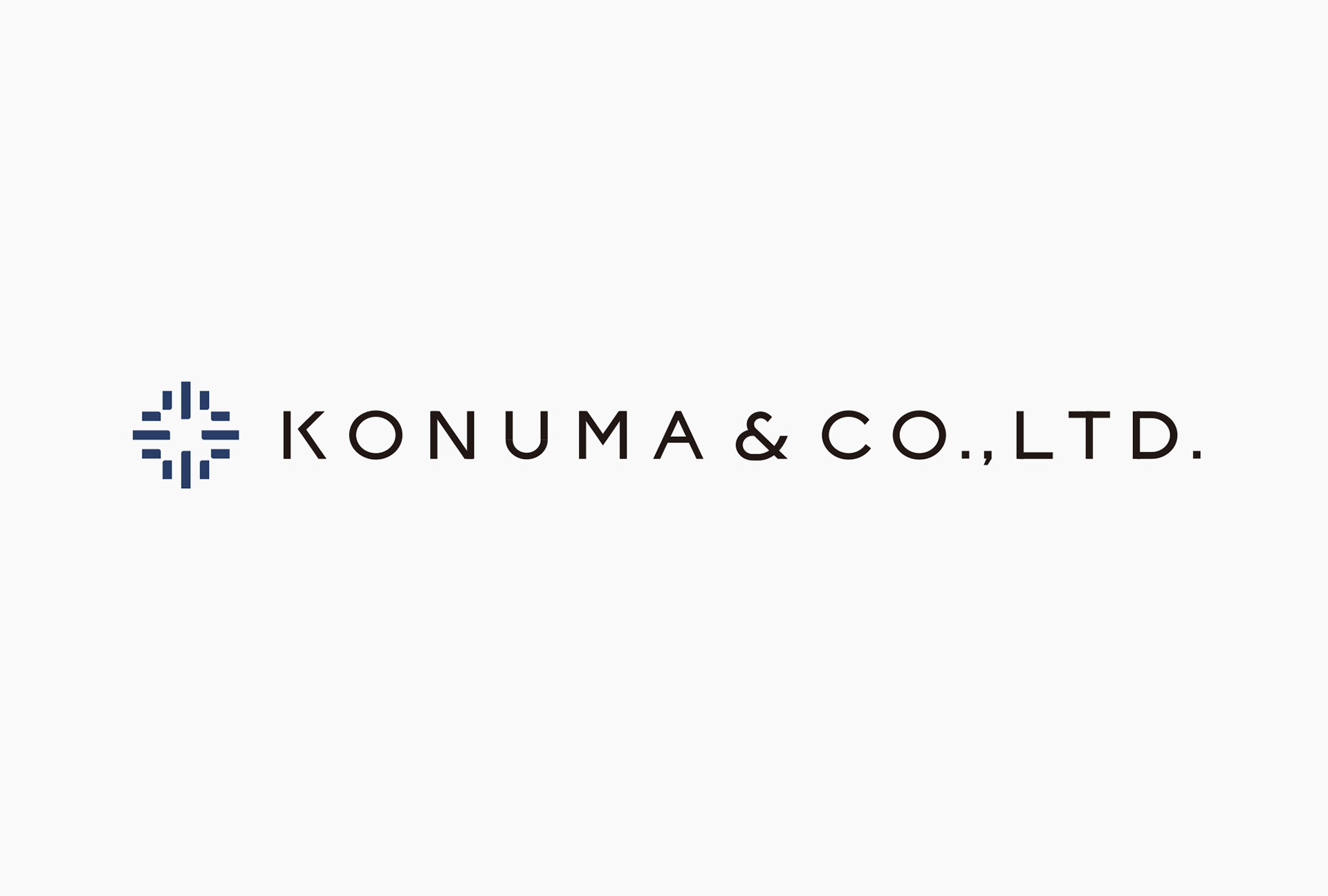
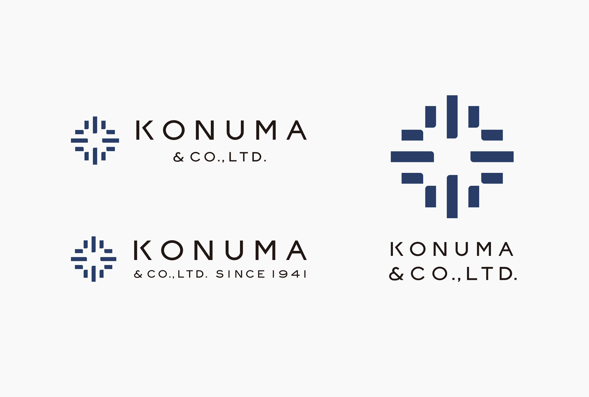
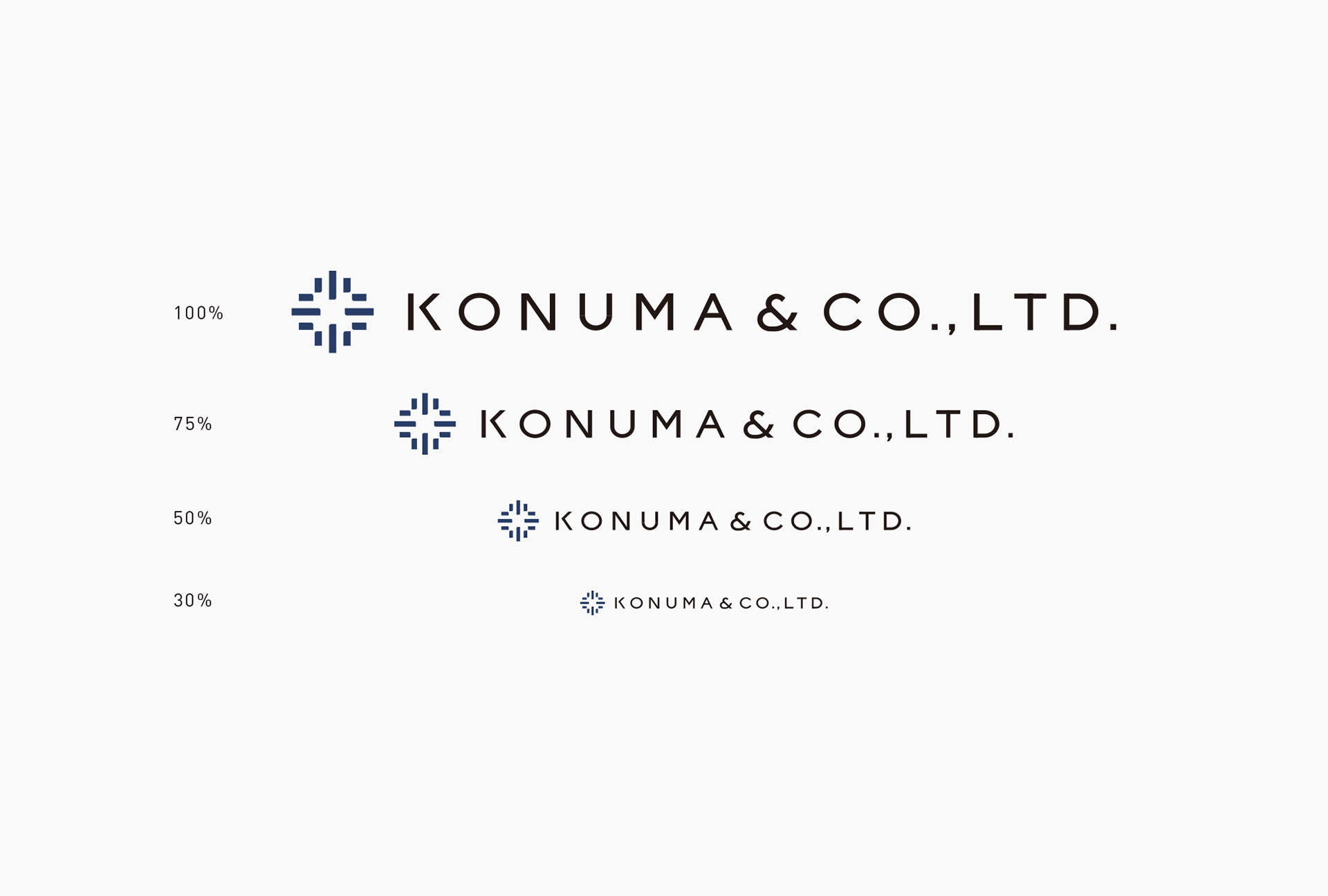
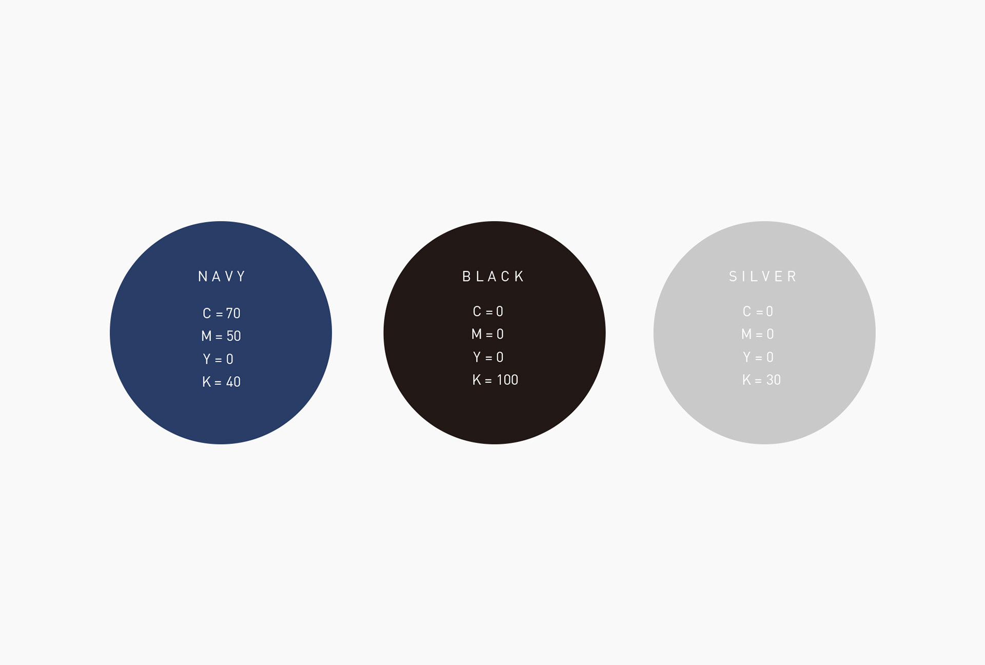
タイプロゴは「Eyeglass Bold」のフォント構造をベースに、オリジナルのものを作成しています。正方形に収まる安定感と、シャープで現代的な印象を同時に持ち合わせています。会社の理念の通り、冷静な判断力や洞察力、また信頼が重要視される事業であるため、静的で落ち着いた配色を意識し、濃紺をメインに、黒、シルバーの三色をコーポレートカラーに設定しています。
We created the original logotype, based on the structure of the “Eyeglass Bold” font. This logotype gives you a feeling of stability due to its square shapes, and at the same time, it captures you with its sharp and modern impression. Their business requires calm judgement and insight, and trust is a big factor in it, just as the corporate philosophy shows. Therefore, we looked for color arrangement that has a quiet and calm impression. We set three colors, navy blue, black and silver, as their corporate colors, with navy blue as the main color.