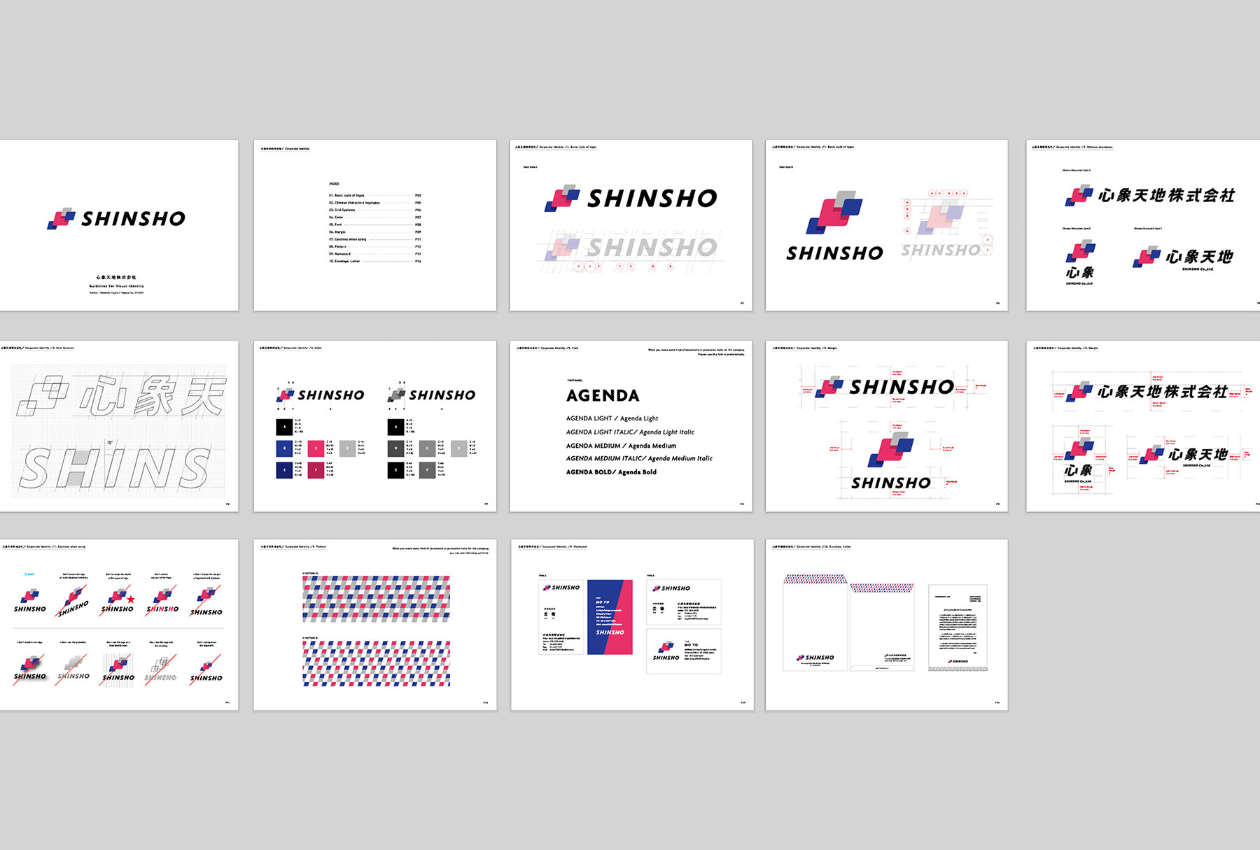
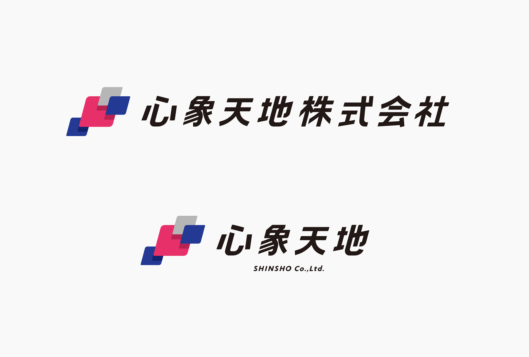
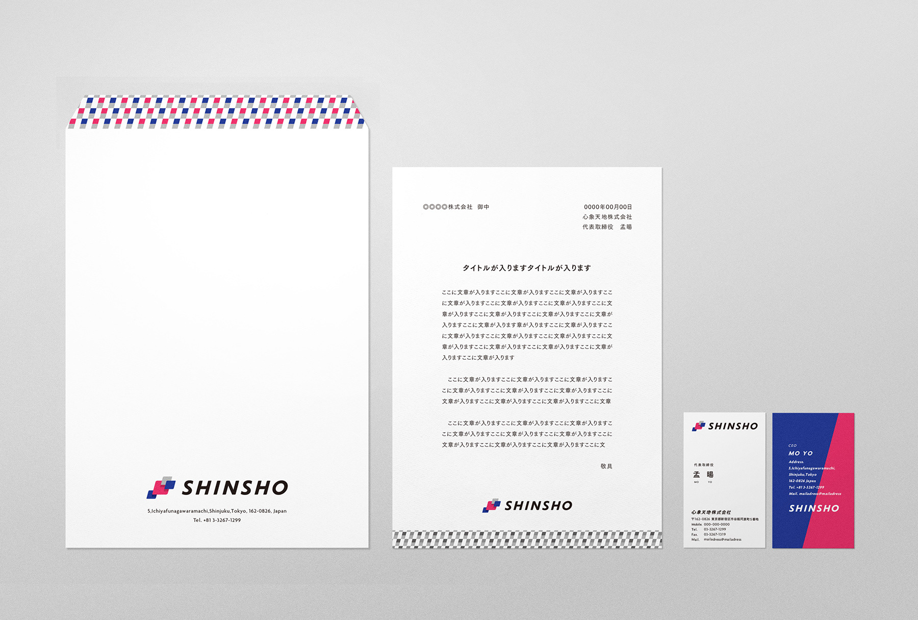
中国・北京に本社を置く心象天地株式会社。展示空間のデザインとプロデュース業を主軸とする同社が、新規事業開拓のために日本法人を設立し、tegusuにて事業キーワードの整理、VI開発、VIガイドラインの制作などを担当しました。
心象とは中国語で「心のイメージ、心に浮かぶ形」を意味しており、天地は活動範囲やフィールドを表す言葉です。同社の経営ポリシーは「心から生まれた美しい景色を、努力して実現させる」ことにあり、その実現のために新しいテクノロジーを積極的に取り入れながら成長していくことを理念としています。
Shinsho Co., Ltd. is a company based in Beijin, China. Shinsho mainly designs exhibition space and conducts production work. When they founded a Japanese subsidiary for new business development, tegusu was responsible for sorting out business keywords, VI development, and VI guideline development.
Shinsho, in the company name, means “Images in your mind, or shapes that occur in your mind.“ Tenchi is a word that signifies a range of activities or a field. The company’s management philosophy is “to realize a beautiful landscape that was born in mind by making efforts.” In order for that to happen, they are willing to proactively adopt new technologies making the company grow.

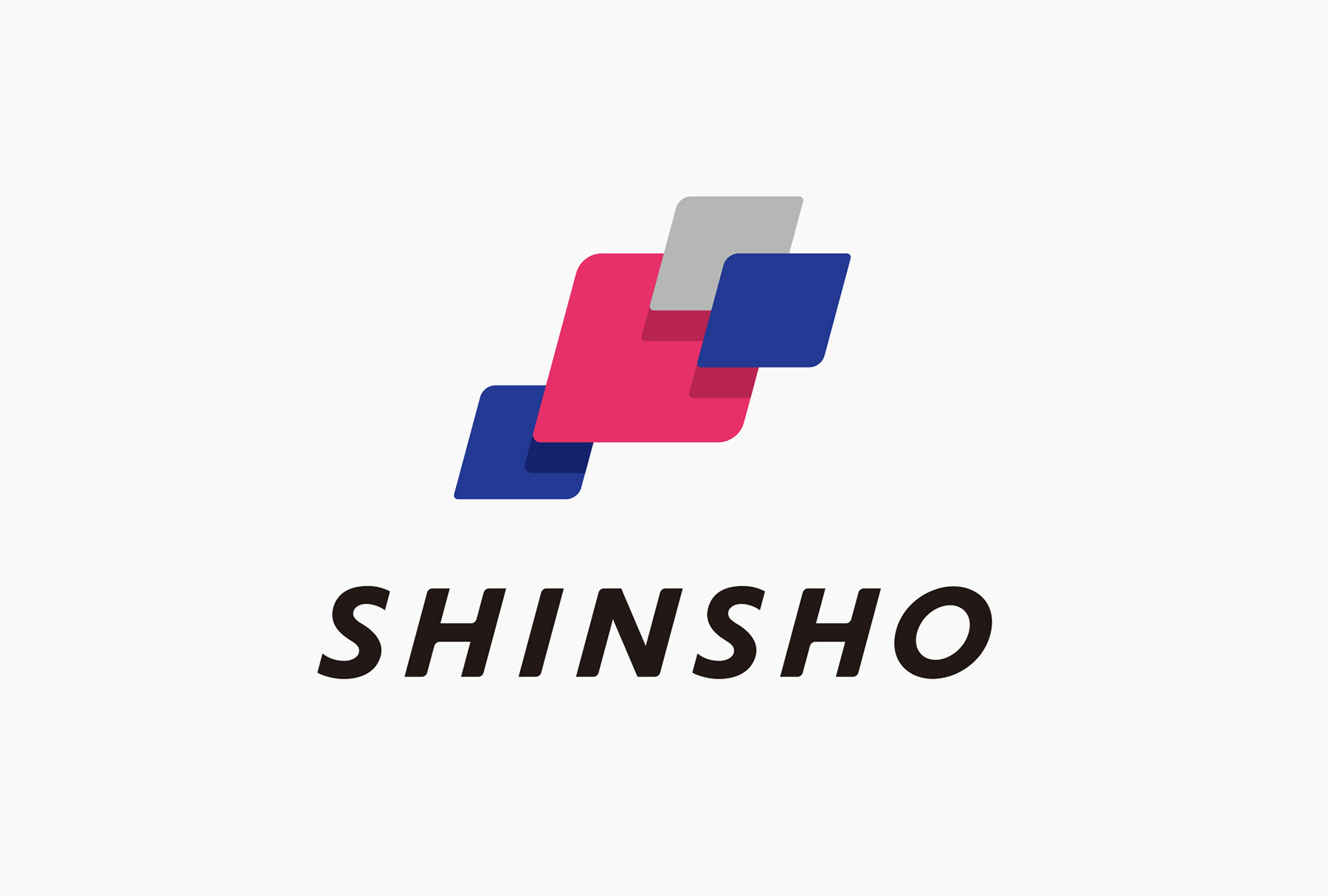
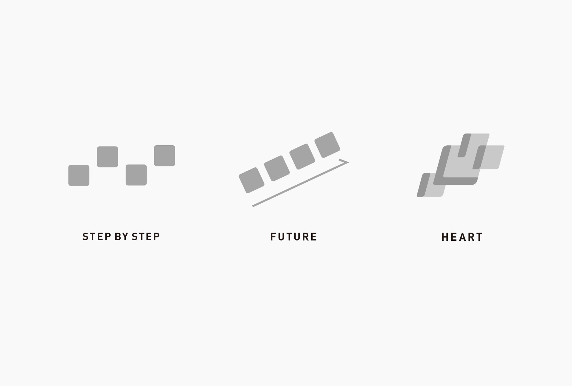
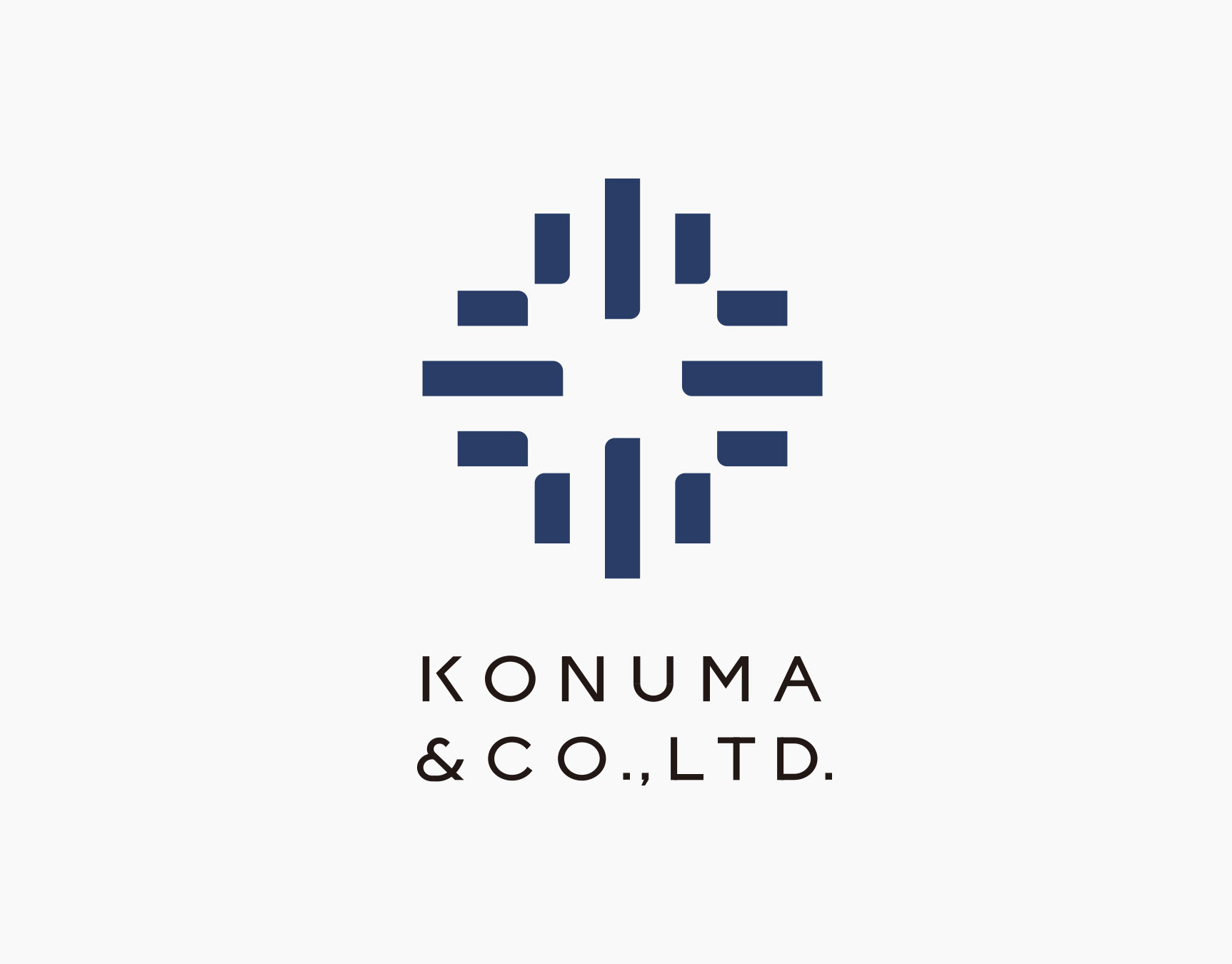
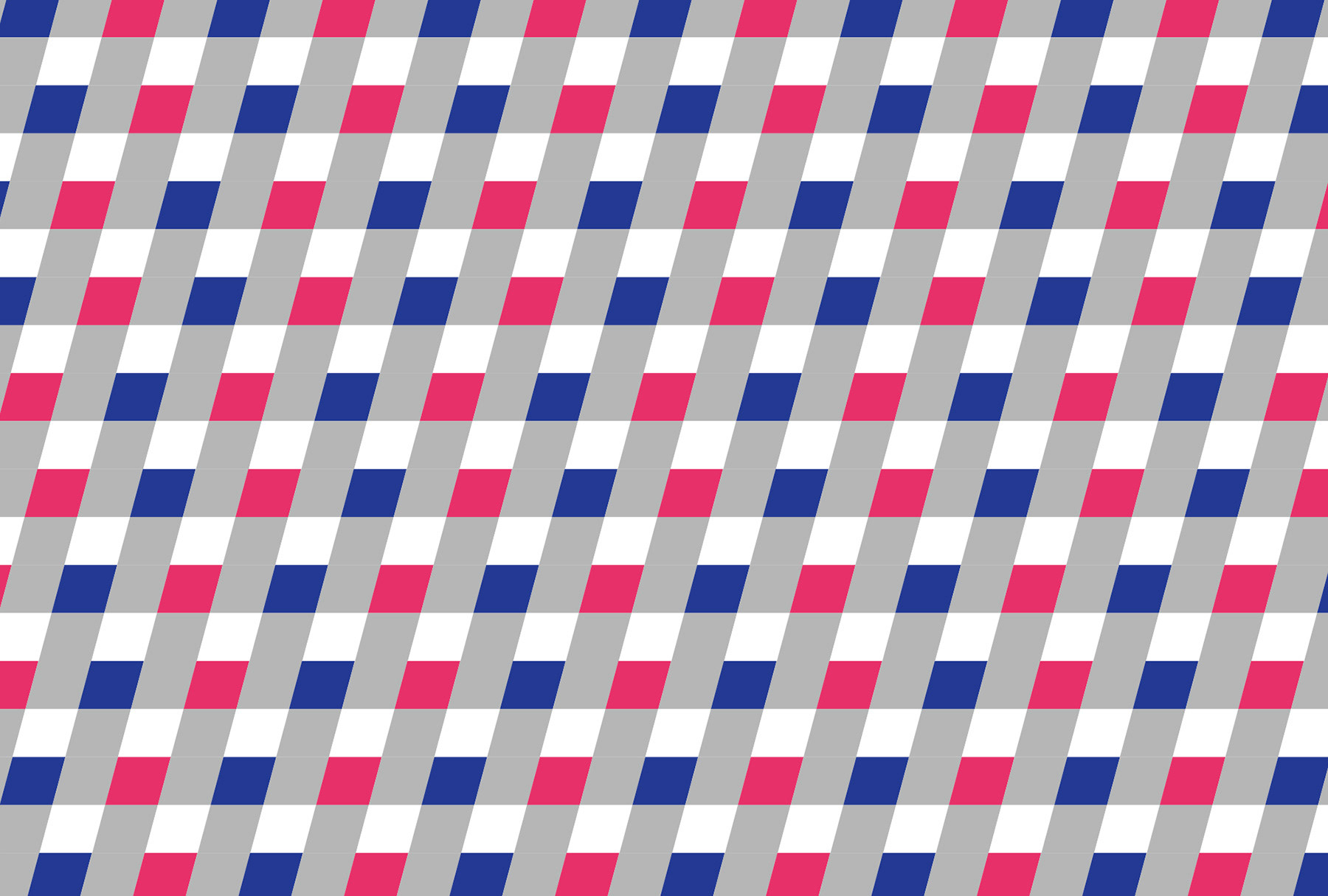
VIの開発にあたっては理念から着想した「STEP BY STEP」「FUTURE」「HEART」という三つのキーワードを掲げ、それらをビジュアライズすることでシンボルマークを生み出しています。映像や画像がピクセルの集合体で作り出されるように、正方形を最小単位のモチーフと定義し、それらが集合することでシンボルが生まれます。これにより「心のイメージを努力の積み重ねによって実現させる」ことをダイレクトに表現しました。
For the development of VI, we presented three keywords “step by step,” “future” and “heart,” which were selected based on the company philosophy. The symbol was created by visualizing those keywords. We defined a square as the minimum motif unit, and the symbol consists of a group of squares, the same way as videos or images are made up of a group of pixels. The idea of “realizing the images in your mind by making continuous efforts” is directly reflected in this.
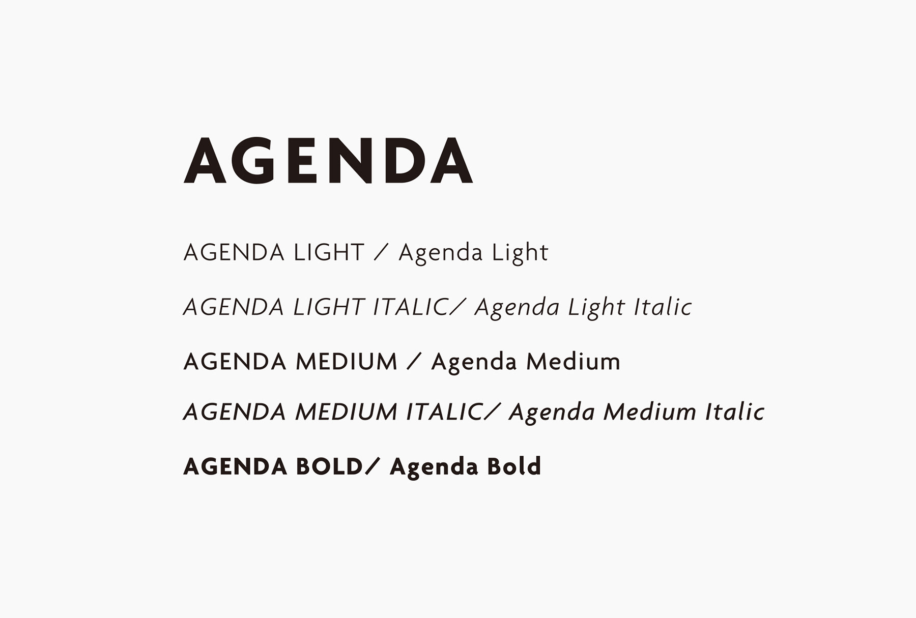
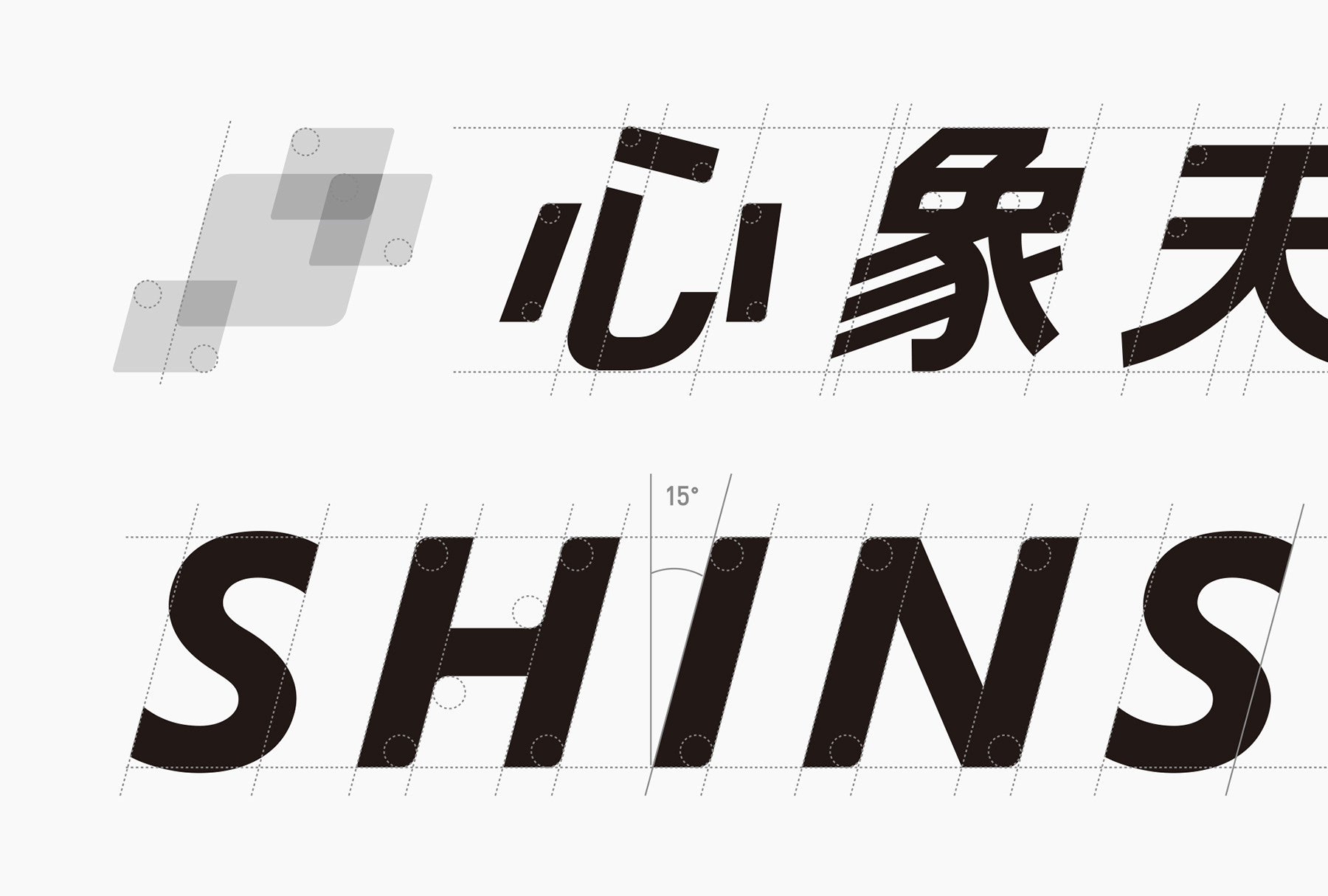
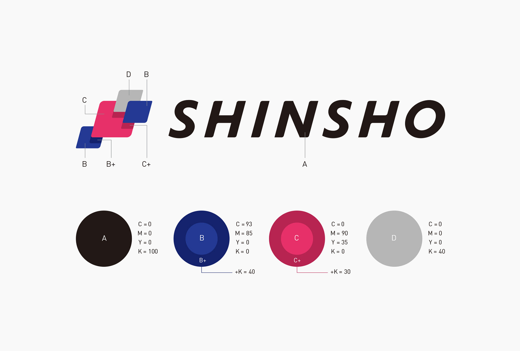
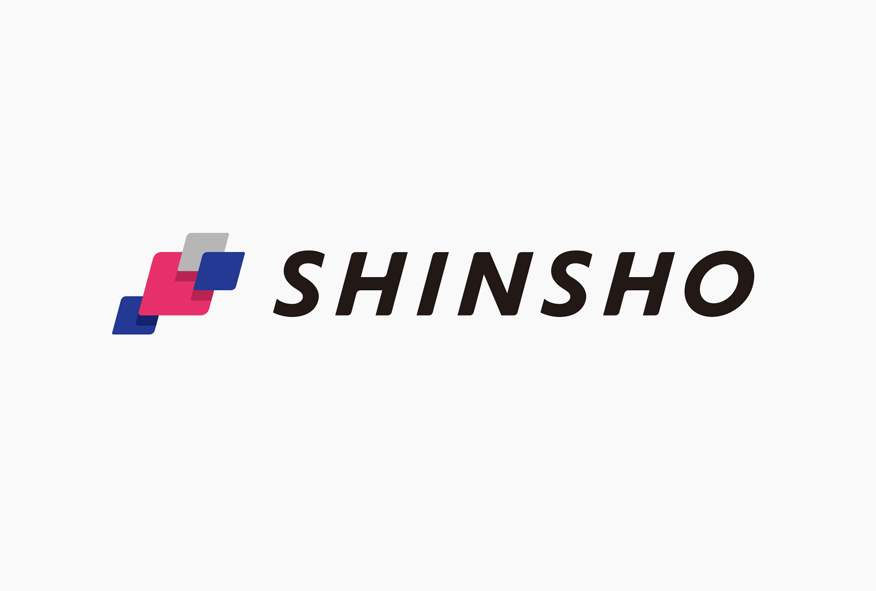
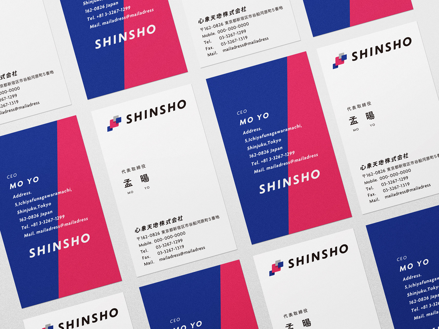
ロゴタイプはAgenda Boldをベースにオリジナルタイプを作成。15度の傾斜は前向きに「FUTURE」を捉え、進んでいく姿勢を表現しています。カラーは、洞察力と冷静さ・真面目さを表すブルー、情熱を持ち躍進していく姿をイメージしたレッド、また協調性を持ち、さまざまなステークホルダーと共に事業を発展させていく誓いを表すグレーの三色を中心に構成しています。
We created an original logotype based on Agenda Bold. The 15-degree angle represents an attitude of moving forward with a positive view of the “future.” The three colors mainly used for the logotype are blue, red and gray. Blue symbolizes insight, calmness and sincerity. Red represents an image of a determined character who moves ahead with a passion. Gray is an oath to be cooperative and develop business together with various stakeholders.
Client : SHINSHO Co., Ltd.
Direction, Design : Masaomi Fujita / tegusu Inc.
Project Management : JCCD studio
Client : 心象天地株式会社
Direction, Design : 藤田雅臣 / 株式会社tegusu
Project Management : JCCD studio