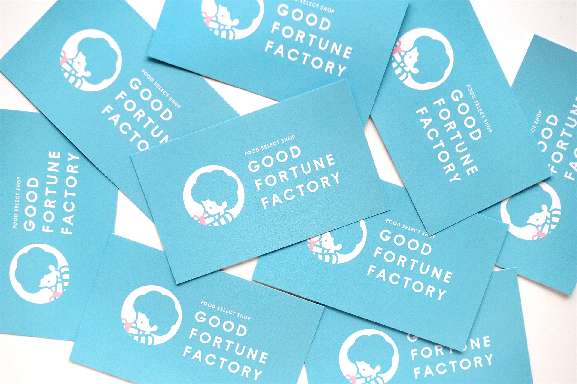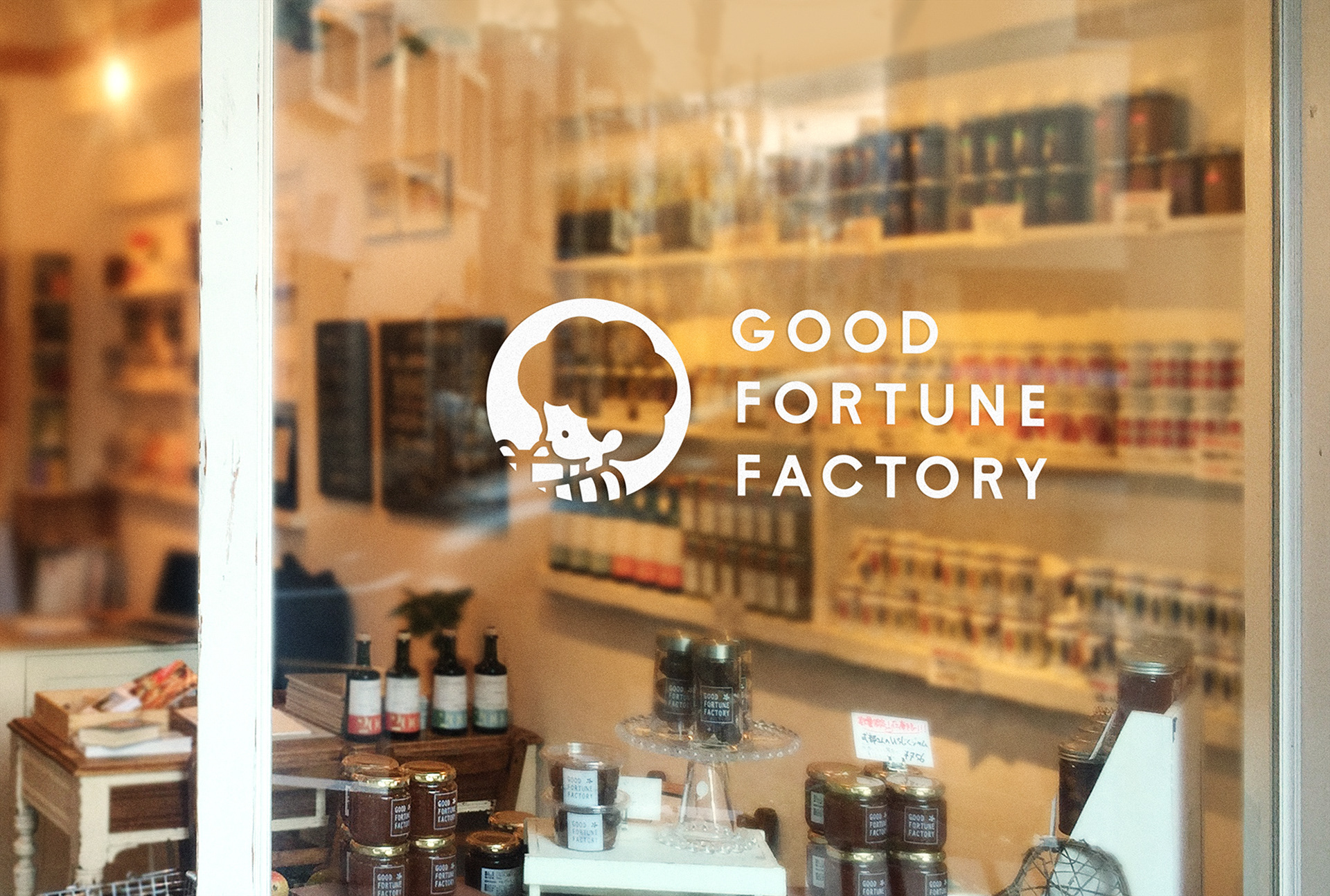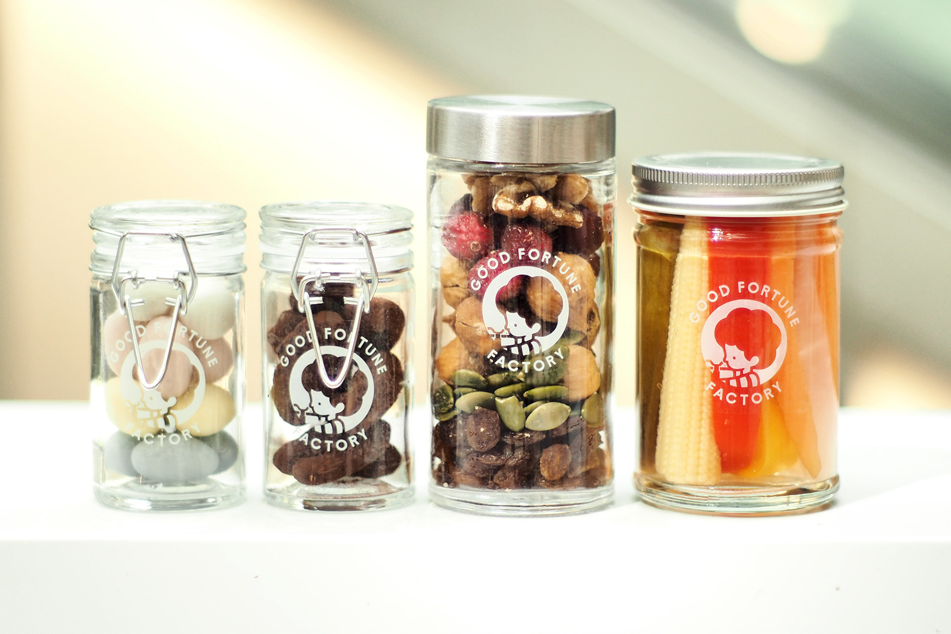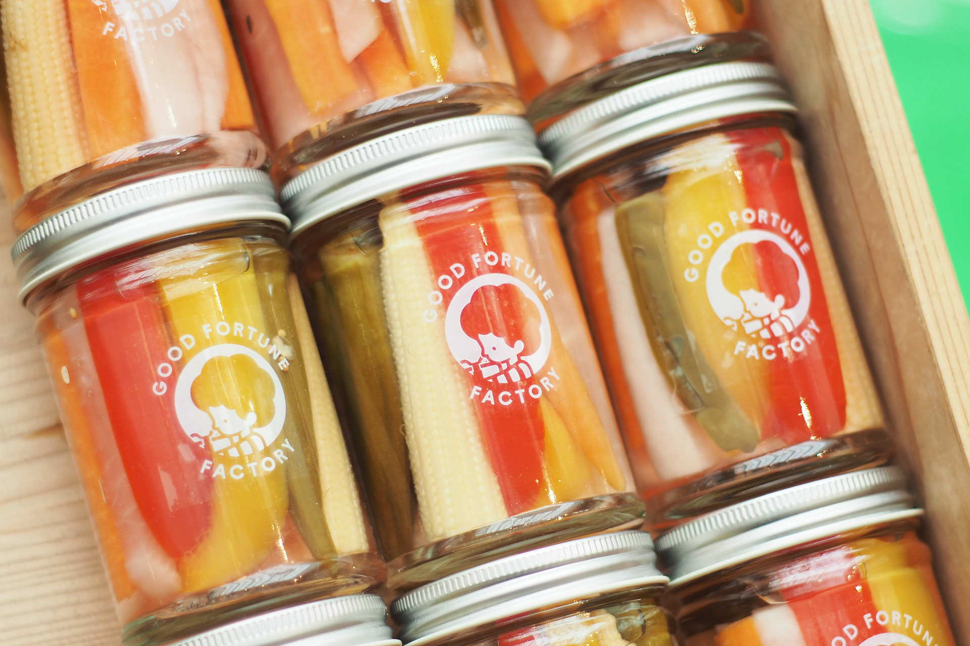
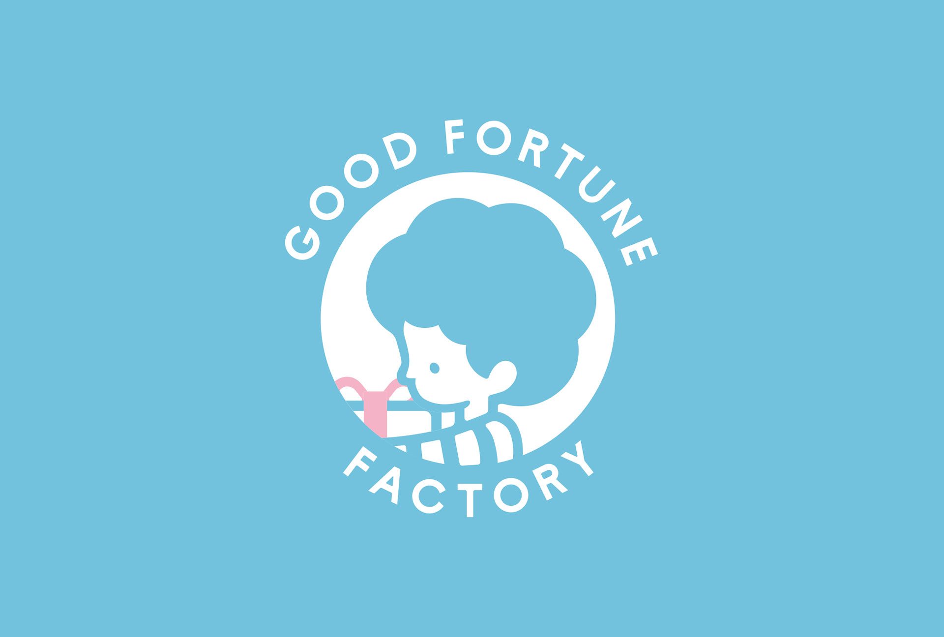
東京都目黒区のフードセレクトショップ。新潟県佐渡島出身の店主が、大自然から学んだ味や感覚を頼りに、美味しく・見た目にも可愛い商品を世界中から厳選して取り揃えています。tegusuでは、お店のロゴ・キャラクター制作・キーカラーの再設定などを行いました。
Good Fortune Factory is a specialty food shop in Meguro-ku, Tokyo. The shop owner is from Sado Island, Niigata Prefecture, and he developed his sense of taste surrounded by Mother Nature. Using his keen sense, he carefully selects food products from all over the world that are not just tasty but also nice and cute in appearance. tegusu produced the shop’s logo and character, and reset the key colors.
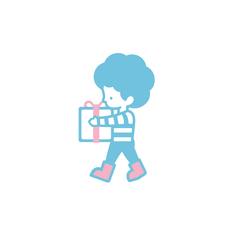
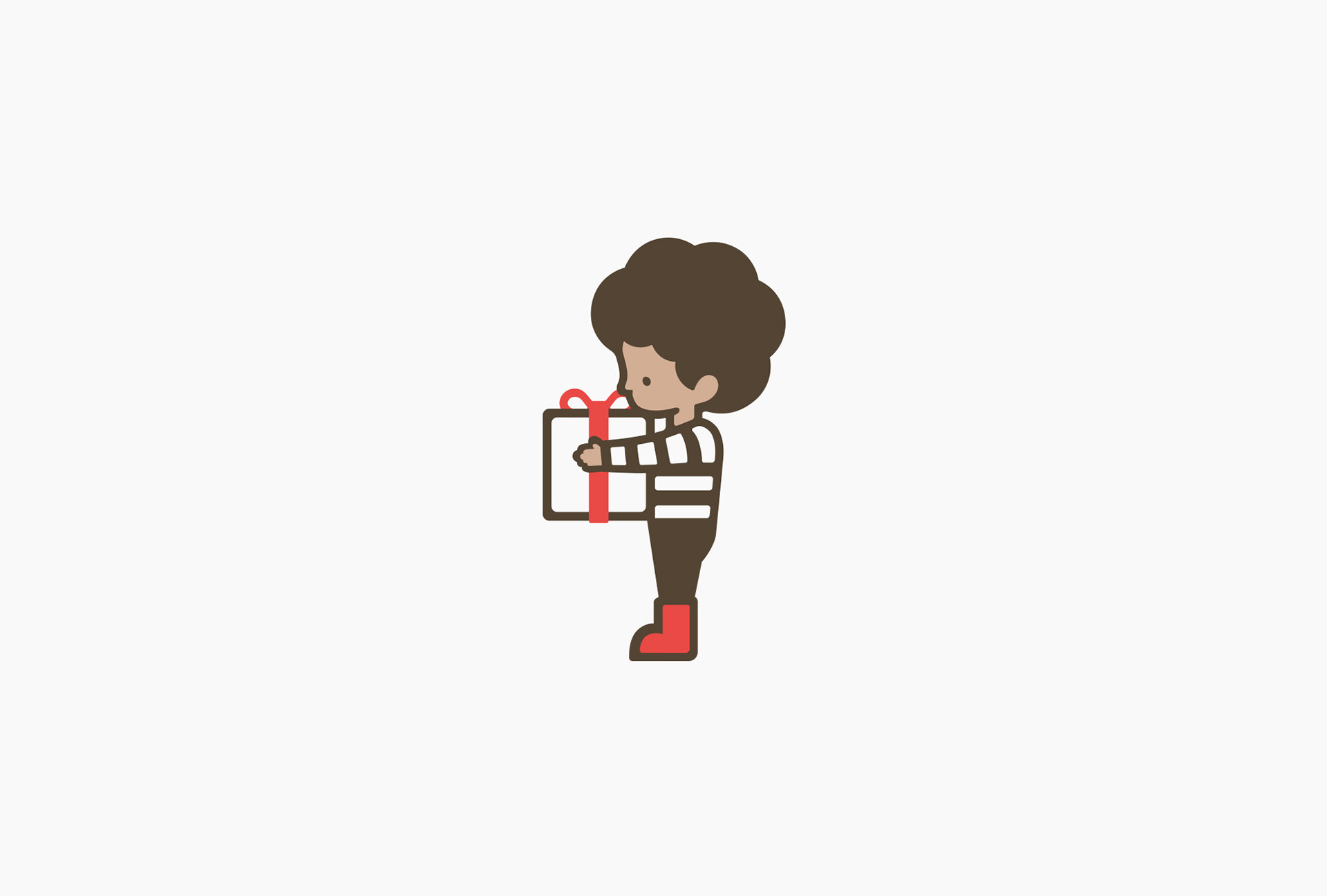
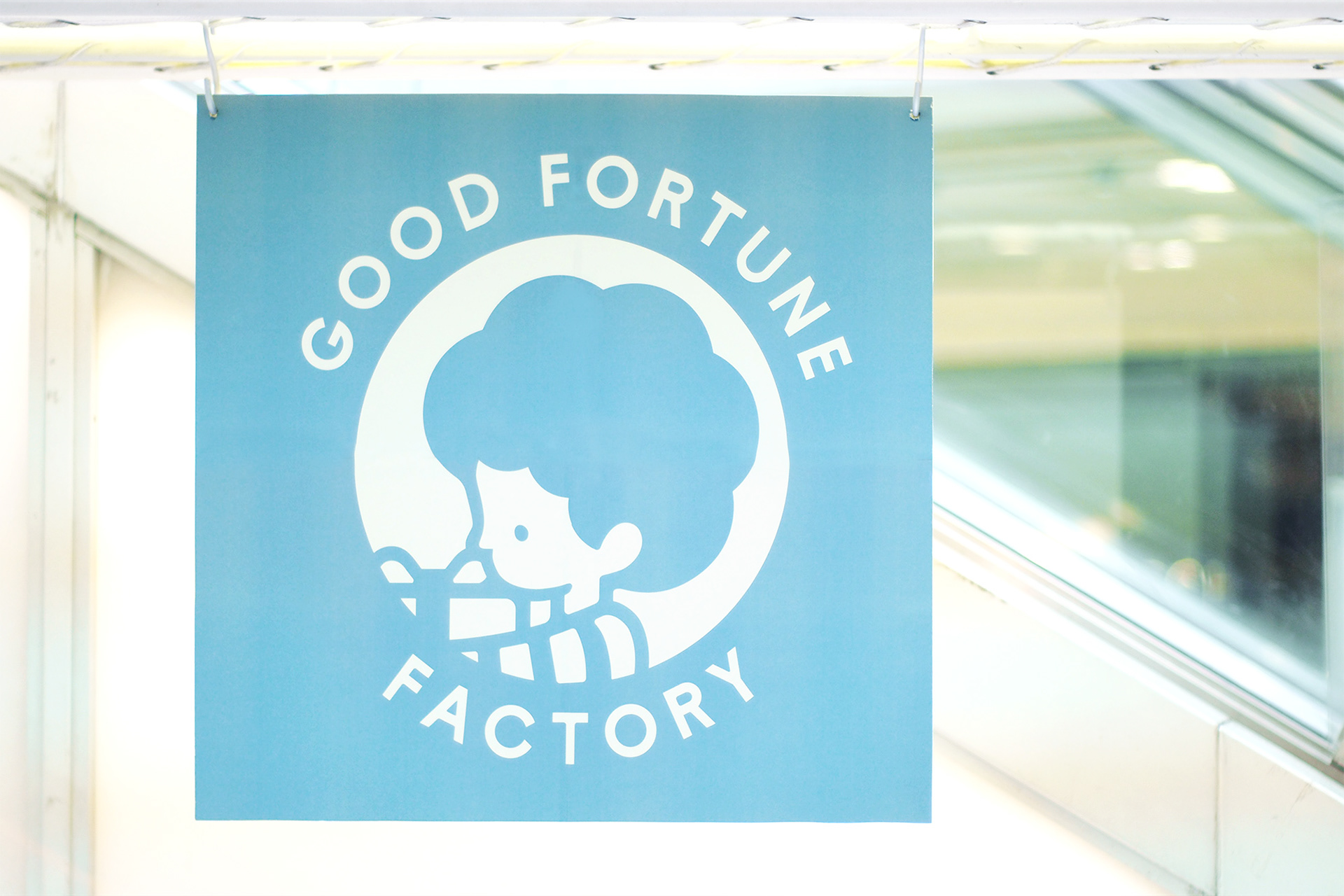
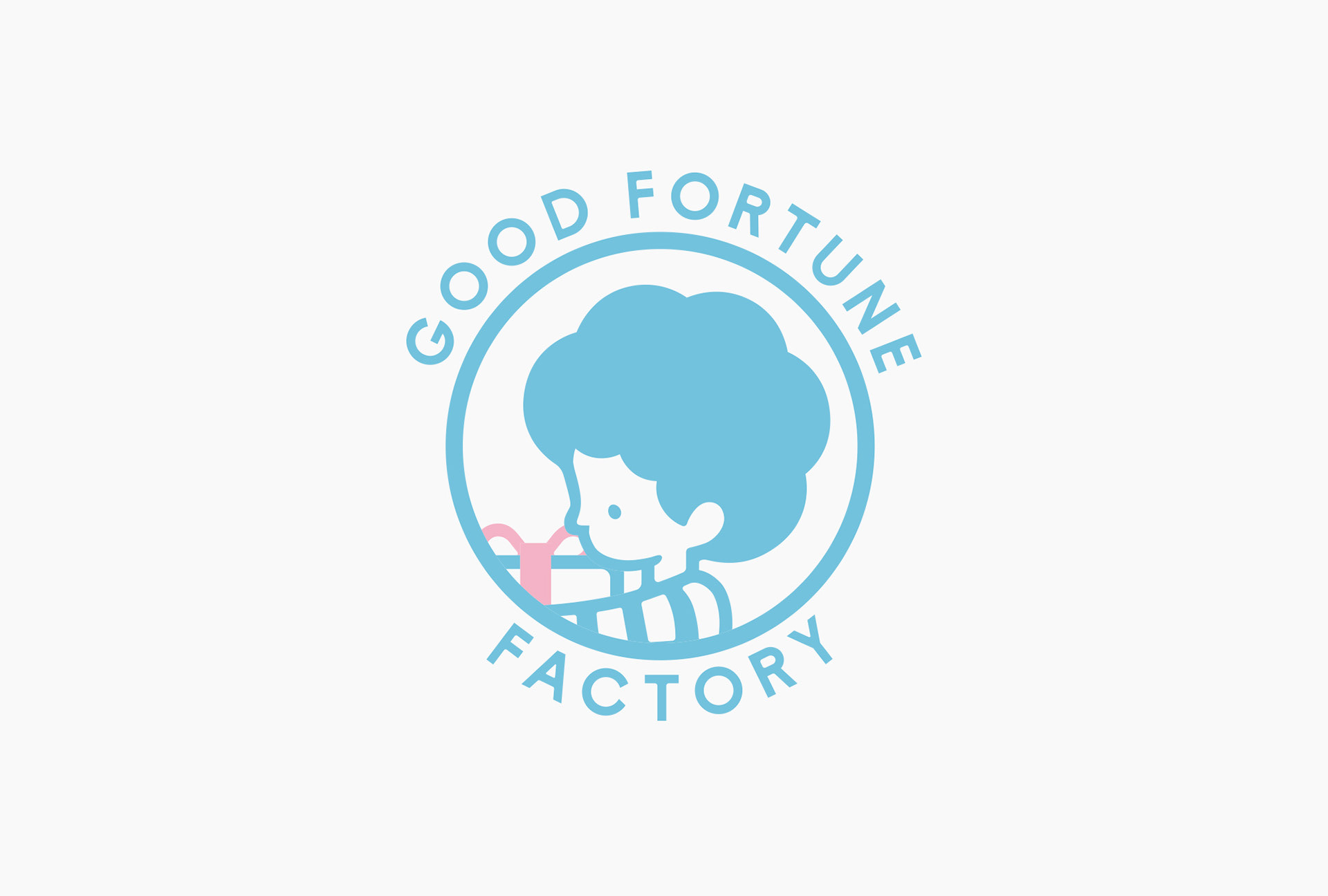
「作り手にも消費者にも、関わる人全てにGOOD FORTUNEを届けたい」という想いでお店をはじめた店主。そんなビジョンを表すキャラクターが「JOYくん」です。JOYくんは、いつも何かのプレゼントを大切そうに抱えて歩き、「幸運を運ぶ少年」として街の人に愛される存在。このストーリーは、地域にとってのGFFの在り方そのものを表すものです。(キャラクターの名前や、プレゼントを抱える子供のイメージは、店主と奥様が考案してくださいました)
The shop owner’s vision, “give out good fortune to all the people involved, including food producers and consumers,” is represented by the character “JOY-kun.” When you see JOY-kun walking, he is always carrying a present very carefully, and he is beloved by everyone in the town as “a boy who delivers good fortune.” This story shows exactly what Good Fortune Factory is like for the local community.
(It was the owner and his wife who came up with the name of the character and the image of a child carrying a present.)
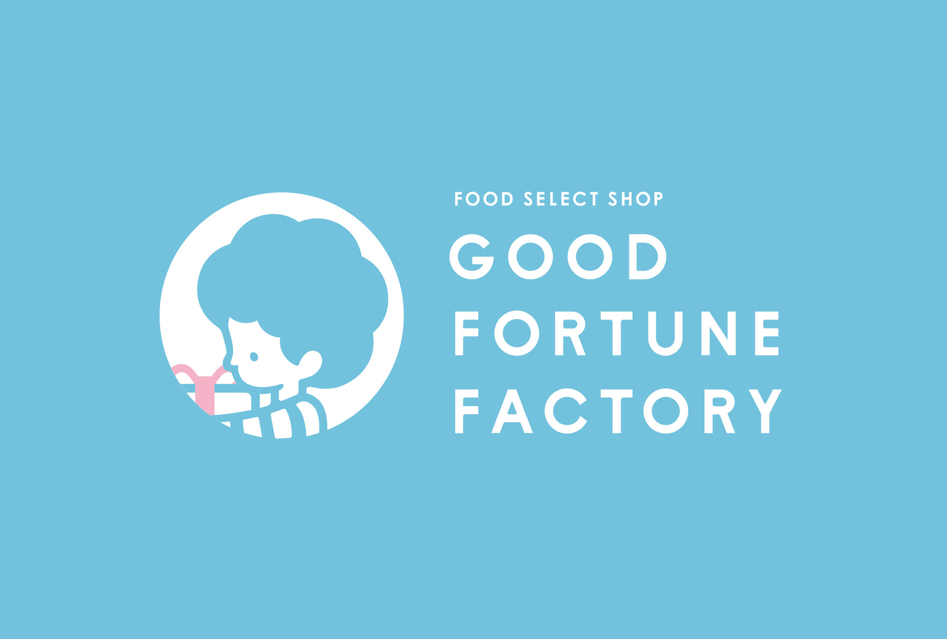
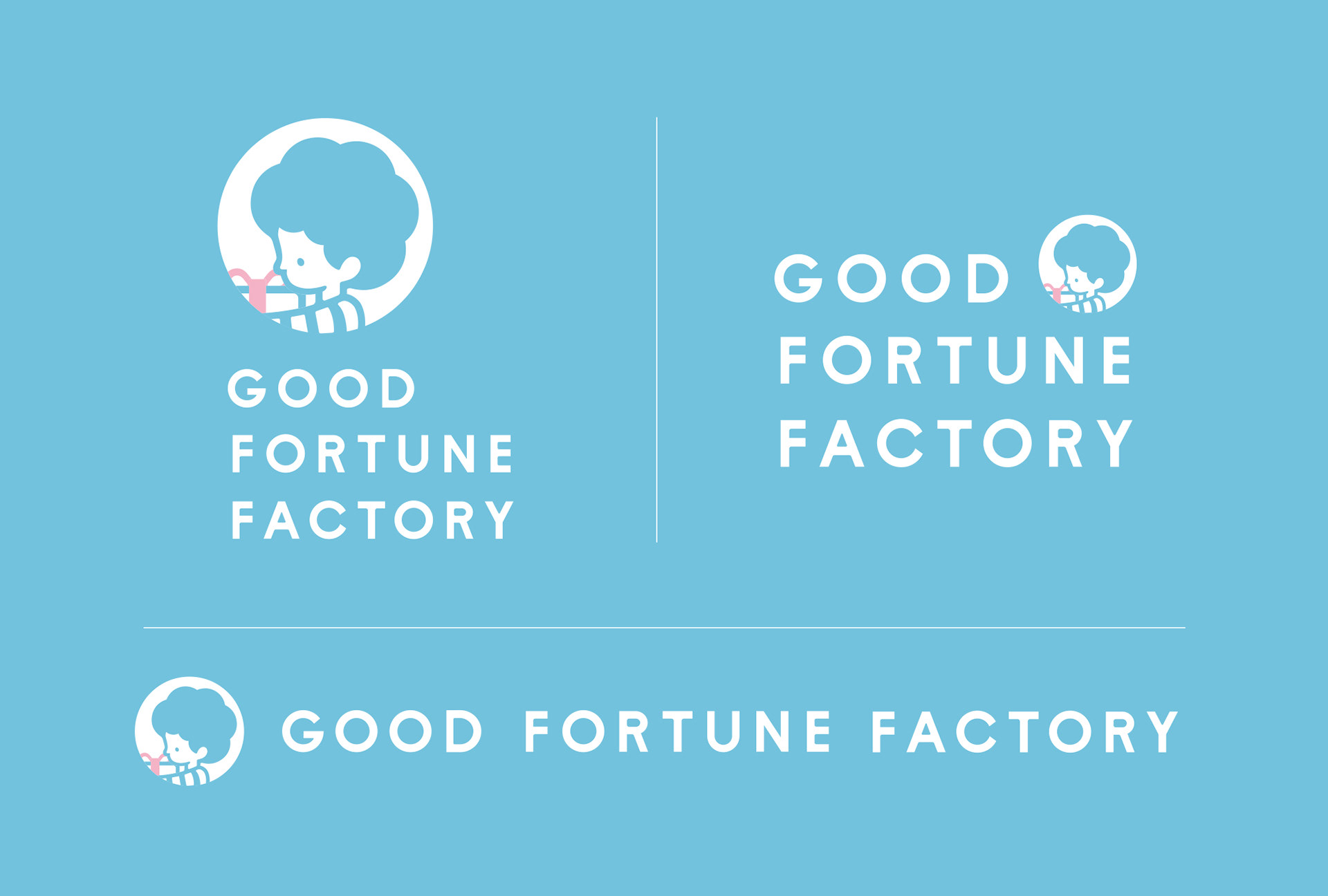
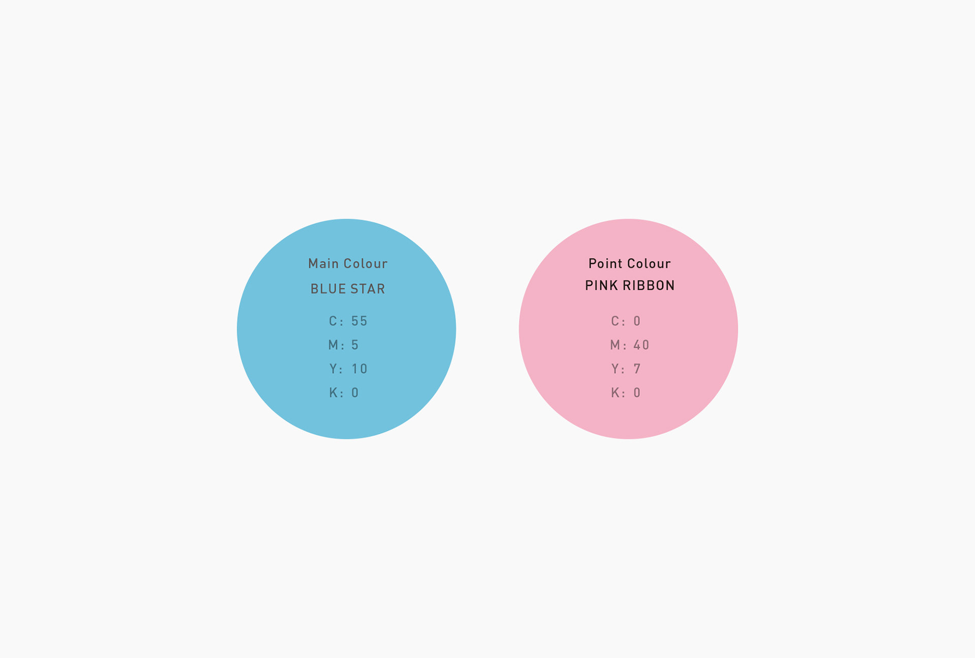
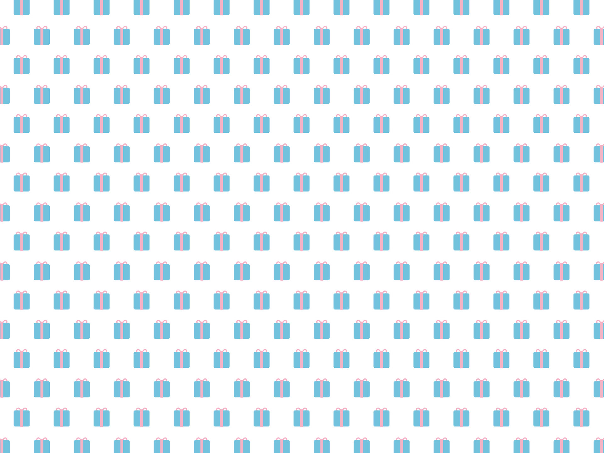
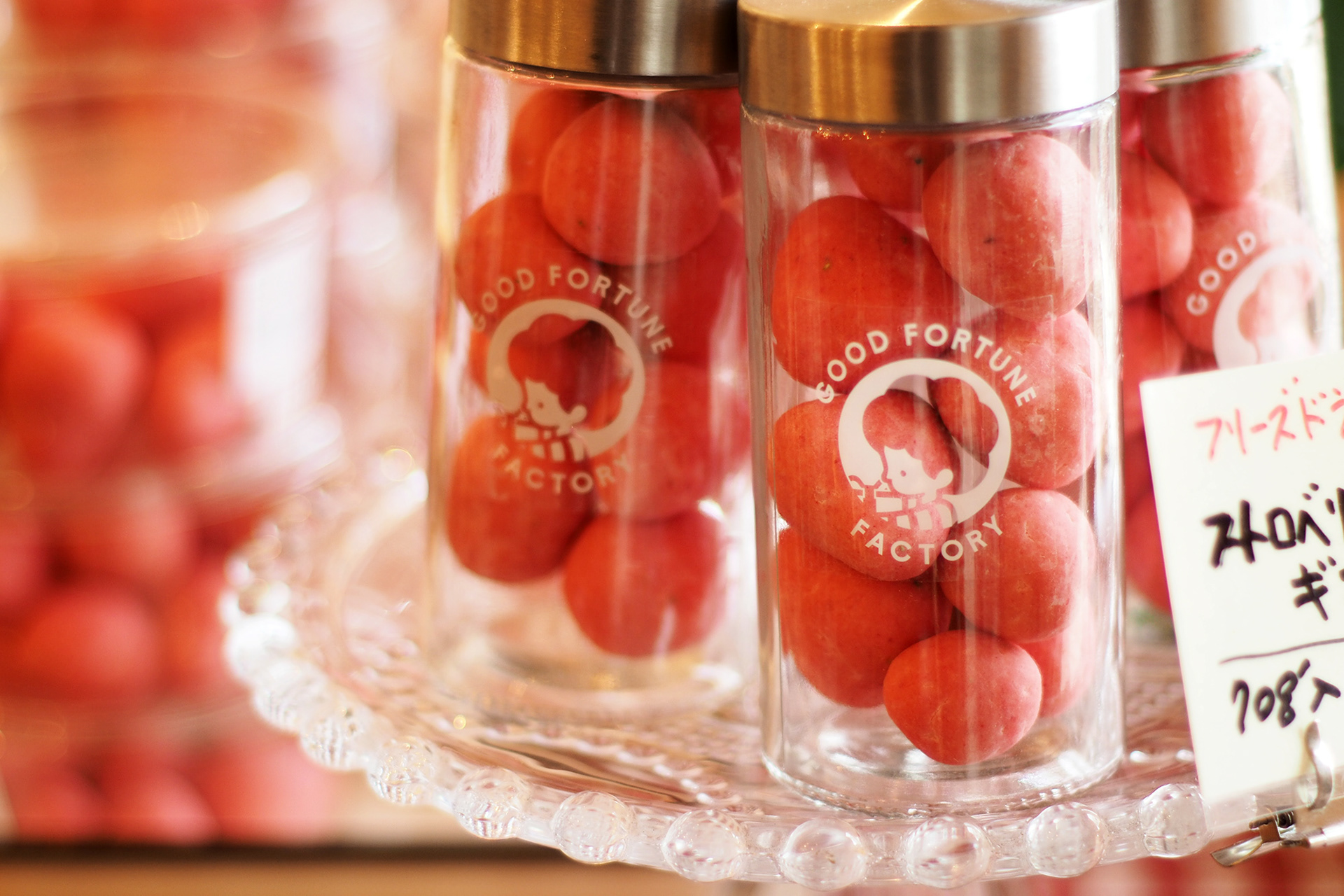
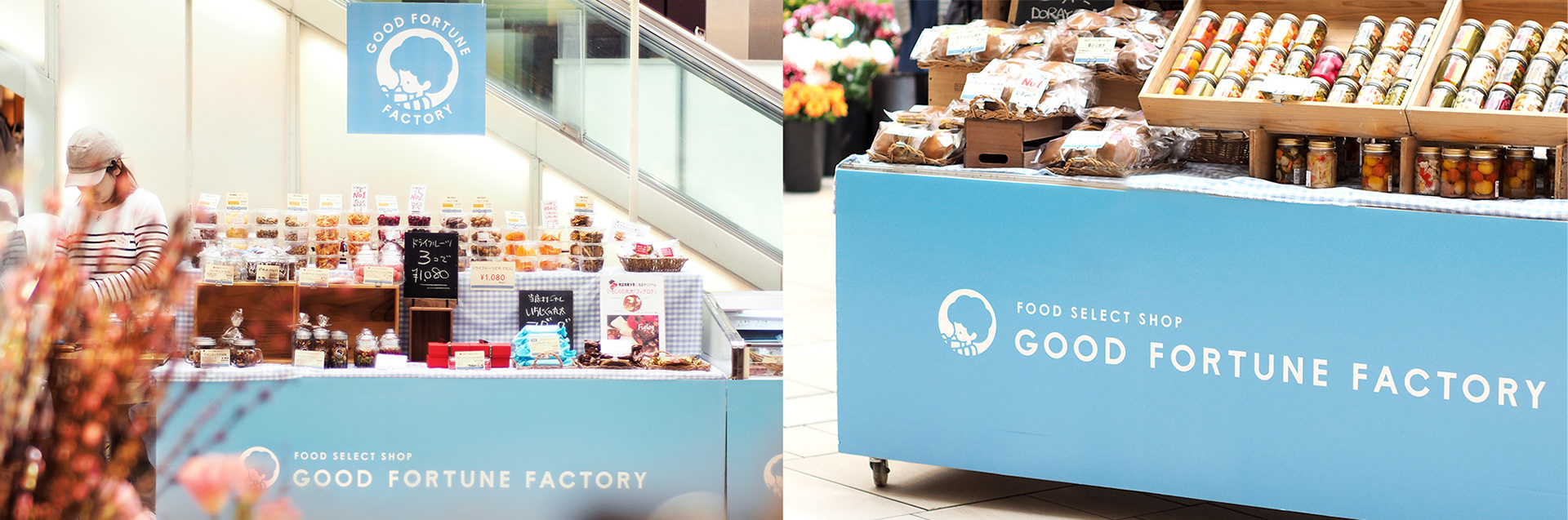
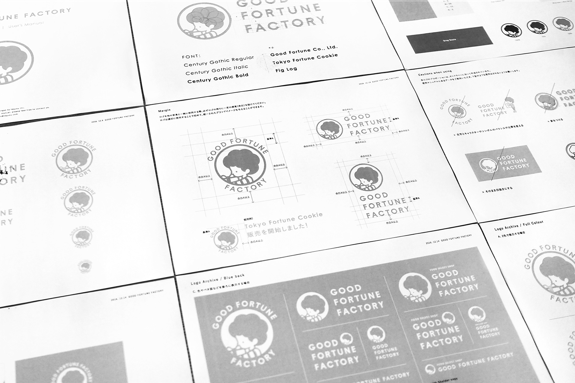
GFFでは以前から、「幸福な愛」を花言葉とするブルースターのカラーを取り入れ、お店のイメージとして定着させてきました。そのメインカラーは引き継ぎながら、ピンクとベージュという新たなコンビカラーを設定し、商品パッケージや店頭ツールなどへ展開時に、一定のイメージを保てるよう配慮しました。
Good Fortune Factory has been using the color of tweedia, which symbolizes “happy love,” and it has been established as the symbol color of the shop. While keeping the color as the main color, we created a new color combination of pink and beige. We paid attention to the existing image of the shop, and maintained it in the design used in product packages or goods at the storefront.