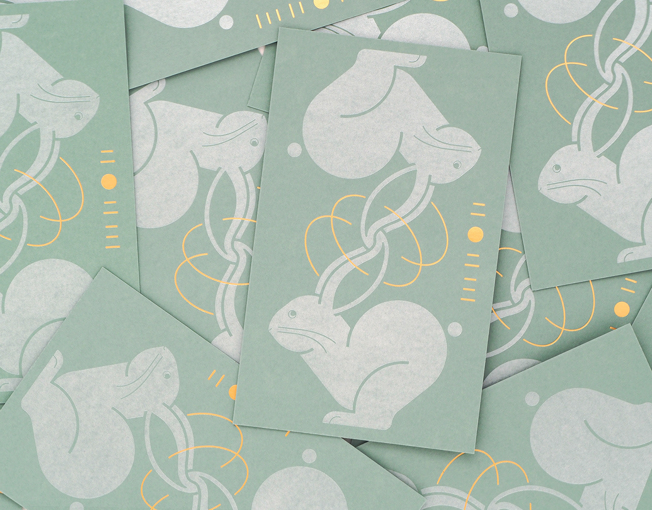
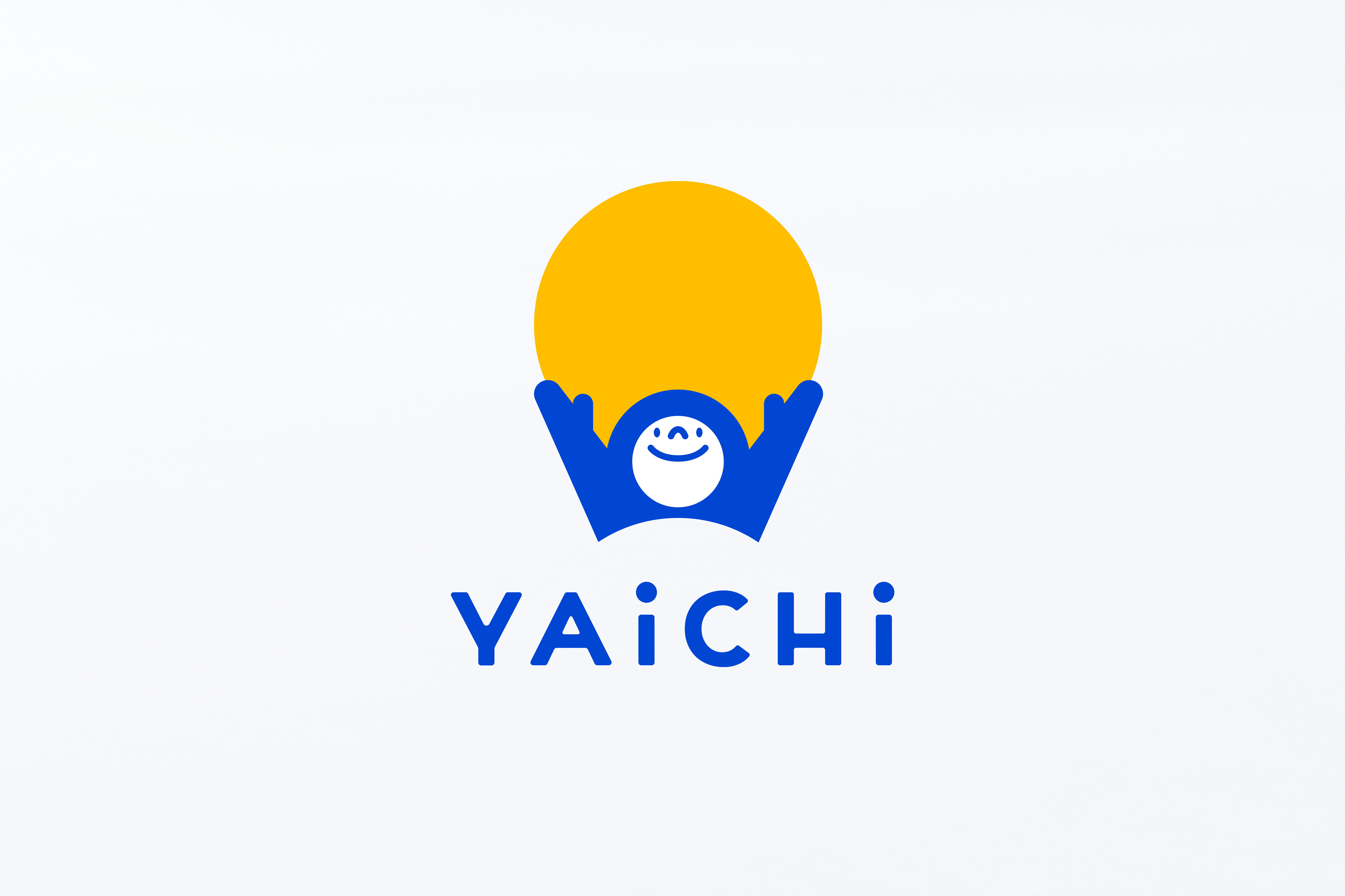
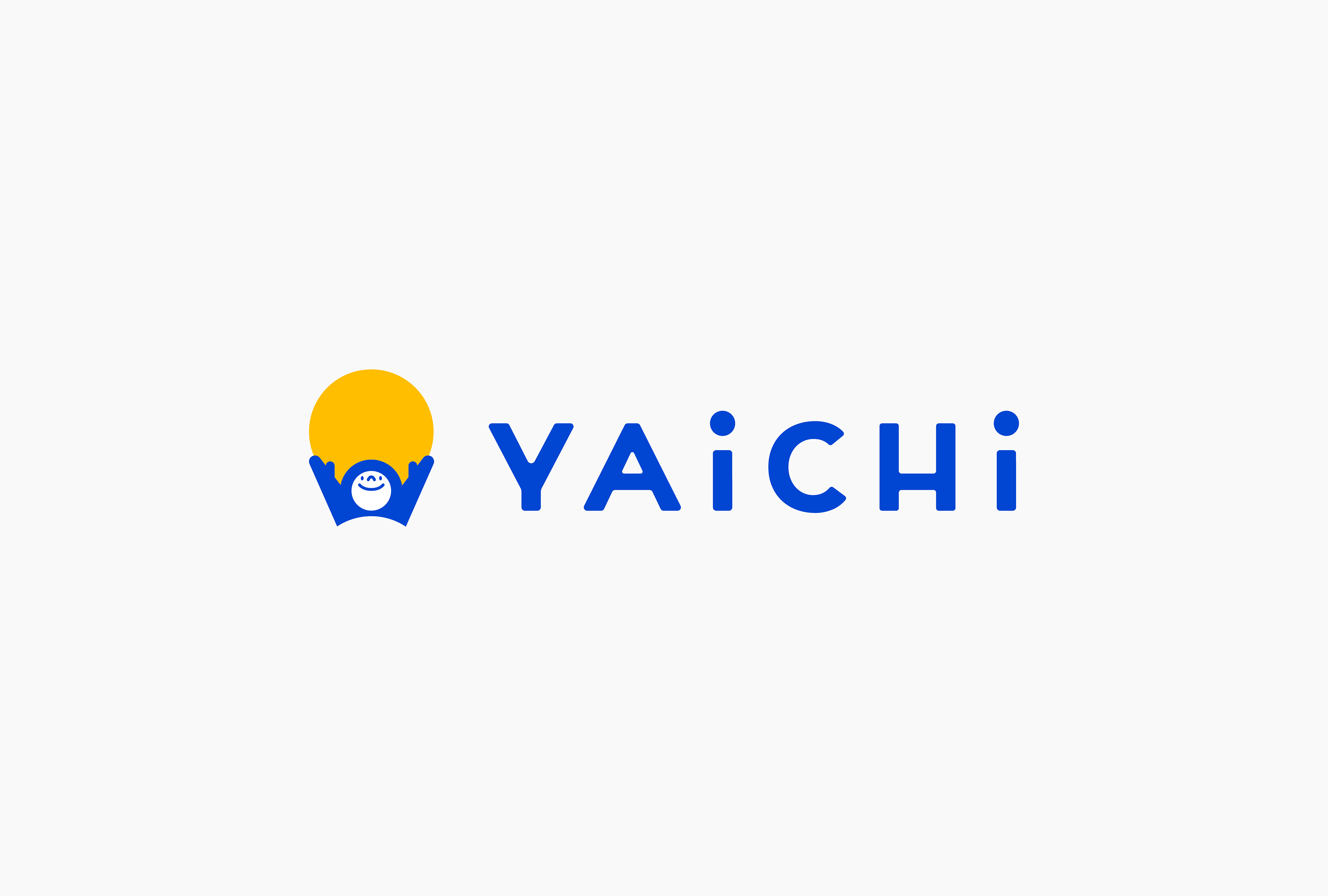
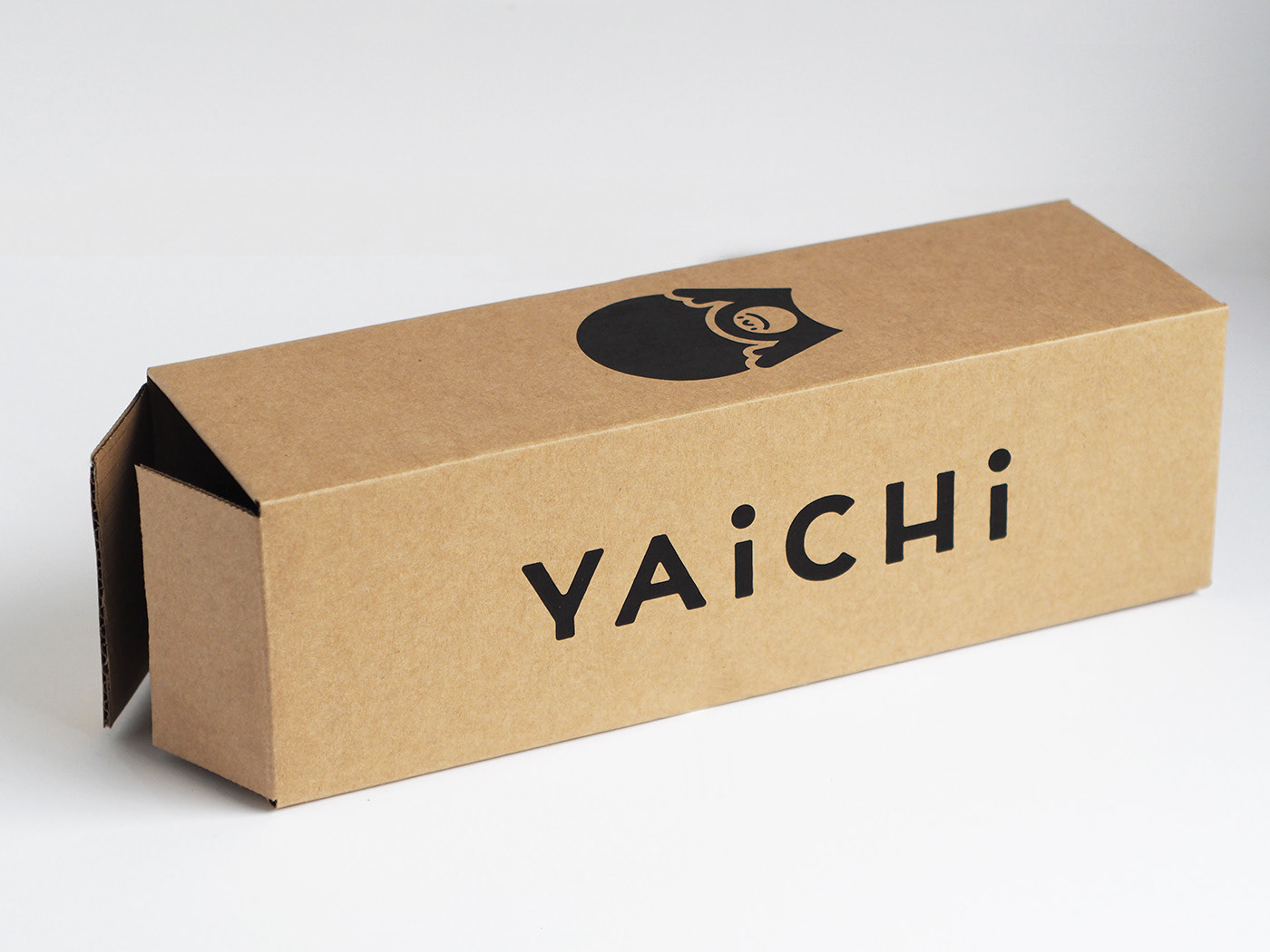
香港において、オンラインショッピングサイト/実店舗を通じて日本の商品を販売している「YAICHI」。ブランドの立ち上げにあたり、VIおよびキャラクターデザイン、イラストレーション等の制作を行いました。
YAICHIは、「Find Japan in YAICHI.」をテーマに、日本のベンダーと香港の人々を繋ぐため、O2Oマーケットプレイスを通して日本の商品を顧客に届けています。「日本の感動を手元に届けること」というミッションと、「遊び心」や「元気」「明るさ」というブランドパーソナリティを、香港チームと私たちの間で共有し、デザインに取り組んできました。
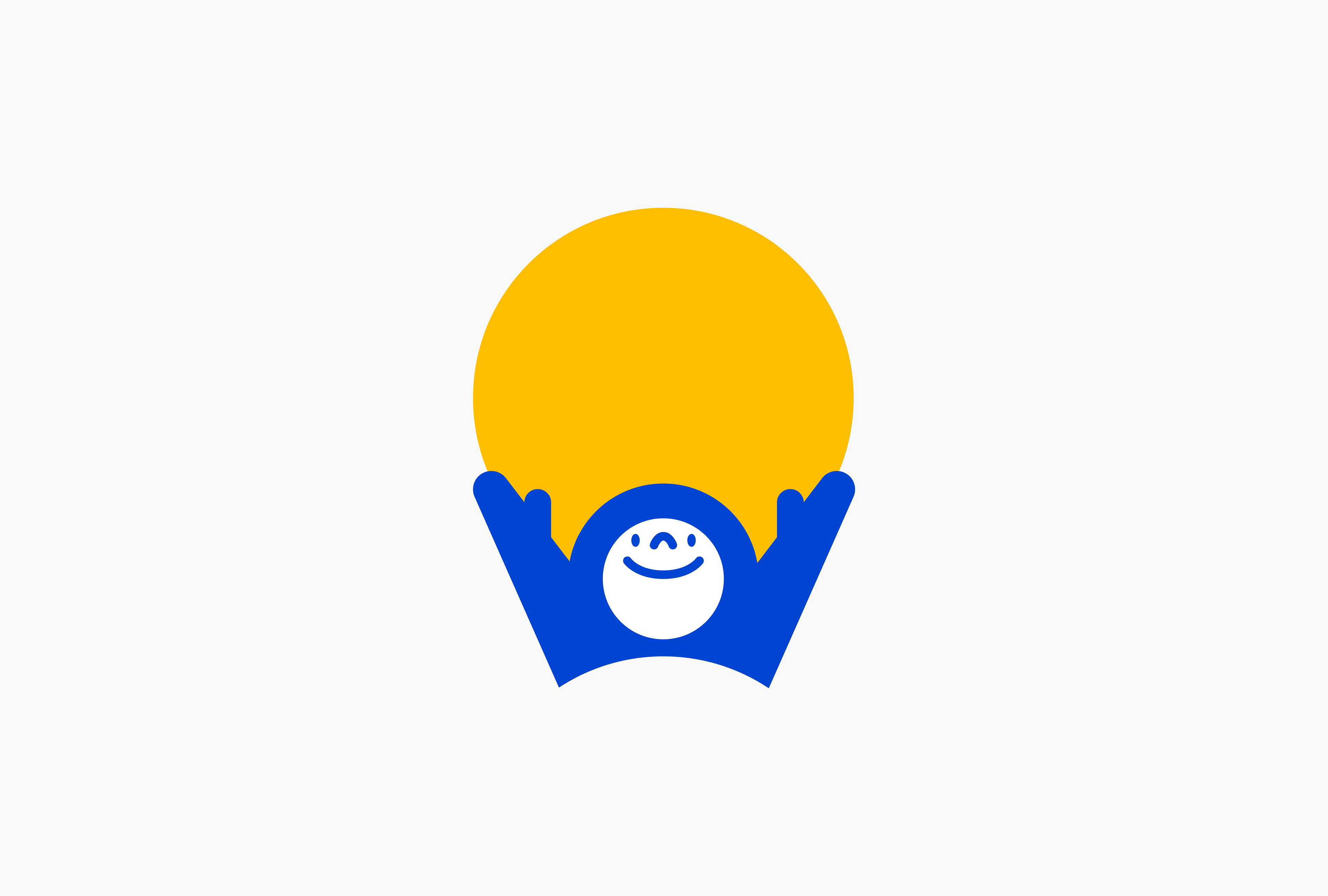
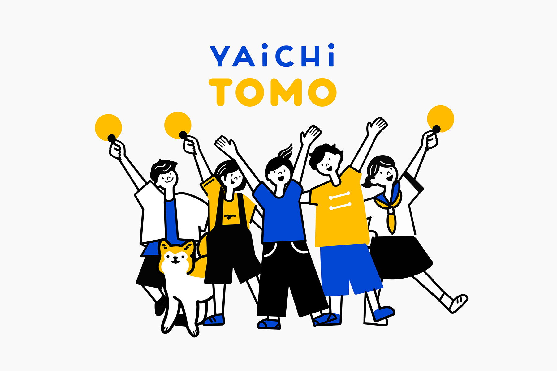
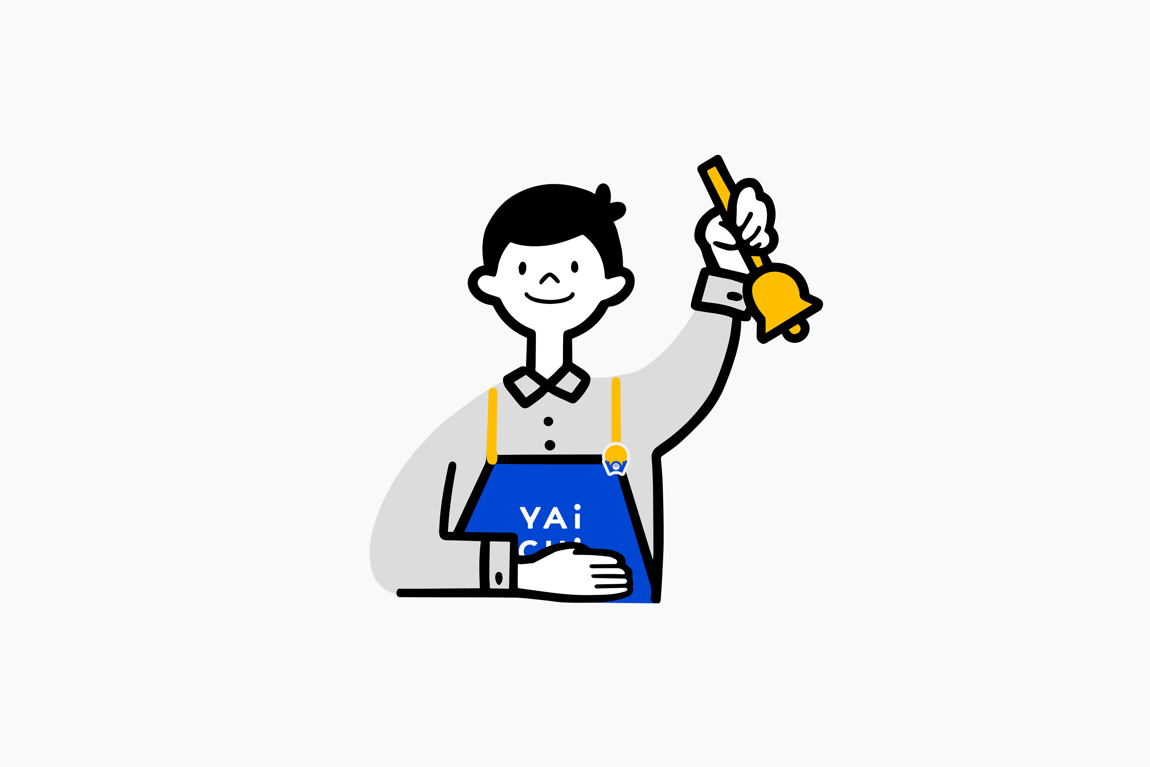
私たちは「日本に届ける/送る」という動作からインスピレーションを得て、頭文字の「Y」の形に腕を開き、天を仰ぐキャラクターシンボルを提案しました。腕を使ったサインが、YAICHIの「元気」を象徴するポーズとして顧客に浸透することで、ブランドイメージをユニークな形で伝えることができると考えました。また、テーマカラーやシンボルをベースに、イラストレーションやブランドアイテムを制作し、YAICHIの世界観を形成しています。
YAICHIは、「Find Japan in YAICHI.」をテーマに、日本のベンダーと香港の人々を繋ぐため、O2Oマーケットプレイスを通して日本の商品を顧客に届けています。「日本の感動を手元に届けること」というミッションと、「遊び心」や「元気」「明るさ」というブランドパーソナリティを、香港チームと私たちの間で共有し、デザインに取り組んできました。
私たちは「日本に届ける/送る」という動作からインスピレーションを得て、頭文字の「Y」の形に腕を開き、天を仰ぐキャラクターシンボルを提案しました。腕を使ったサインが、YAICHIの「元気」を象徴するポーズとして顧客に浸透することで、ブランドイメージをユニークな形で伝えることができると考えました。また、テーマカラーやシンボルをベースに、イラストレーションやブランドアイテムを制作し、YAICHIの世界観を形成しています。
We created the VI, character design, and illustration for the launch of the YAICHI brand, which sells Japanese products in Hong Kong.
YAICHI delivers Japanese products to the people of Hong Kong through an O2O marketplace under the theme "Find Japan in YAICHI.
The Hong Kong team and we shared the mission of "bringing the excitement of Japan to your fingertips" and the brand personality of "playfulness," "energy," and "cheerfulness" in our design efforts.
We were inspired by the action of "Deliver/Send to Japan" and proposed a character symbol with arms open in the shape of the initial "Y" and looking up to the sky. We believed that the sign with the arms would be a unique way to communicate the brand image to customers, as the pose symbolizes the "energy" of YAICHI. We also created illustrations and brand items based on the theme colors and symbol to form the YAICHI worldview.


Client : Next81 Limited
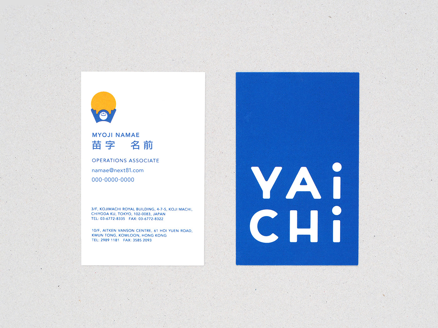
Art Direction, Graphic Design : Masaomi Fujita / tegusu Inc.
Graphic Design : Mami Kamiya / tegusu Inc.
Illustration : Kozue Ichihara
--------------------
Check out our latest project :
Thank you for watching.