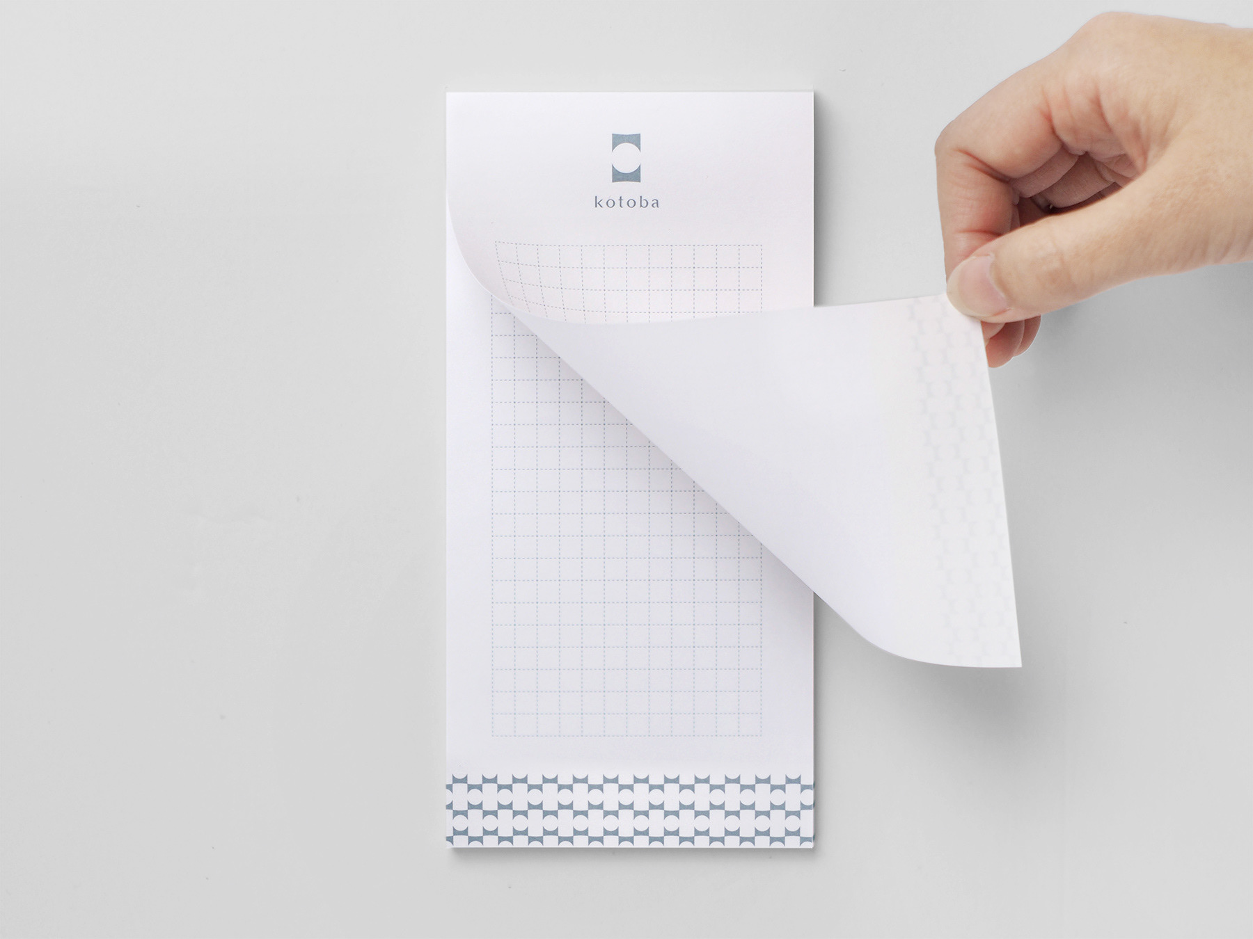
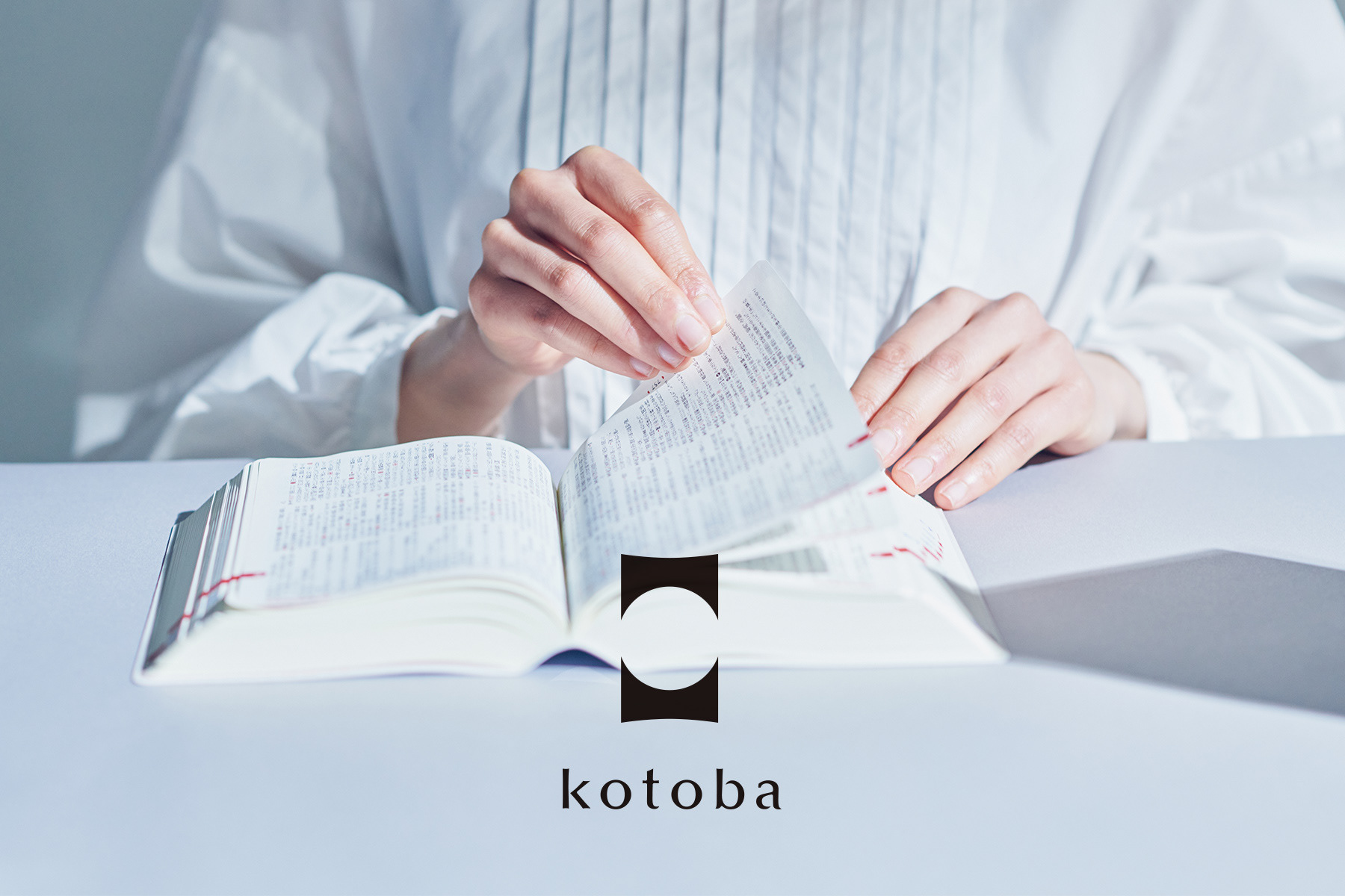
株式会社kotobaは、2022年に設立された小学館グループの辞書編集を専門とする会社です。辞書文化を未来に残すため、時代に合わせた良質な辞書をつくり続けることを理念に、日本語および外国語の辞書、それに類するものの企画立案、原稿作成、編集を行っています。
tegusuでは同社の設立にあたり、Mission, Visionの整理やコーポレートロゴ(VI)の策定、オフィスツール等のデザインを行いました。
Founded in 2022, kotoba Inc. is a company specialising in dictionary editing within the Shogakukan Group. The company's philosophy is "to continue to produce high-quality dictionaries in line with the times".
kotoba Inc. plans, drafts and edits dictionaries in Japanese and foreign languages in order to preserve dictionary culture for the future.
In establishing kotoba Inc, tegusu developed the company's philosophy, designed the corporate logo (VI) and office tools.
kotoba Inc. plans, drafts and edits dictionaries in Japanese and foreign languages in order to preserve dictionary culture for the future.
In establishing kotoba Inc, tegusu developed the company's philosophy, designed the corporate logo (VI) and office tools.
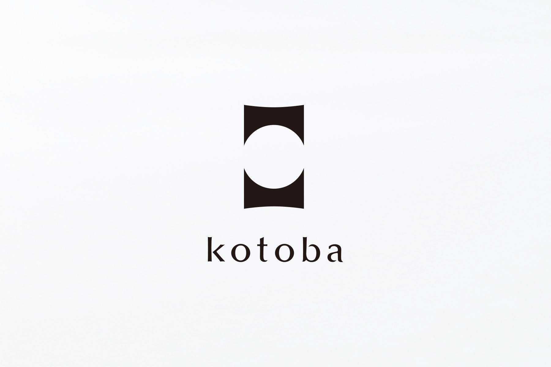
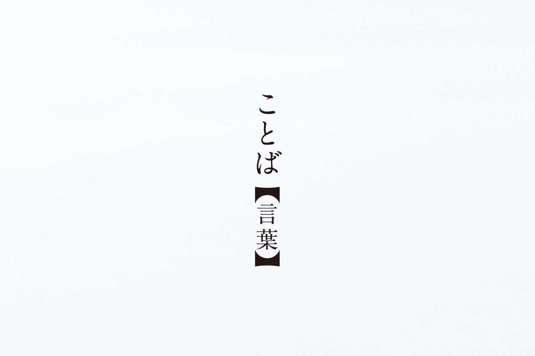

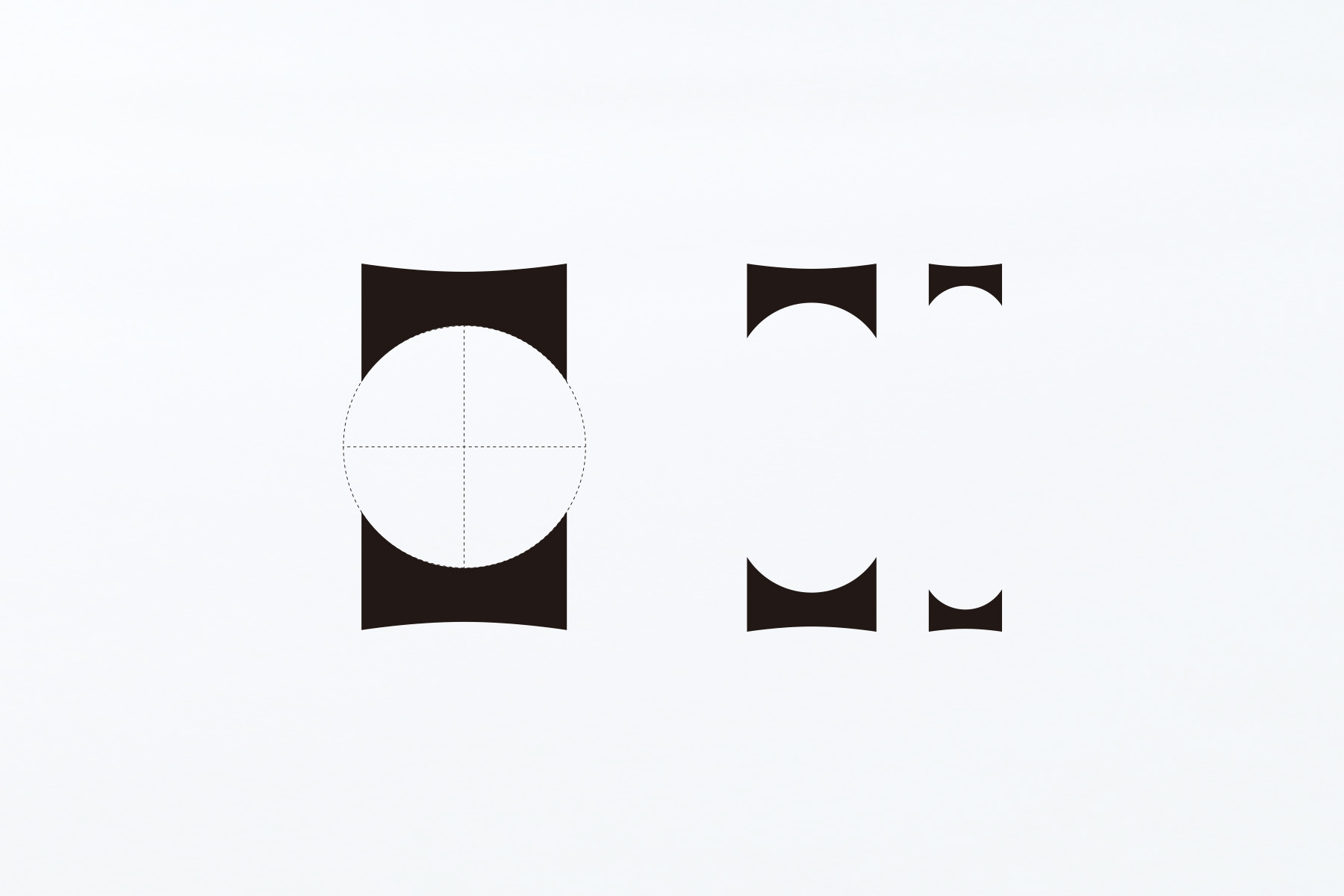
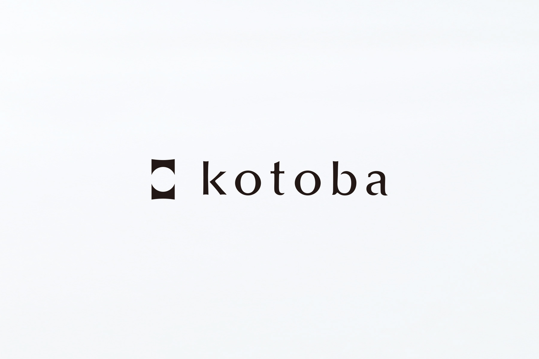
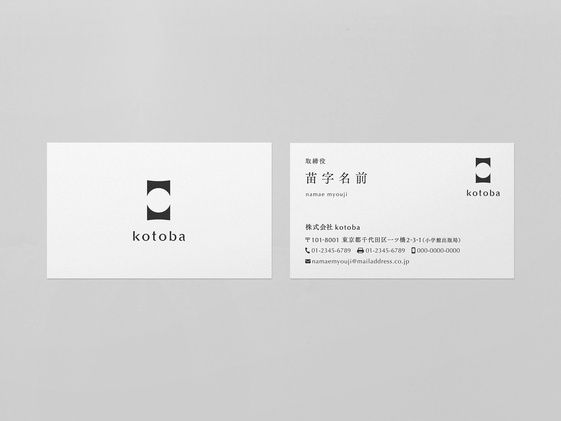
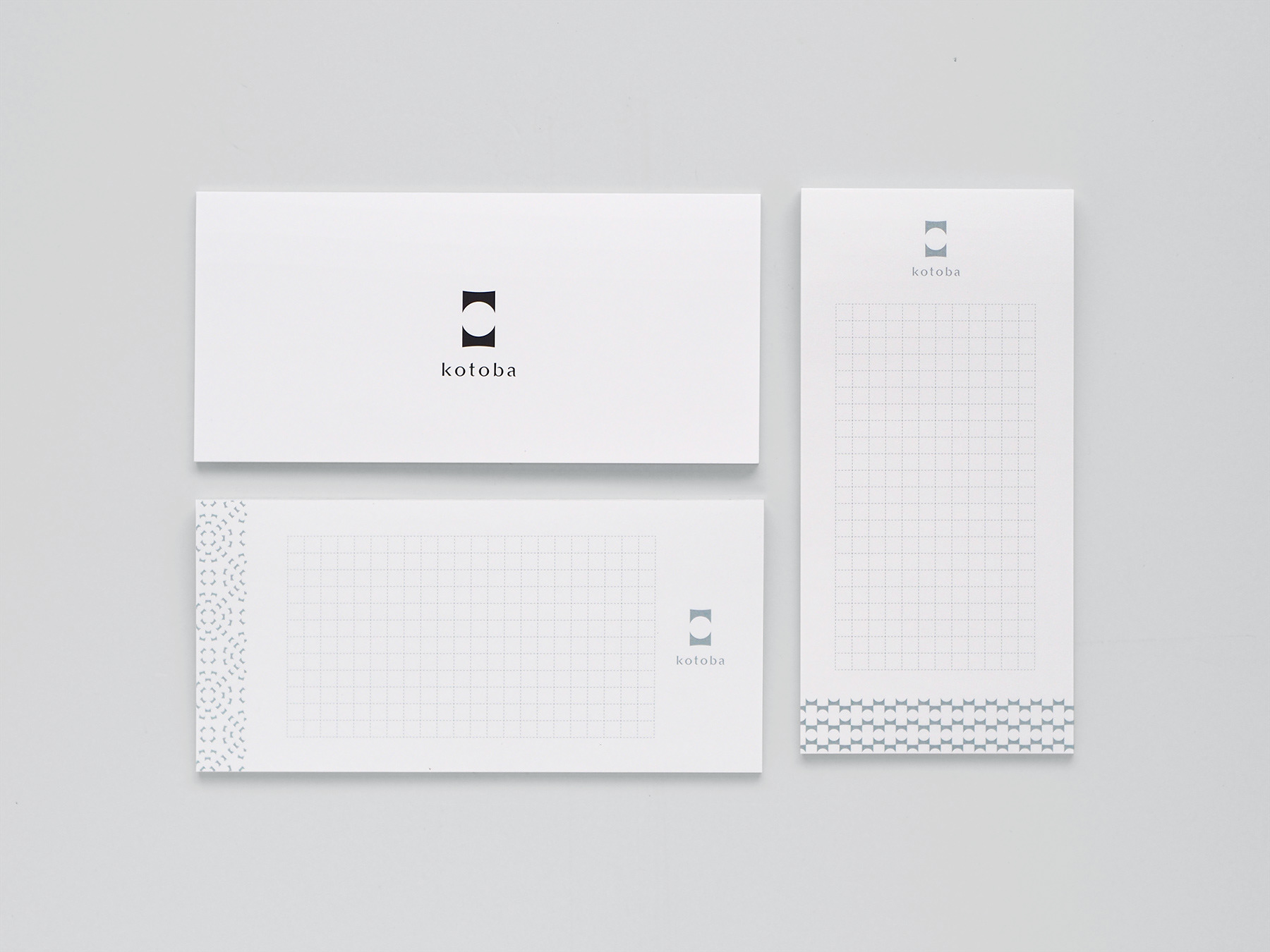
ブランドシンボルは、辞書において見出し語を示す際の、隅付き括弧をモチーフにしたデザイン。 中心にある正円形のスペースは「ことばを創造する空間」を表現しており、さまざまな文献や参考資料をもとに、ことばの語釈や用例を形として示し、柔軟な発想で時代に合った辞書を作り続けることへの誓いを表しています。
The brand symbol was inspired by the black lenticular bracket used to display 'headwords' in dictionary pages.
The circular space at the centre of the symbol represents a 'space for creating words'.
kotoba Inc. continues to define word annotations and examples of usage based on a variety of literature and reference materials. The design represents the company's philosophy of 'continuing to create dictionaries that match the times'.