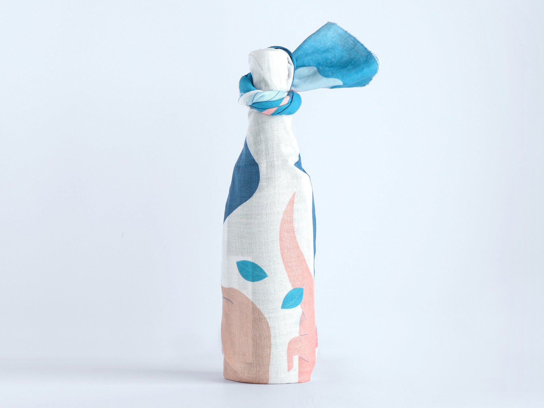

PHOTO by Kamila Szuba
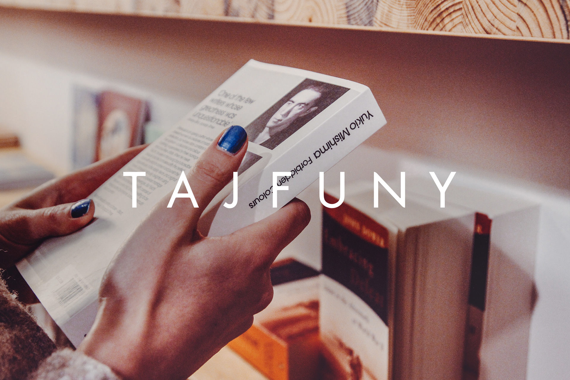
TAJFUNYはアジアの文学作品を扱うポーランドの出版社/書店です。日本を中心とした書籍をポーランド語に翻訳し、その魅力を多くの人に伝えることを目的に設立され、2018年10月にワルシャワに拠点となる店舗をオープンしました。tegusuでは、ブランドアイデンティティ・シンボルマークのデザイン、それらを展開したブランドツールや、SNSにおけるプロモーションビジュアル、出版物のブックデザイン等を担当しています。
TAJFUNY is a Polish publisher & bookstore that handles Asian literary work. With a mission to translate mainly Japanese books into Polish in order to spread its allurement, they opened their store in Warsaw in October, 2018. We had been in charge of the design for their brand identity symbol mark, along with the branding tools, promotion visuals for social media, and book design for their publications.

2018年の春、私たちはTAJFUNYからデザインの相談を受けました。「日本文学はポーランド市場において少しずつ広まっているものの、まだ選択肢は多くない。日本語独自の表現の面白さが伝わるよう、ポーランドの読者のために適切に翻訳し、美しいカバーデザインでアジア文学の魅力を届けたい。」ブランド名称「台風」のごとく、アジア文学ムーブメントの中心となるのが、チームのビジョンでした。私たちは、旅行ガイド本で伝えられるエキゾチックで異国情緒あふれる日本ではなく、もっと生活に寄り添った日本らしいデザイン=ミニマムでシンプル、研ぎ澄まされた印象を伝えていく必要がありました。それと同時に「初見でアジアや日本を連想させるもの」というのがチームからの要望でした。


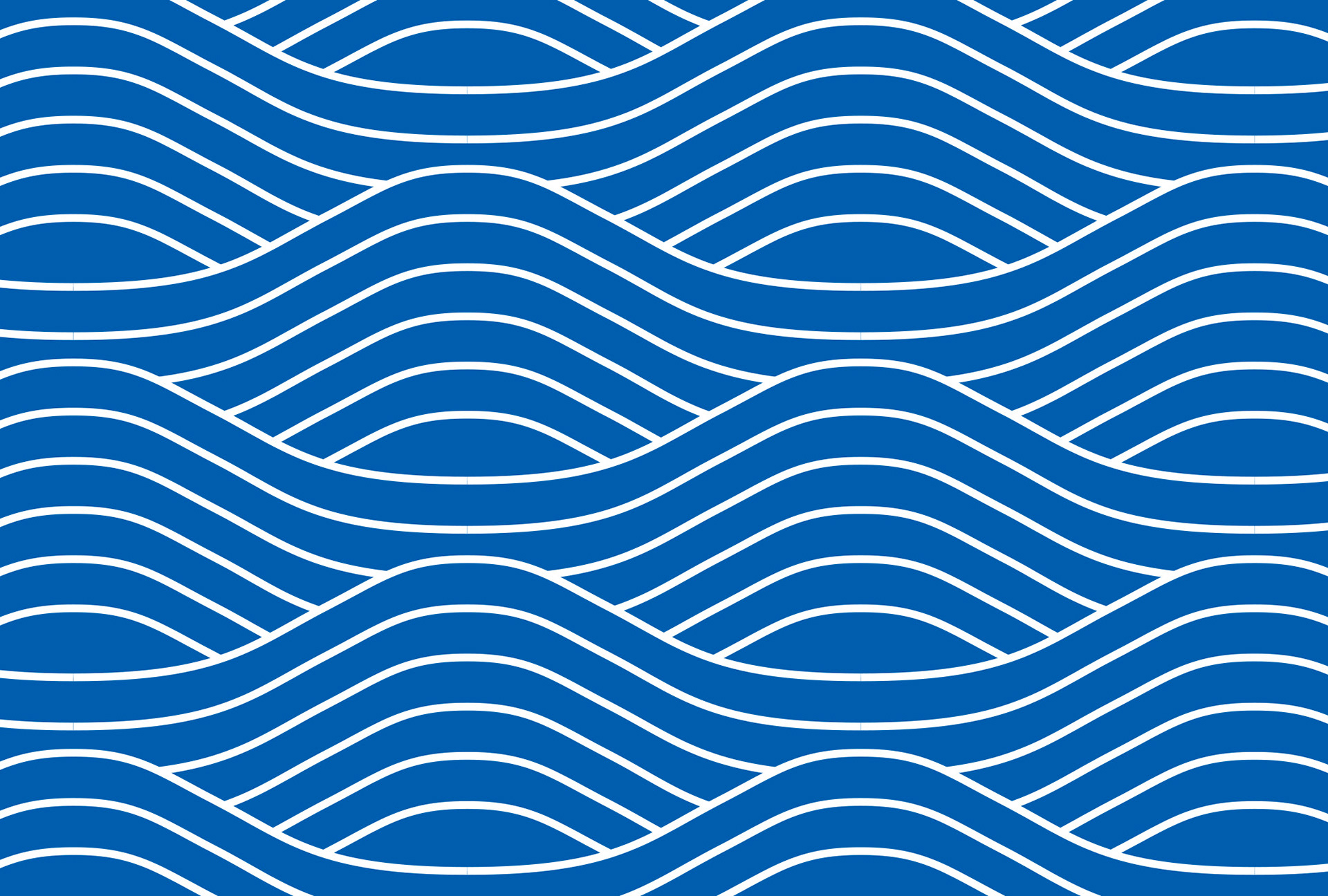
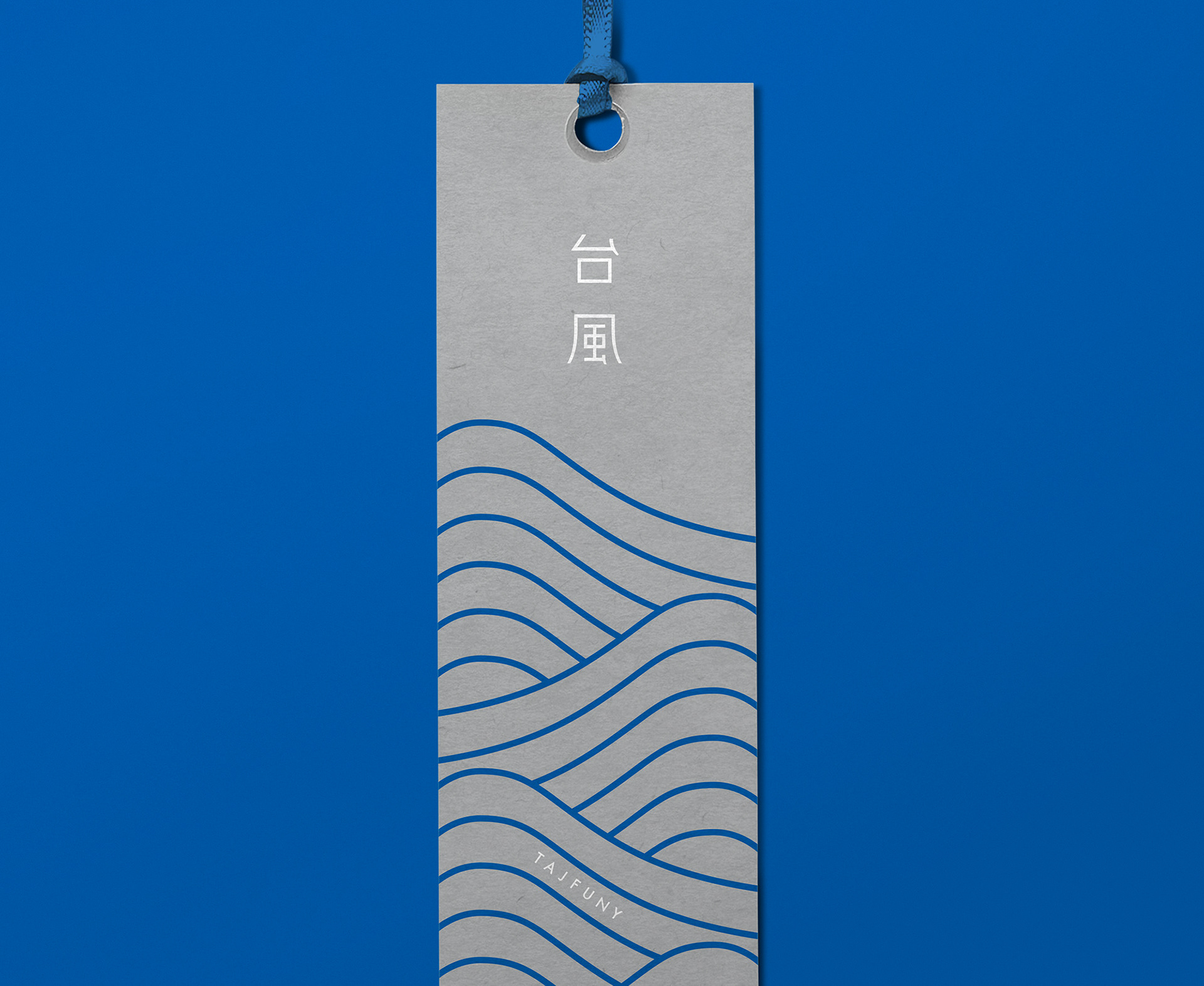
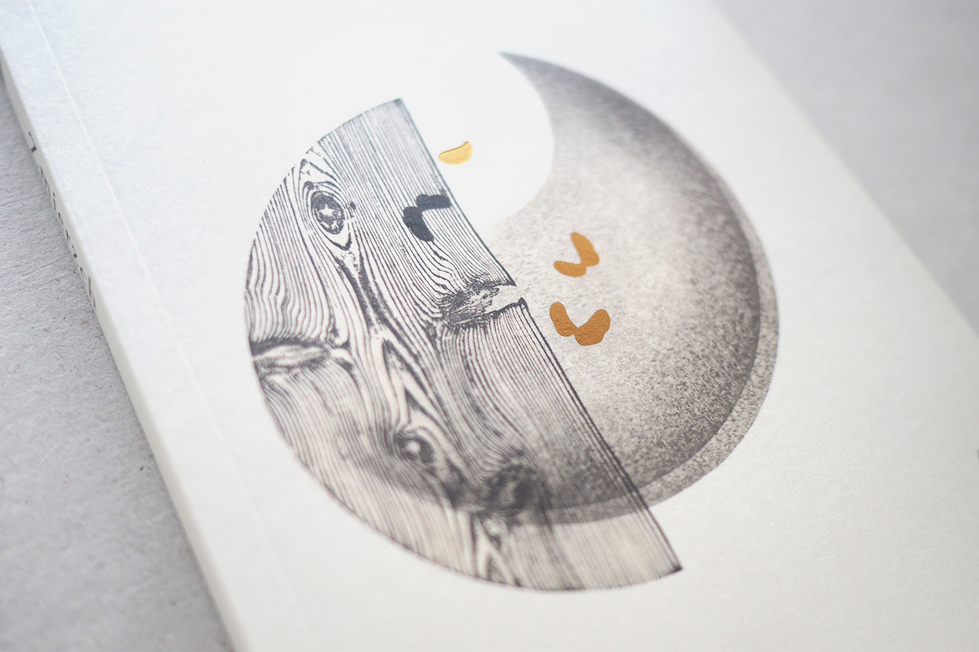
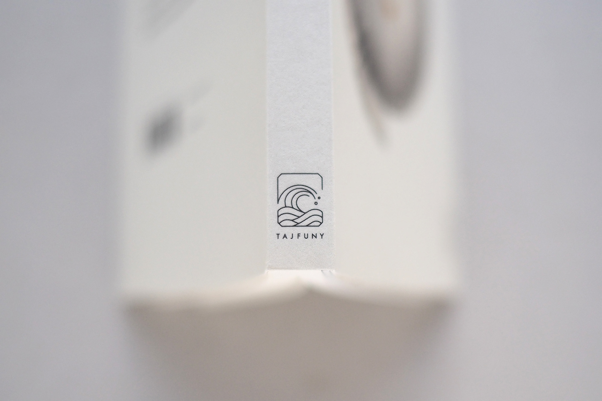
うねりを伴った波が「台風」だけではなく、アジアや日本そのものを連想させるのは、和文様に用いられる青海波文(せいがいはもん)や、葛飾北斎の富嶽三十六景のイメージが関係していると思います。TAJFUNYチームと私たちは、このうねりを持つ波の図柄をシンボル化することが、ブランドのビジョンとアジアらしさを伝える最短のコミュニケーションだという考えに至りました。このシンボルは円を中心とした幾何学図形に沿って制作されていますが、ロゴタイプも同様に、ジオメトリックフォントの代表格であり、単体表示でもミニマムな印象を確立できる「Futura」をベースに作成しています。
We believe that it is not only the twisting waves of the “typhoon”, but also the Seigaihamon used in many Japanese patterns, and the image of Fugaku Sanjurokkei, or Thirty-six Views of Mount Fuji, by Katsushika Hokusai that is associated with Asia and Japan. The TAJFUNY team and we came to the conclusion that symbolizing these pattern of the wave would be the quickest way to convey the brand vision and the Asian-ness.This symbol is created with a circle in the center and geometric figures, but like the logo type, it is created based on a representing geometric font “Futura” which can give a minimal impression even when displayed on its own.
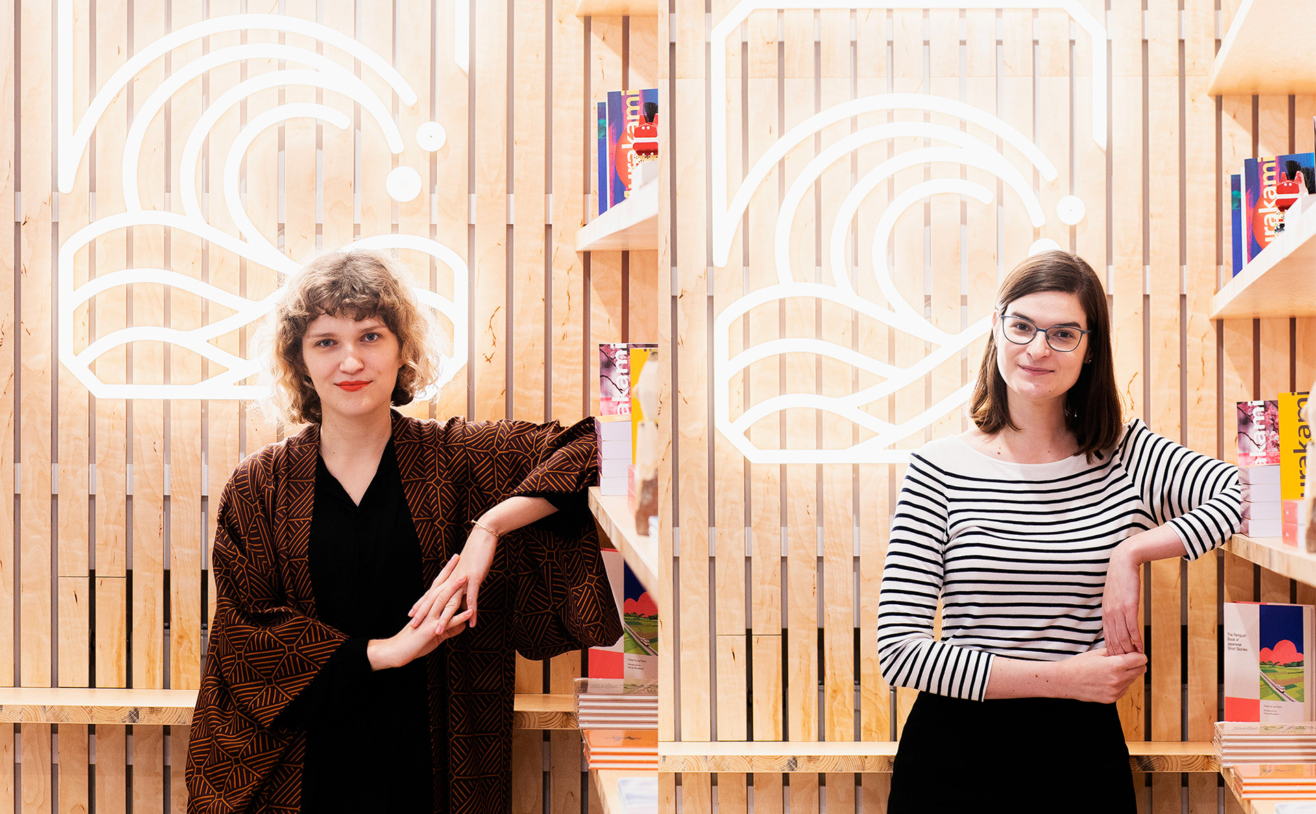
Carolina, the owner of TAJFUNY(Left) and business partner Anna (Right) PHOTO by Filip Skroń


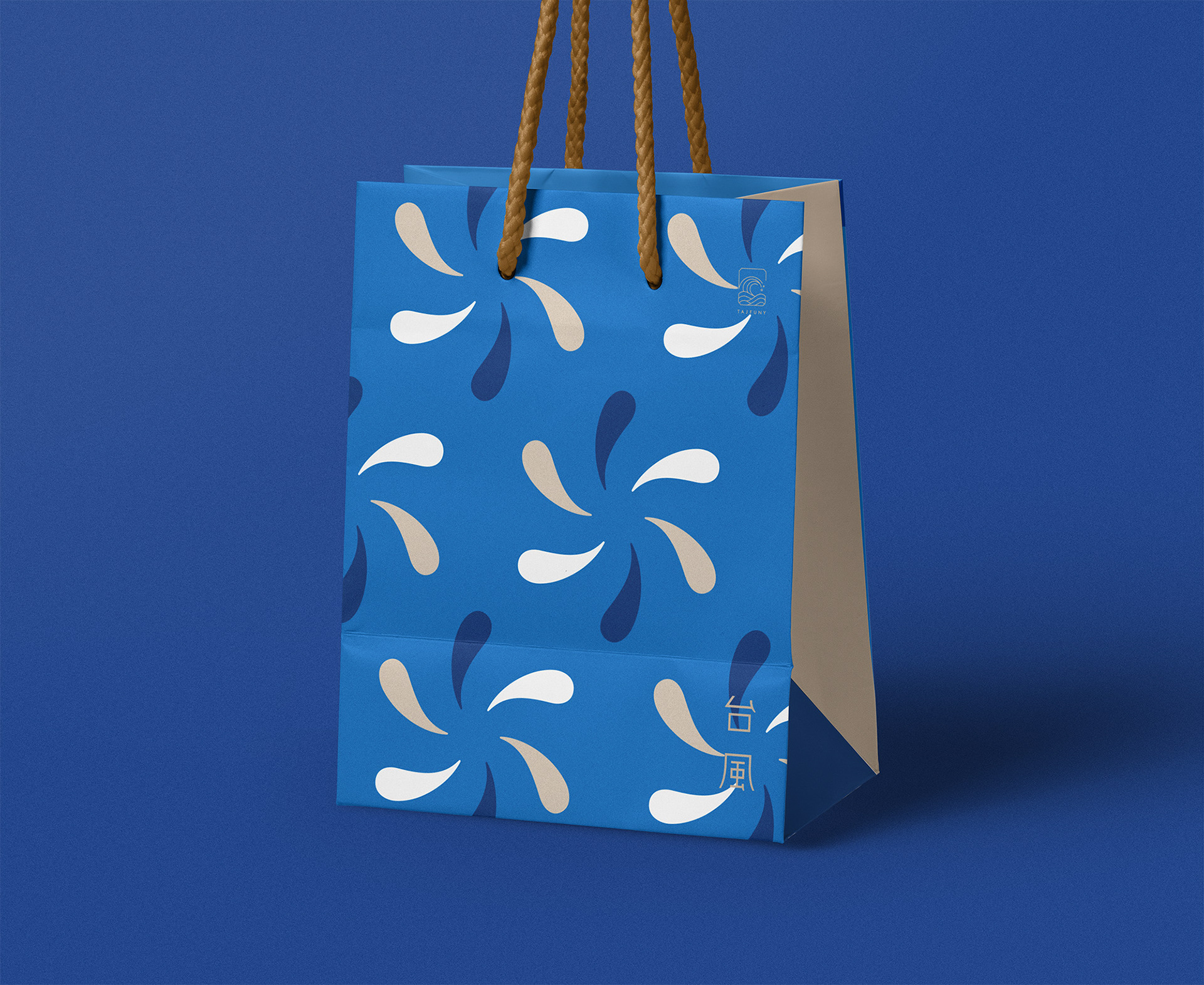
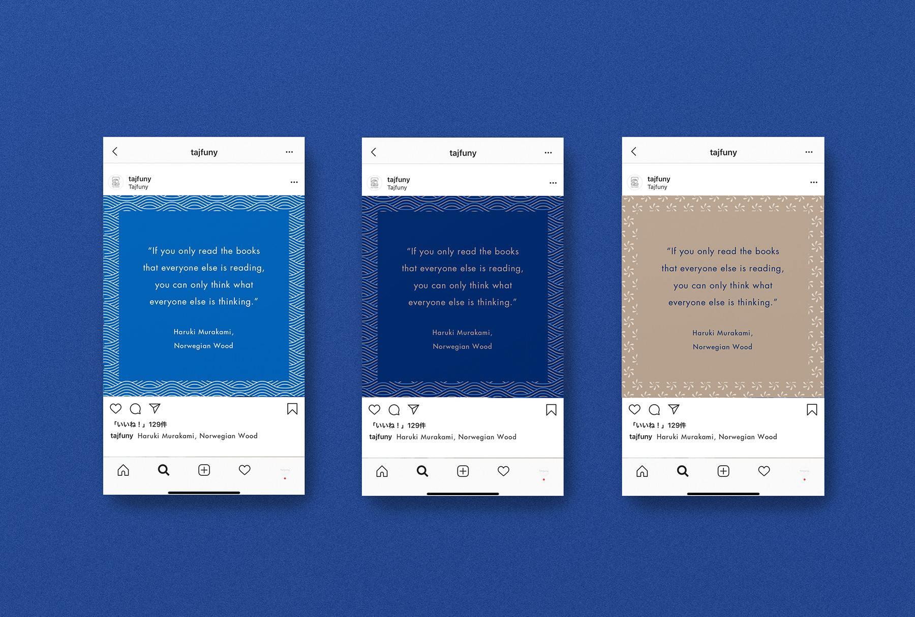
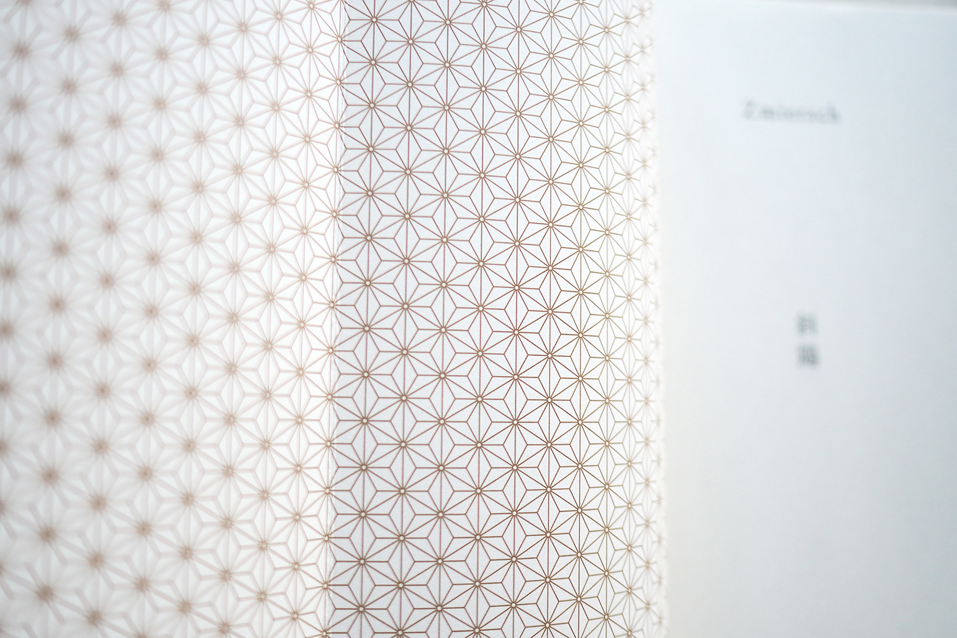
書籍カバーなど多様な表示環境に対応するため基本のロゴ使用色は黒ですが、ブランドの展開としては波をイメージした青を基調と、日本画で海を描く際にも用いられる群青色や藍色などの伝統色を中心に選定しています。さらに私たちは、各ブランドツールへとグラフィックを落とし込むため波のモチーフをパターンへと展開しました。また出版社という文脈から、文章を区切る読点を用い、回転する台風の動きから着想を得た和柄を作成しています。
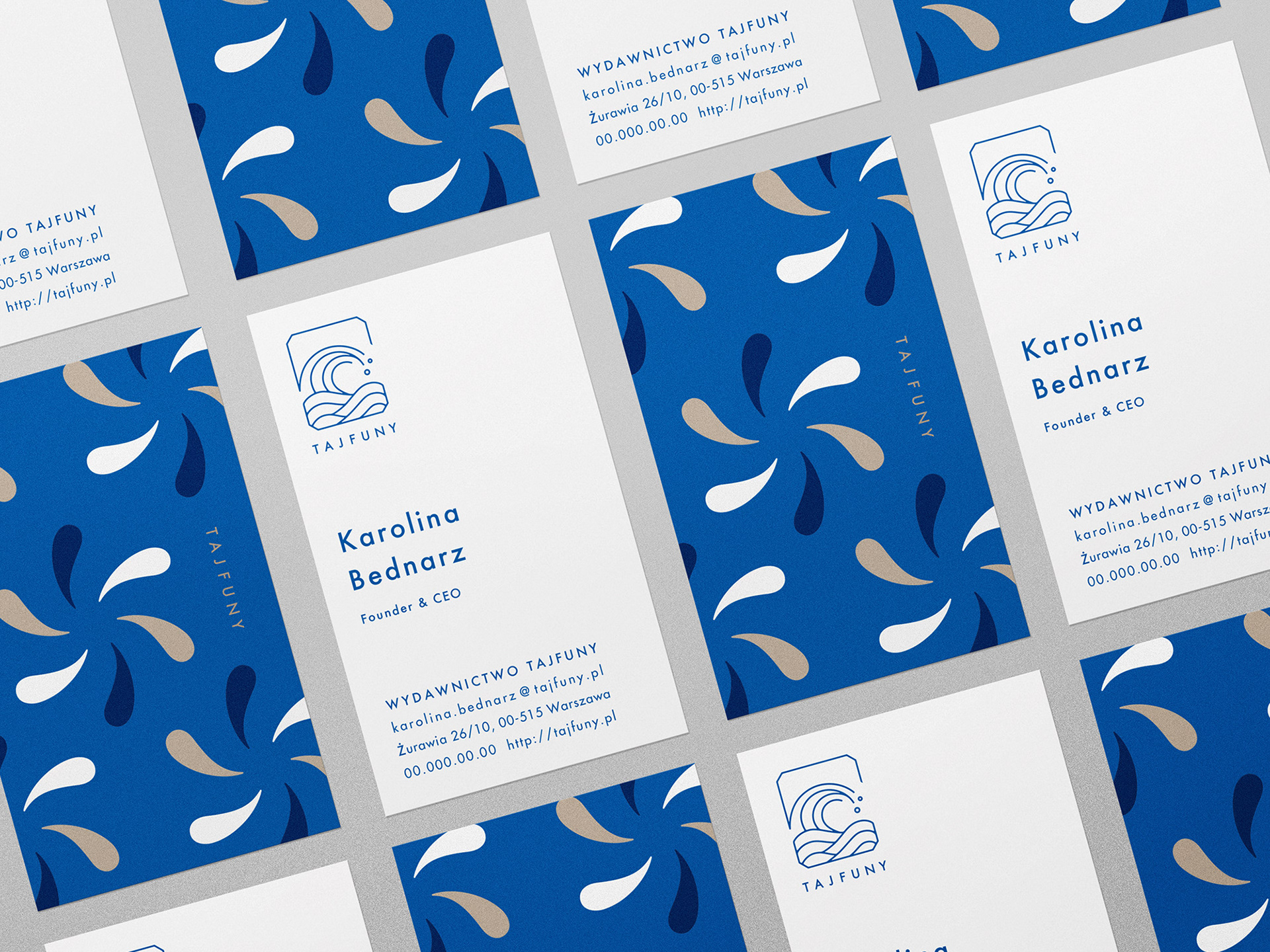


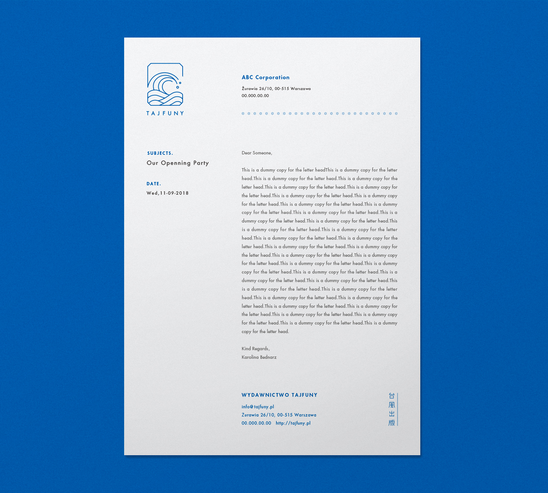
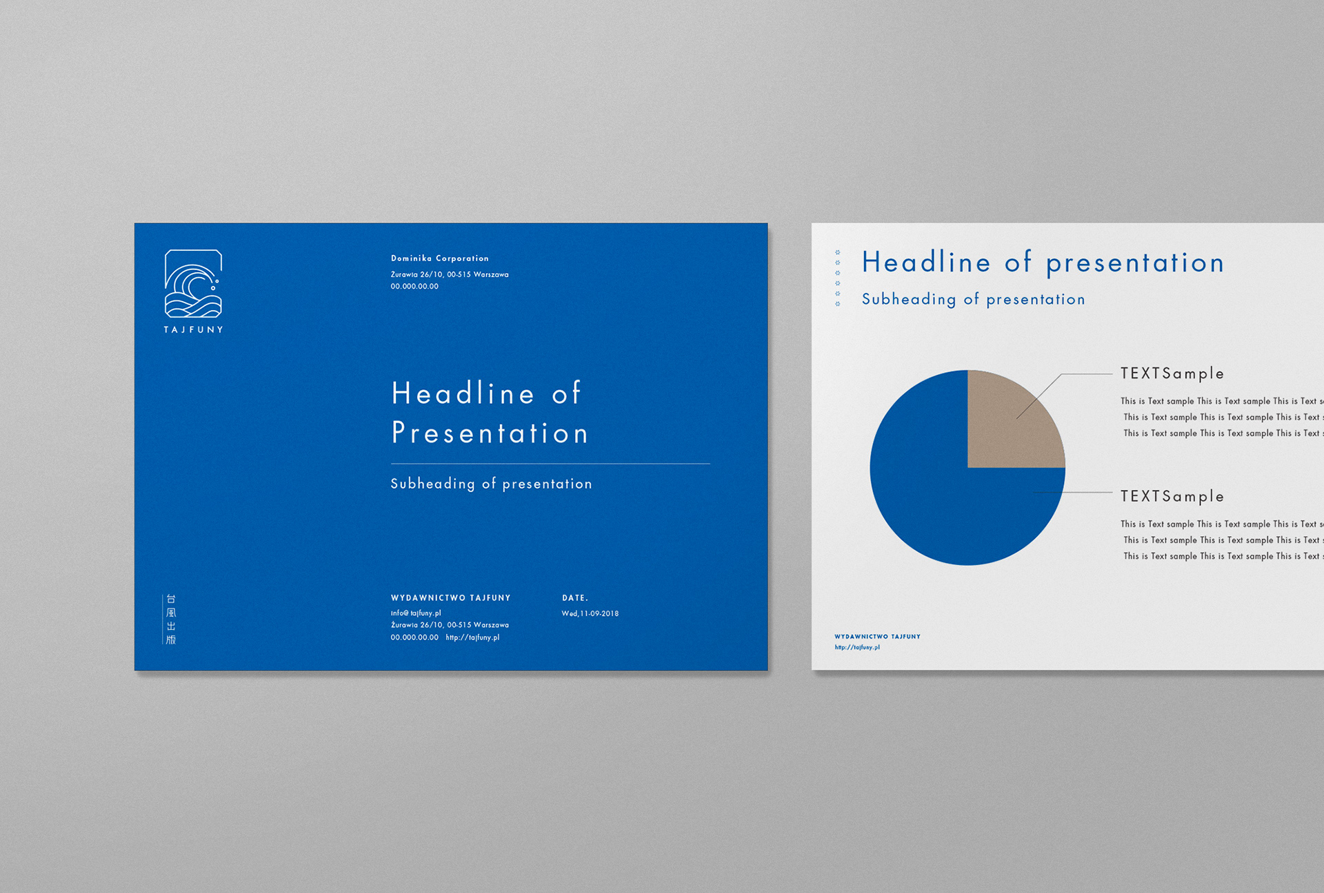
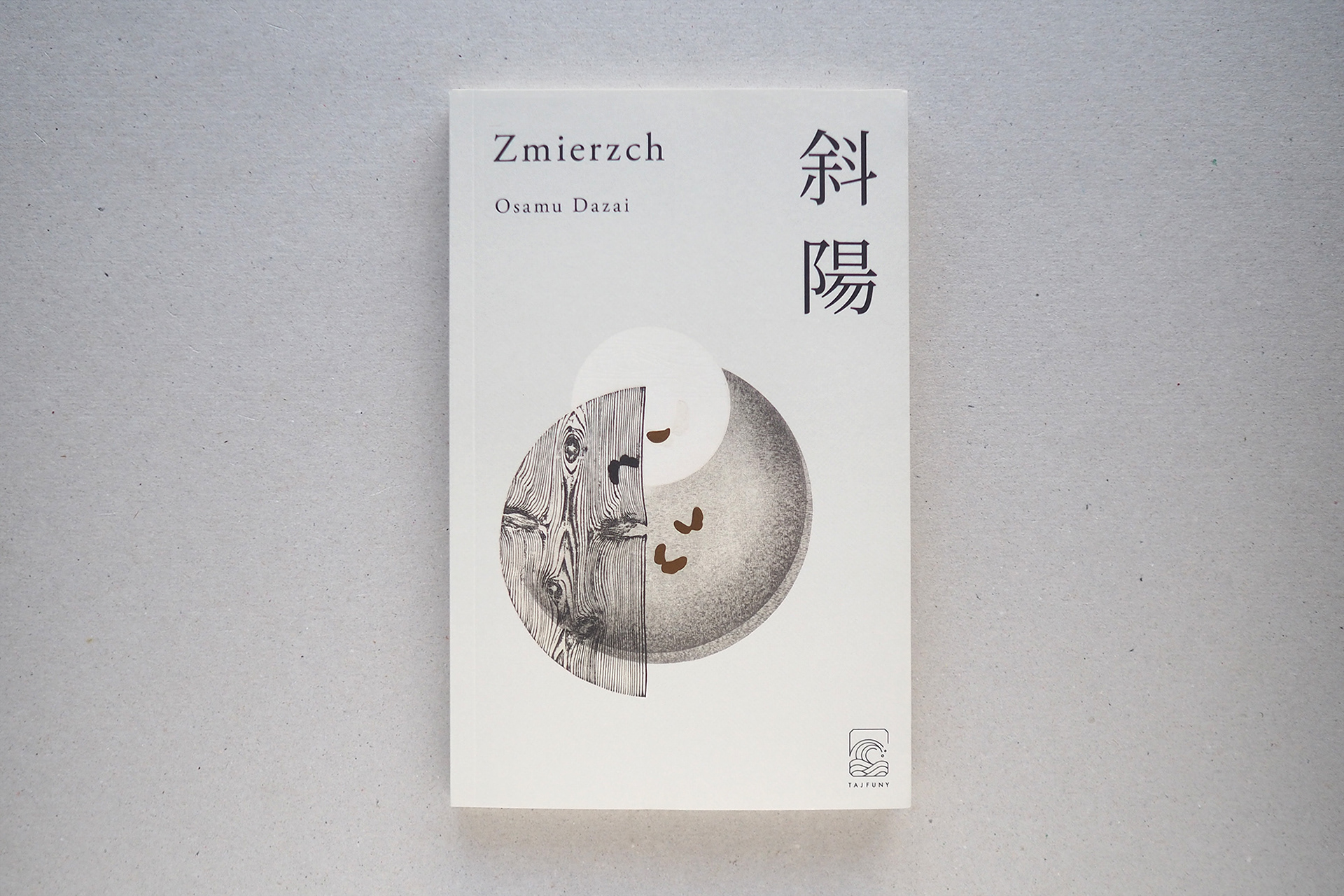
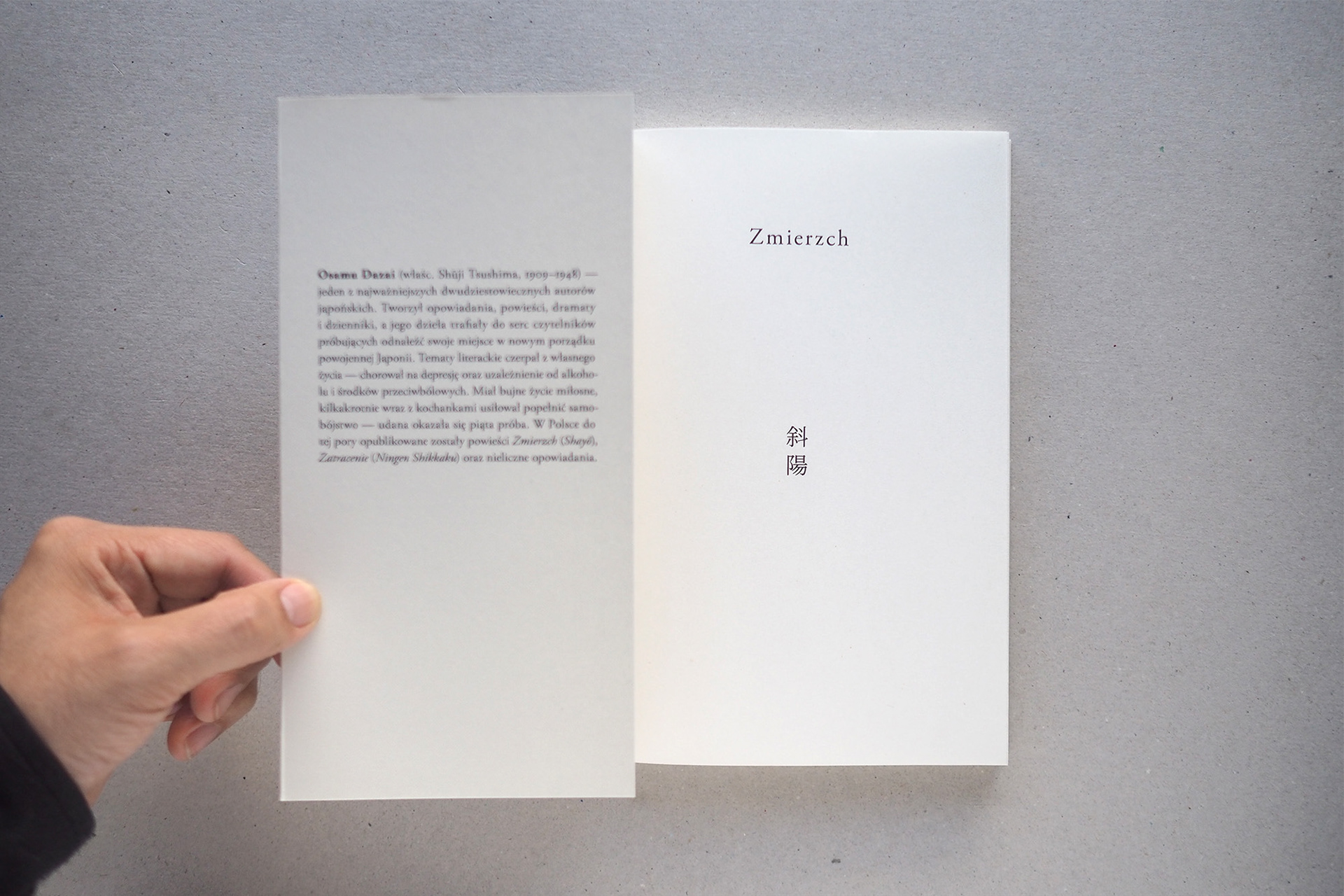
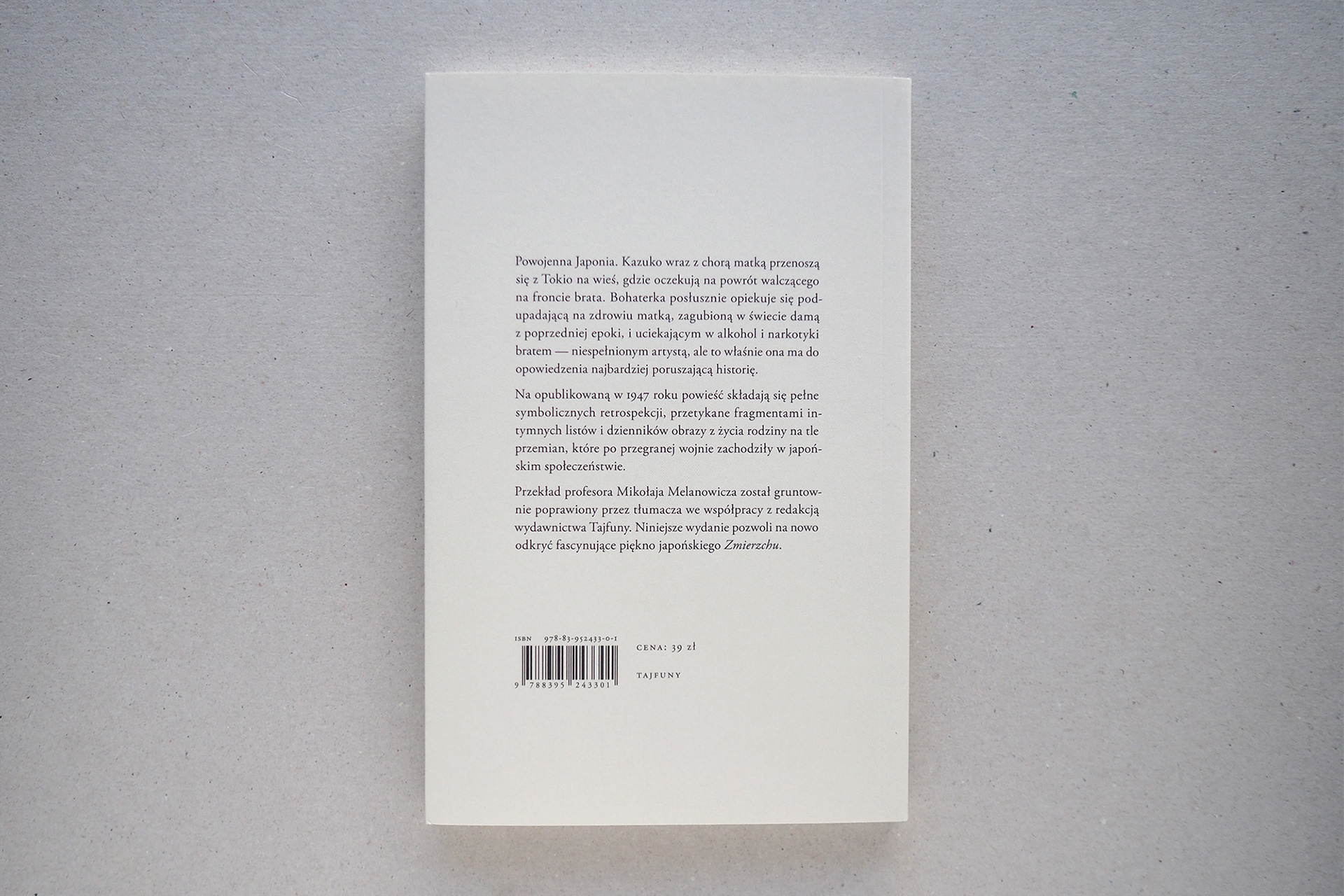
これらのブランドの紹介は、46ページにわたるブランドガイドラインに記載されています。ロゴの使用法、フォントやカラーとその色の持つ意味、提供するグラフィクモチーフなどを体系的にまとめています。TAJFUNYから出版第一号の書籍デザインでは、私たちは使用フォントとそのコンポジション、レイアウトフォーマットなどを提供しています。表紙に使用するアートワークの選定やエディトリアルデザインはポーランドのチーム(to / studio )で行なっています。
The introduction of these brands are shown in 46 pages in the brand guideline. We have systematically organized the usage of logos, the font and coloring, as well as the meaning behind those colors, and the graphic motif we provide. In the first book design from TAJFUNY’s publication, We have provided the font rules, composition, and layout format. The artwork used for the cover and the editorial design has been done by the Polish team “ to / studio “.
店舗デザインもポーランドチーム(Sara Świda, Pracownia Tryktrak)によるもので、ブランドのメインカラーであるブルーのファサードとウッドルーバーが美しいデザインになっています。
The design for the store is also by a Polish team, “ Sara Świda, Pracownia Tryktrak “, beautifully using the brand’s main color blue façade and wood louvre.
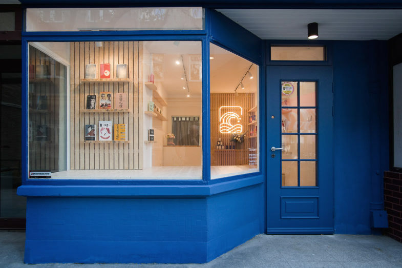
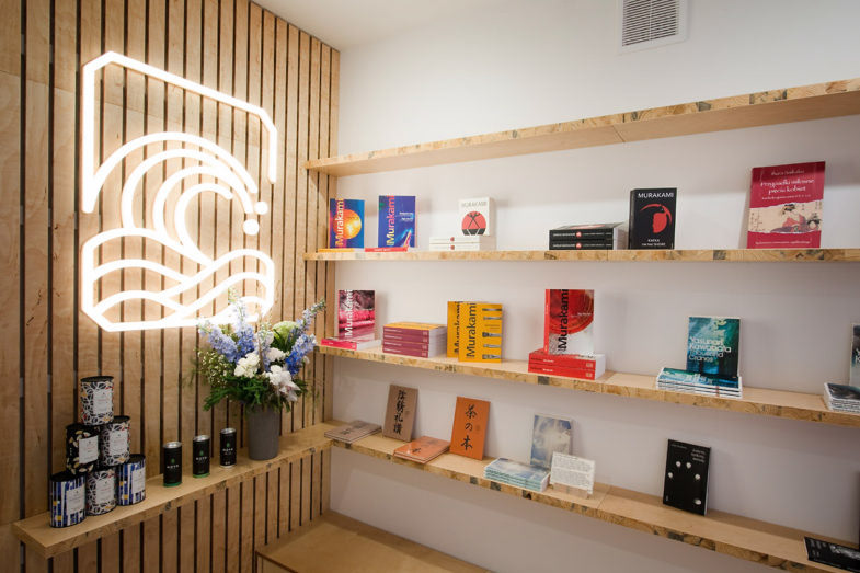
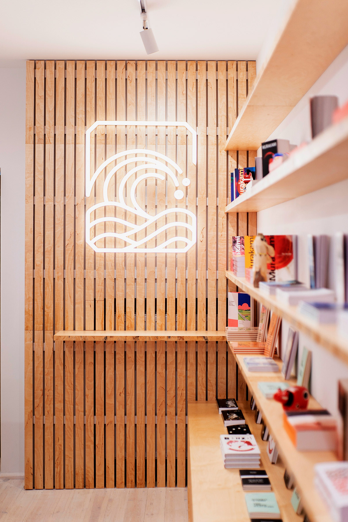

PHOTO by Filip Skrońc
オープニングレセプションの様子。店から溢れ出るほどの人で賑わい、おにぎりや団子などの日本食も振る舞われた。
At the opening reception. The store seemed to have been flooded with people, and Japanese food such as rice balls, “onigiri”, and dumplings, “dango”, were served.


PHOTO by Kamila Szuba
Store concept design, Interior design : Sara Świda
Design, Construction : Pracownia Tryktrak
Editorial Design of "Zmierzch" : to/studio
Top image & Store event photo : Kamila Szuba
Profile photo : Filip Skrońc
Direction, Design : Masaomi Fujita / tegusu Inc.
Editorial Design of "Zmierzch" : to/studio
Top image & Store event photo : Kamila Szuba
Profile photo : Filip Skrońc
Direction, Design : Masaomi Fujita / tegusu Inc.