千葉県船橋市で1912年に創業した株式会社飯塚海苔店のコーポレートブランド刷新プロジェクト。
tegusuでは企業理念の言語化やMission/Vision/Valueの策定、VIデザイン、パッケージデザイン、包装紙材等の刷新など、全方位のクリエイティブディレクションを行っています。
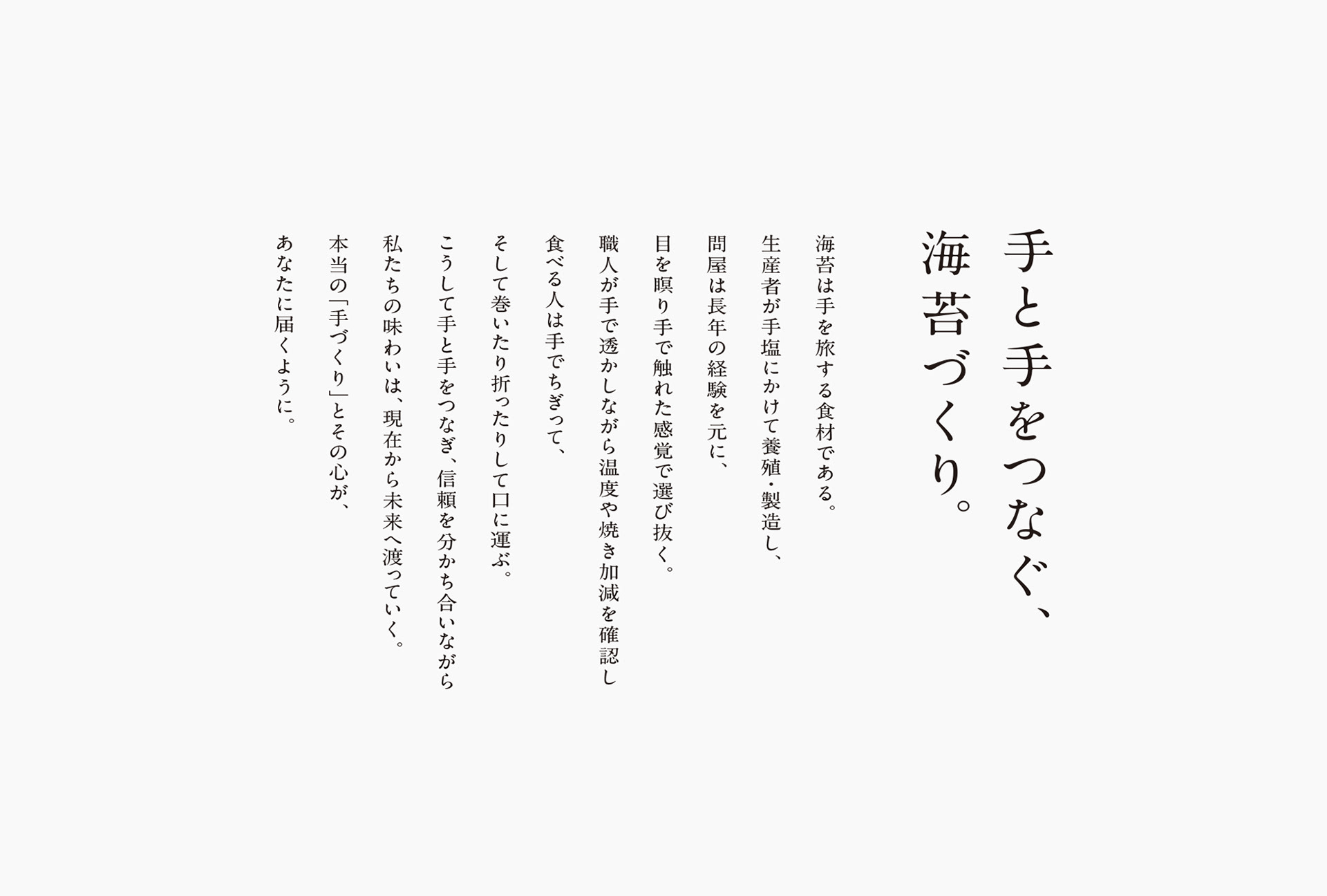
「海苔は手で食べるもの」であることに着眼し、飯塚のり店が生産者と消費者の“手をつなぐ”存在となるよう「手と手をつなぐ、海苔づくり。」という企業理念を策定。以降、VIはもちろんパッケージデザインやグラフィックモチーフに至るまで、すべて「手描き」や「手作業」など人の手が加わっていることにこだわりを持って設計を行っています。
Corporate brand renewal project for Iizuka Nori Co., Ltd., founded in 1912 in Funabashi City, Chiba Prefecture.
tegusu provided comprehensive creative direction for the brand, spanning the verbalization of the corporate philosophy, formulation of the Mission, Vision, and Values, Visual Identity (VI) design, package design, and the renewal of wrapping materials.
Focusing on the idea that "nori is eaten with one's hands," we established the corporate philosophy: "Crafting nori that connects hand to hand," positioning Iizuka Nori as a bridge between producers and consumers. Guided by this concept, every design element—from the VI to package designs and graphic motifs—was crafted with a meticulous emphasis on the human touch, incorporating hand-drawn and handcrafted details throughout.
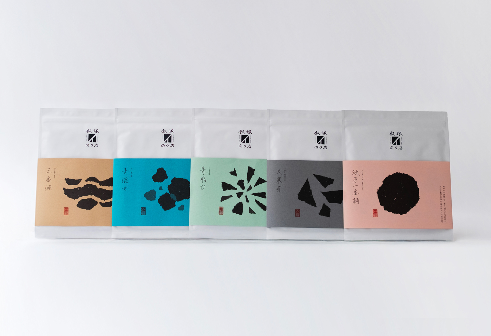
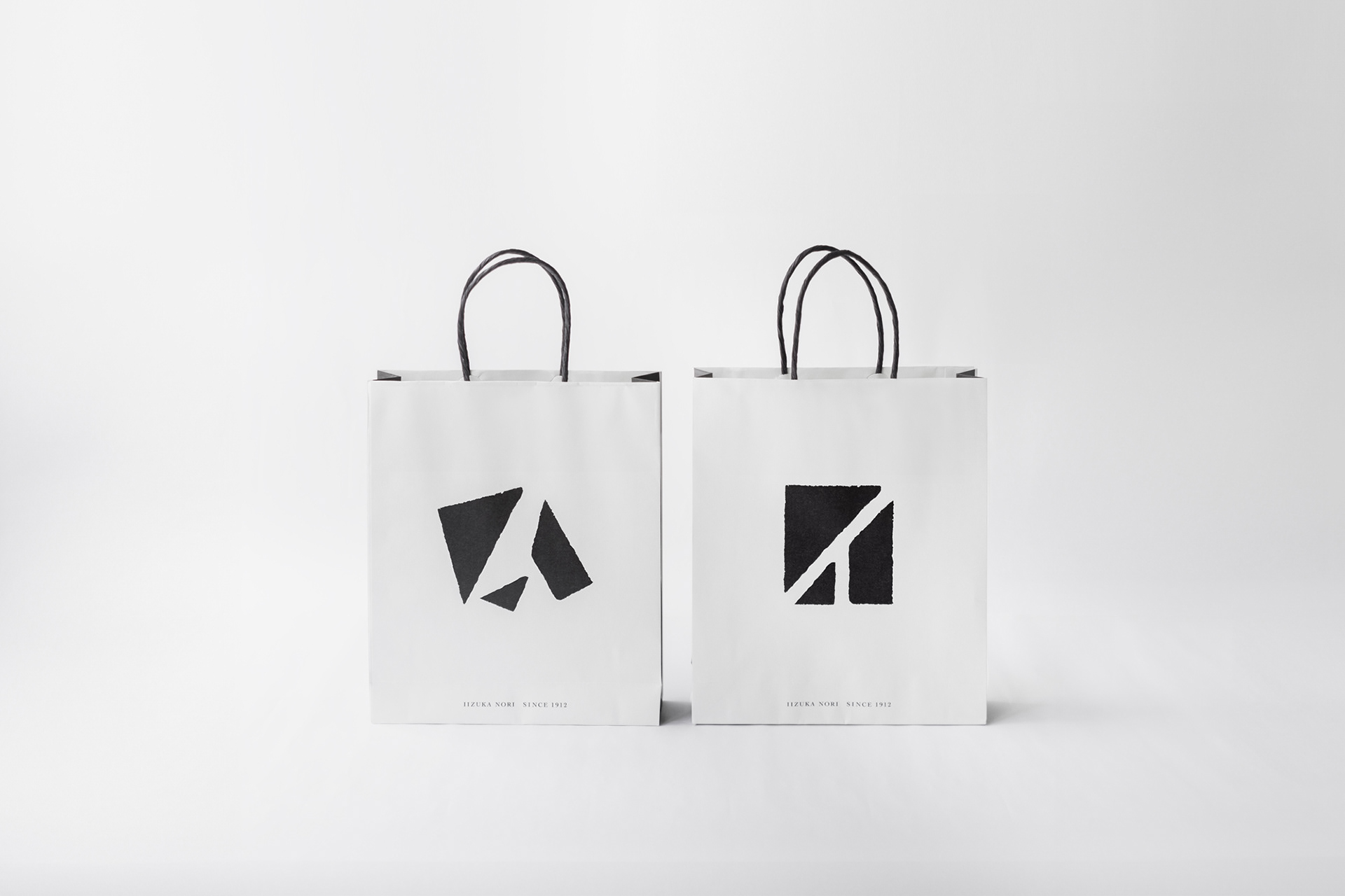
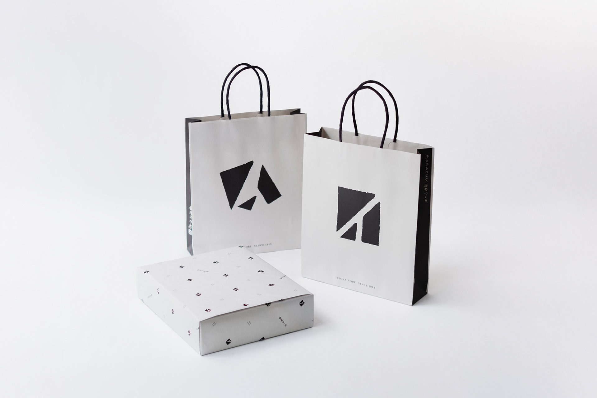
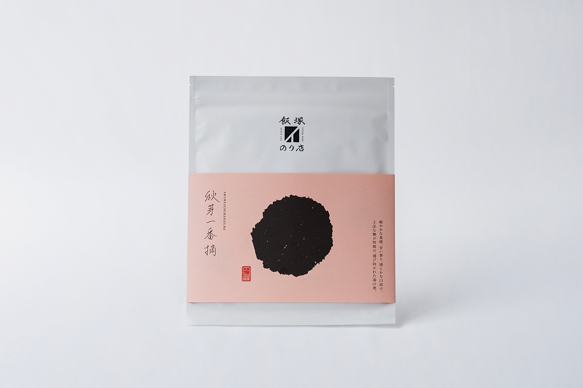
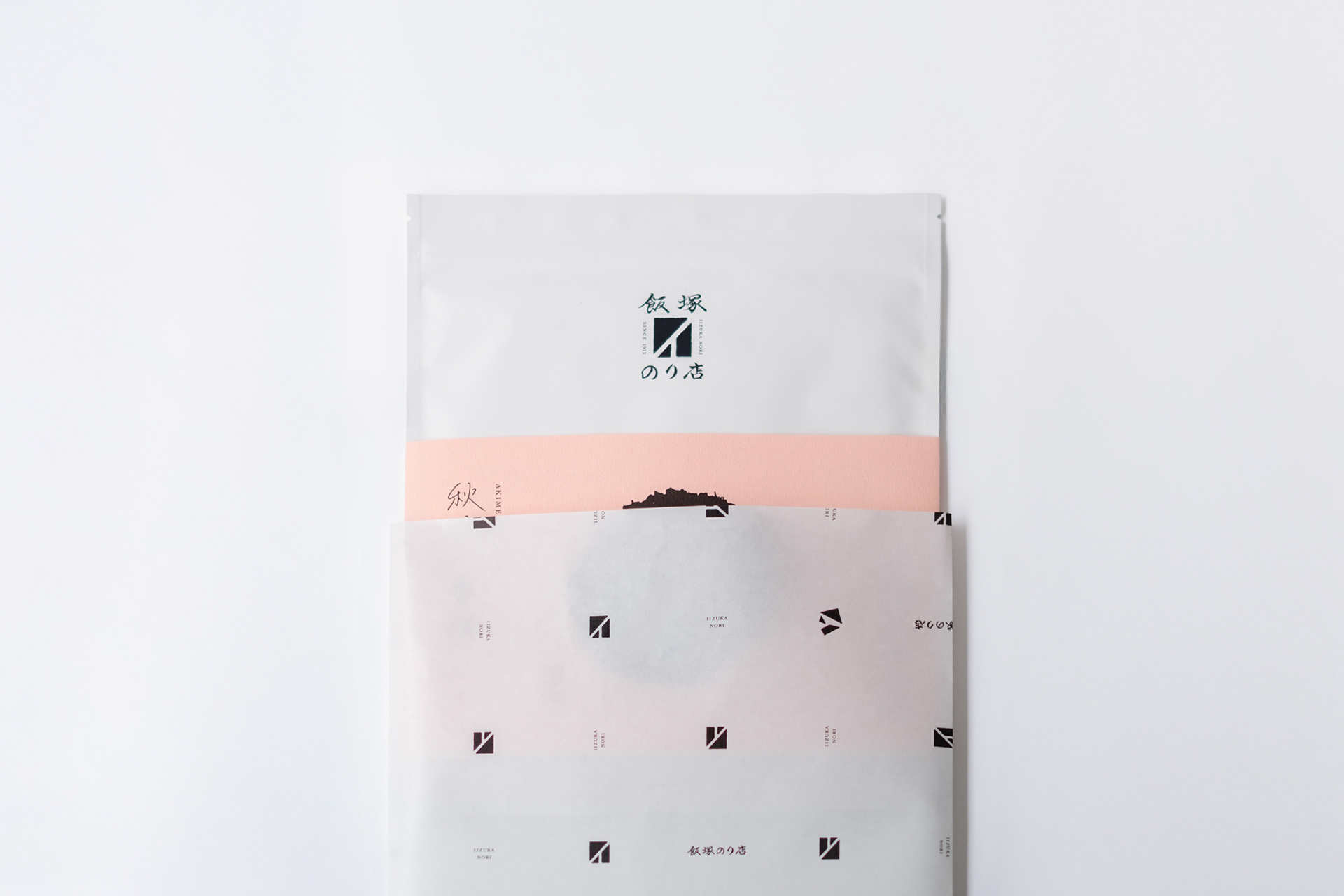
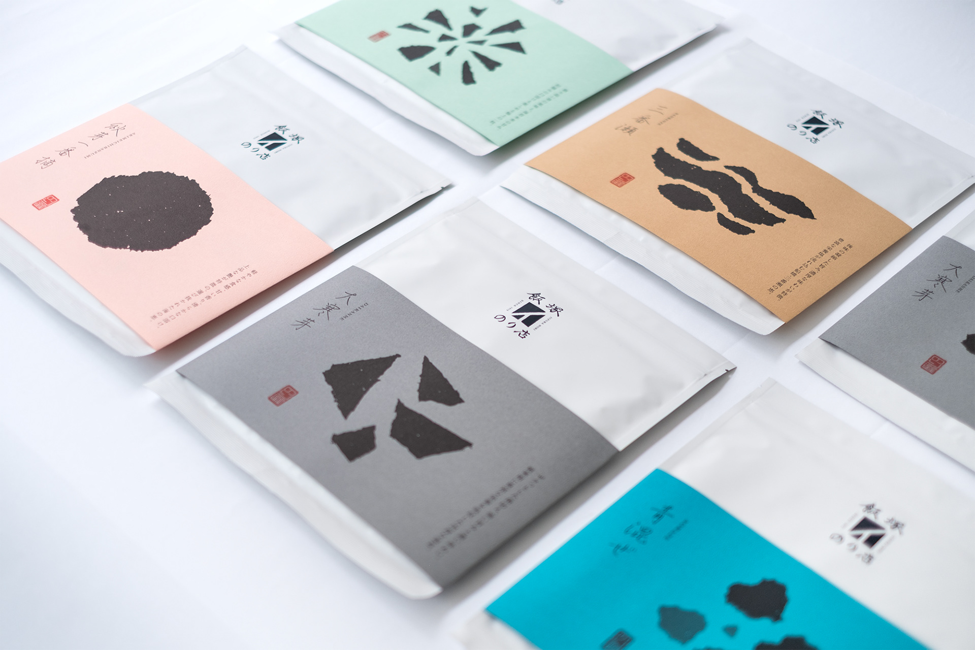
シンボルは海苔の全形比率で設計。生産者/飯塚のり店/消費者の三者が海苔を分け合うイメージを、海苔をちぎってシンボル化しています。最初のパッケージデザインである「のり選びシリーズ」は5種類を展開しており、それぞれ収穫の時期や産地の違いにより味わいや食感が異なります。アルミ製のパッケージに巻かれた巻紙は色違いのタント紙を用い、手でちぎった海苔の形状をモチーフに、口どけの違いを視覚的に表しています。
The symbol is designed using the standard aspect ratio of a full sheet of nori. It depicts three parties—producers, Iizuka Nori, and consumers—sharing nori together, rendered as a symbol by illustrating a sheet torn by hand.
The initial packaging series, "Nori Selection," features five distinct varieties, each offering a unique flavor and texture based on its harvest timing and origin. The bands wrapped around the aluminum pouches use various colors of Tanto paper. Inspired by the shape of hand-torn nori, these paper bands visually express the differing levels of melt-in-the-mouth texture.
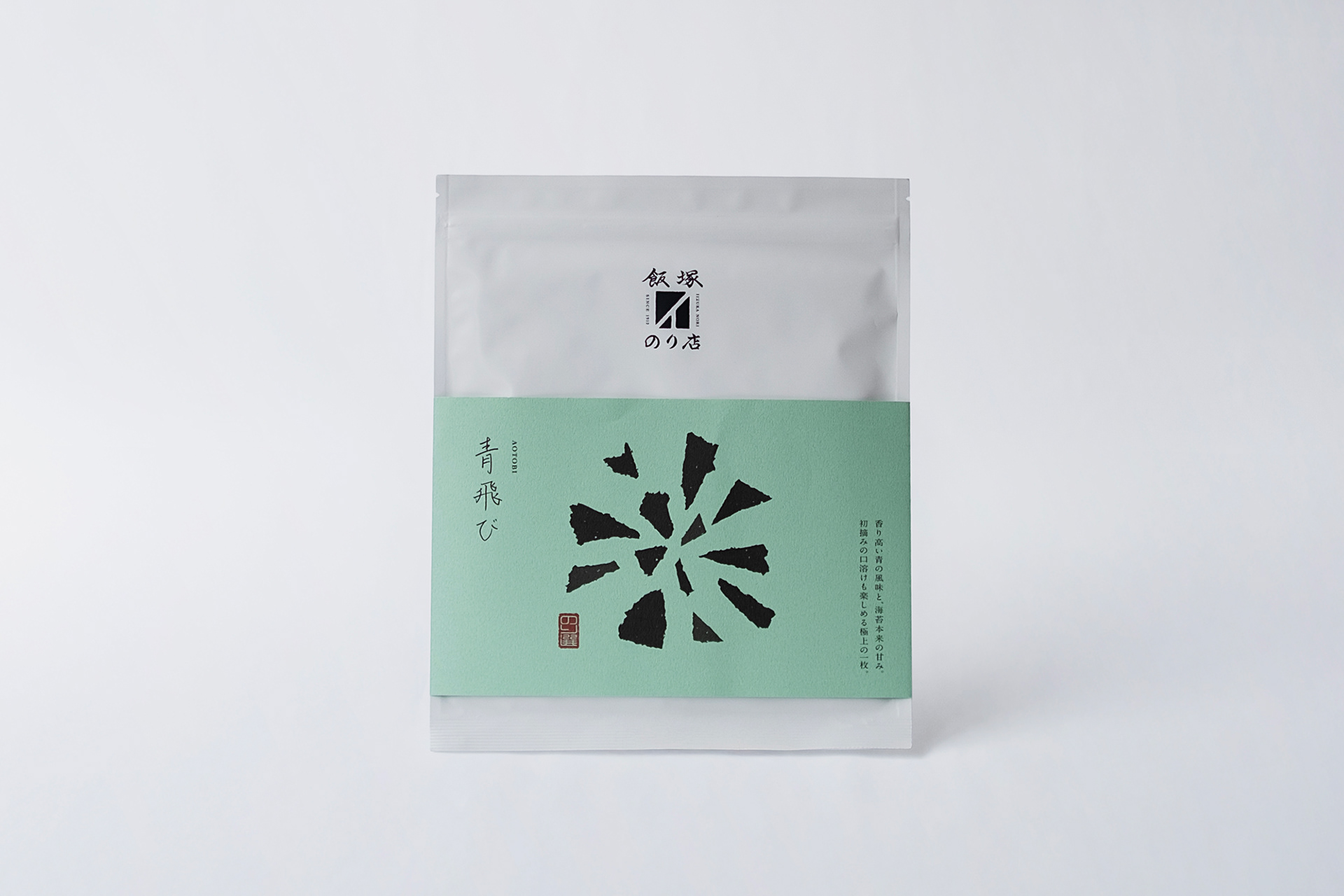
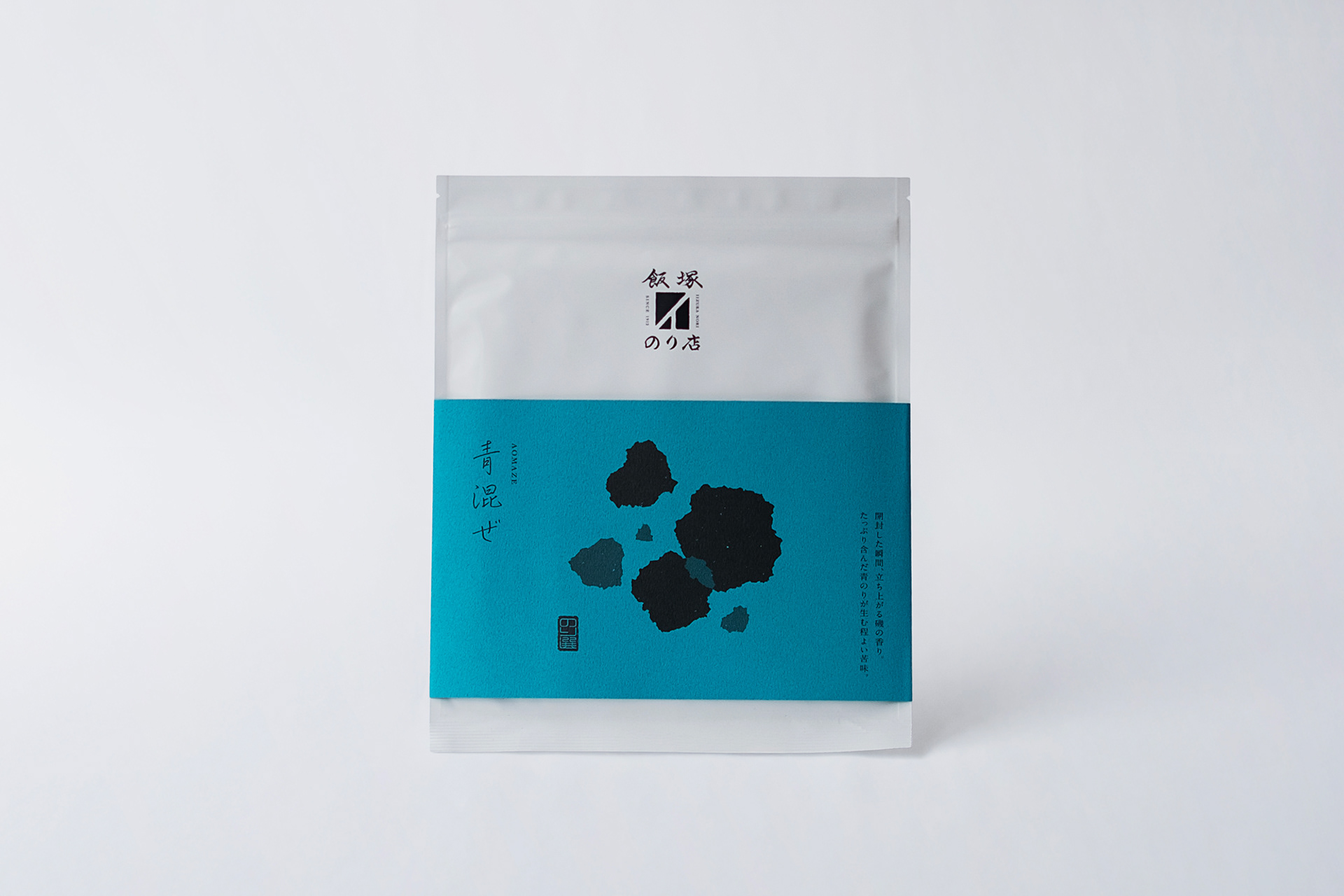
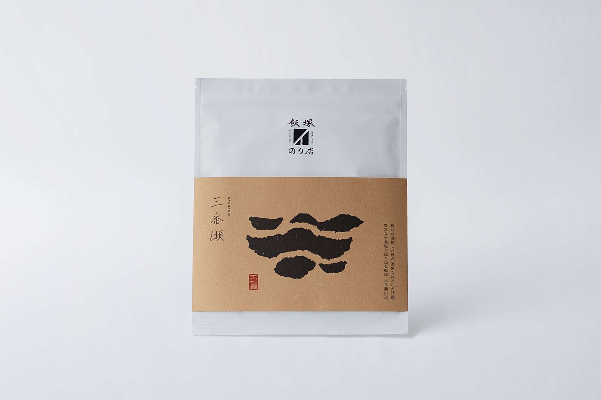
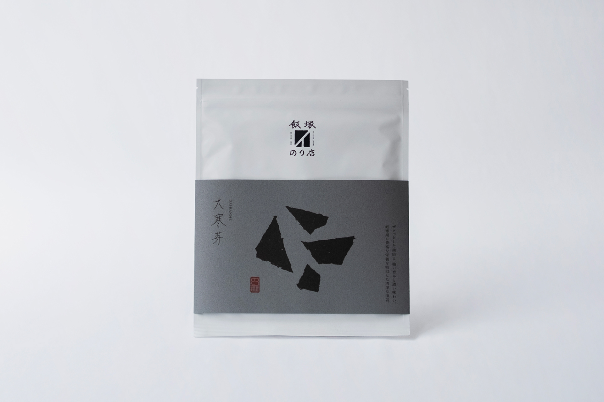
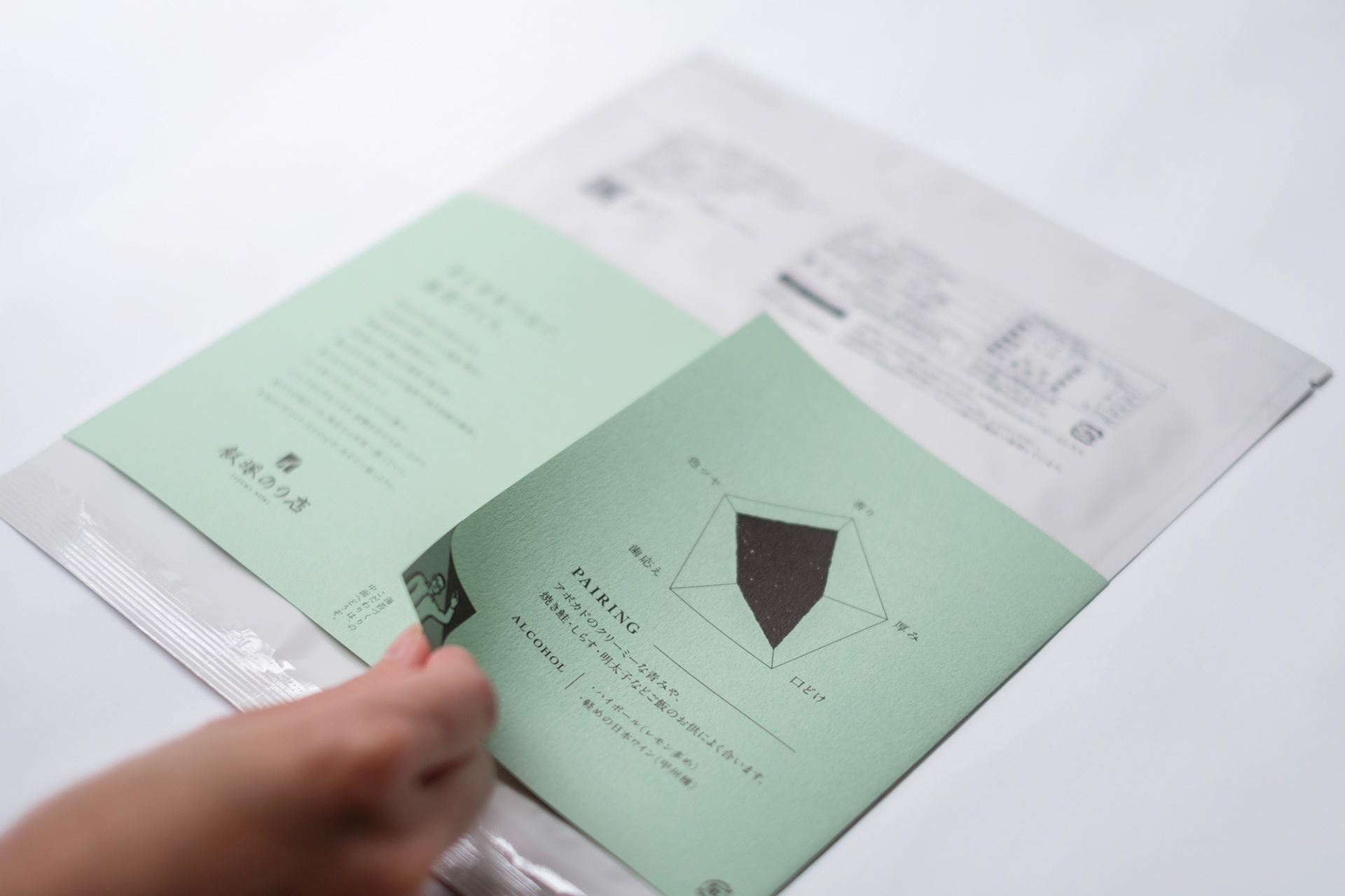
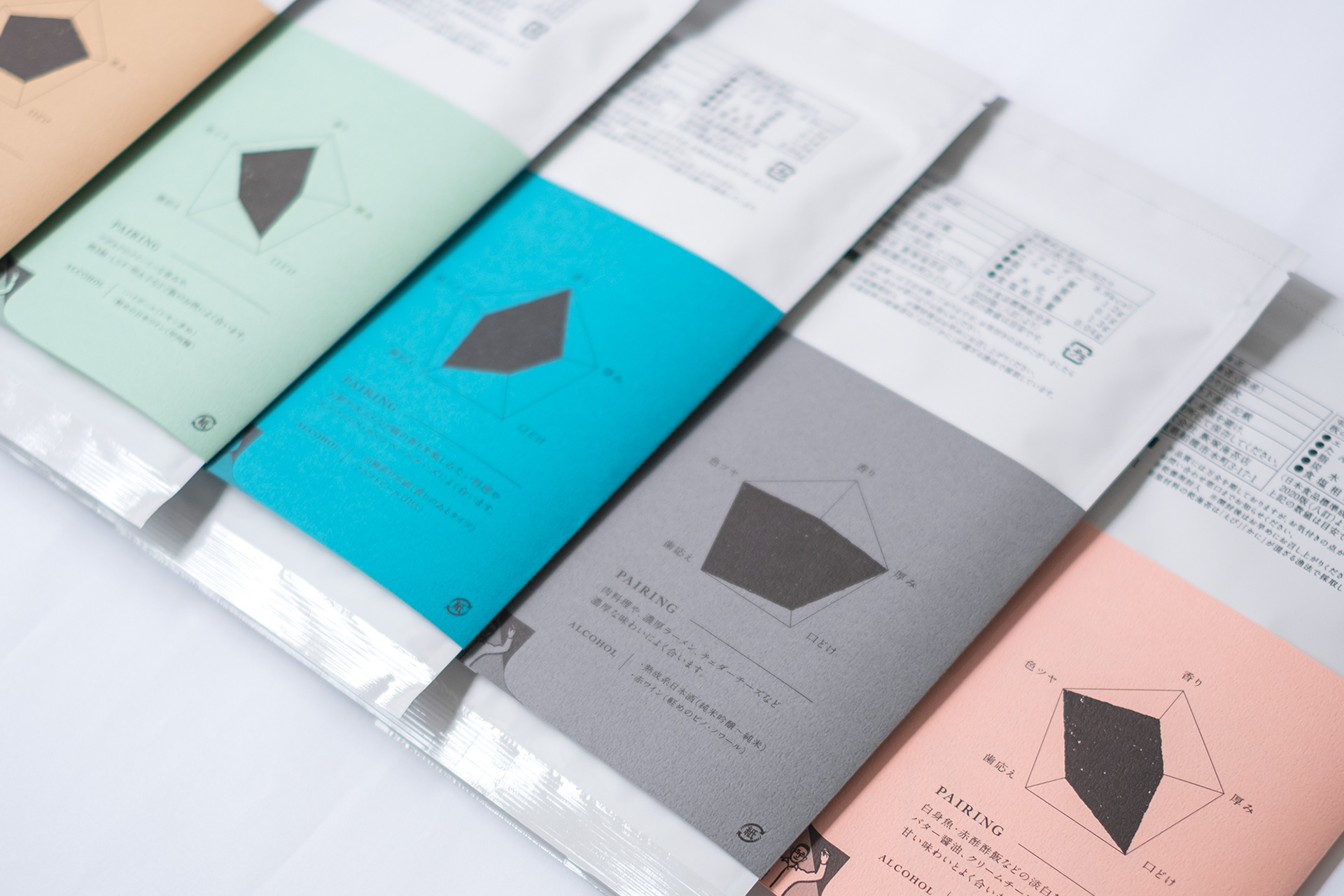
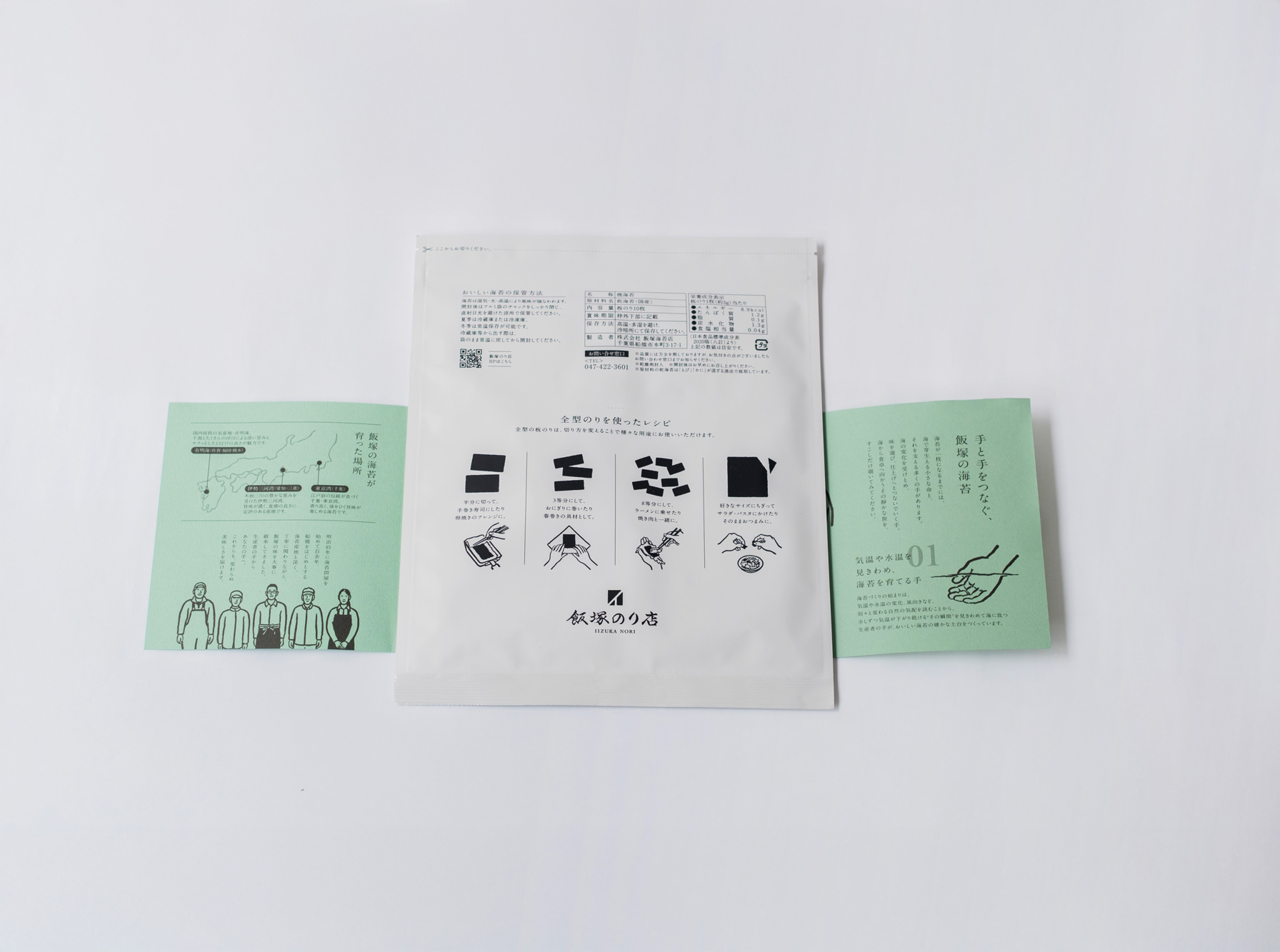
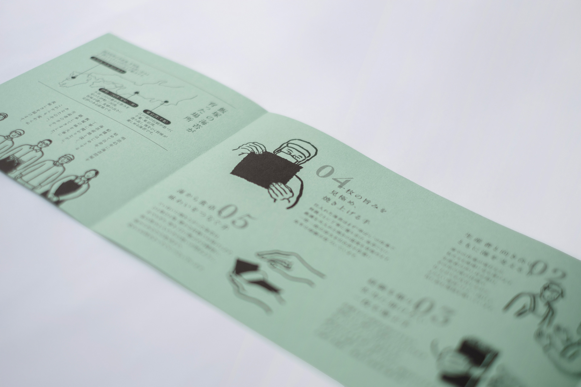
パッケージ裏面には収穫時期や地域によって異なる海苔の味わいをチャートで紹介。商品ごとにフードやドリンクのペアリング提案も掲載しています。また巻紙の裏面には飯塚のり店の想いや、海苔が消費者の手に届くまでのプロセスが大庫真理さんのイラストと共に紹介されています。今後も引き続き商品リニューアルを継続的に行っていきます。
The back of the package features a taste profile chart showcasing how flavor varies depending on harvest timing and region, alongside suggested food and drink pairings for each variety. Furthermore, the back of the paper band conveys Iizuka Nori’s philosophy and the journey of nori to the consumer's hands, brought to life through illustrations by Mari Ohko.
Product updates and brand renewals will continue to roll out incrementally in the future.
Client : 株式会社飯塚海苔店
Art Direction, Copy writing : Masaomi Fujita / tegusu Inc.
Graphic Design : Chiori Komiya / tegusu Inc.
Graphic Design : Chiori Komiya / tegusu Inc.
Illustration : Mari Oogo
--------------------
Check out our latest project :
Thank you for watching.