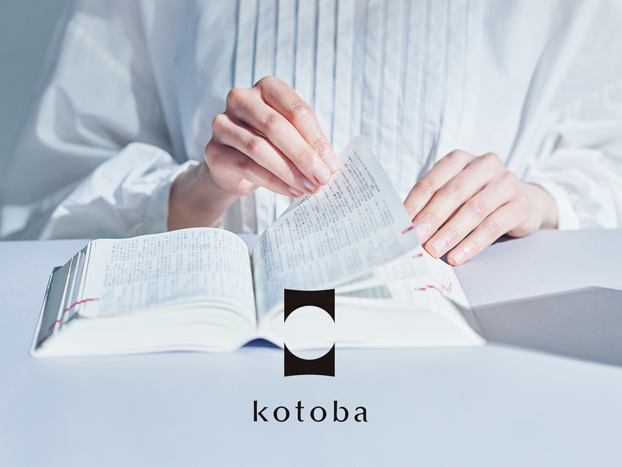

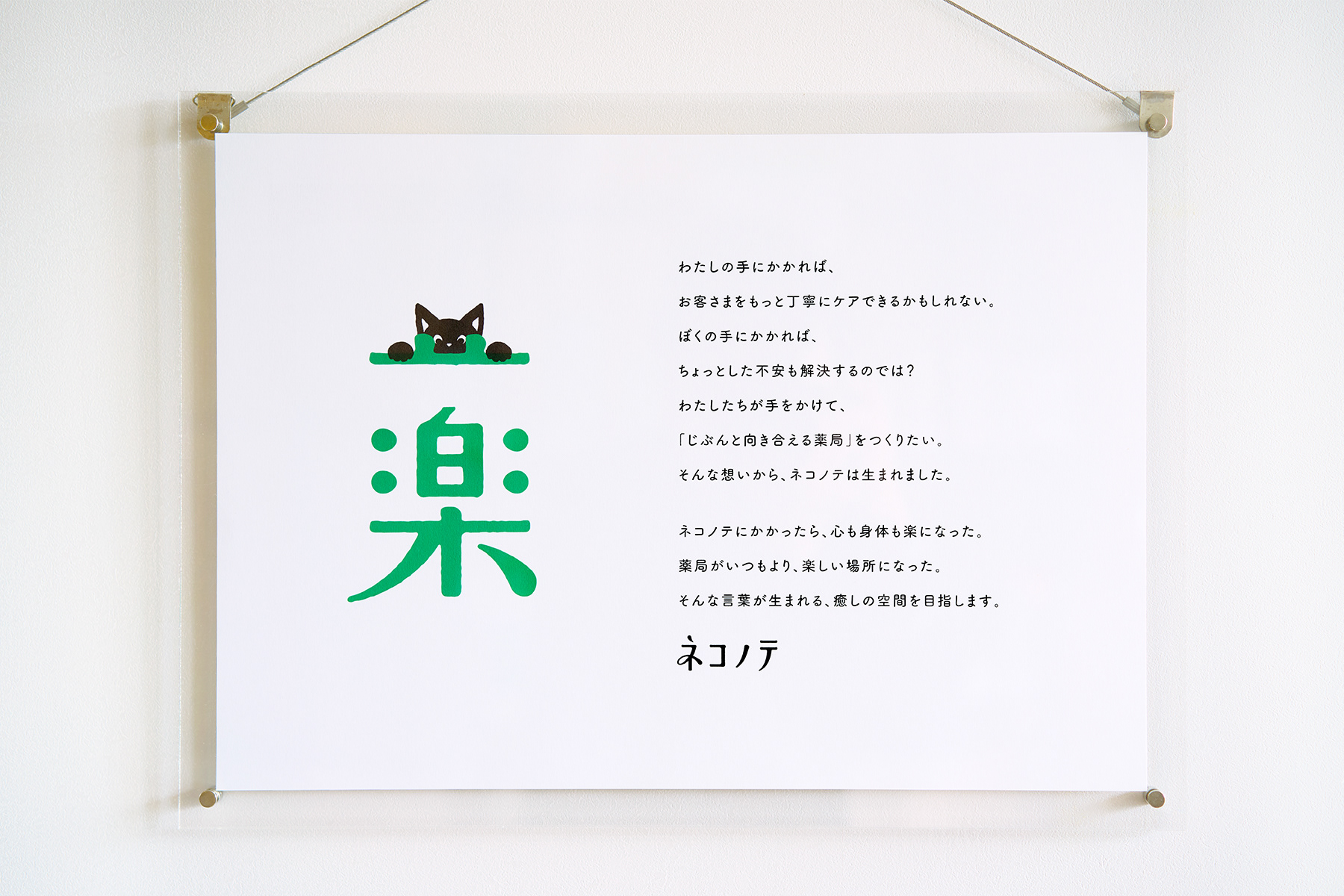
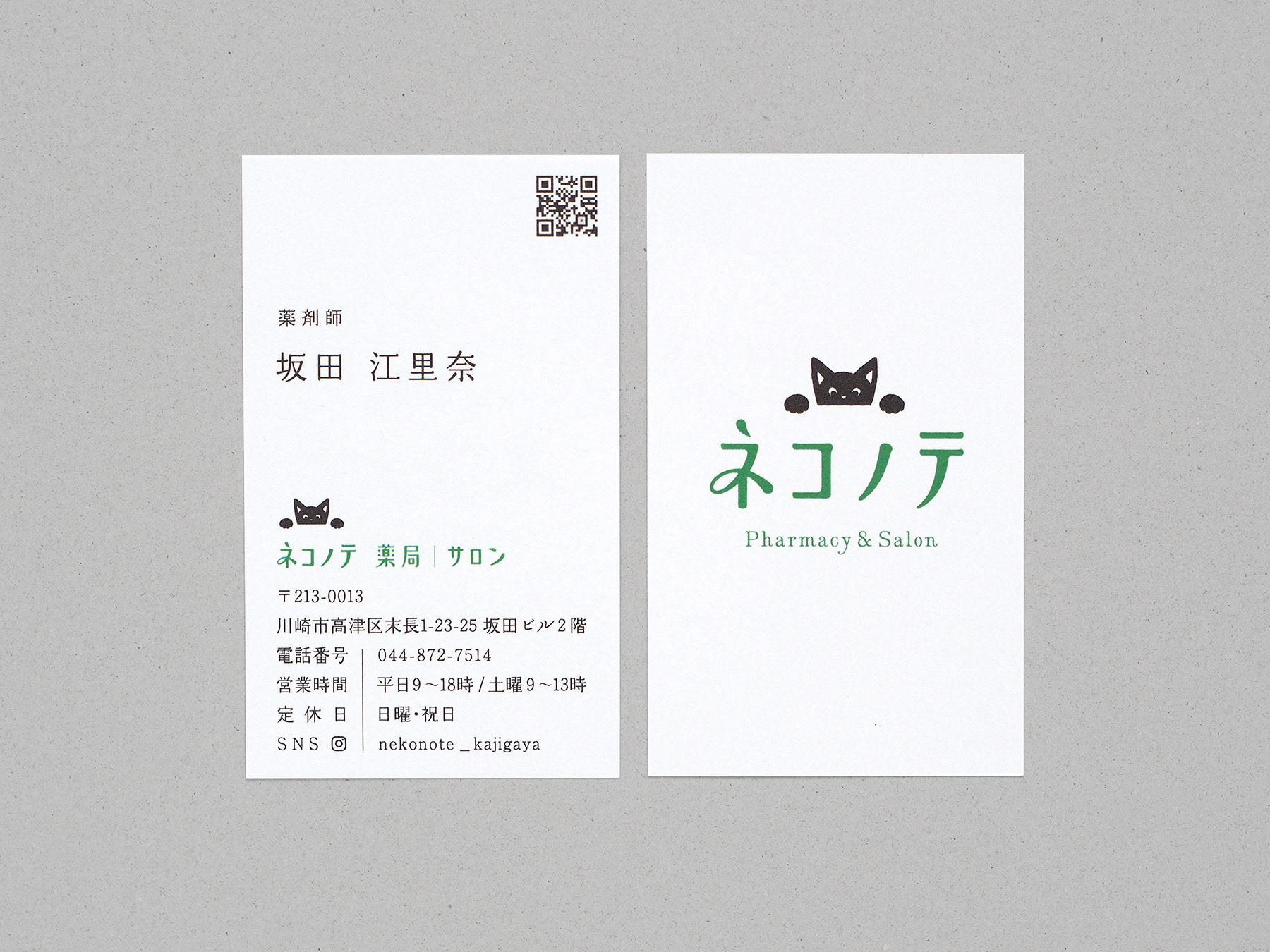
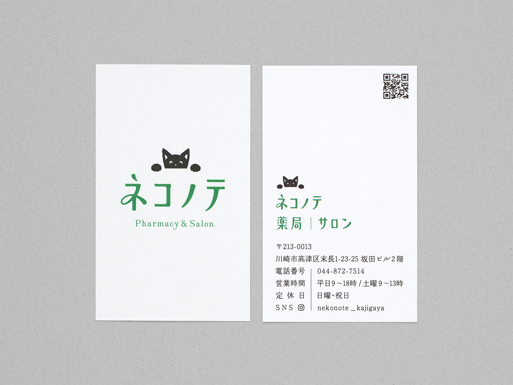
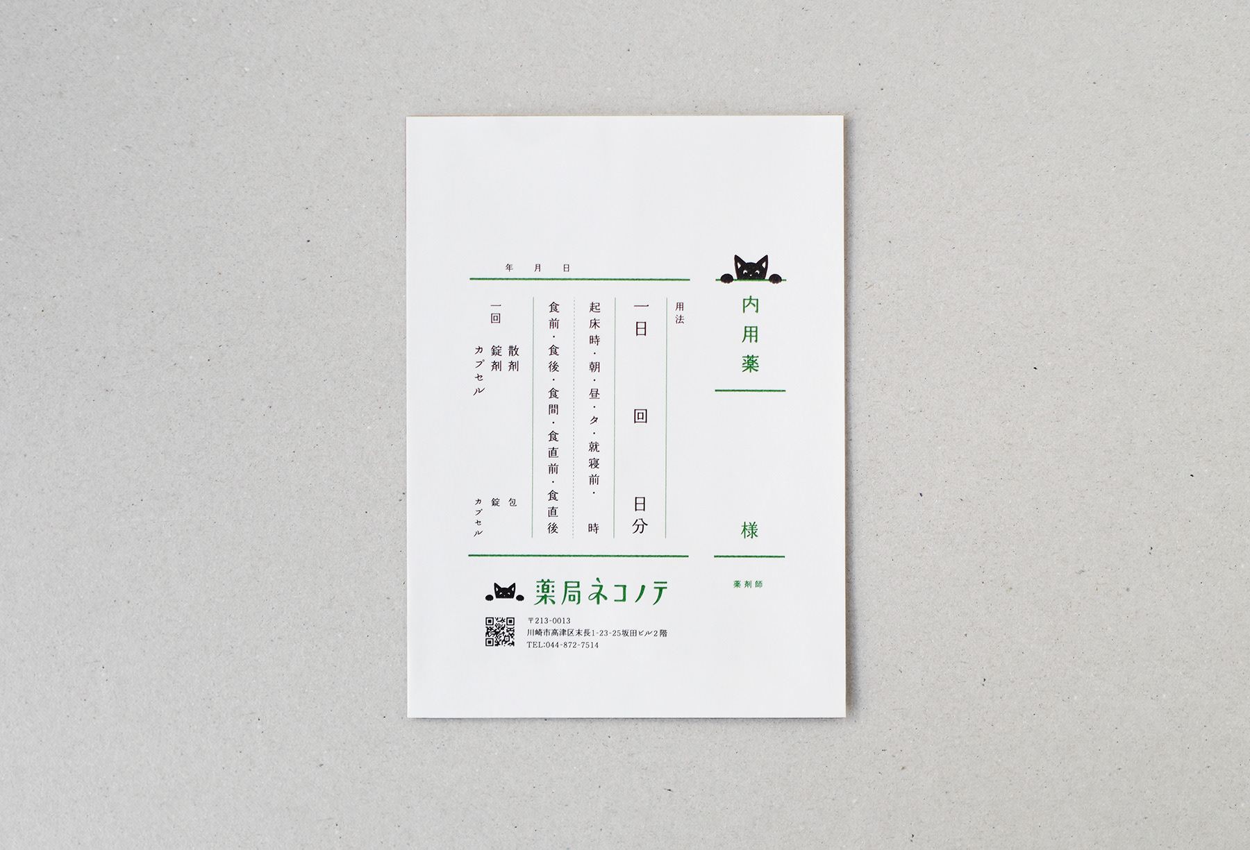
「じぶんと向き合う場所」をコンセプトに、薬局とサロンのサービスを展開する「ネコノテ」の、ロゴやメッセージボード、カード類や薬袋等のデザインを行いました。
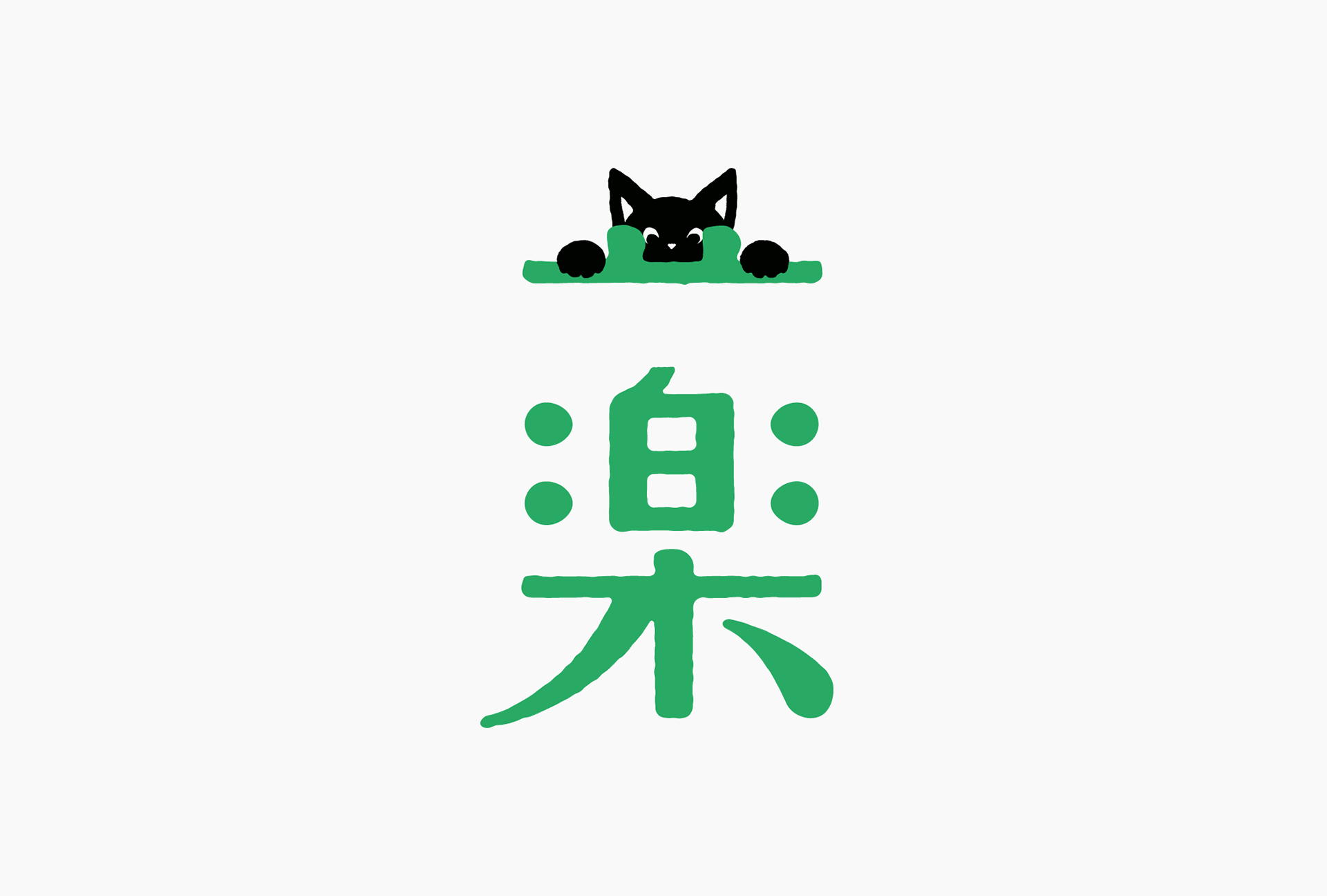
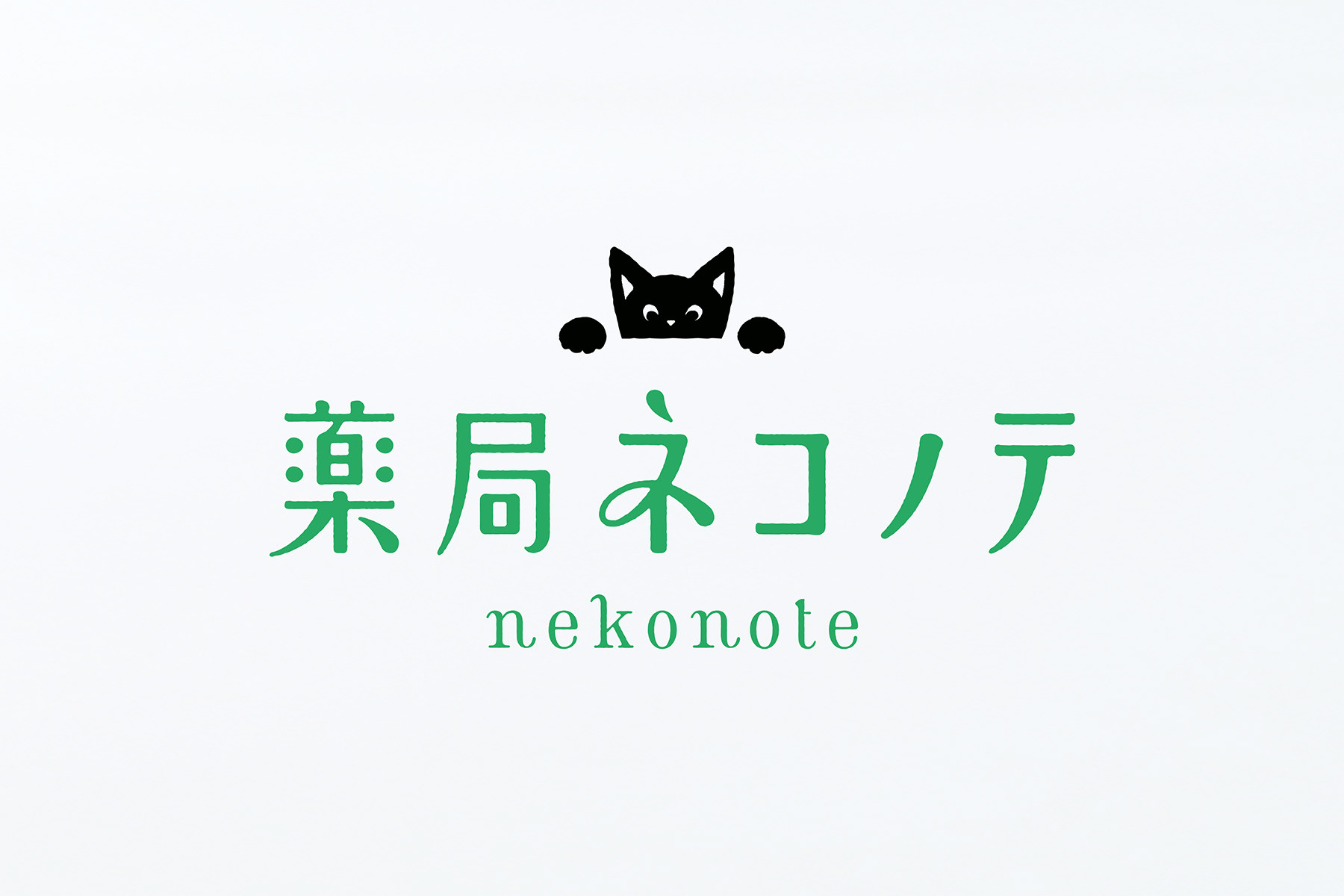
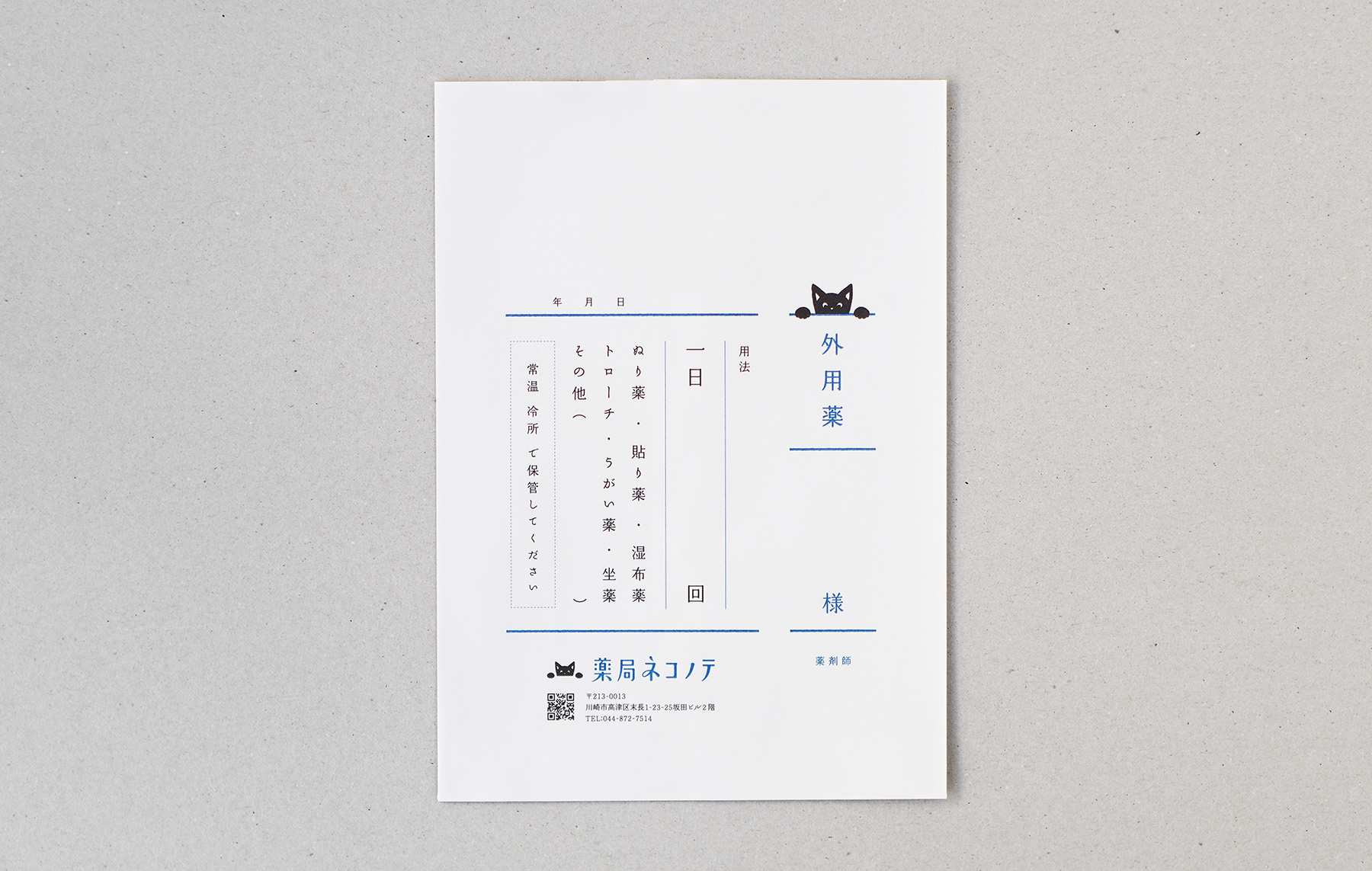
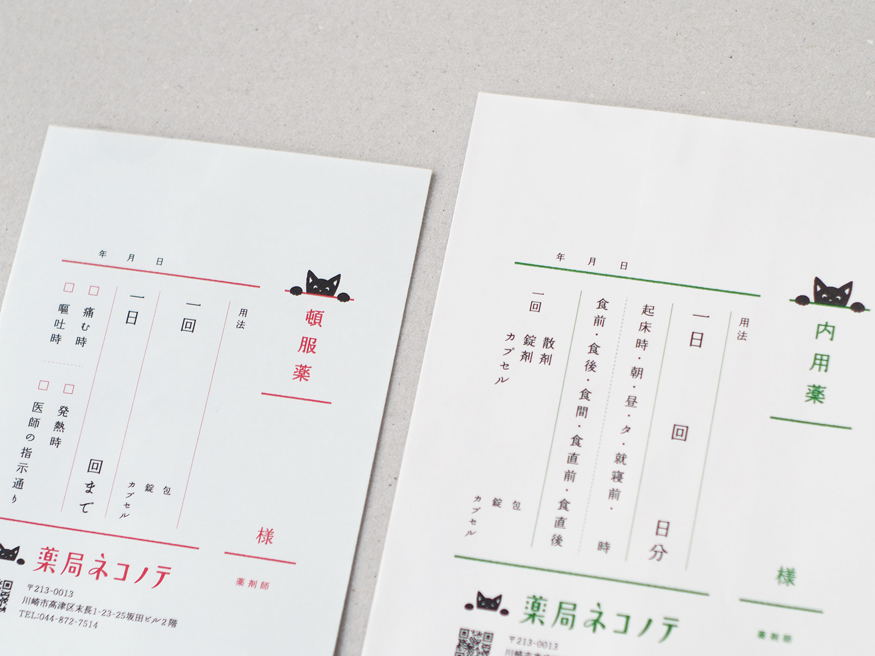
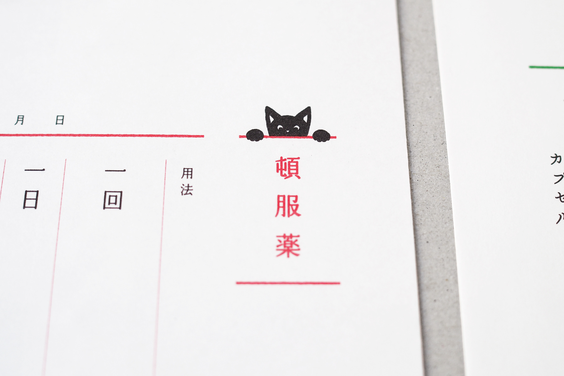
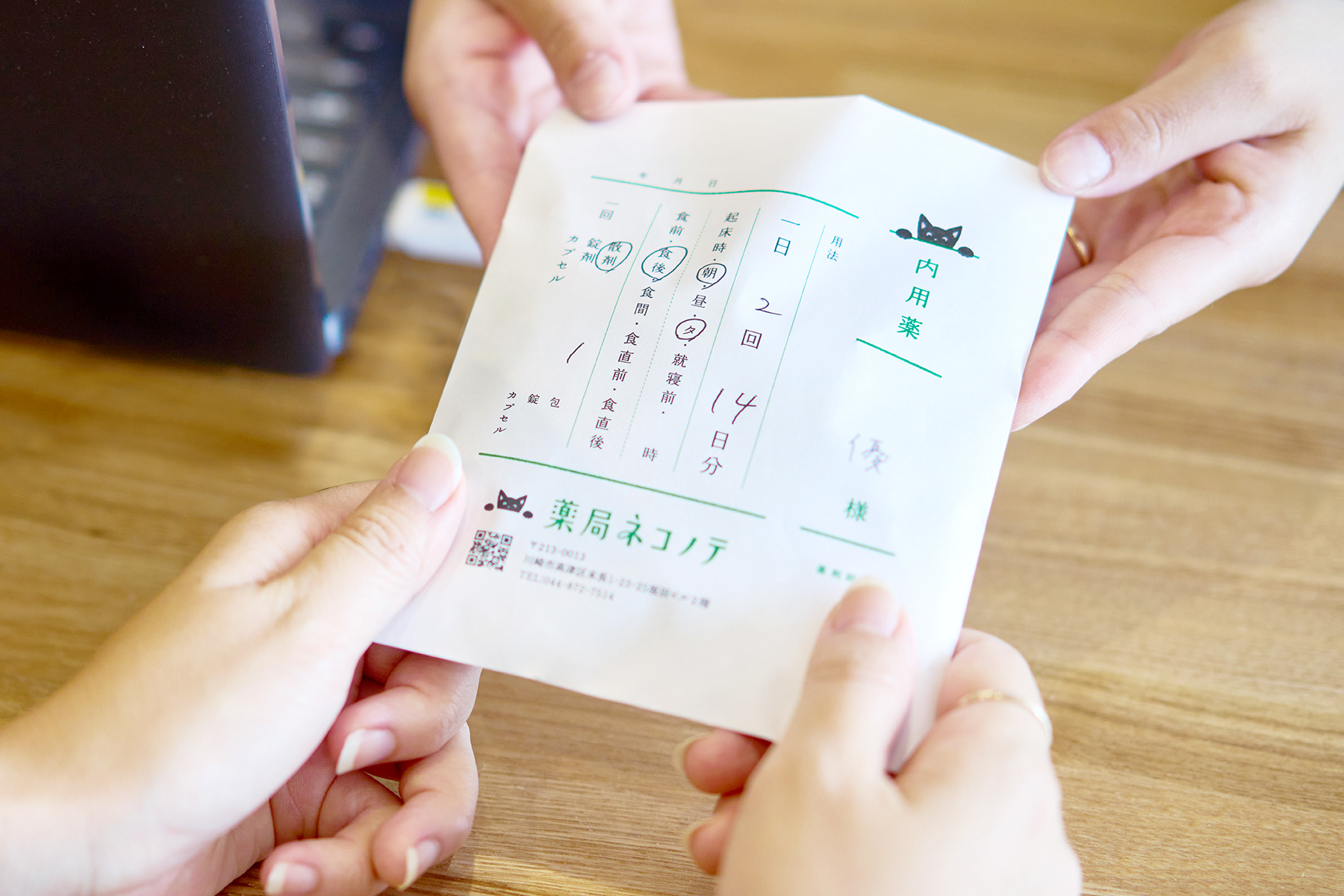
従来の薬局の在り方を見直したいという想いから、カフェのようにひと息つけるスペースや、よもぎ蒸しを行うサロンを併設するネコノテ。「ネコノテにかかる」ことで心と身体が楽になる、というメッセージを、手をかけて覗くネコのシンボルや、薬の漢字を用いて伝えています。
"Nekonote" is a facility offering pharmacy and salon services based on the concept of "Face to Face with Myself. We designed the logo, message board, cards, and medicine bags.
"Nekonote" was opened based on the owner's belief in rethinking the role of pharmacies and providing new value. The facility differs from a conventional pharmacy in that it includes a café space and a yomogi-styling salon. "Nekonote" means "cat's paw" in Japanese. The symbol of a cat peering this way with its hand on the wall expresses the facility's role in easing your mind and body.


Client : Nekonote
Art Direction, Graphic design : Masaomi Fujita / tegusu Inc.
Graphic Design : Ryoko Miyoshi / tegusu Inc.
Graphic Design : Ryoko Miyoshi / tegusu Inc.
--------------------
Check out our latest project :
Instagram
Thank you for watching.