鈴木亜生氏を代表とするASEI建築設計事務所は、東京都を拠点に全国各地の建築・インテリアの企画/設計/監理を行っています。地域や環境の隠れた魅力を新しく感じ興す「感興する建築」をテーマに、住宅から文化施設まで様々な建築設計を手がています。tegusuでは同社のVI開発/コンセプト開発を行いました。
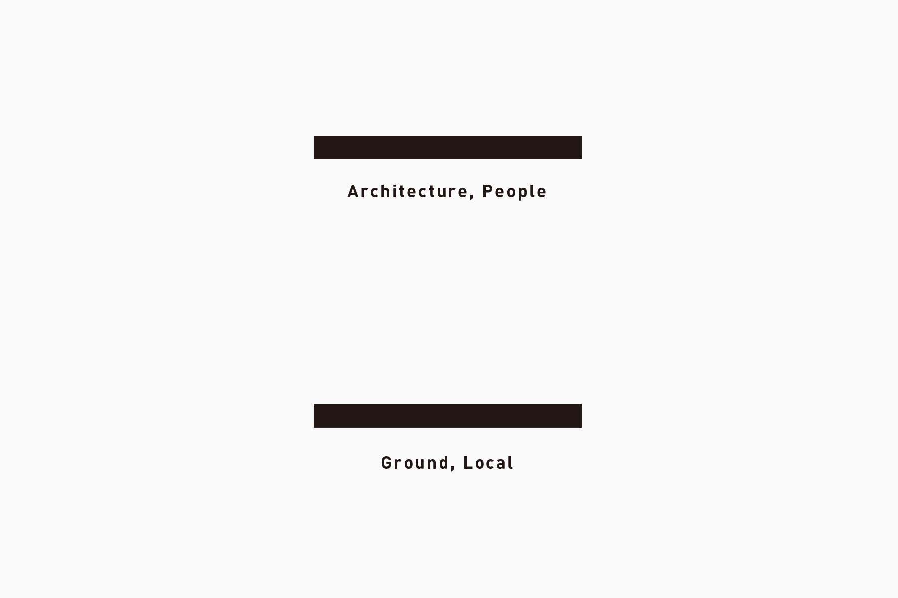
ASEI ARCHITECTS, a company based in Tokyo led by Mr. Asei Suzuki provide planning, design and management of architecture and interiors located throughout the country. They deal with various kinds of architecture including residential buildings and cultural facilities with the theme “empowering architecture,” making people recapture the hidden charms of local areas or environment. tegusu handled the VI and concept development for the company.

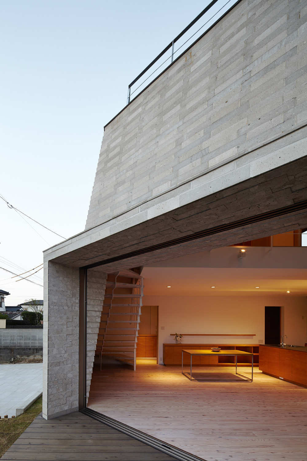
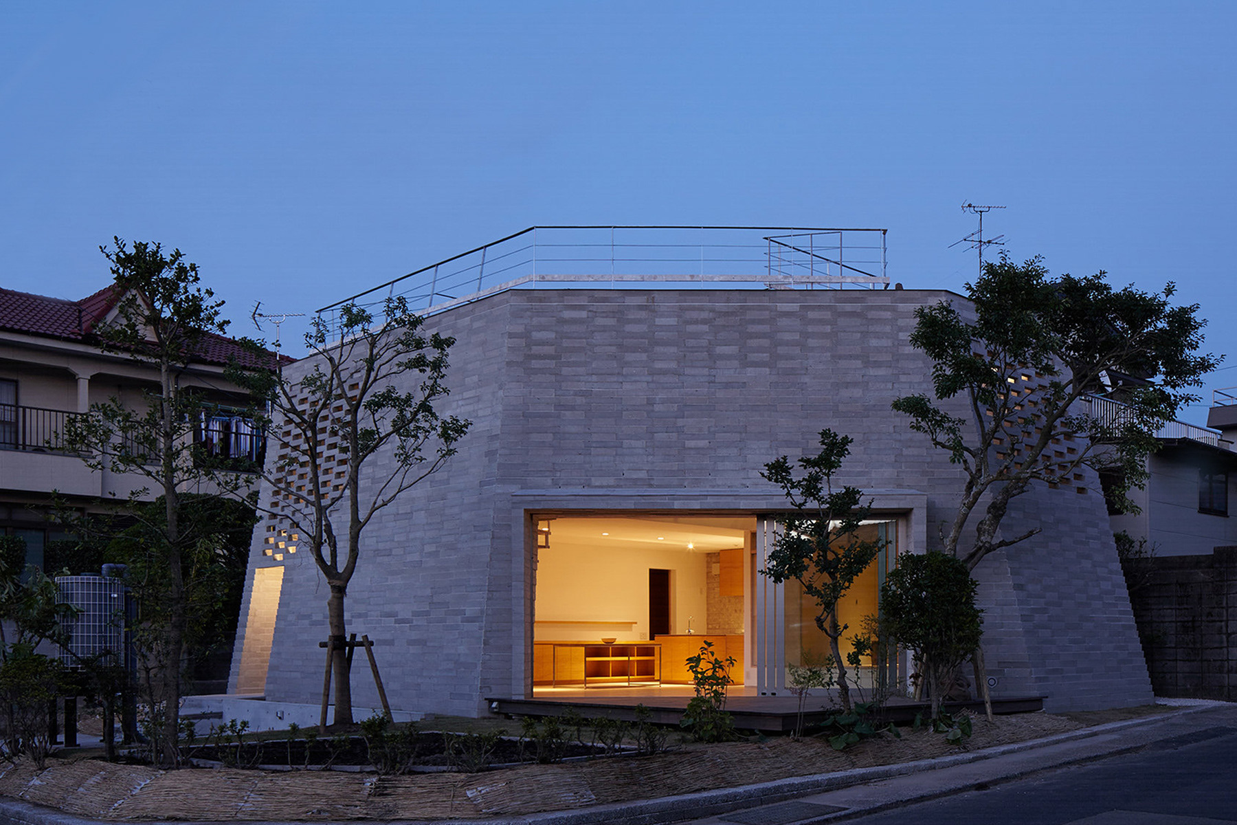
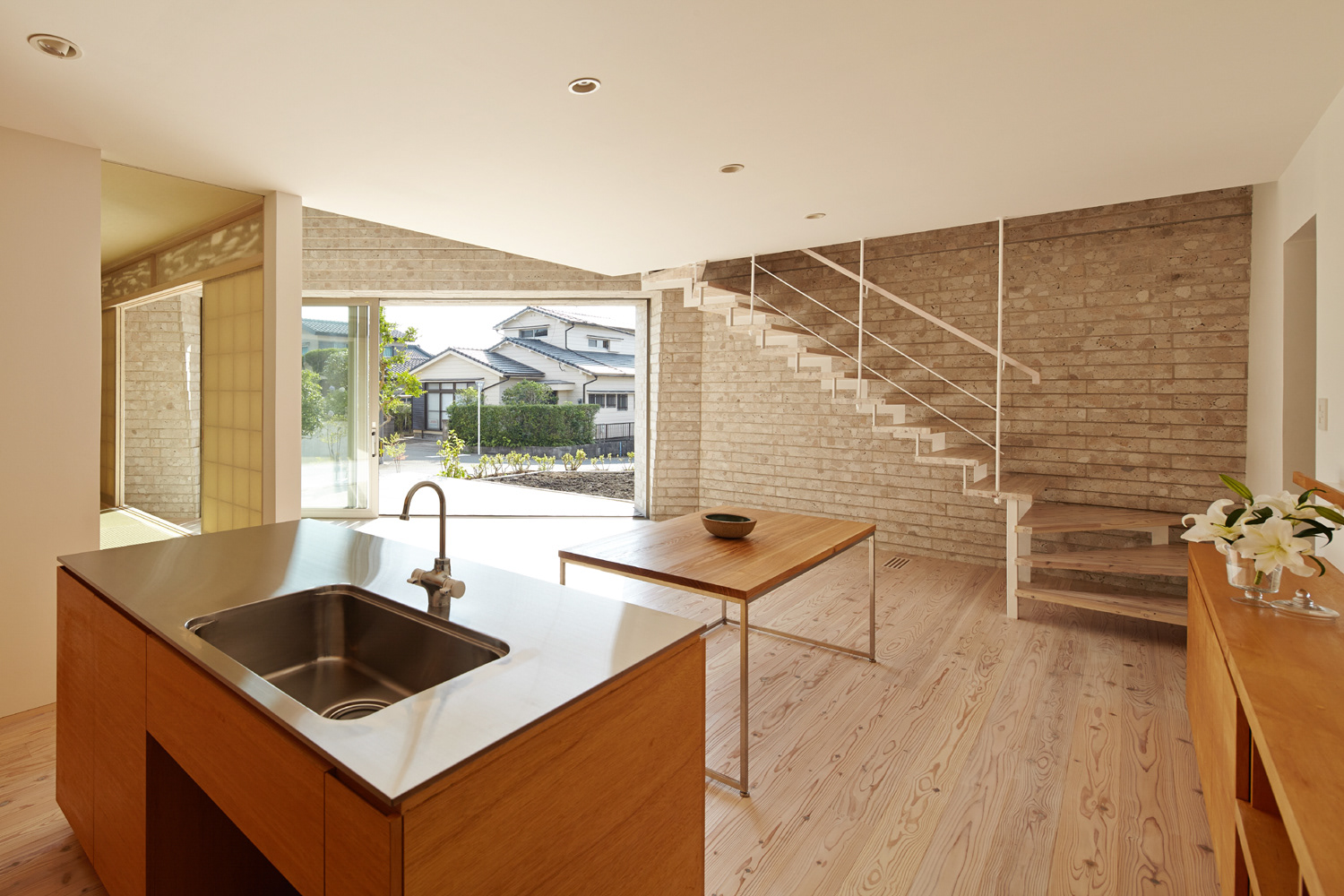
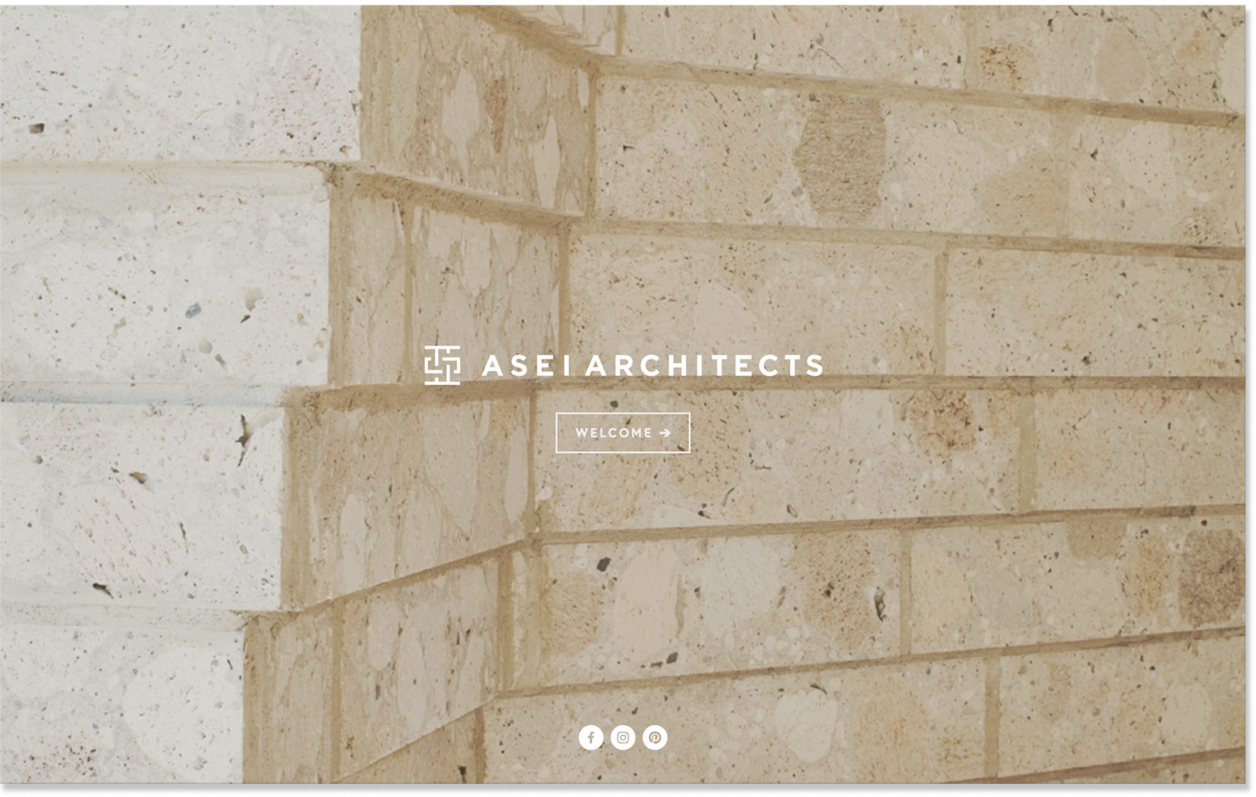
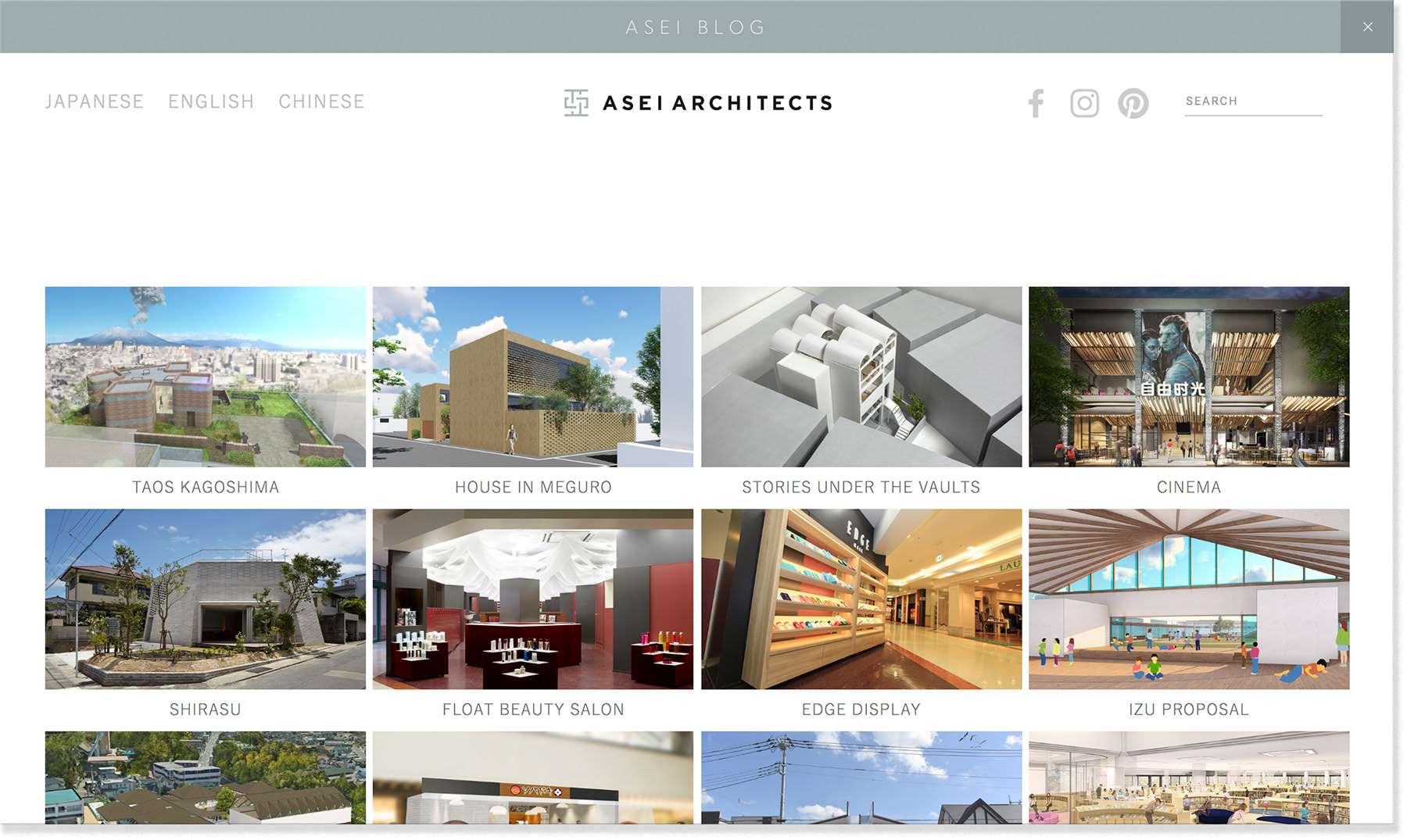
One of their works " SHIRASU" which reused underground vocanic soil in Kagoshima Photo by Taichi Ano
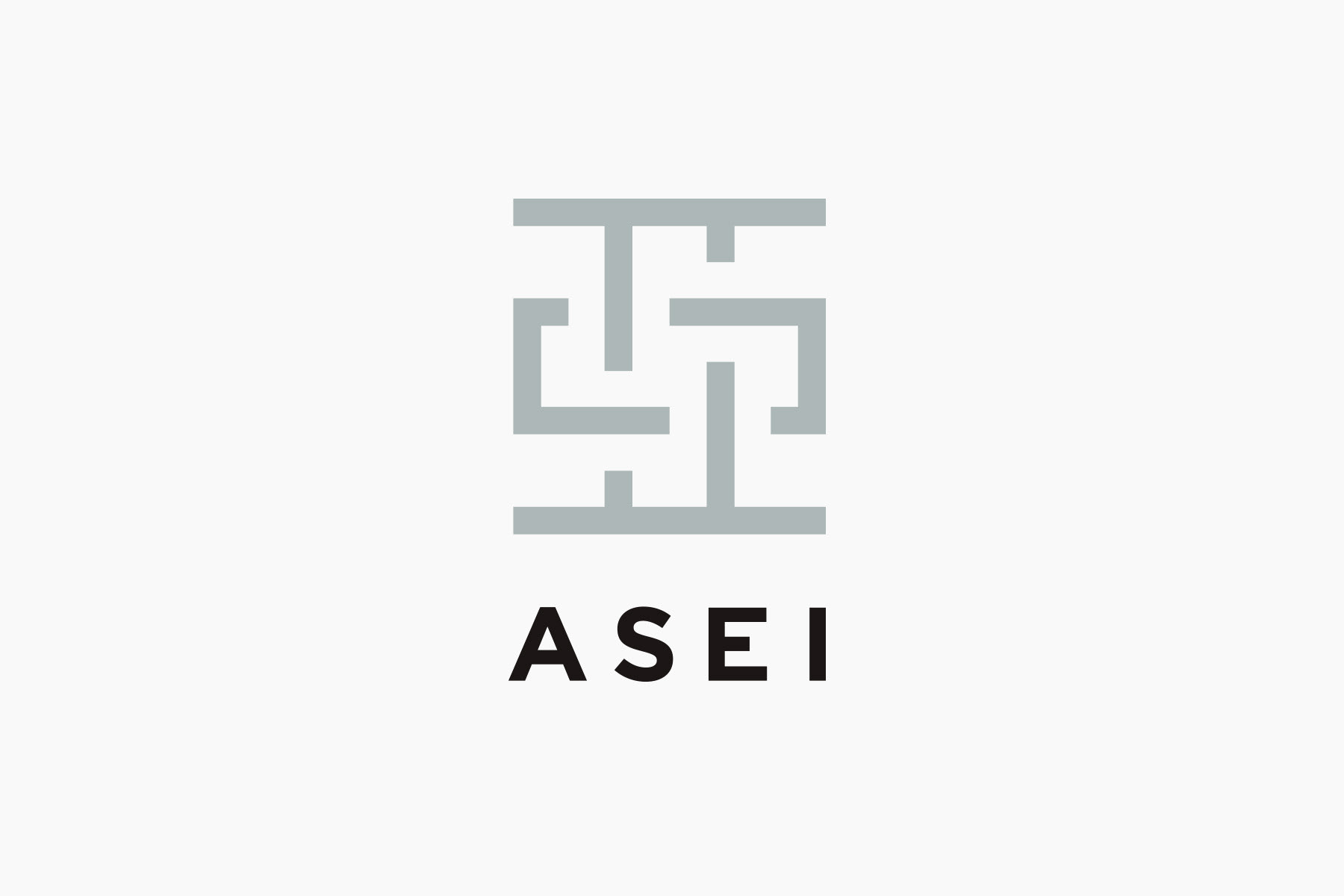
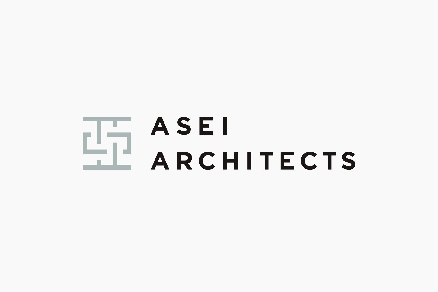
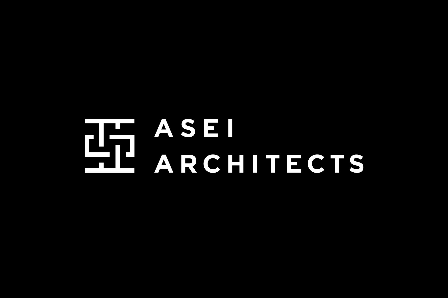
ASEI建築設計事務所では「環境と建築の接点」に着目し、地域に眠る未活用の資源を建築材料として使用する試みを行なっています。代表作に鹿児島の地下資源・シラスをを再利用したエコハウス「SHIRASU」があります。tegusuでは、同社の理念やスタイルを視覚的に表現するのに、事務所名である亜生氏の「亜」の漢字フォルムから着想を得ました。
In ASEI ARCHITECTS, they focus on “contact points of the environment and architecture” and attempts to use resources that are left unused in local areas as building materials. One of their main work is an ecohouse called “SHIRASU,” which reused underground vocanic soil in Kagoshima. tegusu got inspiration from the shape of “亜,” kanji used in the company name “Asei,”which is also Mr. Suzuki’s first name, in visualizing ASEI’s philosophy and style.
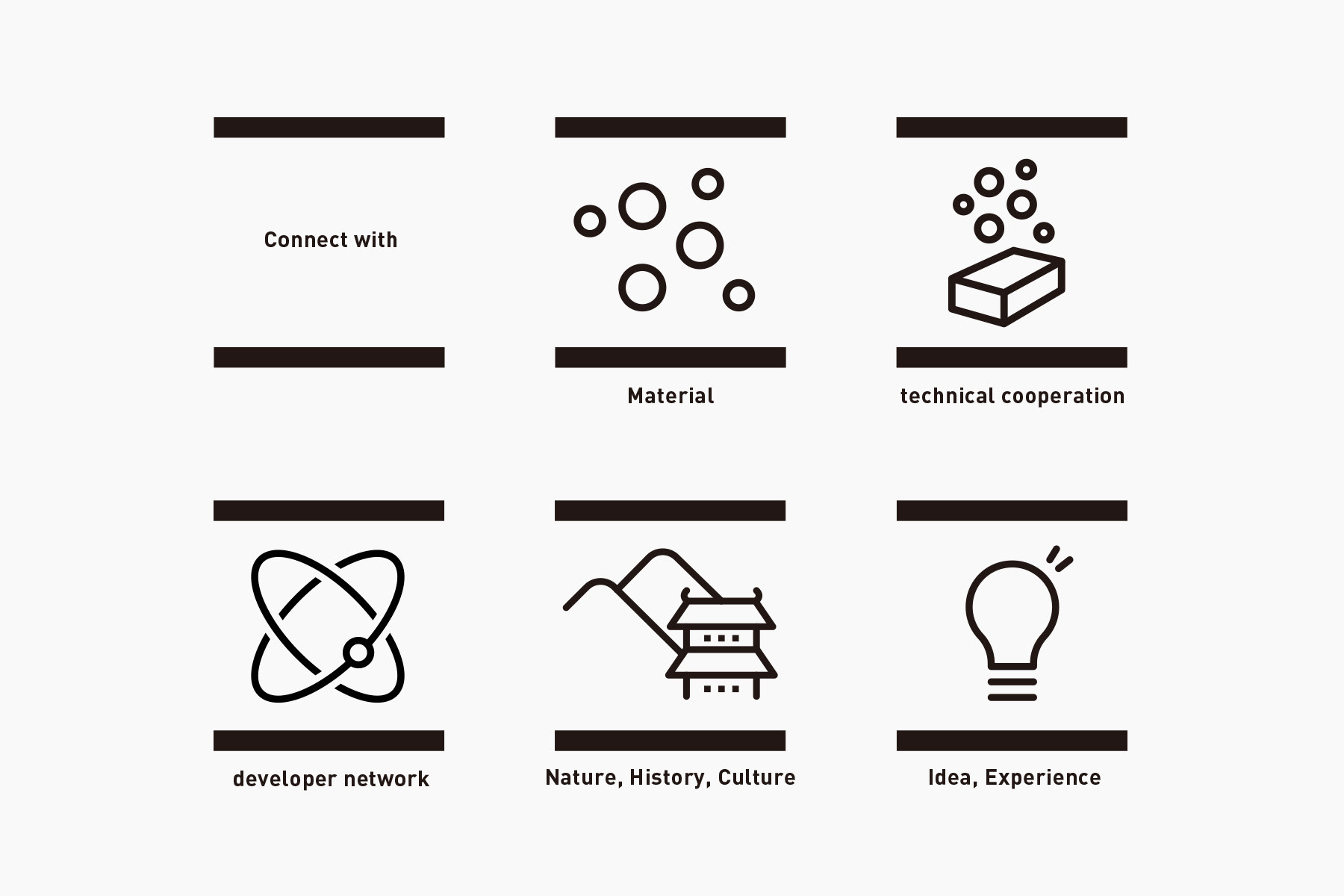
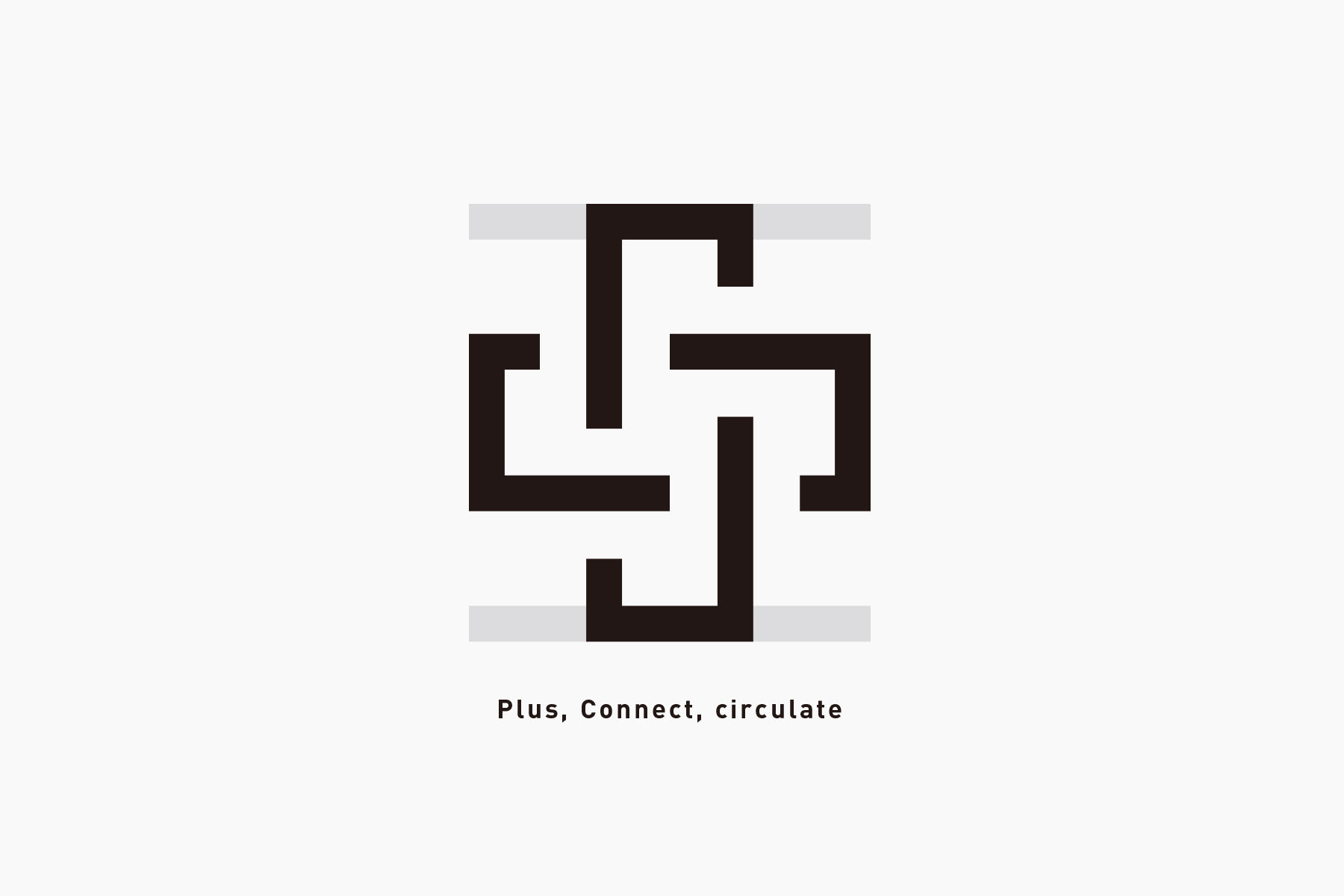
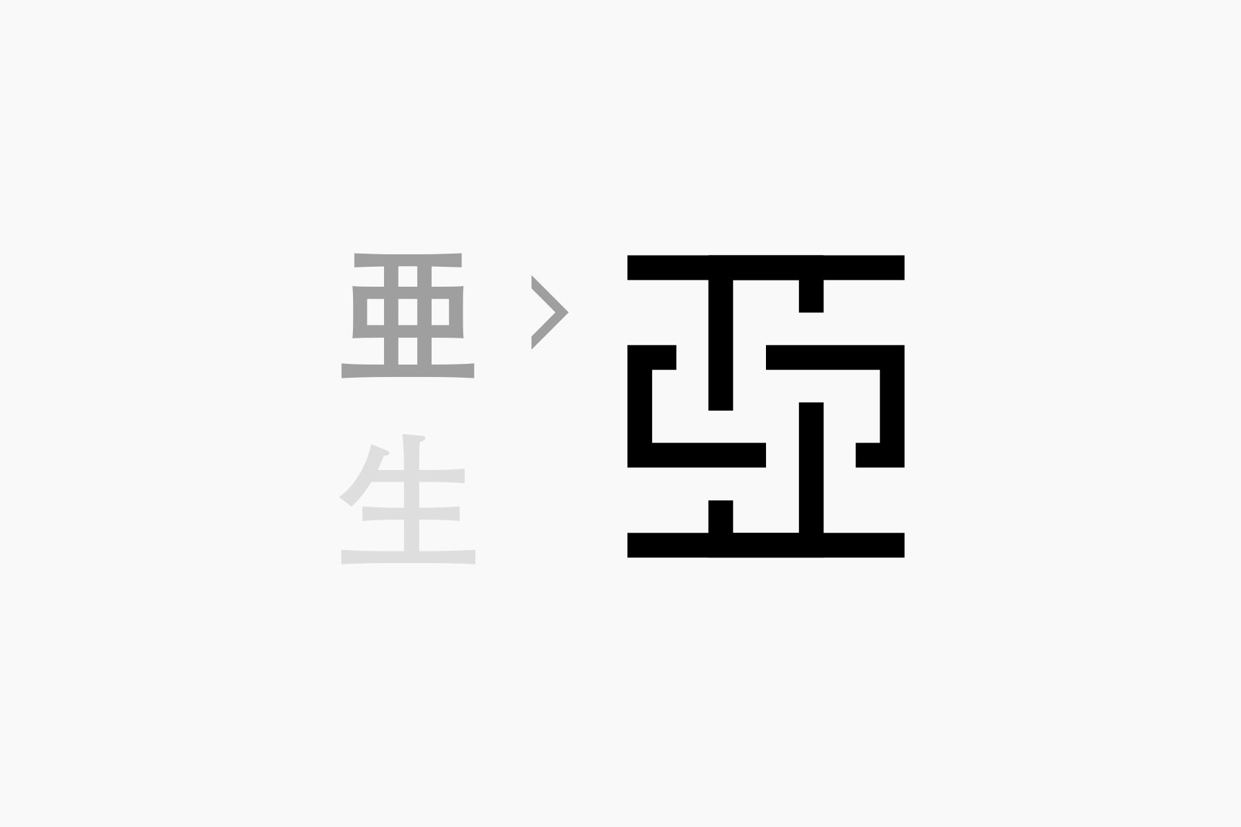
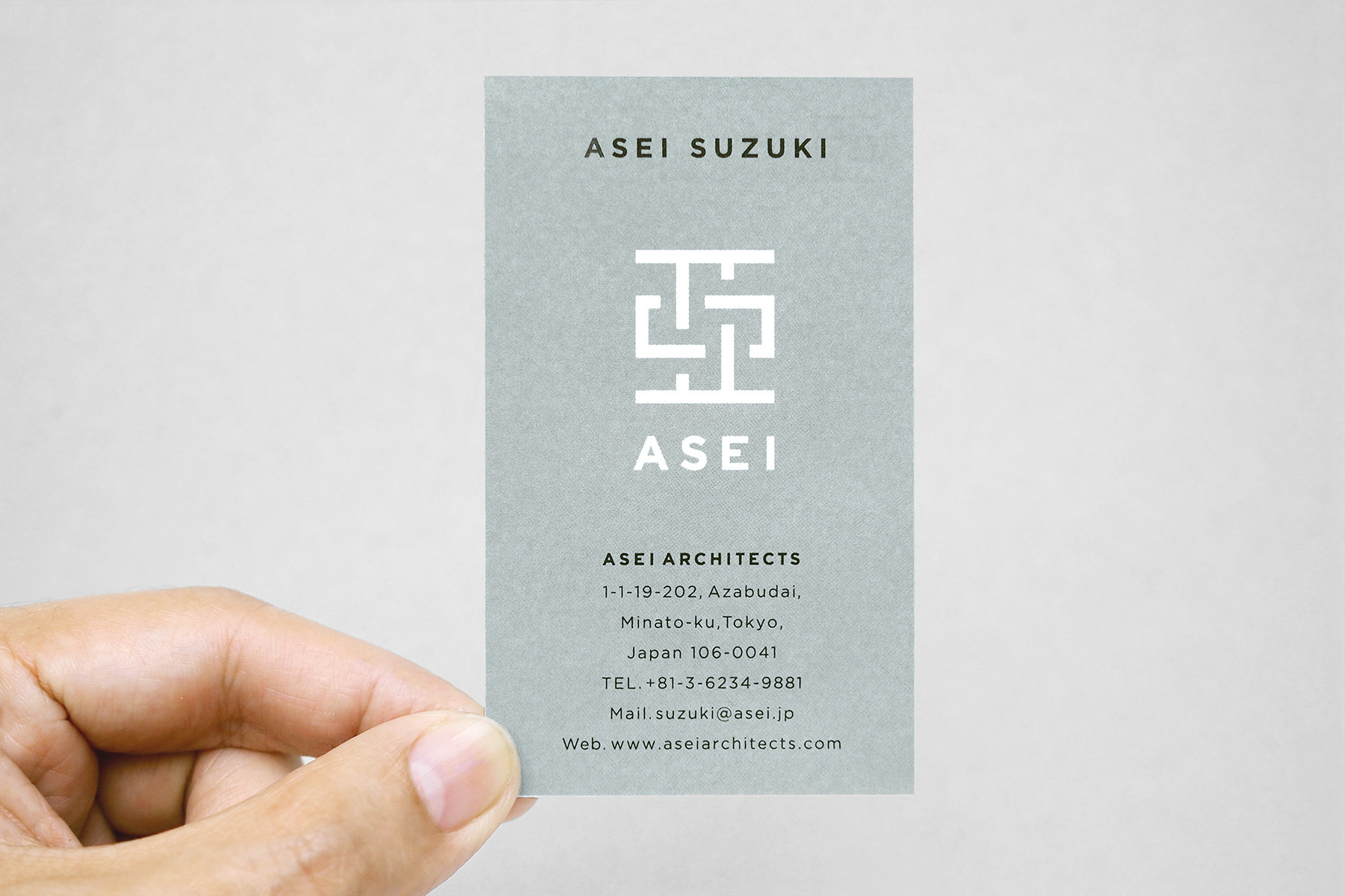
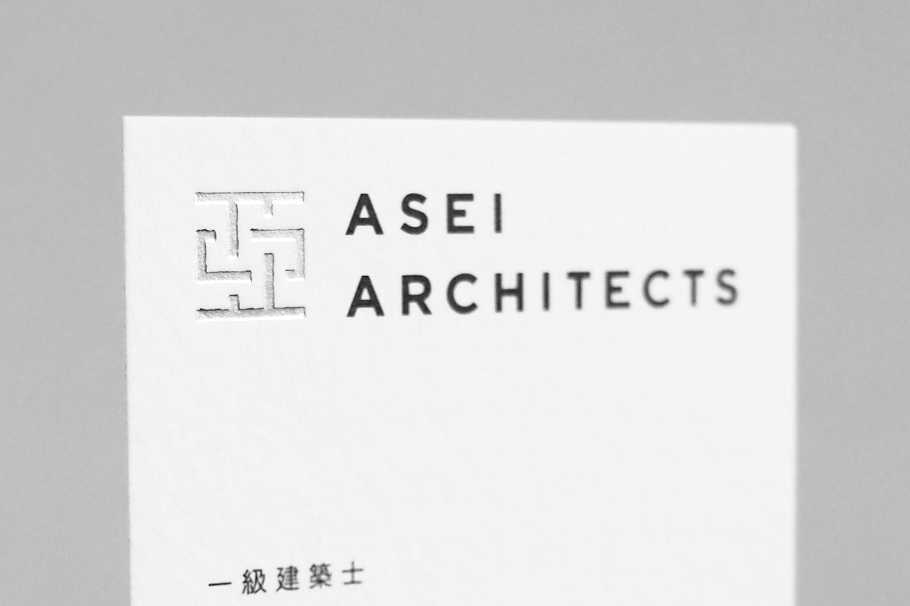
「亜」の漢字を構成する下の線を「土地や地域」、上の線を「建築や人」と捉え、それらを繋ぐ真ん中のフォルムを「素材/技術協力/開発ネットワーク/自然や歴史/経験やアイデア」など、同社のサービスであると定義しました。これらをプラスの力に変え、さらに循環・持続させていくことが、環境と建築の関わり方を考える同社のスタイルそのものを表現していると考えました。
また「亜」という漢字は、建物を作るための「土台」や、物事に「次ぐ・準じる」という意味を含んでおり、建築のあり方の基礎=「土台」から考え、地域の資源に「準じた」素材を考える事務所の理念に通ずる漢字でもあります。
The line at the bottle of the kanji “亜” represents “a land or area,” and the line on top symbolizes “architecture and people.” We defined the shape in the middle, which connects the upper and lower lines as “materials, technical cooperation, development network, nature and history, and experience and ideas”, which are the services provided by ASEI. We determined that transforming these elements into positive power, and keeping it circulating and sustained, is exactly the style of this company, which is dedicated in pursuing how the relationship between the environment and architecture should be.
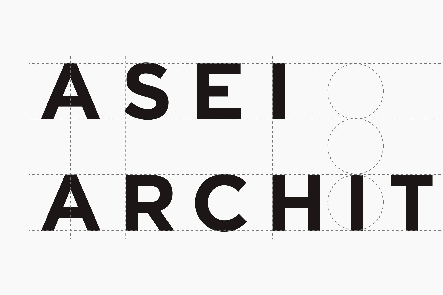
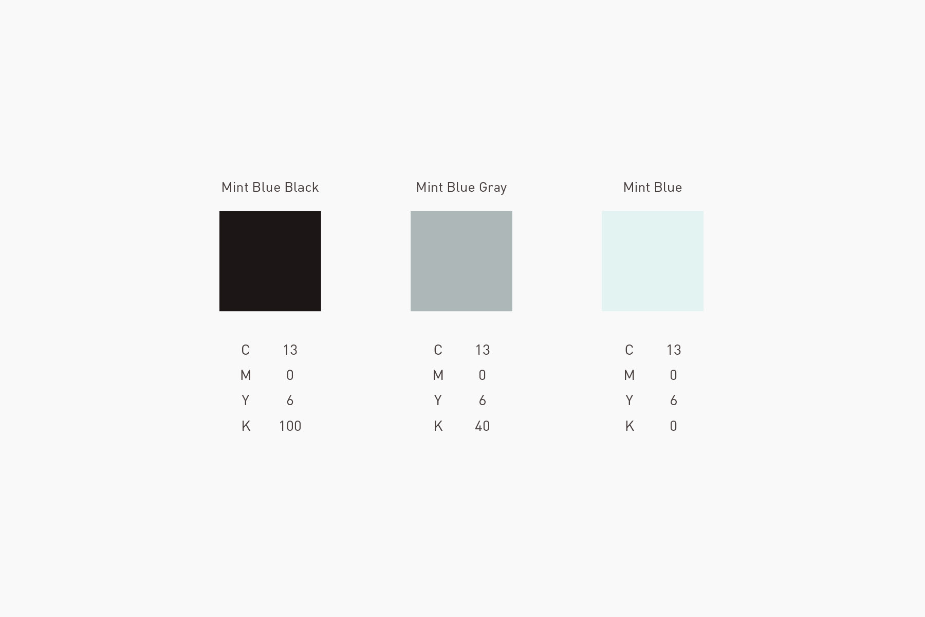
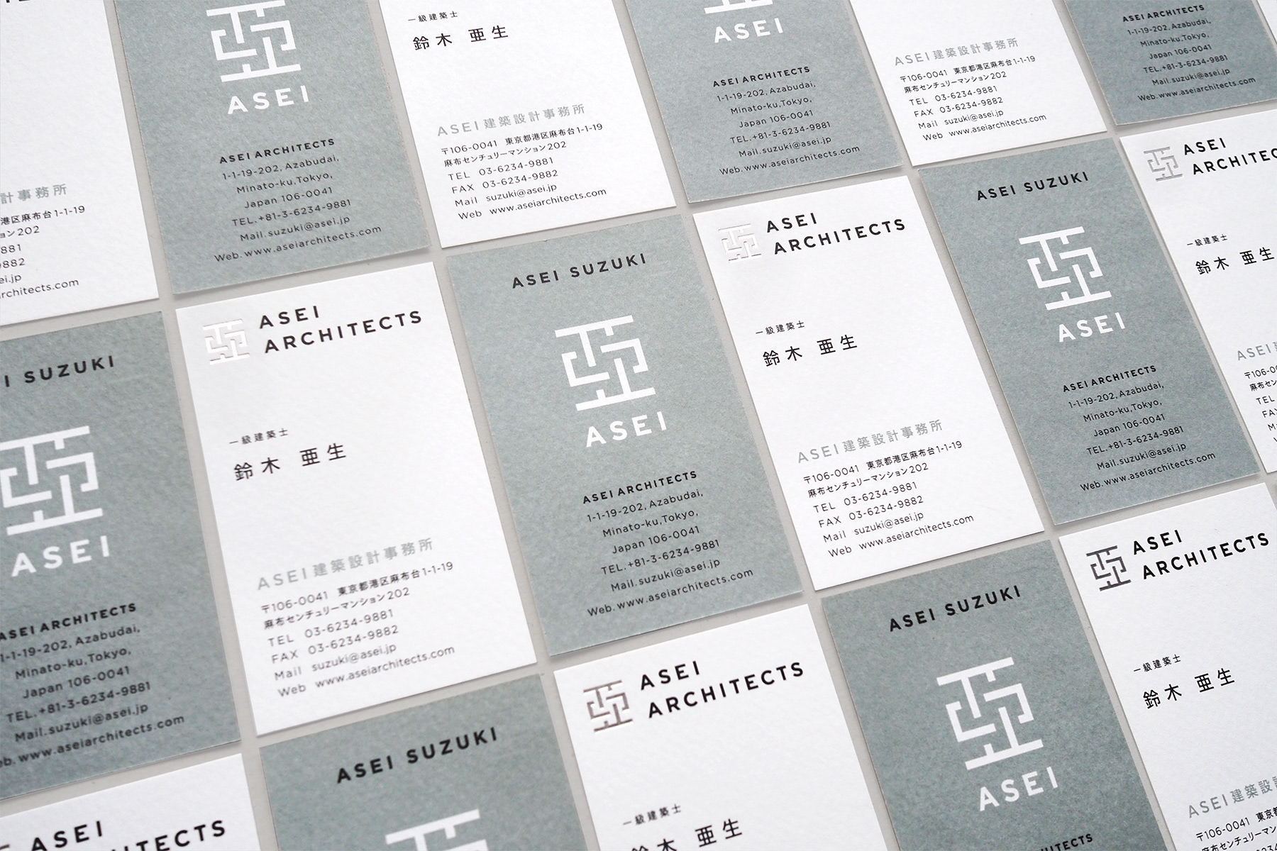
キーカラーは、水や空気などの自然物をイメージさせるミントブルーに、ブラックを配色することで全体を構成しています。言葉で言い表すのが難しい微妙なカラーは、「感興」という語の持つ繊細な印象を表現するために考えました。フォントはジオメトリックで骨太な構造を持ちながら、無機質すぎない人間味のある柔らかさを持った「Gotham」をベースにしています。
As the key colors, mint blue and black are used. Mint blue is a color that is associated with natural things such as water and air, and it’s arranged with black to make this subtle color combination. We came up with the color combination that is hard to describe with words to reflect a delicate impression “kankyo,” the word used in ASEI’s business theme. While the font is geometric and has a stout structure, it is created based on “Gotham,” which is not too mechanical and has human-like softness.
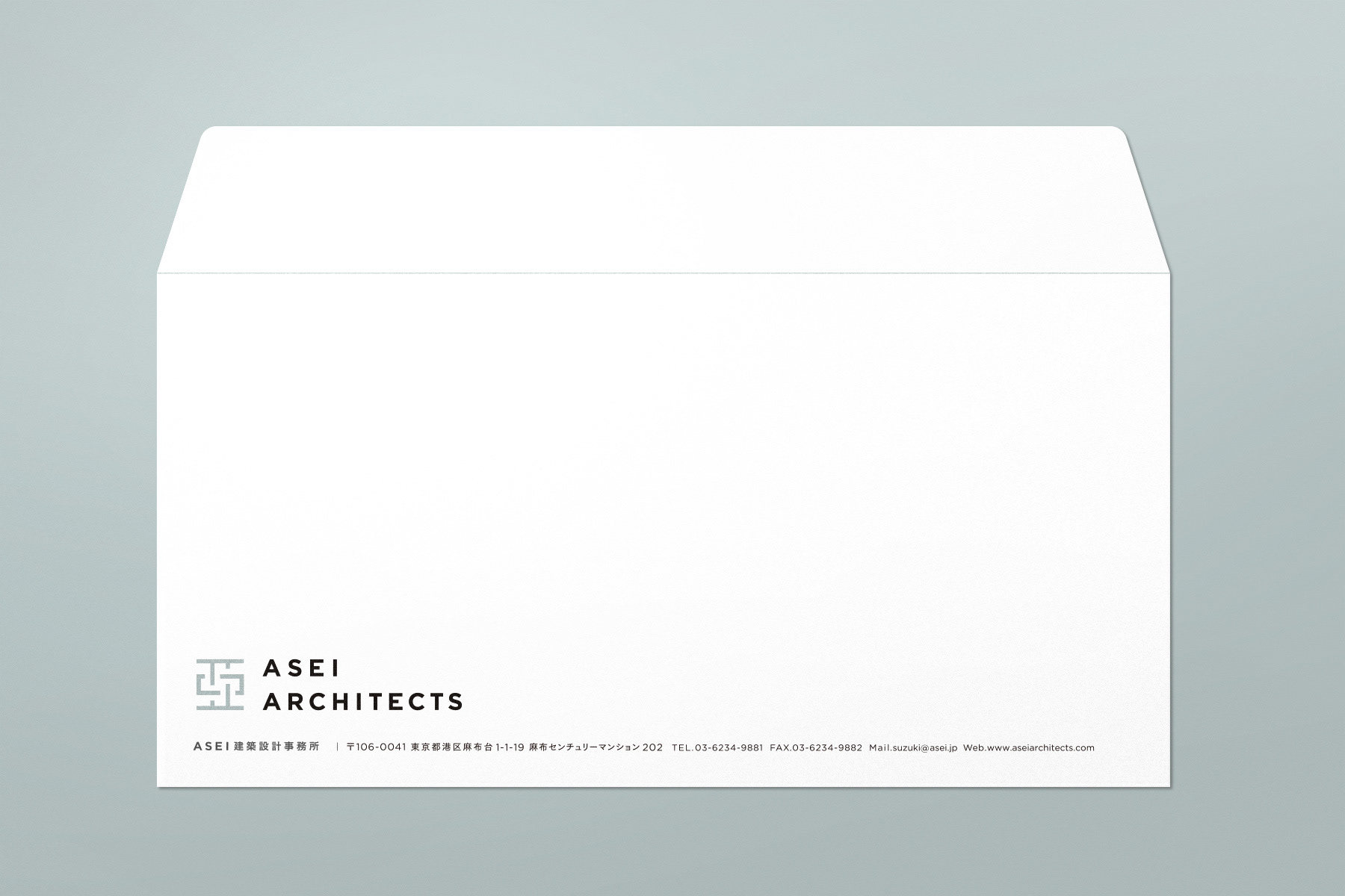
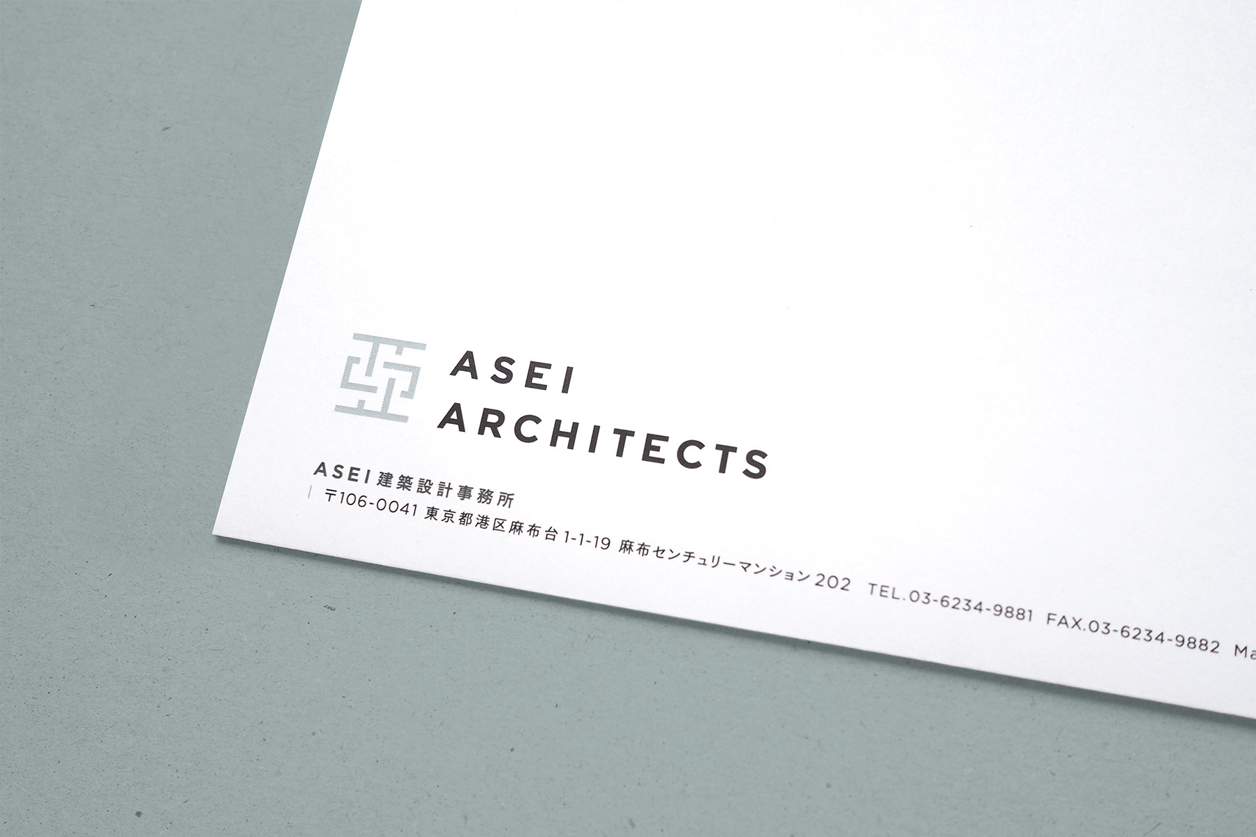
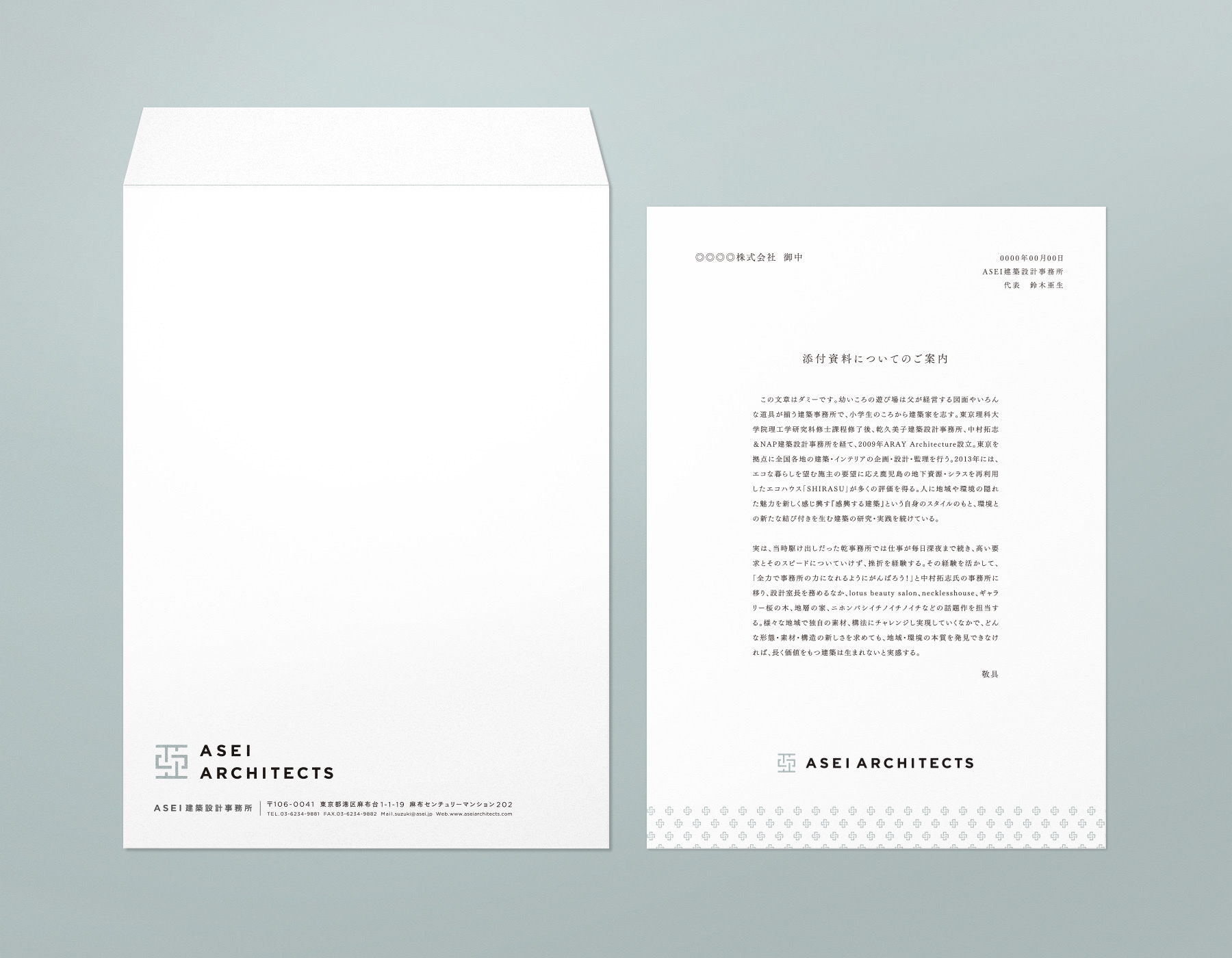
Client : ASEI建築設計事務所
Direction, Design : 藤田雅臣(tegusu Inc.)
Logo motion movie : 藏本優(tegusu Inc.)
Client : ASEI ARCHITECTS
Direction, Design : Masaomi Fujita (tegusu Inc.)
Logo motion movie : Yu Kuramoto(tegusu Inc.)