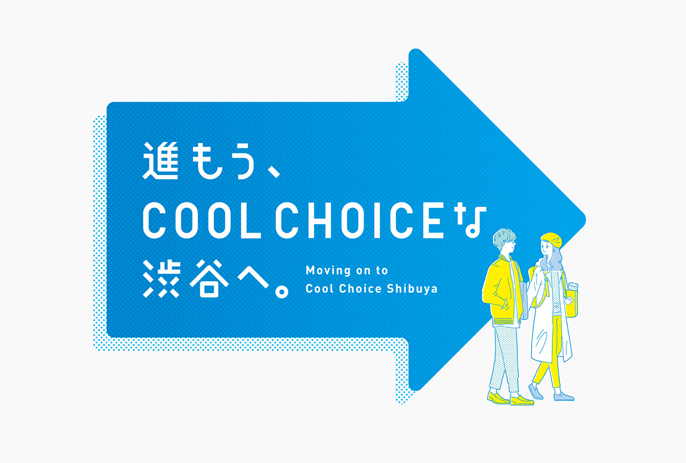
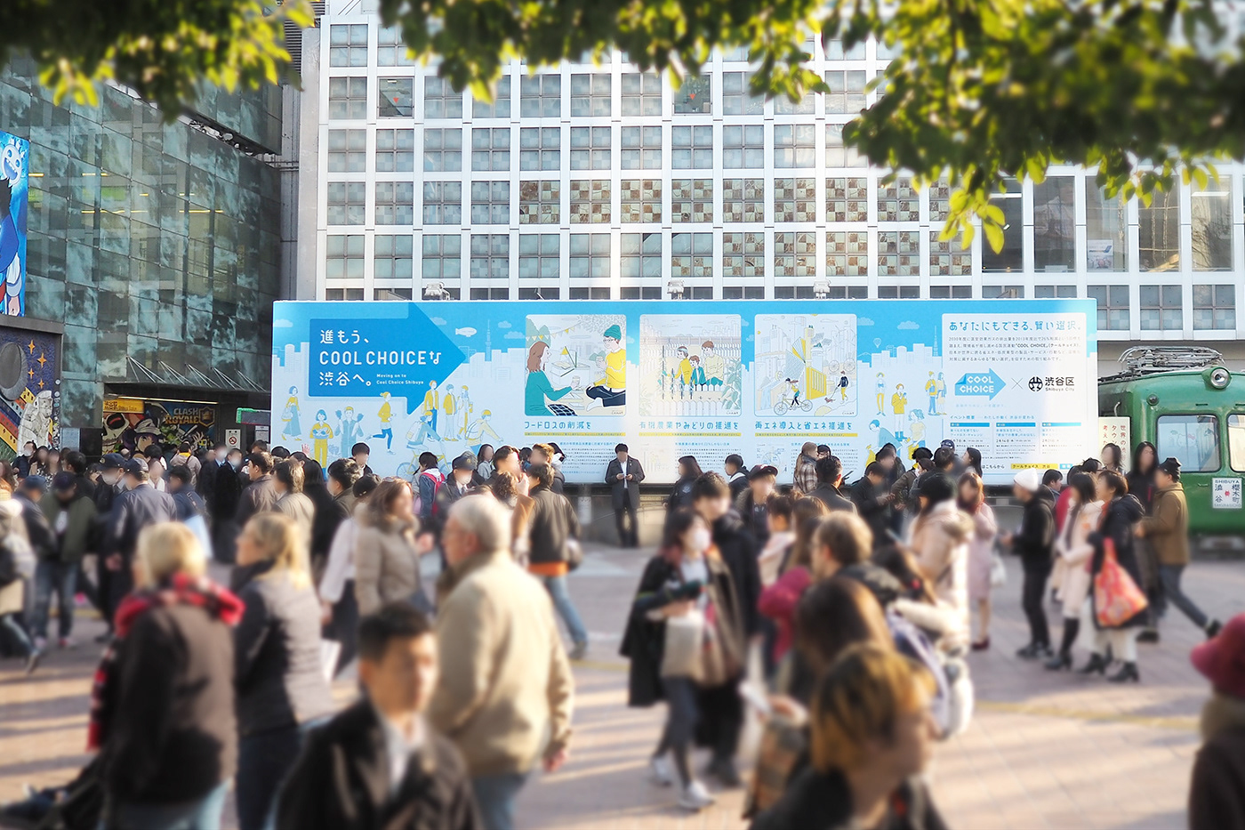
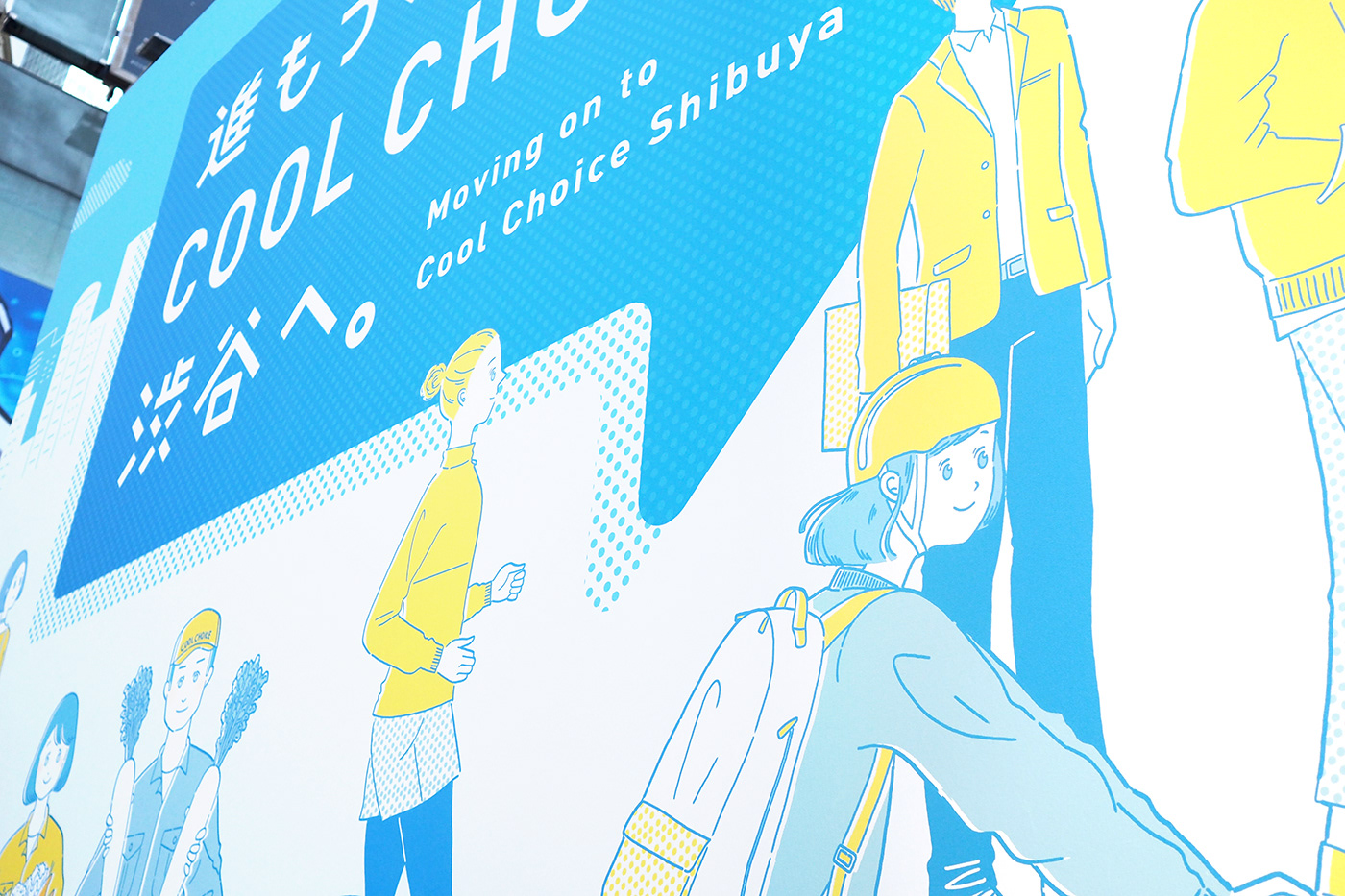
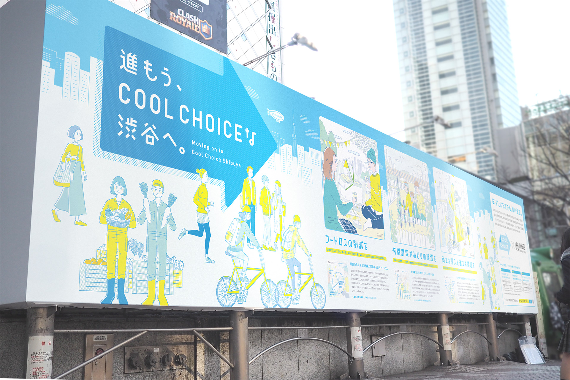
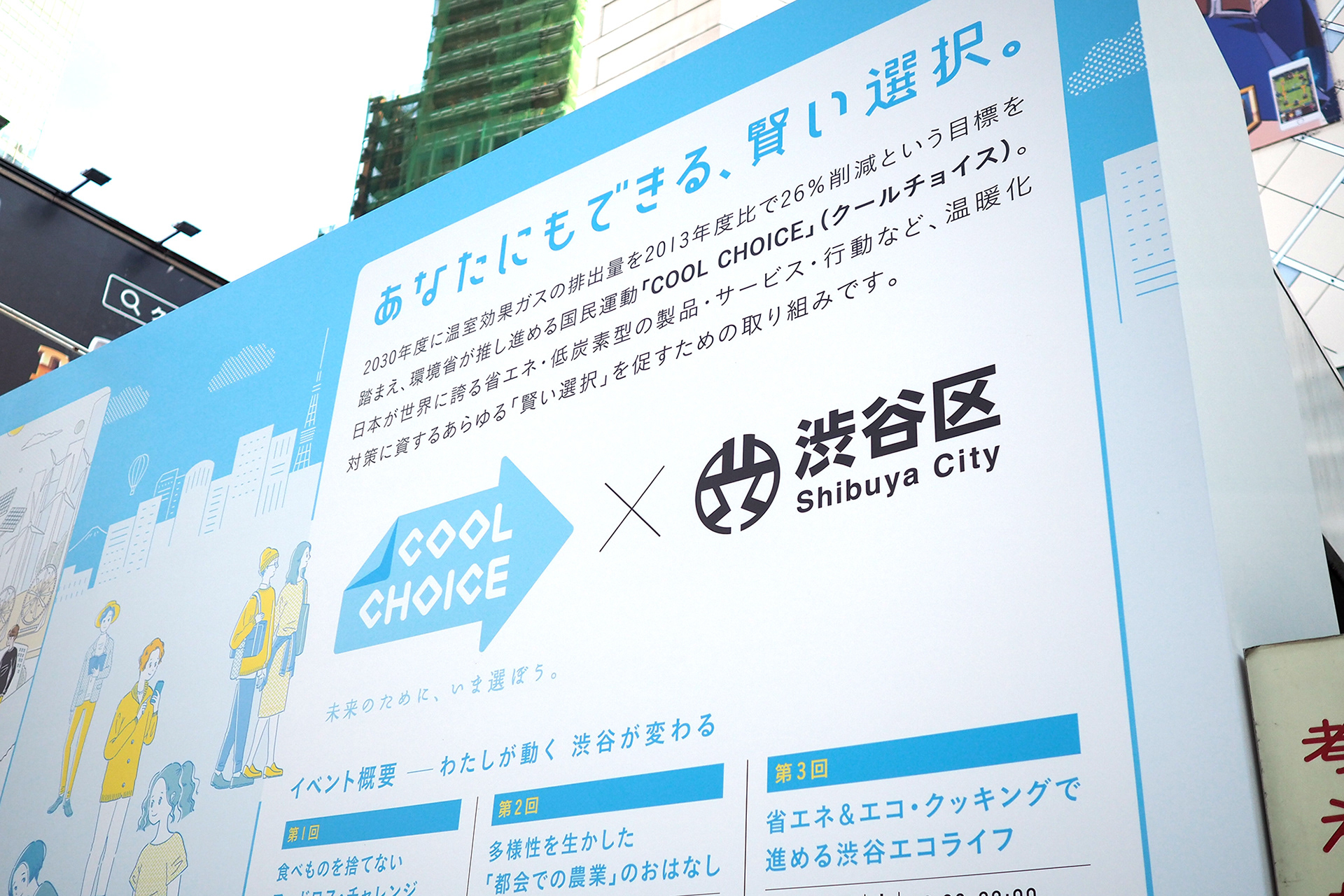
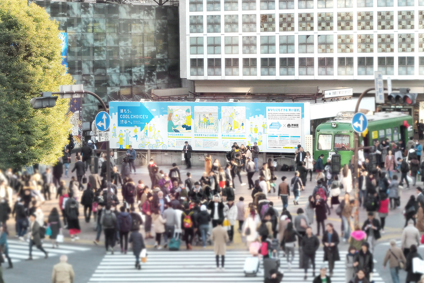
環境省が提唱する「COOL CHOICE」は、2030年に向けた温室効果ガスの排出量削減を目標に、私たちができる身近な行動から、製品・サービスに至るまで、温暖化対策のためのあらゆる「賢い選択」を提案する国民運動です。今回、東京都渋谷区が「COOL CHOICE」を啓発するための取り組みの一環で、渋谷ハチ公前のスペースで大型PR広告を掲出しています。
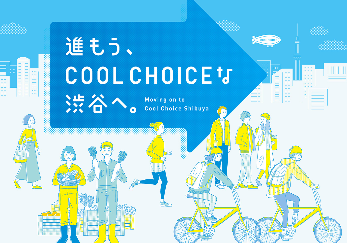
tegusuではこの広告の構成・ディレクション・キャッチコピーやデザインを担当しました。プロジェクトマネージメントはひとしずく株式会社が、イラストレーションは川添むつみさんが担当しています。
“COOL CHOICE” is a national movement advocated by the Ministry of the Environment. It proposes all the “smart choices” that we can make to combat global warming, with the aim of achieving the reduction of greenhouse gas emissions for 2030. These choices include choices for things we can do on an everyday basis, as well as choices for products and services. Currently, the Shibuya Ward in Tokyo is displaying a large-sized advertisement in an area in front of the Statue of Hachiko as part of their effort to promote “COOL CHOICE.”
tegusu handled the layout, direction, copywriting and designing of this advertisement. Hitoshizuku Inc. provided project management, and Mutsumi Kawazoe handled the illustrations.
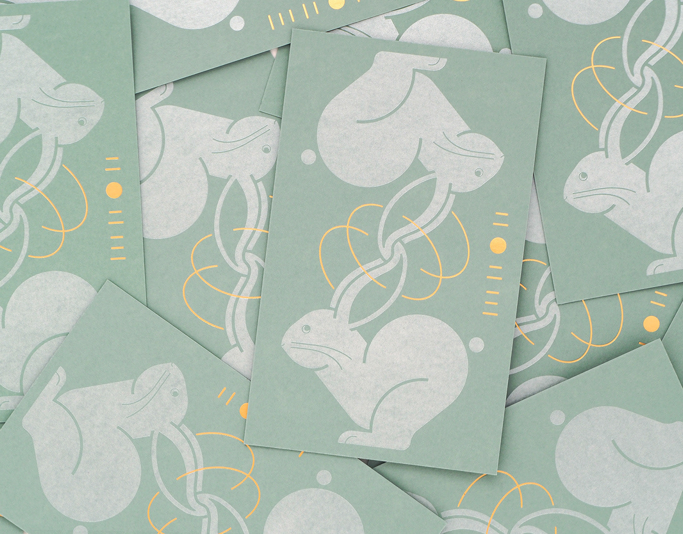
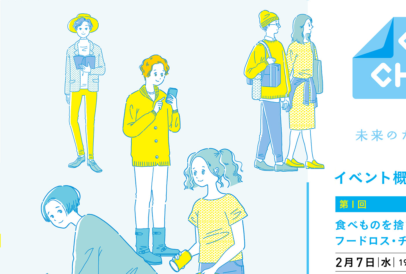
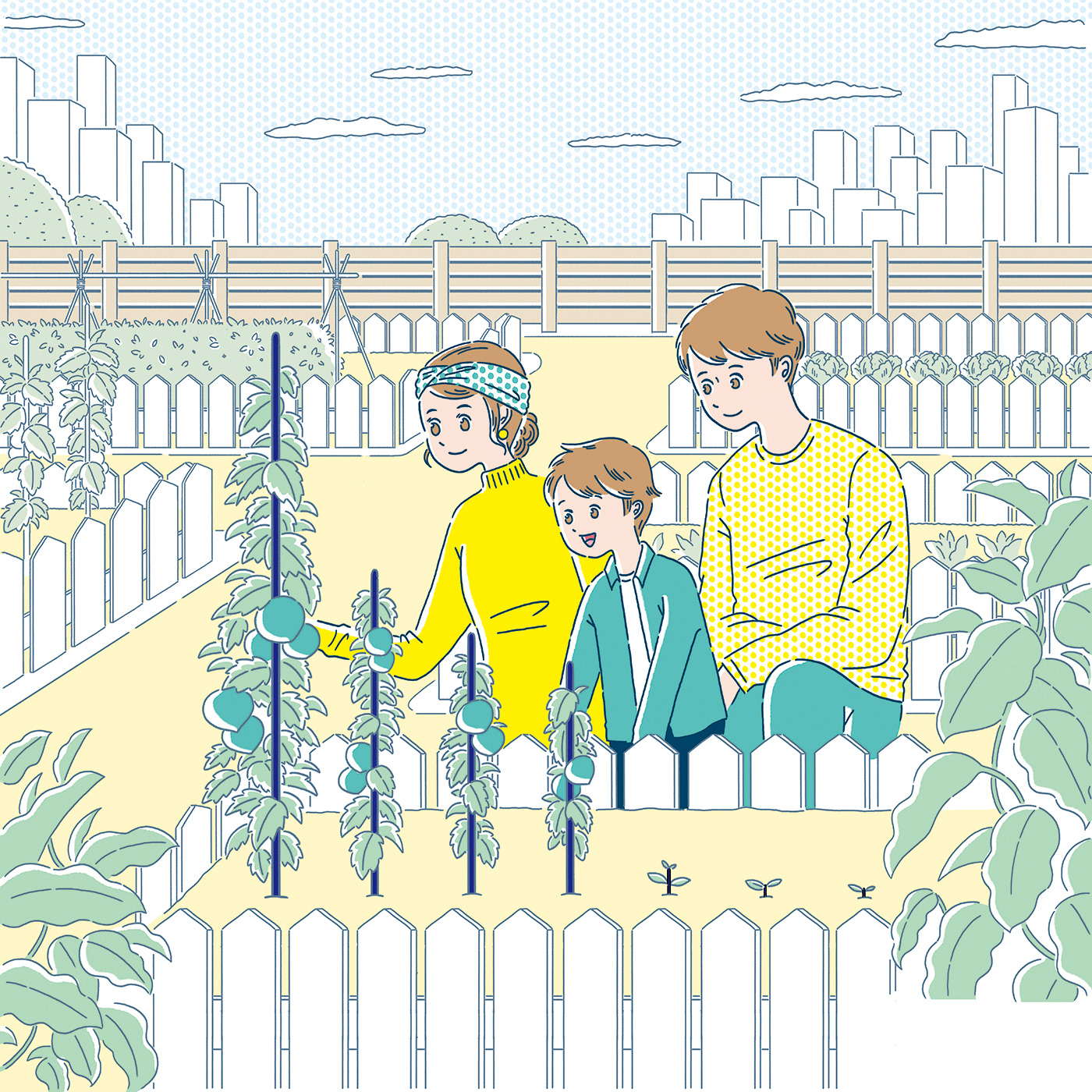
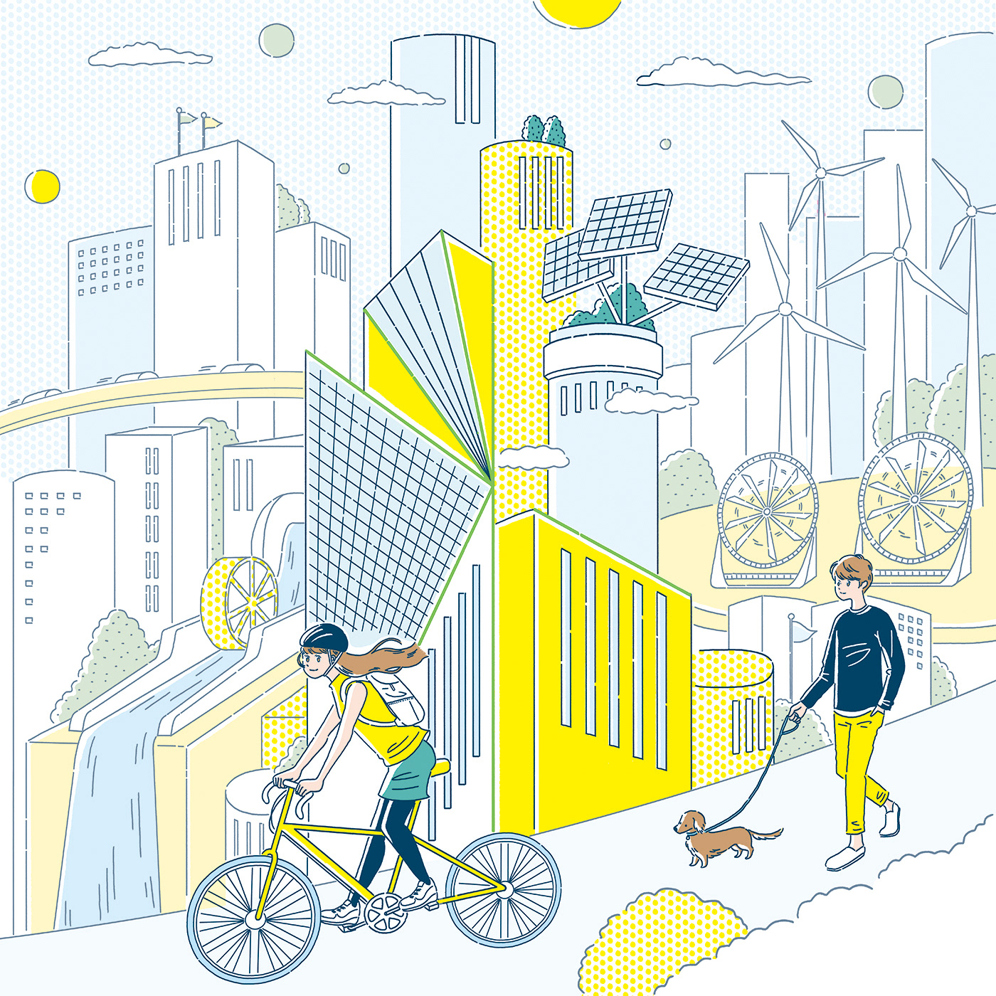
広告の中では「フードロス」「農業」「ダイベストメント」をテーマに、各テーマにおける現状の課題を表したグラフと、課題に対して私たちができる解決策=COOL CHOICEを、イラストレーションと文章で提示しています。
このテーマを伝える手段として、ひとしずく株式会社が考案した「CHART project」が使用されています。「CHART project」とは、社会課題のチャート(グラフ)をアート作品に変えて伝えていく活動であり、各テーマに沿った三つのイラストレーションも、チャートの線を生かしながら、課題が解決されていく未来のイメージが描かれています。
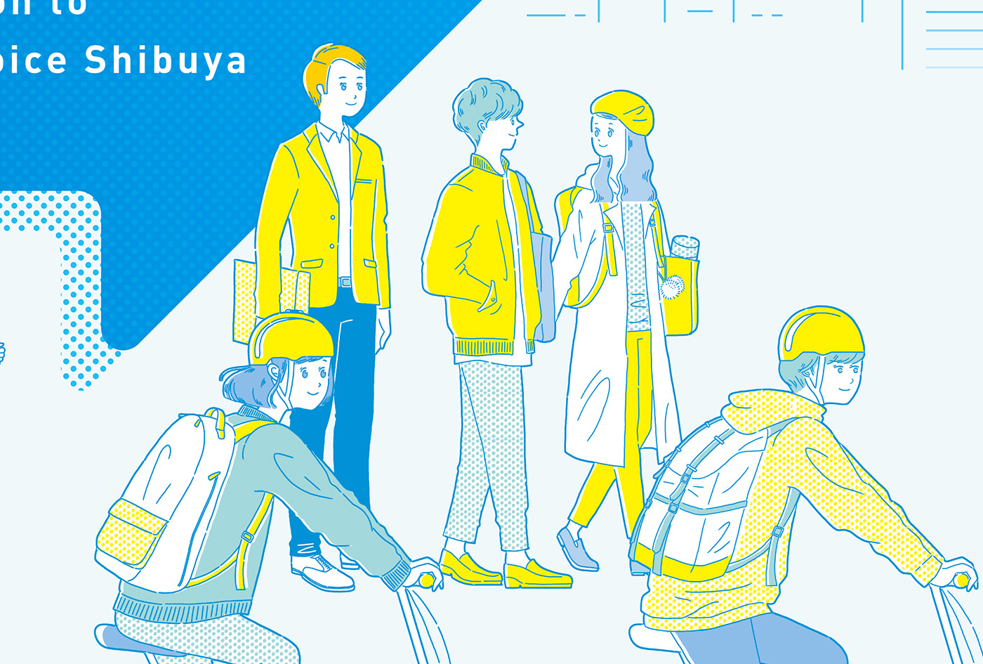
また広告には「COOL CHOICE」のテーマカラーの青や、ロゴに使用されている矢印を象徴的に用い、渋谷の街の人々が各々に「COOL CHOICE」な取り組みをしている様子を、明るい色彩で描いています。
With the themes of “food loss,” ”agriculture,” and “divestment,” this advertisement shows the graphs indicating issues with the current situation of each theme, and solutions for the issues that we can provide (= COOL CHOICE) are presented in illustrations and writing.
As a means of promoting awareness regarding these themes, “CHART project” is used. “Chart project” was launched by Hitoshizuku Inc., and it is an activity transforming charts (graphs) of social issues into artwork for the purpose of raising awareness. Three illustrations were created based on the themes, and in these illustrations the lines of the charts are used effectively, creating an image of the future where the issues are resolved.
Blue, the theme color of “COOL CHOICE,” and the arrow which appears in the logo are also used symbolically in the advertisement. It illustrates people in Shibuya doing their share of the “COOL CHOICE” effort in bright colors.

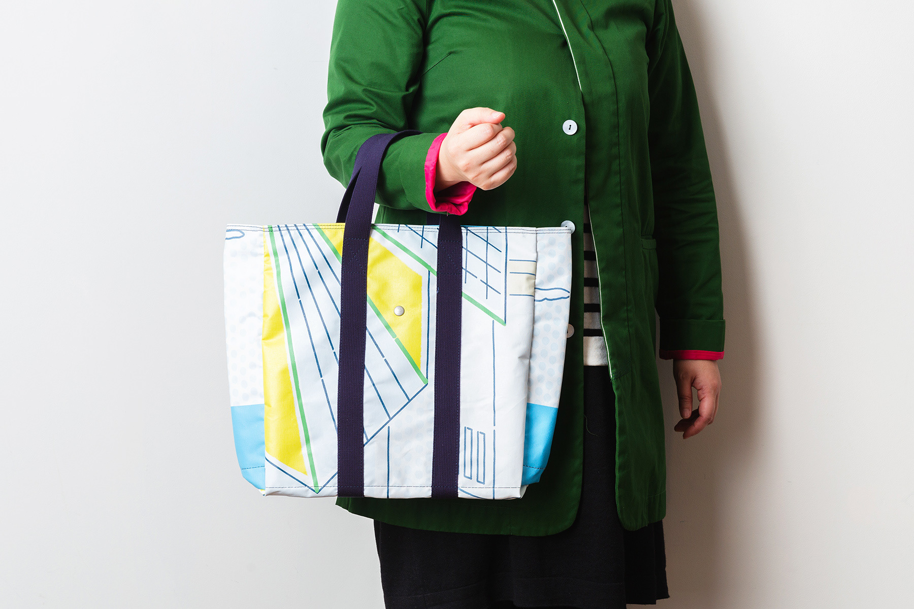
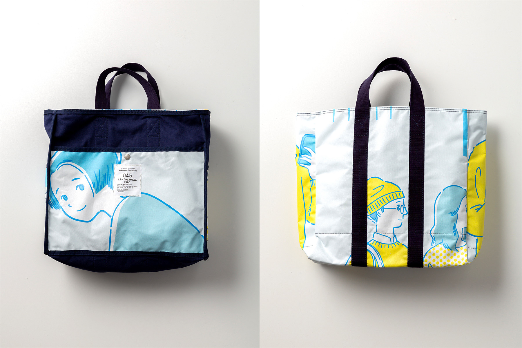
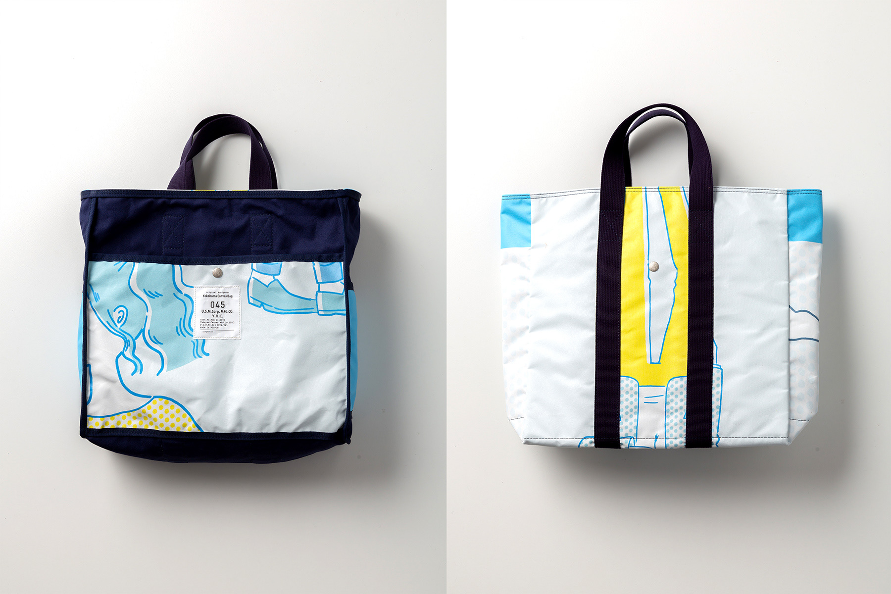
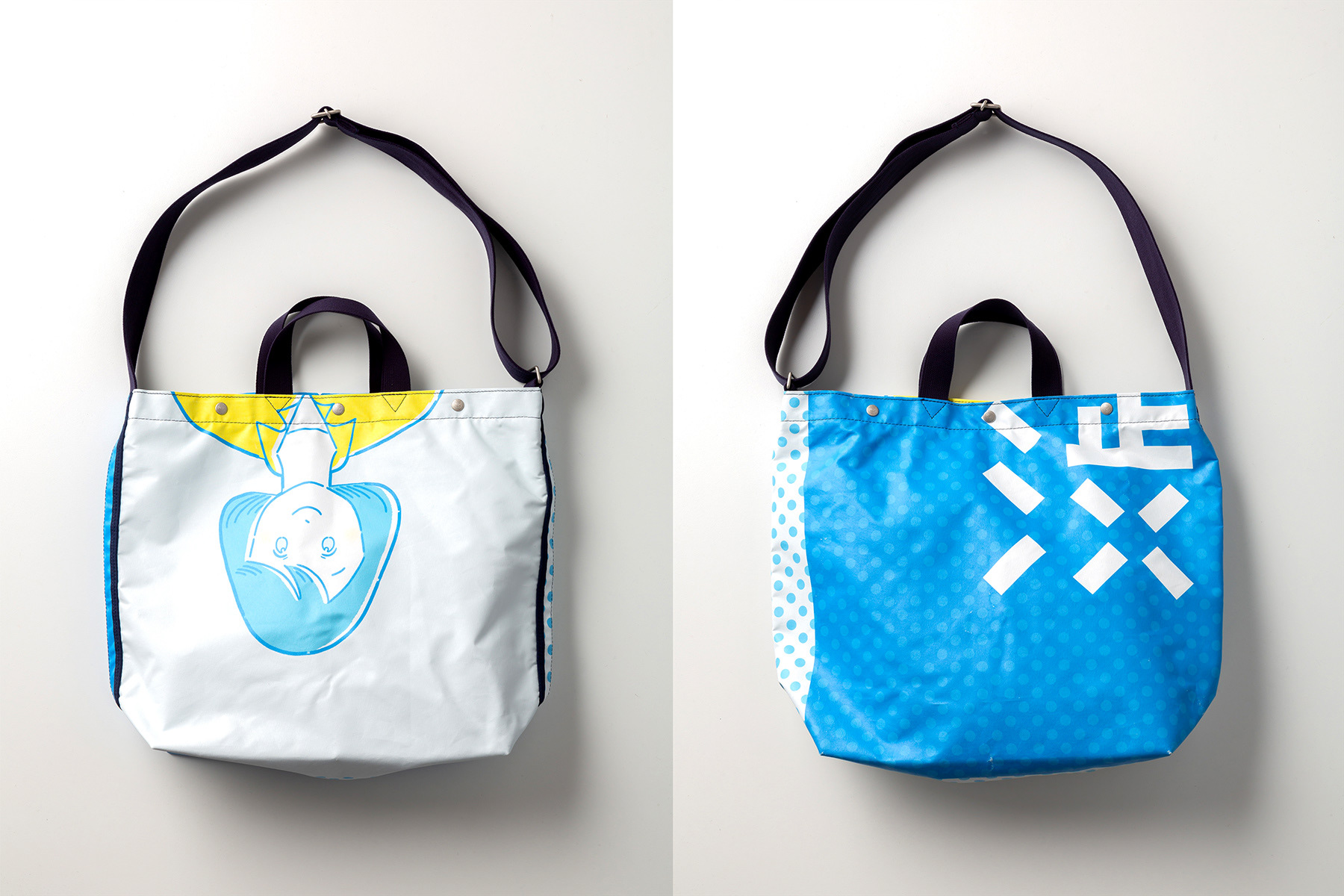
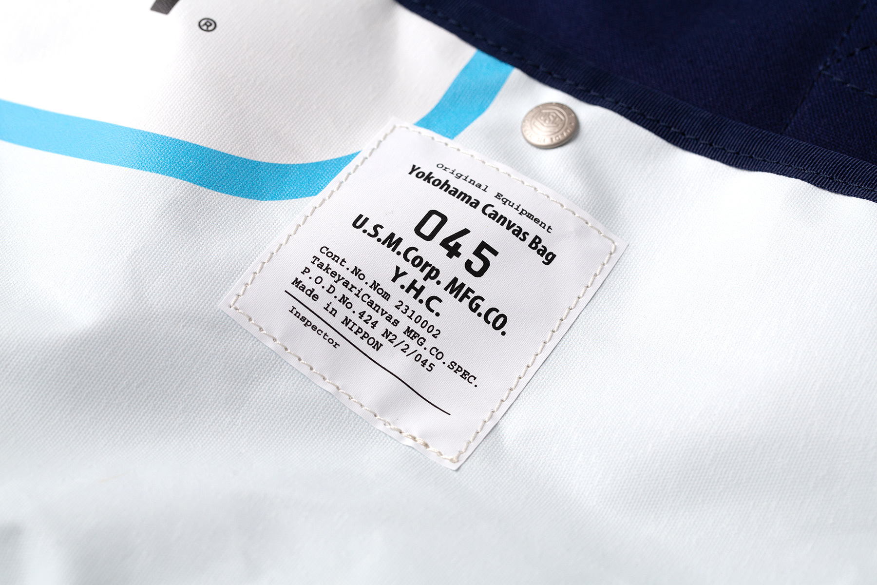
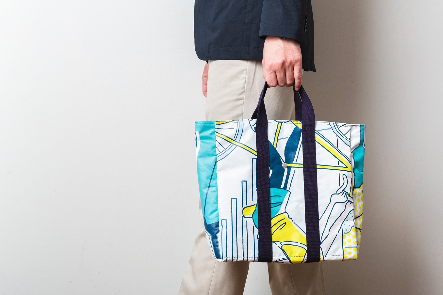
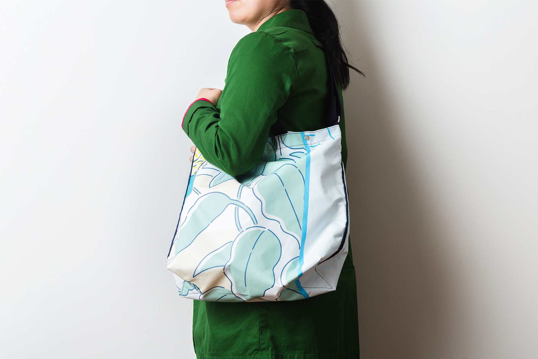
またこの大型広告は、41種類のリサイクルバッグとして生まれ変わりました。「広告幕は、掲出期間が終わると破棄されるものですが、野外で使用されるため、防水、軽量かつ丈夫なもので、捨ててしまっては、もったいない」という想いから、ひとしずく株式会社の取り組みとして製品化。「横浜帆布鞄」とのコラボ商品として、世界に一つのバッグとなりました。
Besides, This advertisement was reincarnated to 41 different designs of bags in collaboration with Yokohama Canvas Bag. The streamer for advertisement is usually discarded when the posting period ends, but this material is waterproof, sturdy, light. because It is made for outdoor.
Thus the project team thought "Mottainai" about this matter, and they reincarnated the materials to only one bags in the world.

Client : 渋谷区
Project Management : ひとしずく株式会社
Direction, Design : 株式会社tegusu
Illustration : Mutsumi Kawazoe
Project Management : ひとしずく株式会社
Direction, Design : 株式会社tegusu
Illustration : Mutsumi Kawazoe
Production:ユー・エス・エム 株式会社
Client : Shibuya City
Project Management : Hitoshizuku Inc.
Direction, Design : tegusu Inc.
Illustration : Mutsumi Kawazoe
Project Management : Hitoshizuku Inc.
Direction, Design : tegusu Inc.
Illustration : Mutsumi Kawazoe
Production : U.S.M.Corporation
Thank you.