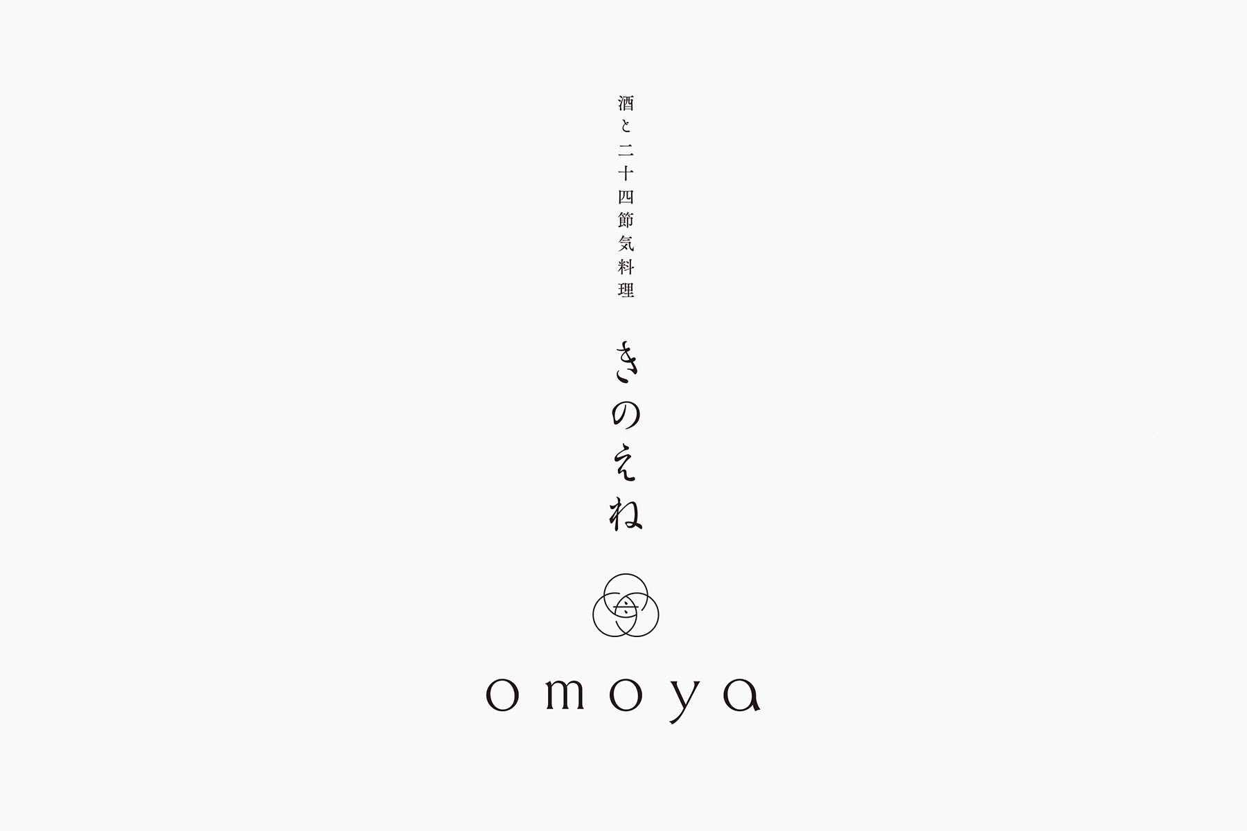
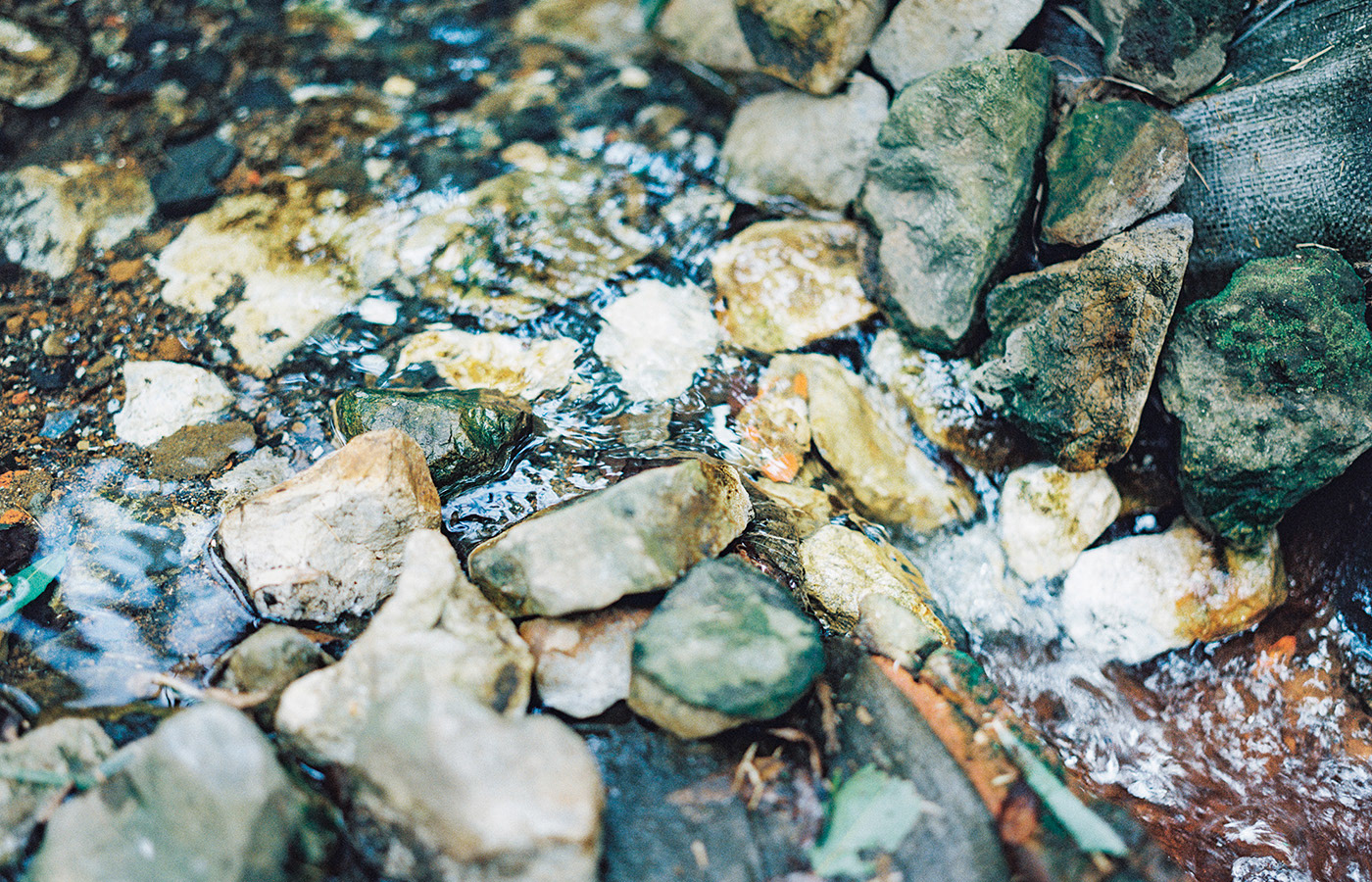
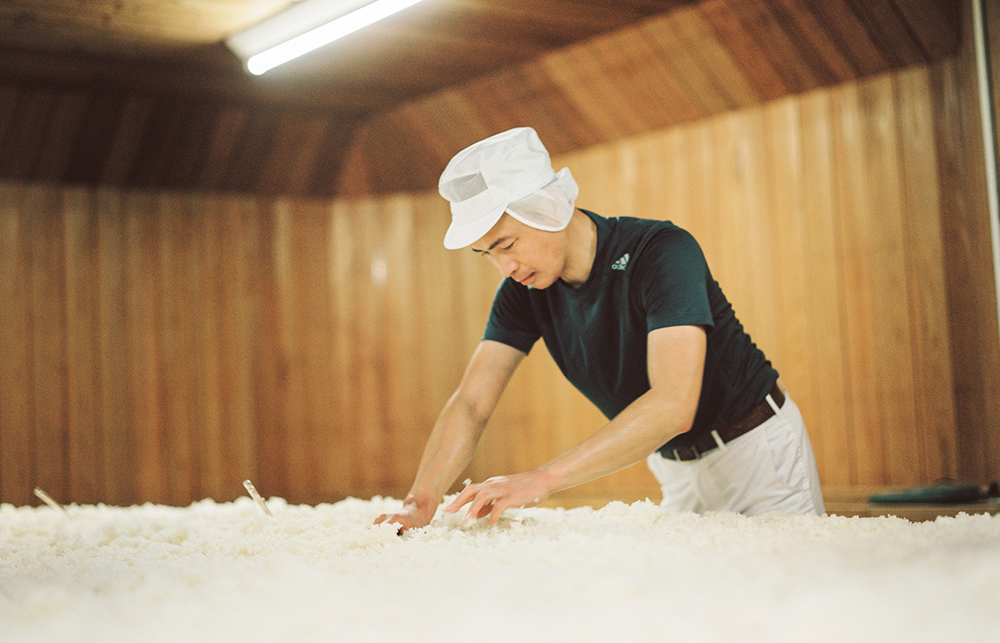
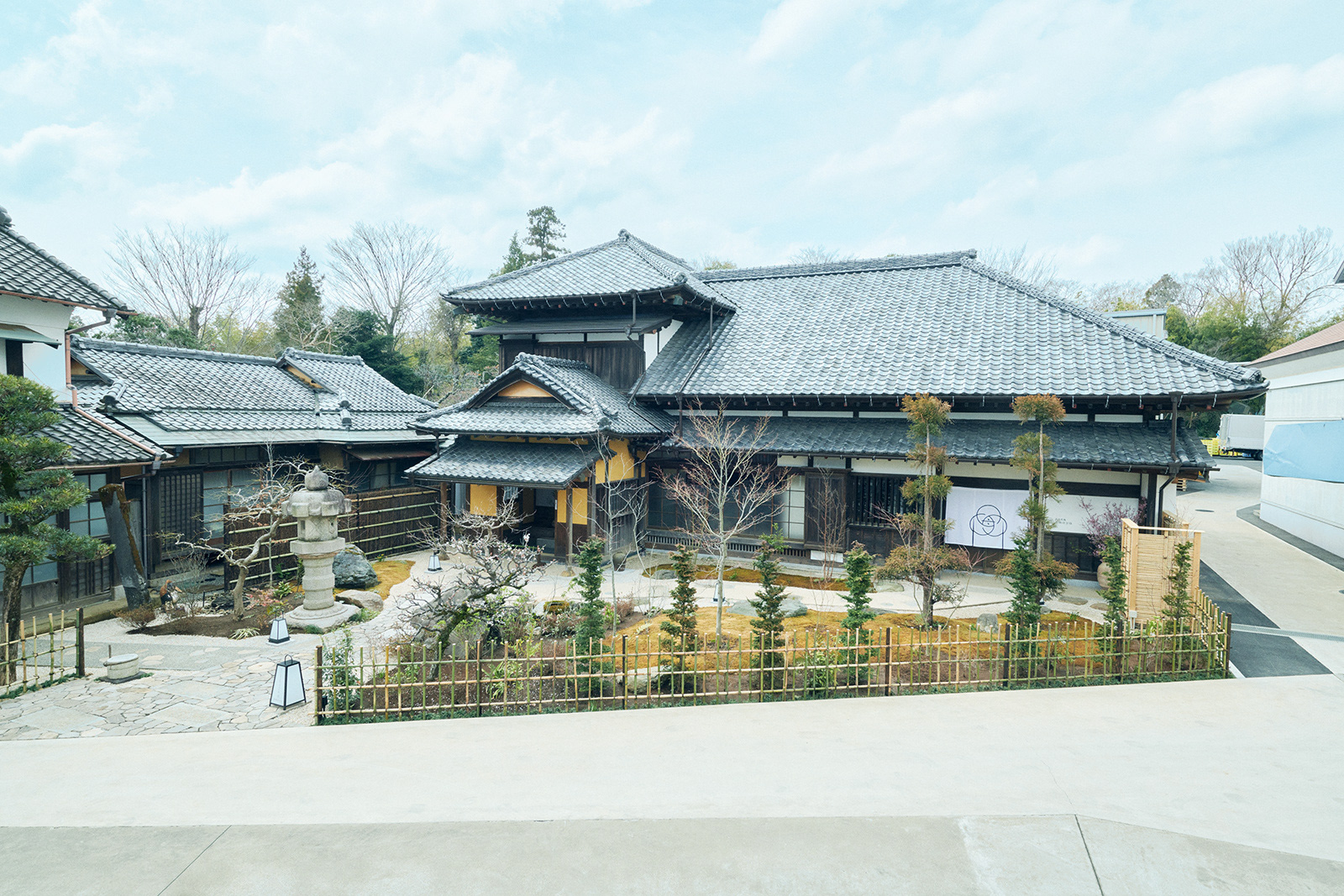
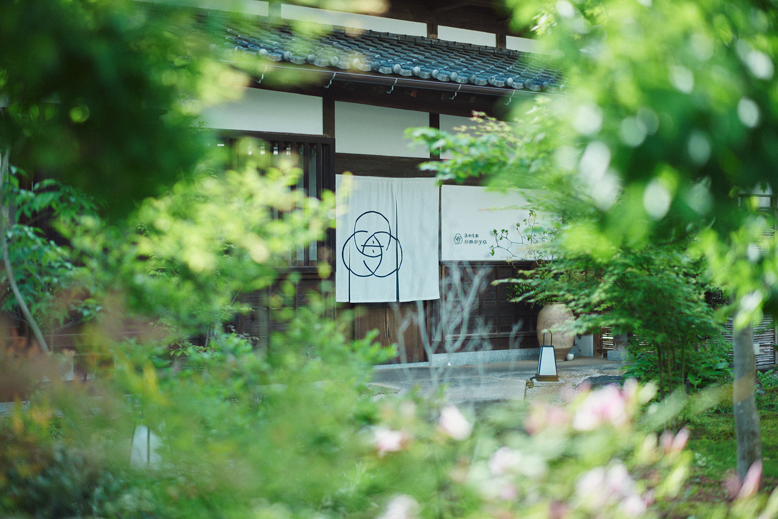
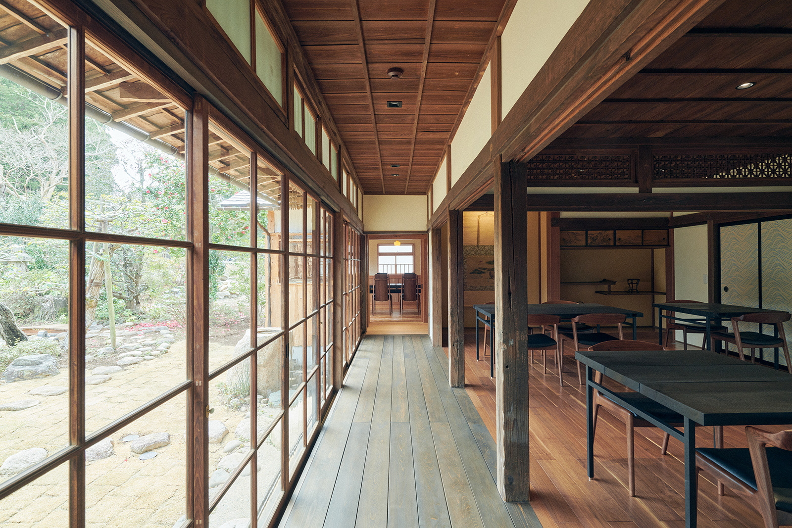
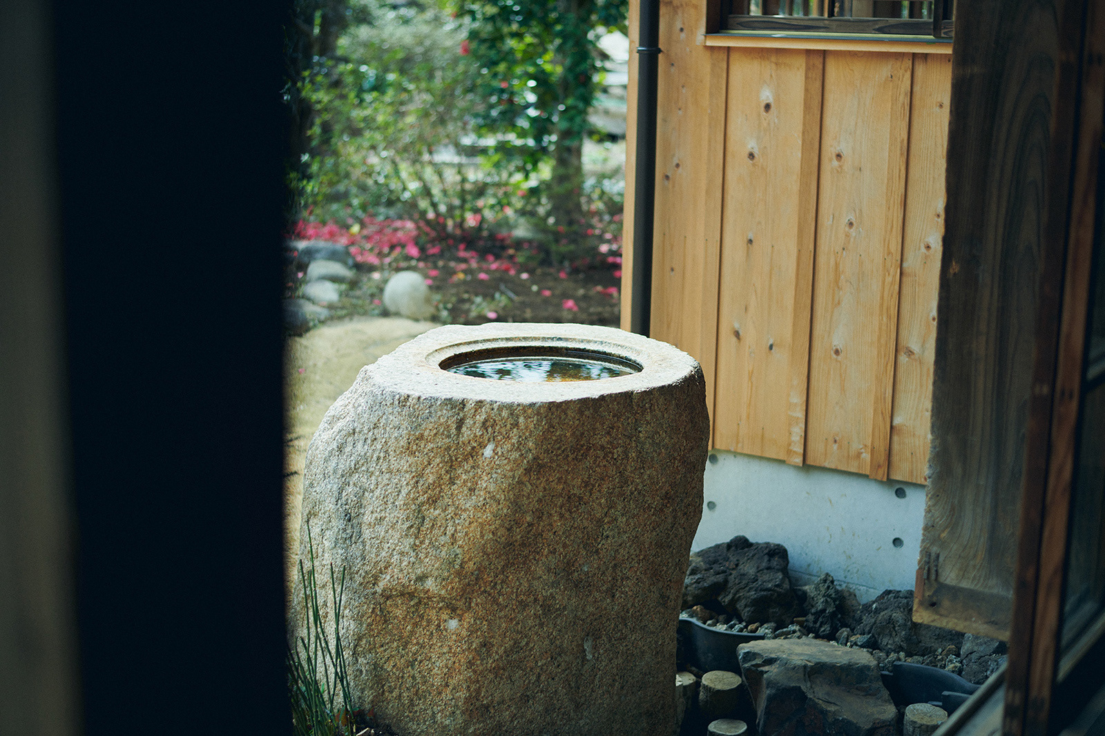
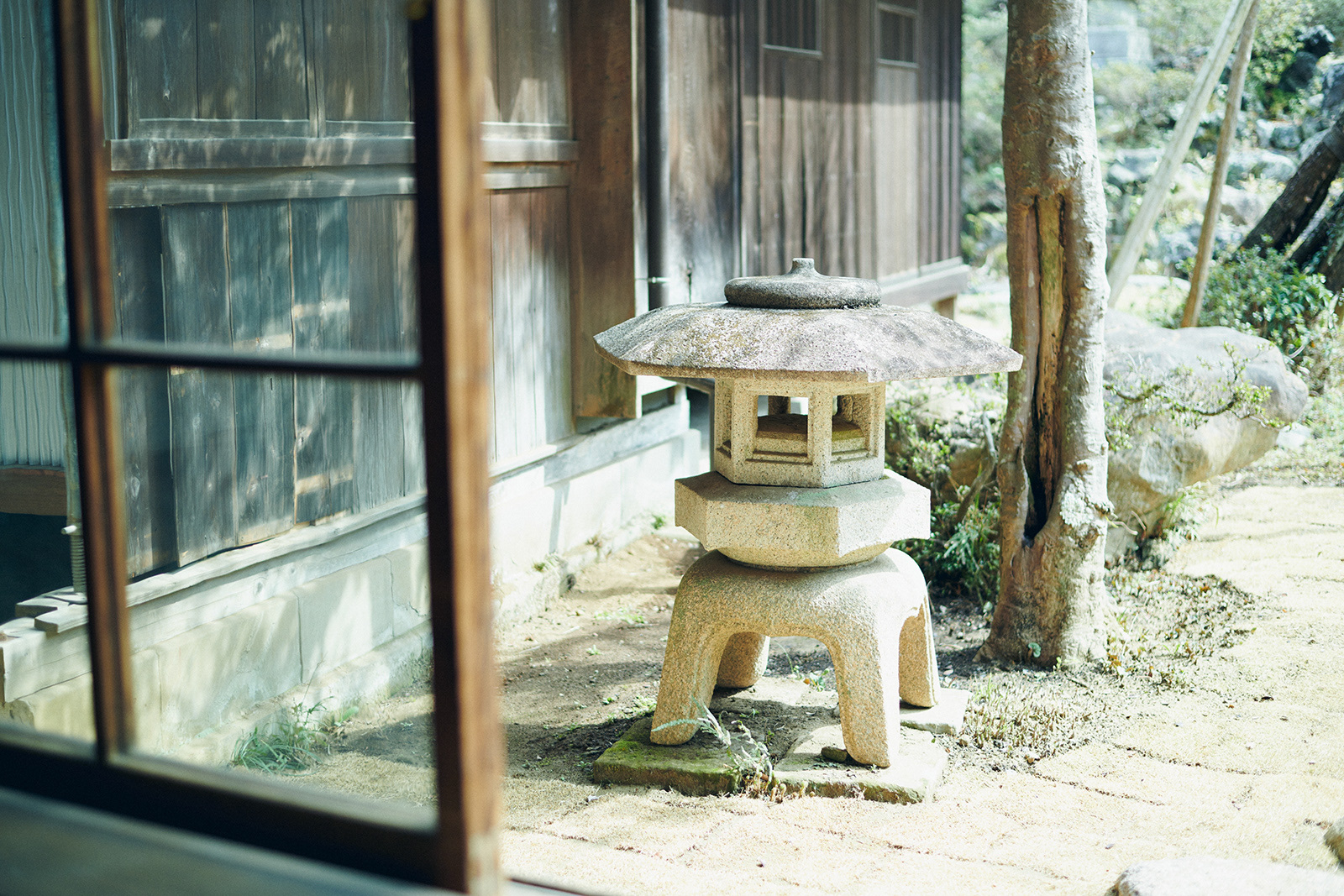
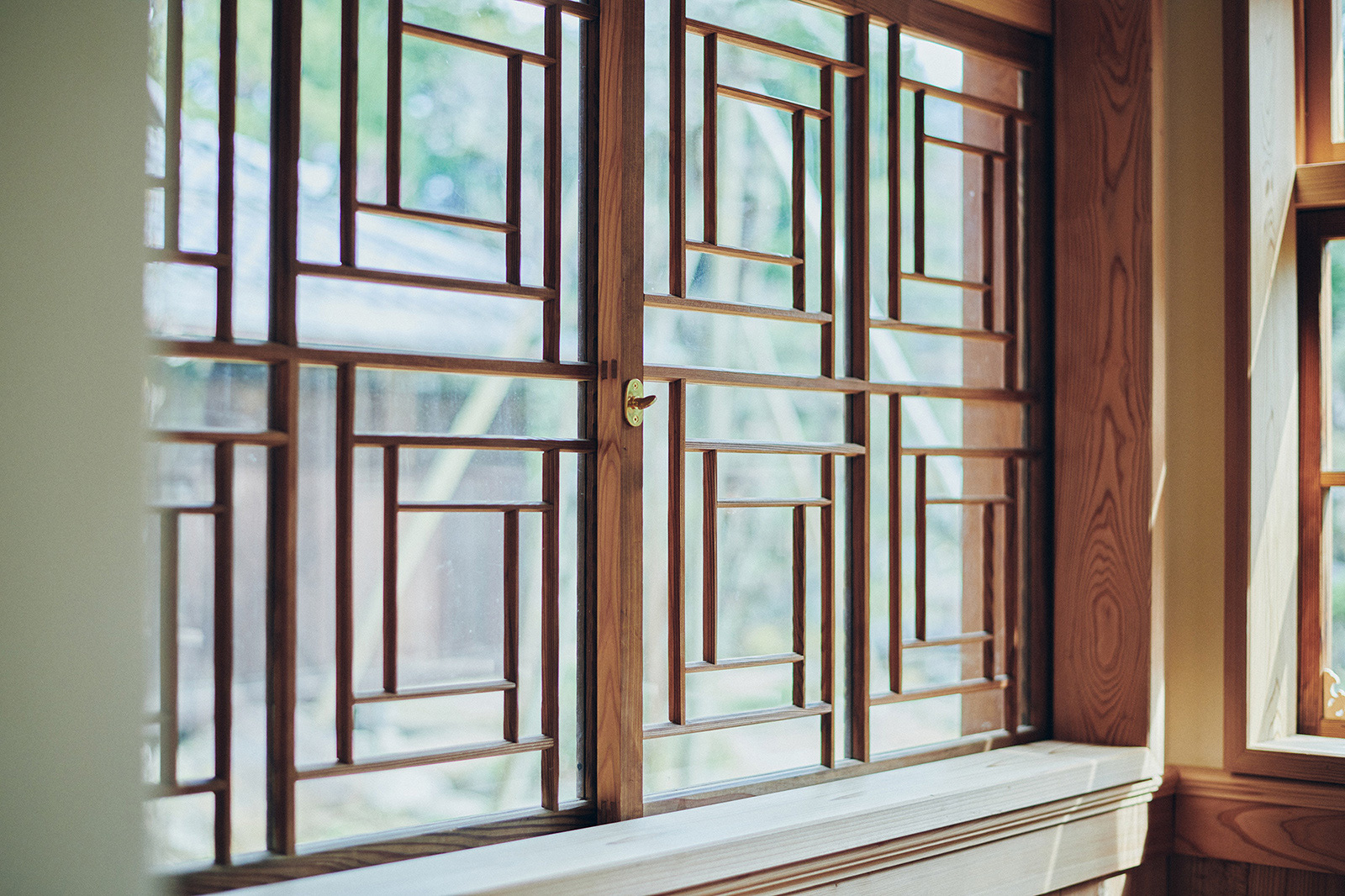
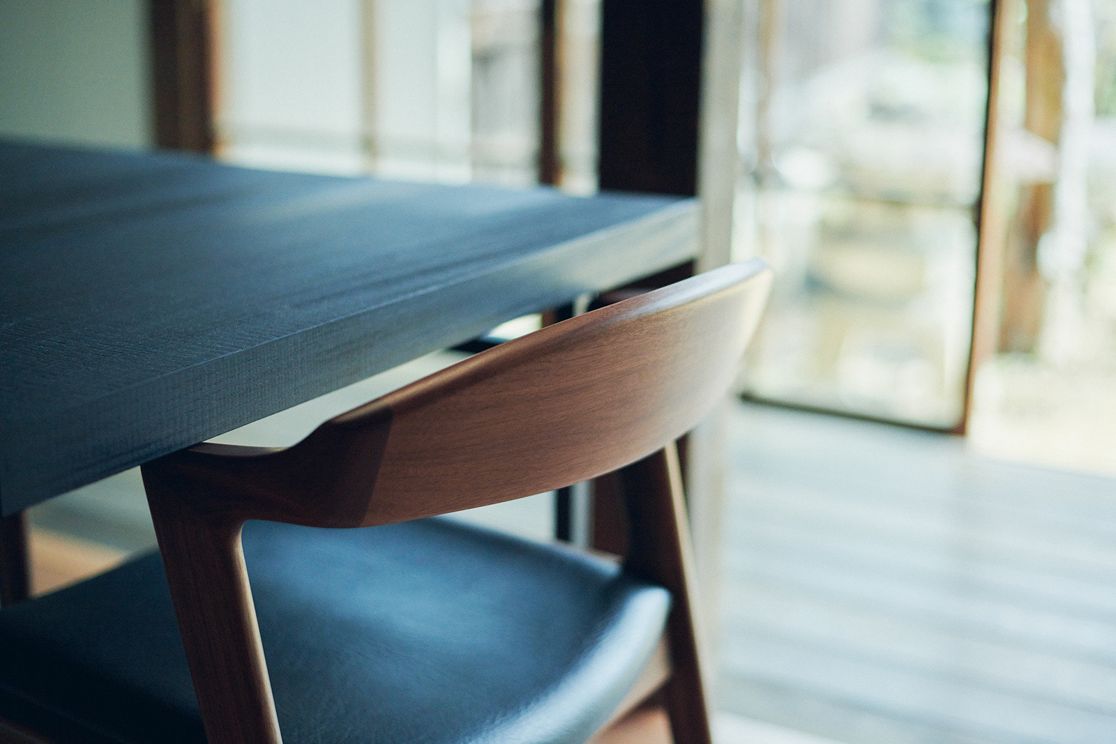
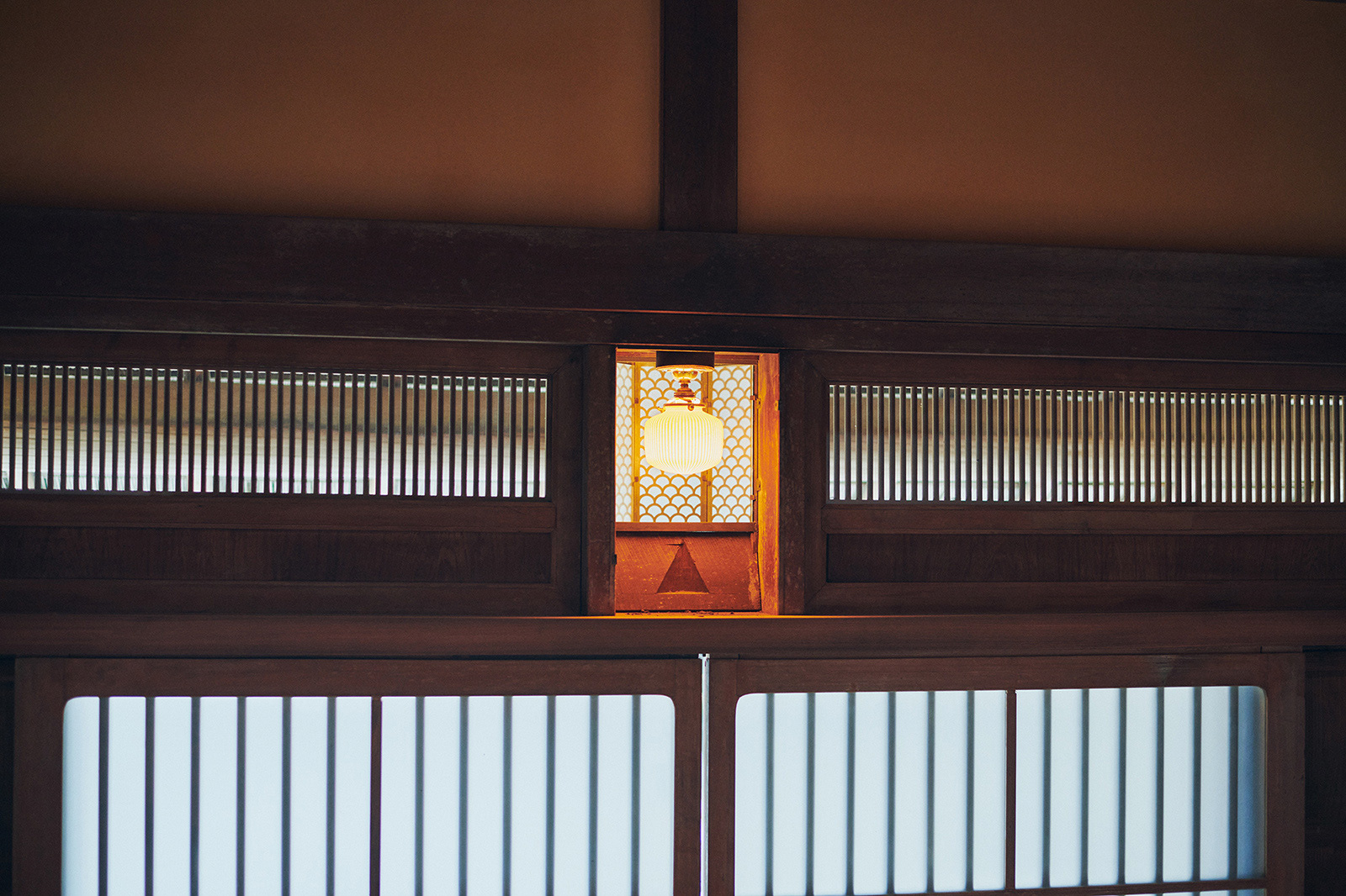
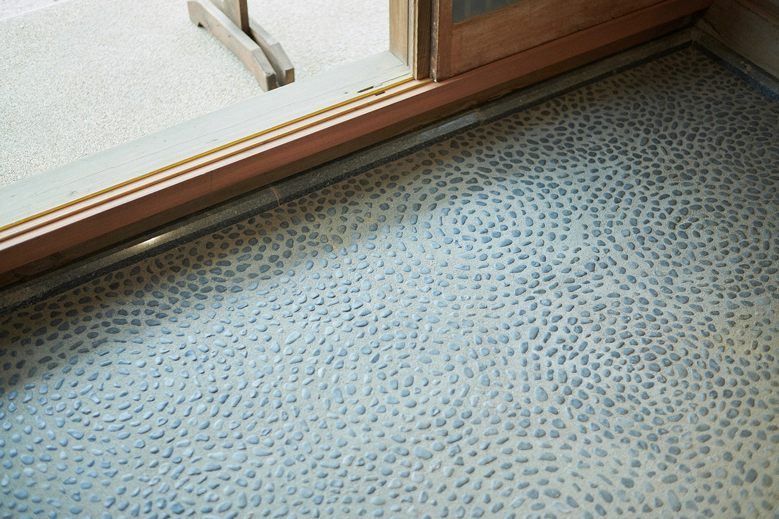
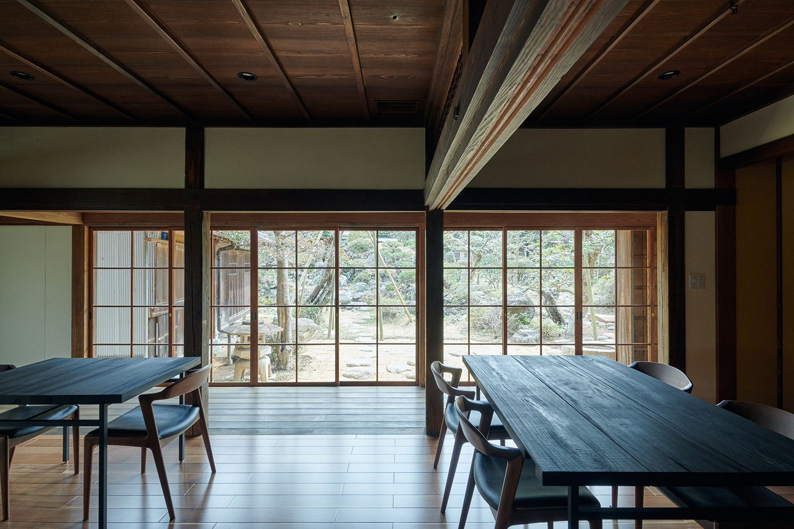
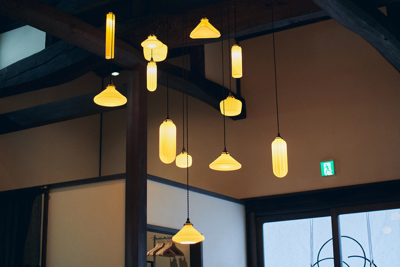
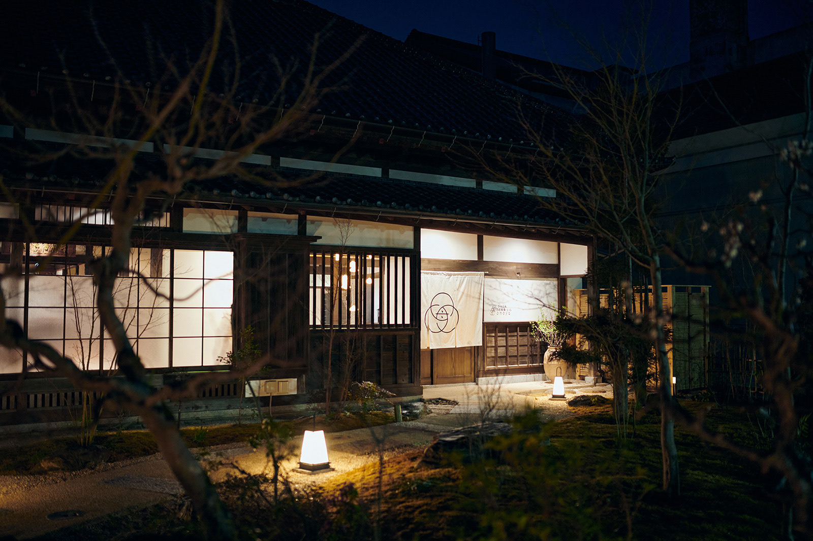
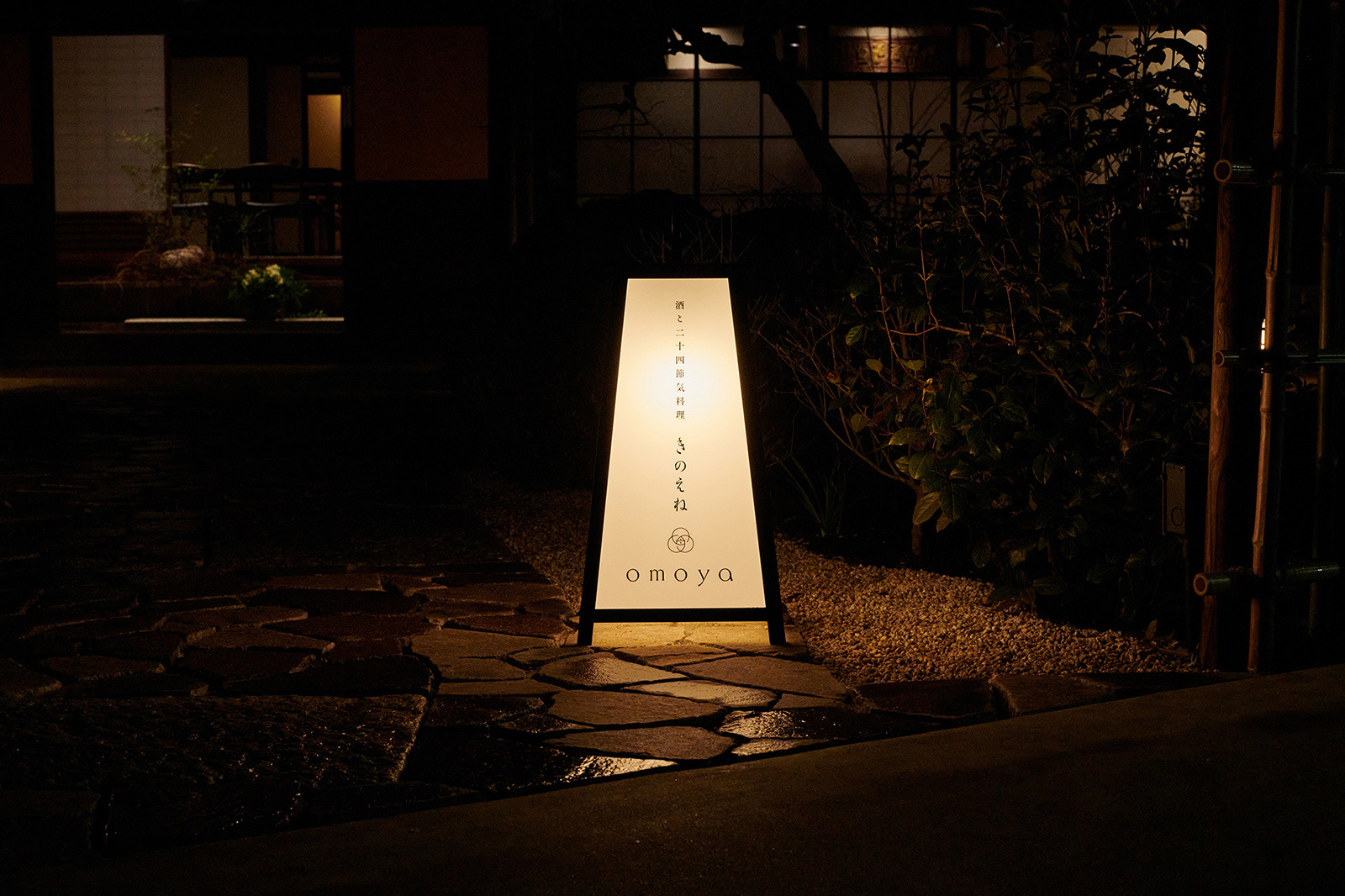
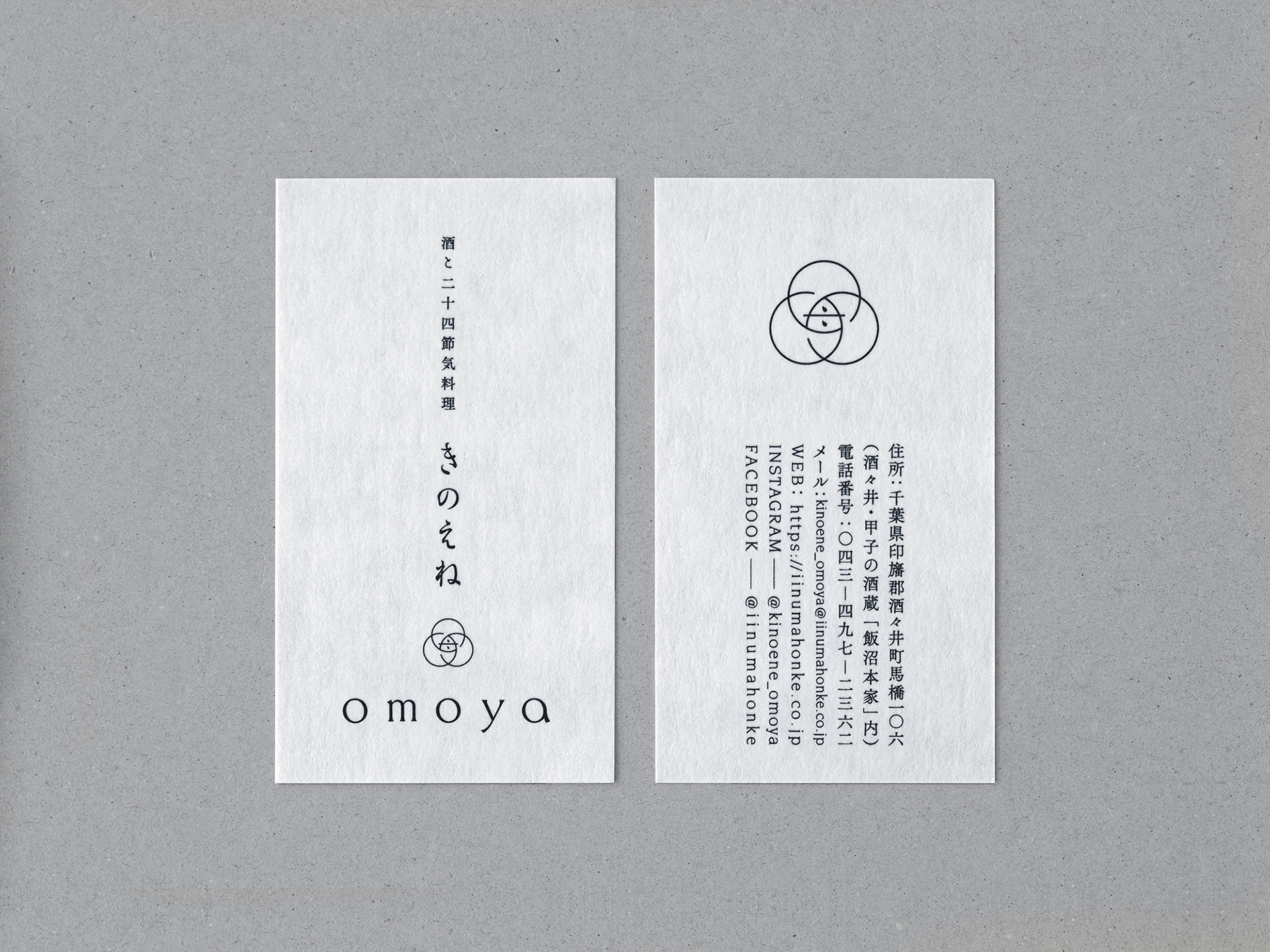
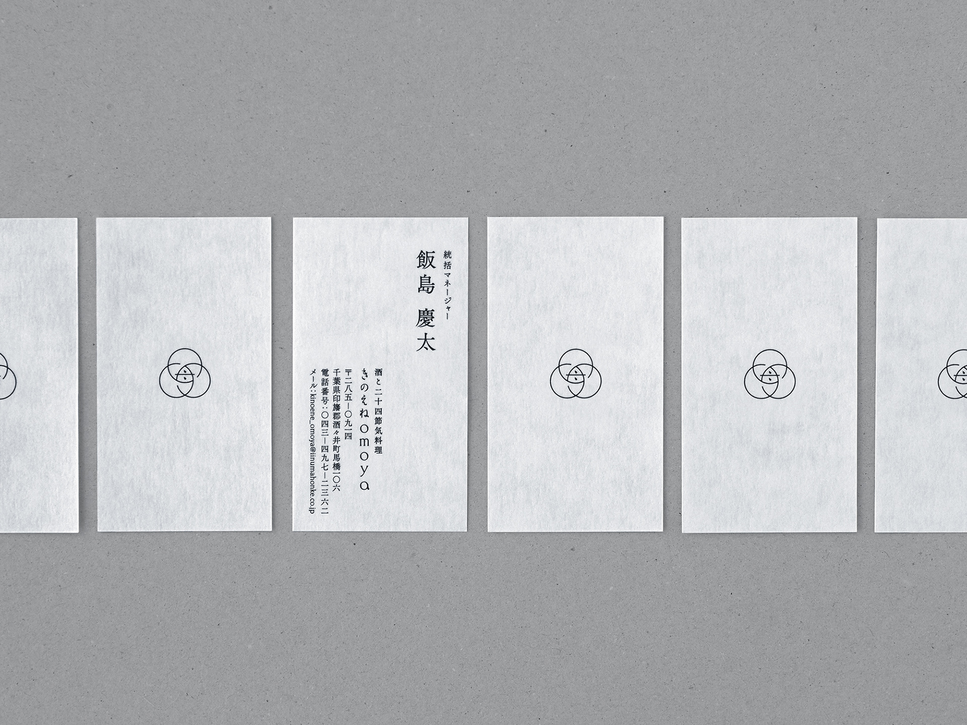
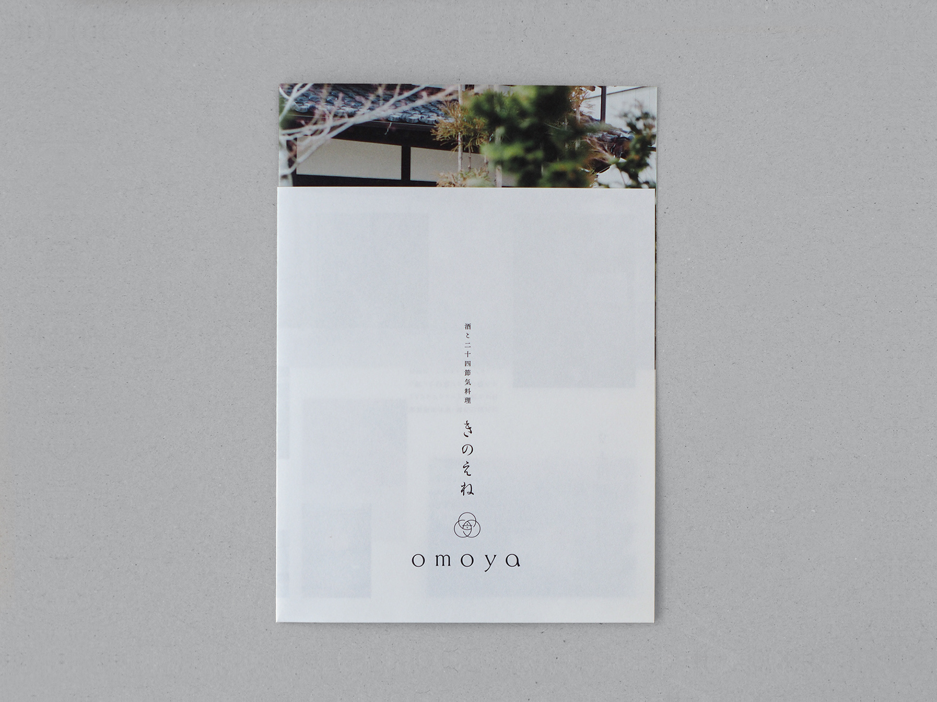
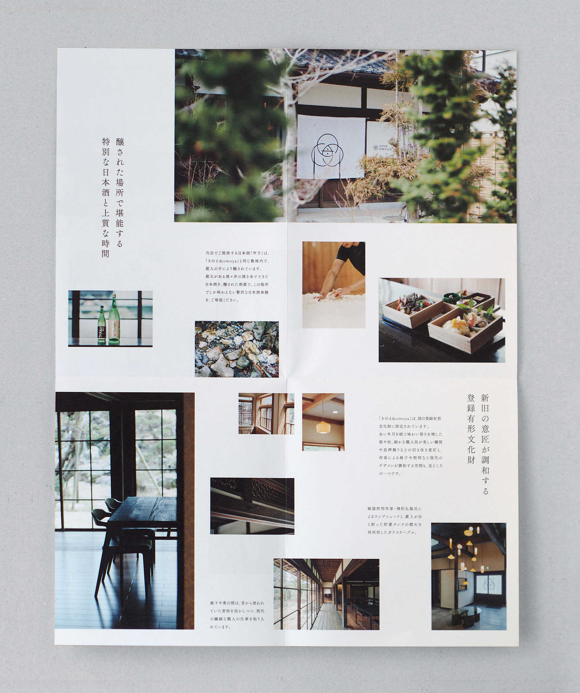
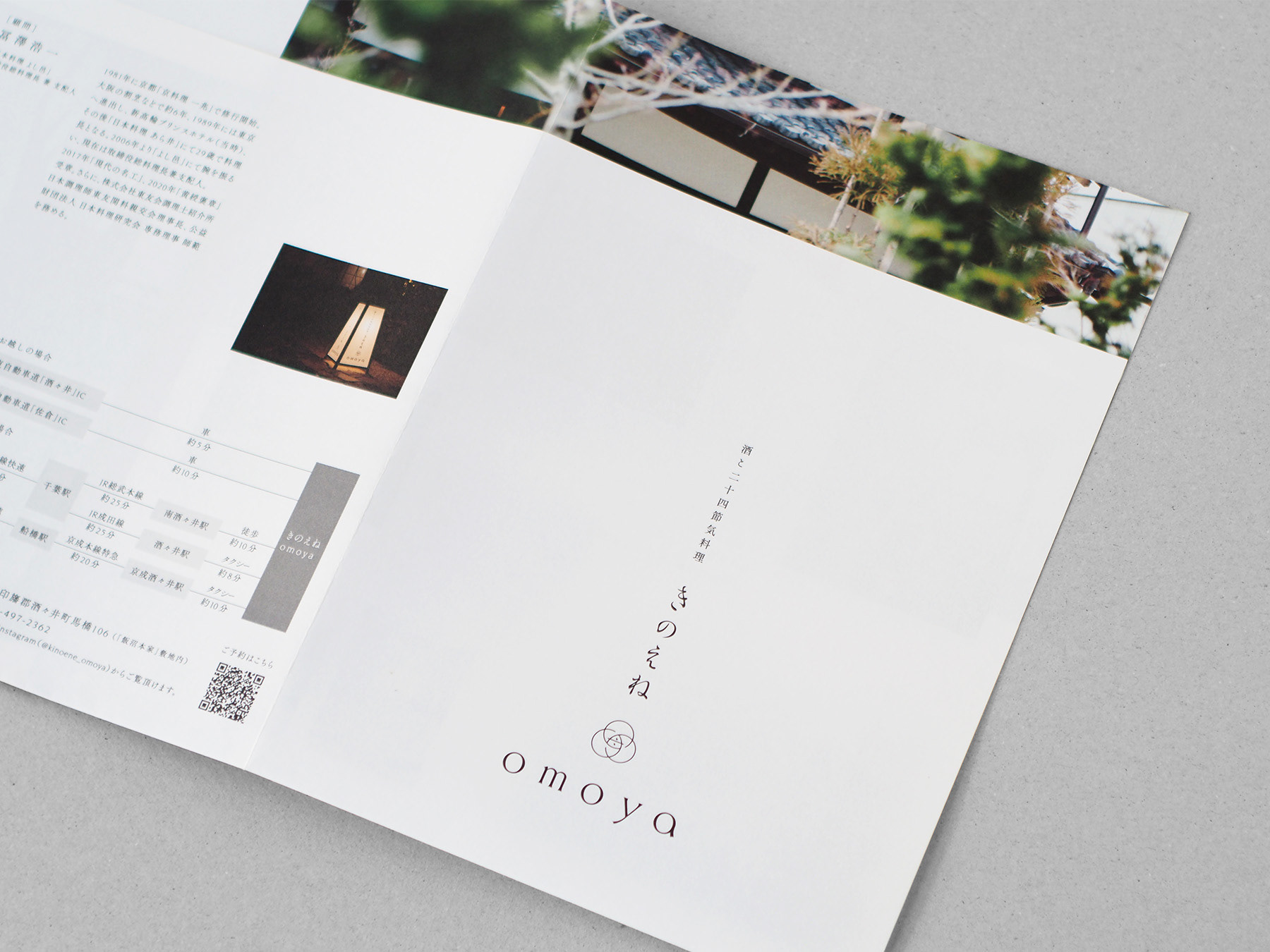
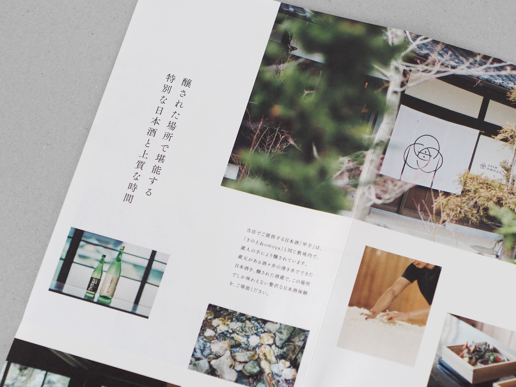
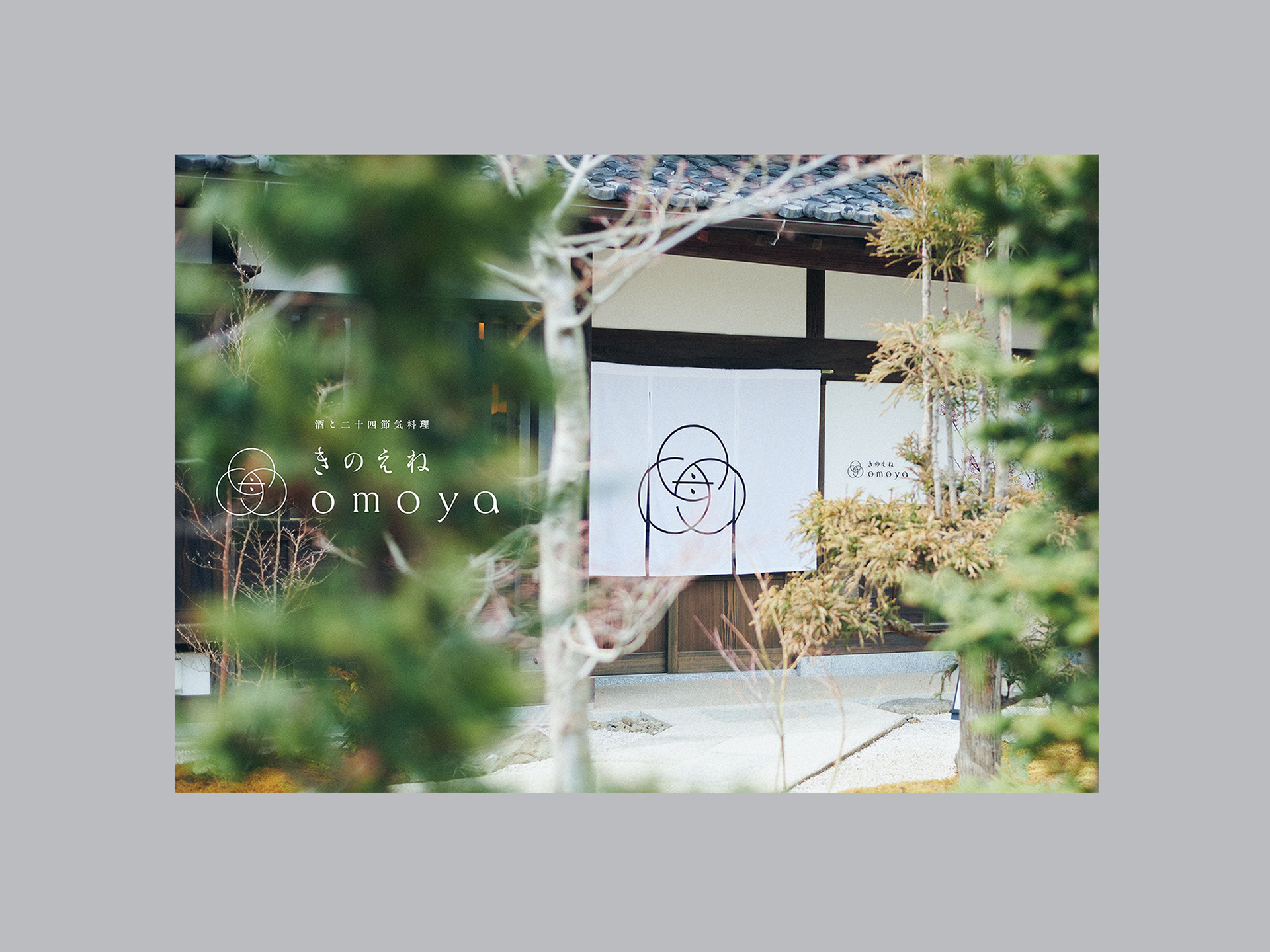
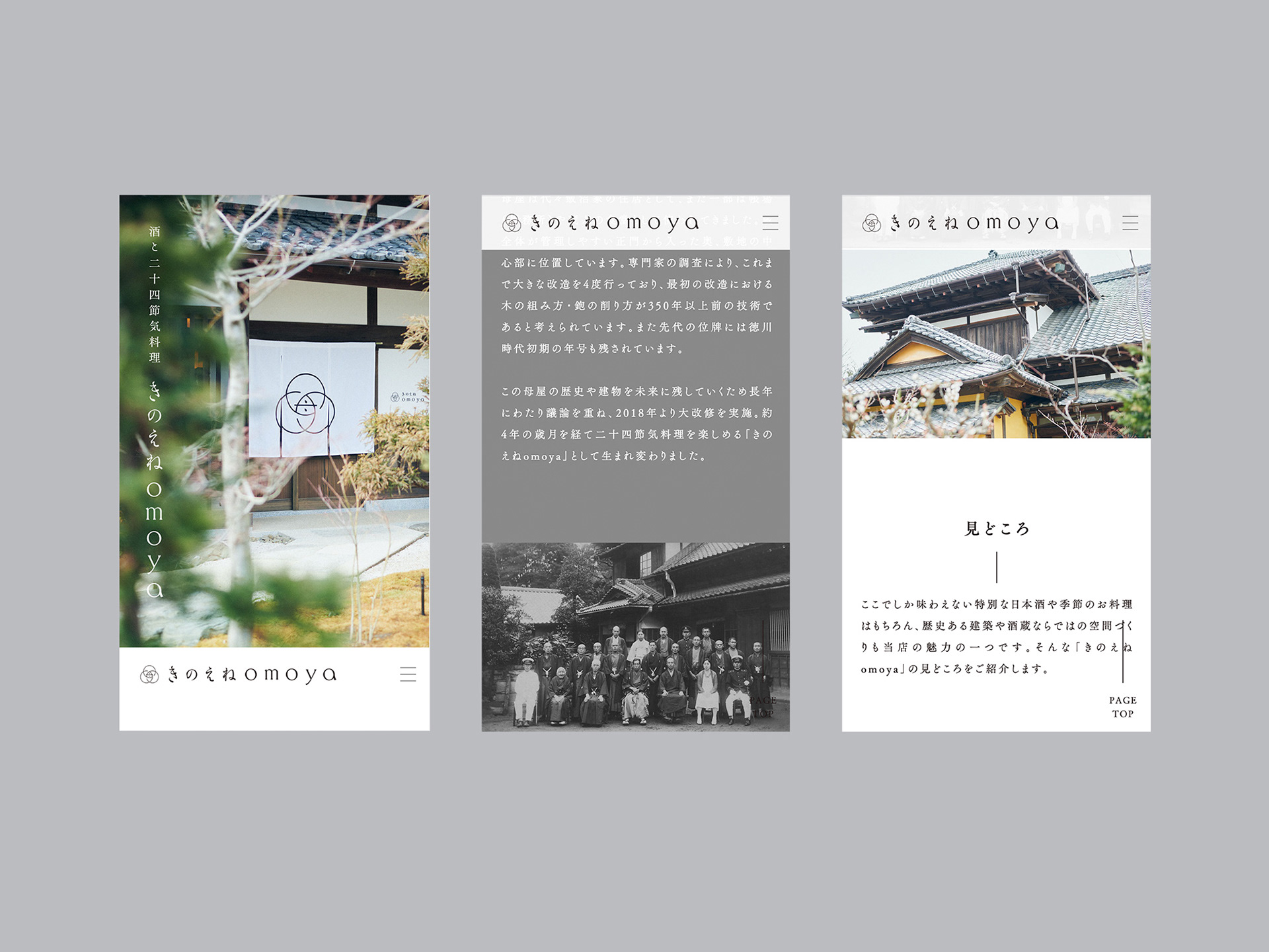
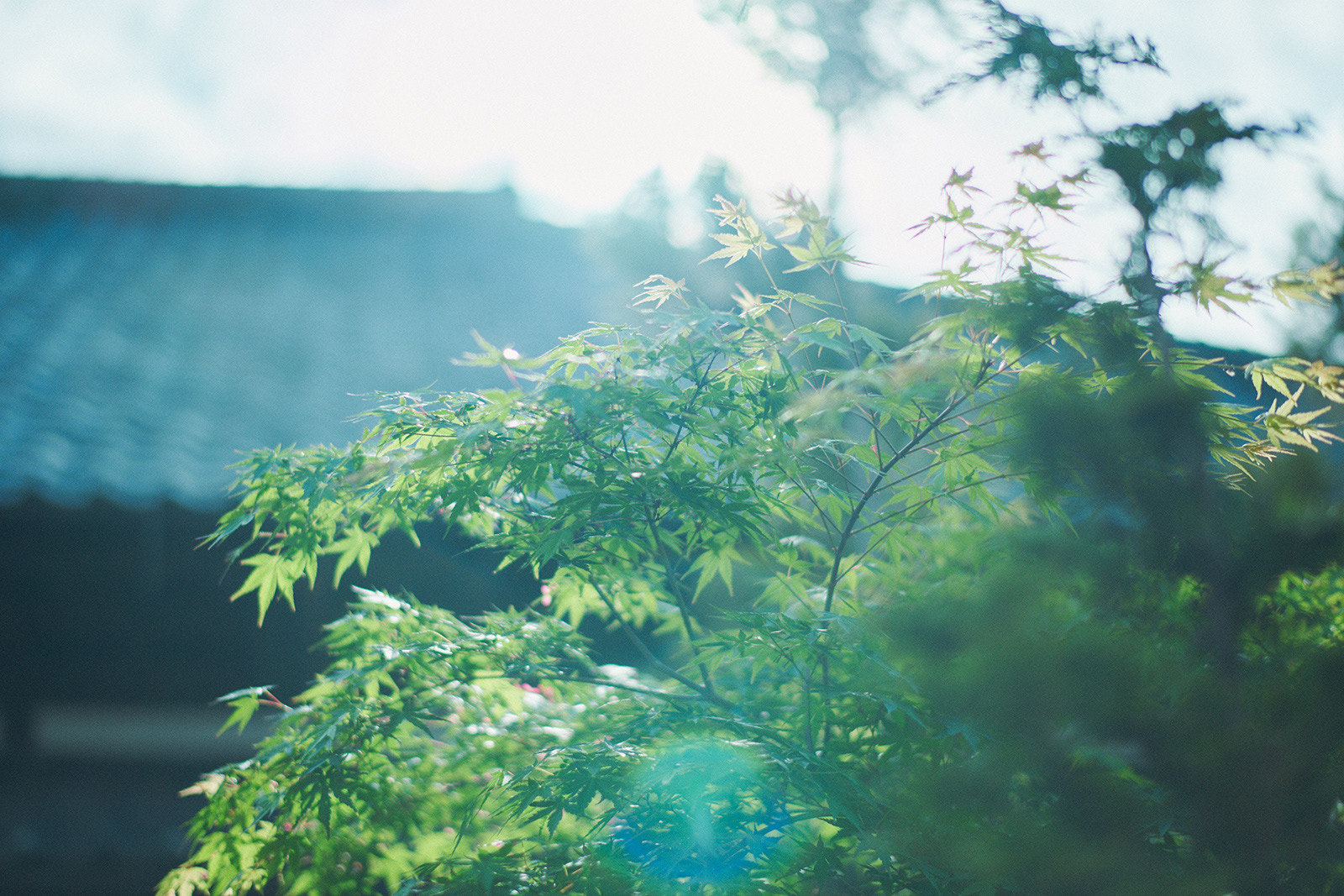
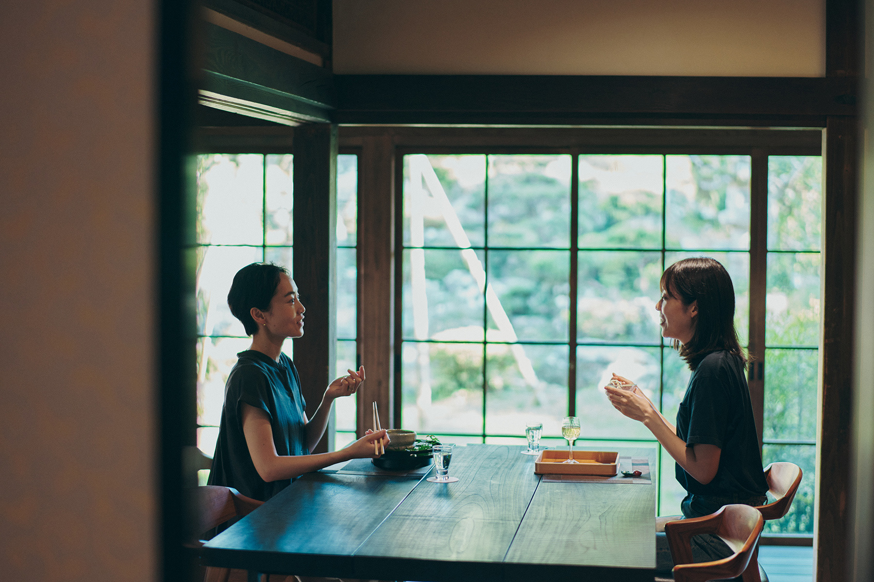
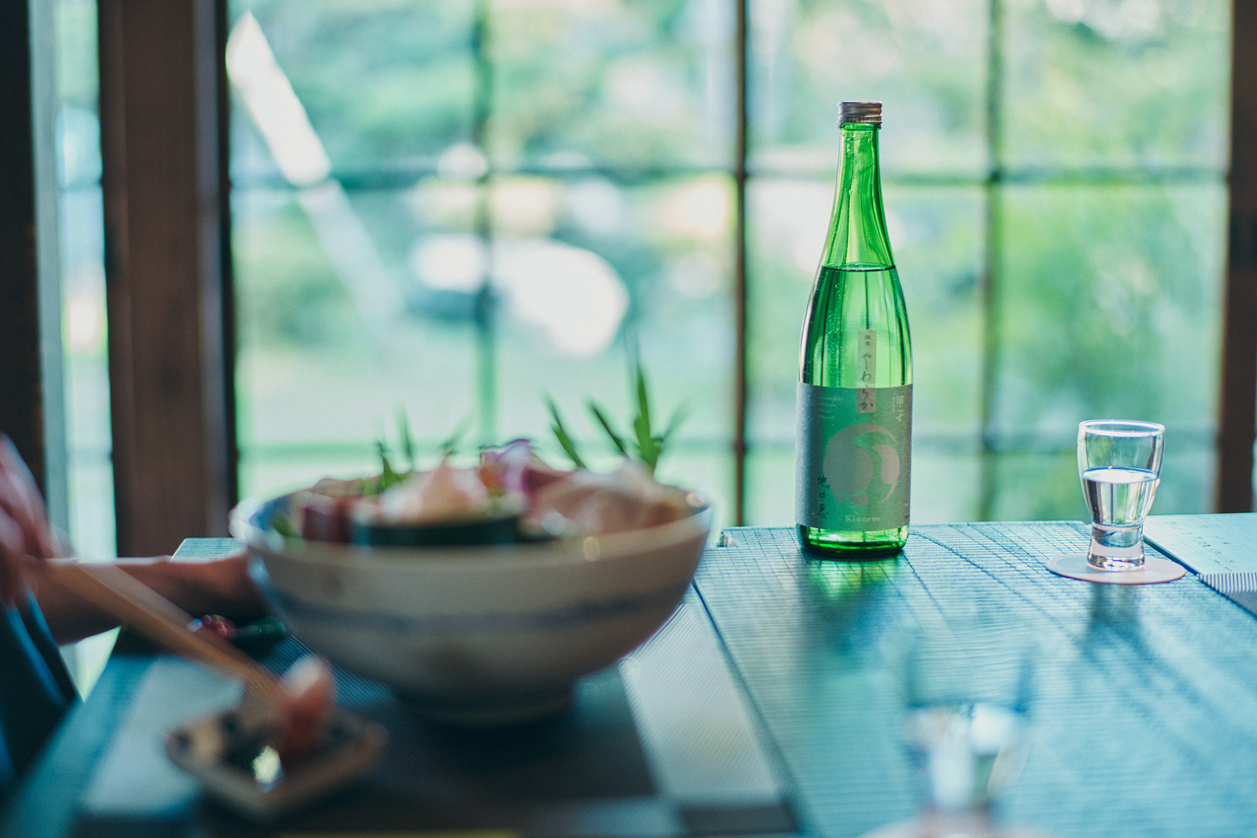
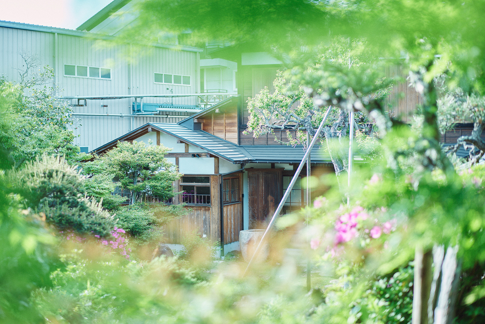
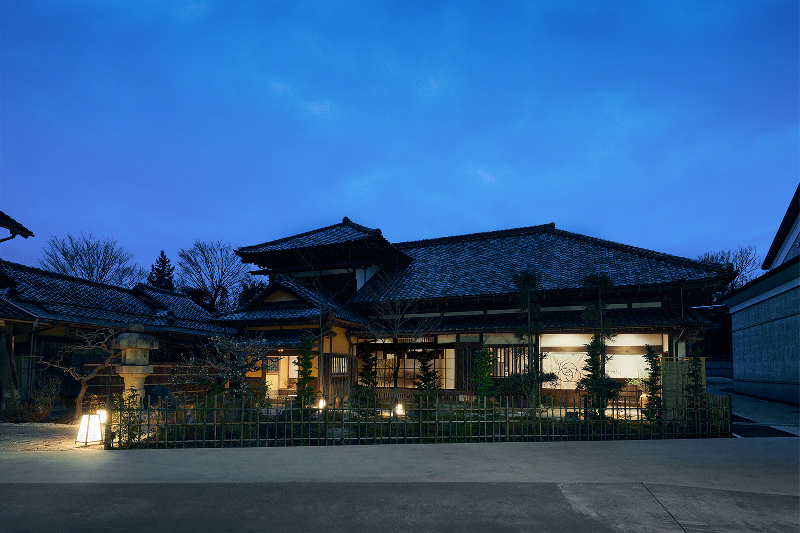
千葉県酒々井町の酒蔵「飯沼本家」の敷地内。代々の当主が住み継いできた築三百年以上の母屋(重要文化財)を大規模改修し、2022年に新たに、酒と二十四節気料理「きのえねomoya」が誕生しました。古い梁や建具と現代作家によるインテリアが融合した空間、名店「よし邑」の料理長を監修にむかえた旬の料理、蔵元でしか味わえない特別な日本酒など、上質な時間を味わえる古民家レストランです。tegusuでは、ネーミングやコンセプトの整理から、VIデザイン、テーブル上のツール、印刷物、WEB、限定日本酒など、全体的なディレクションやデザインを行いました。
On the grounds of the Iinumahonke(飯沼本家) sake brewery in the town of Sakai, Chiba Prefecture, there is a main house (an important cultural property) that is over 300 years old and has been home to the head of the brewery for generations. This building was extensively renovated to create the sake and 24-season cuisine restaurant "Kinoene omoya" in 2022.
The space is a fusion of old beams and fittings and interior design by contemporary artists. The chef of the famous restaurant "Yoshimura" was invited to supervise the seasonal cuisine. Special sake that can only be tasted at the brewery. This is an old private house restaurant where you can enjoy quality time. tegusu provided overall direction and design, from naming and concept organization to VI design, tabletop tools, printed materials, website, and limited edition sake.
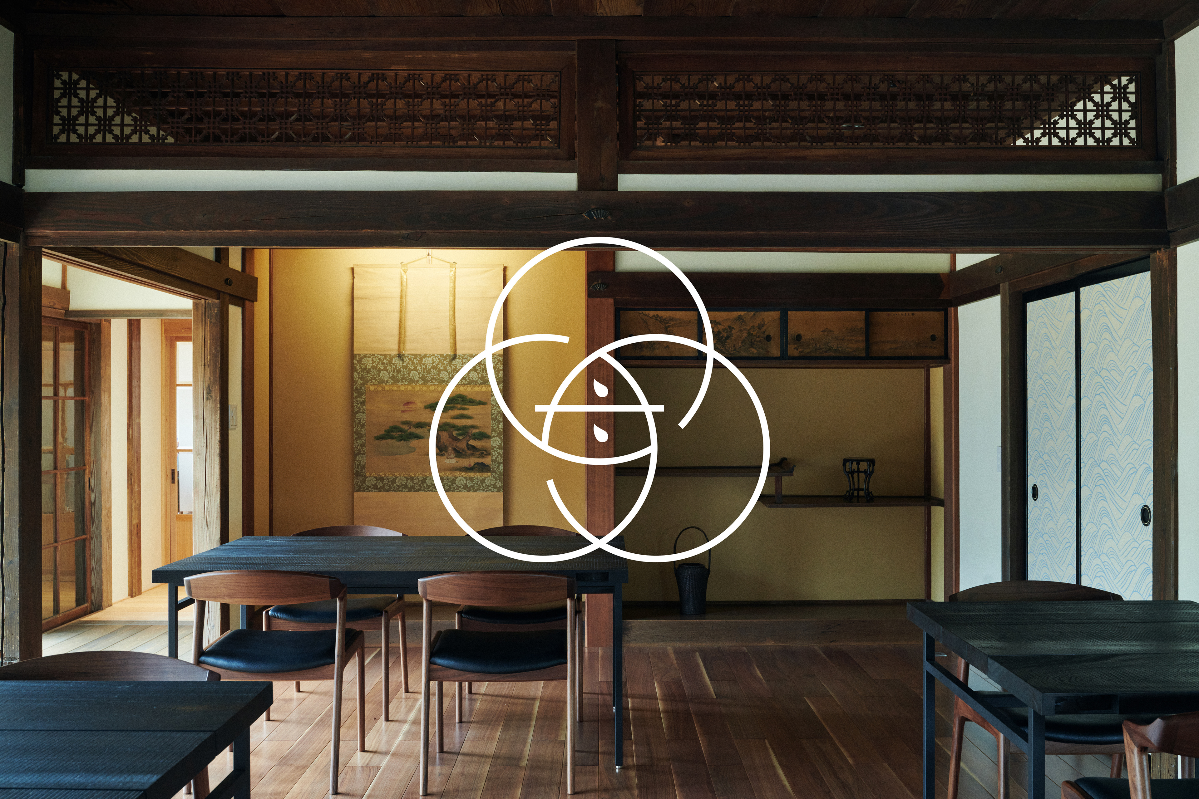
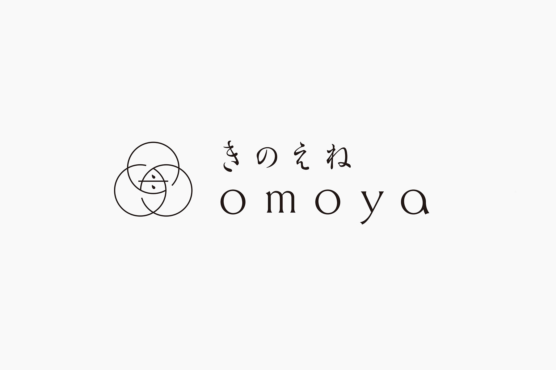
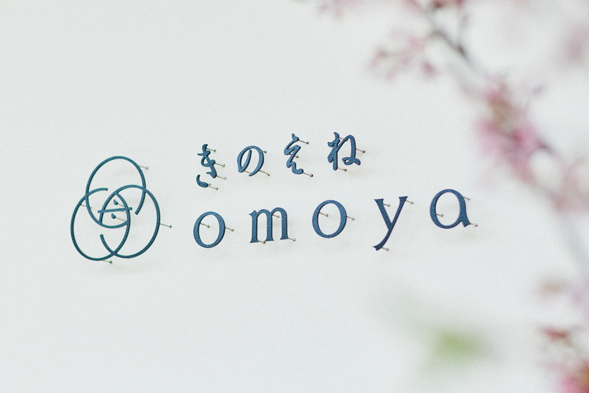
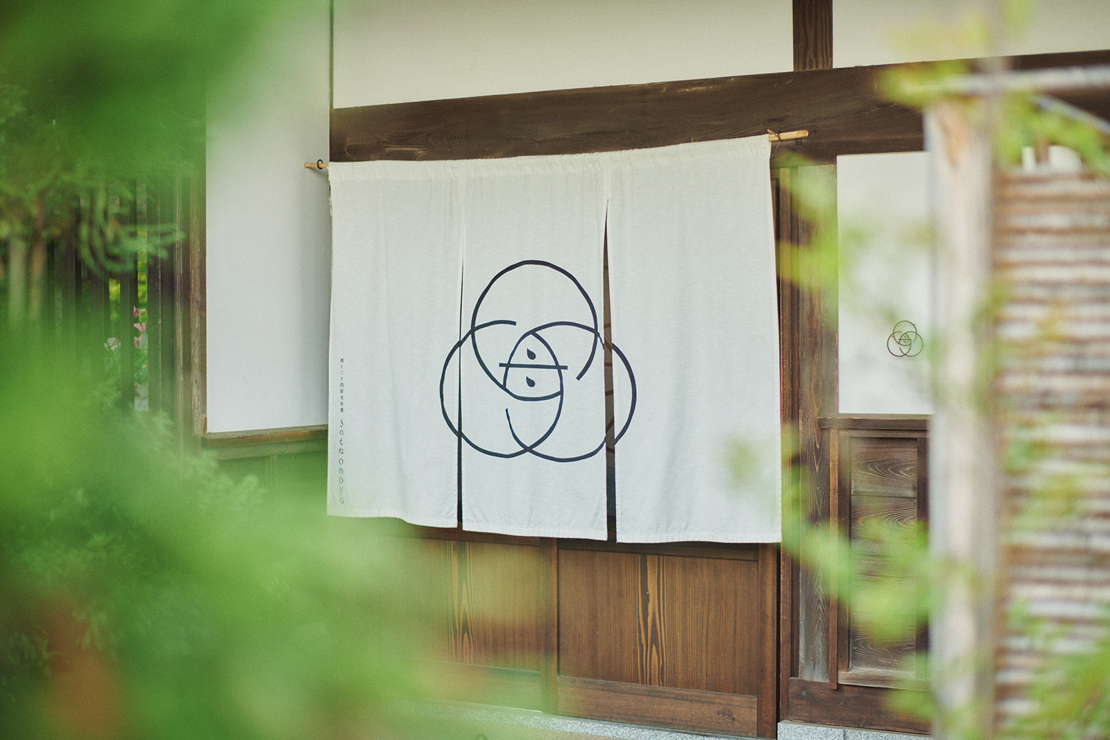
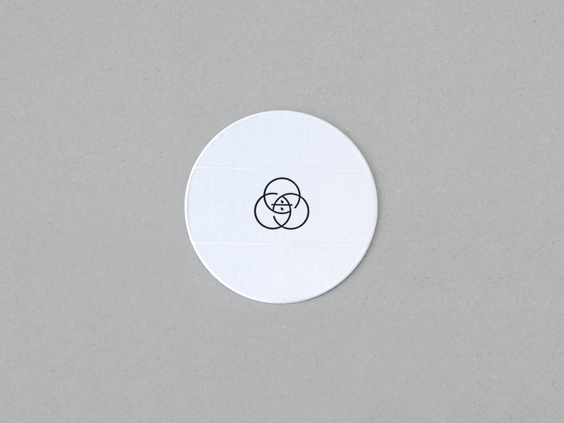
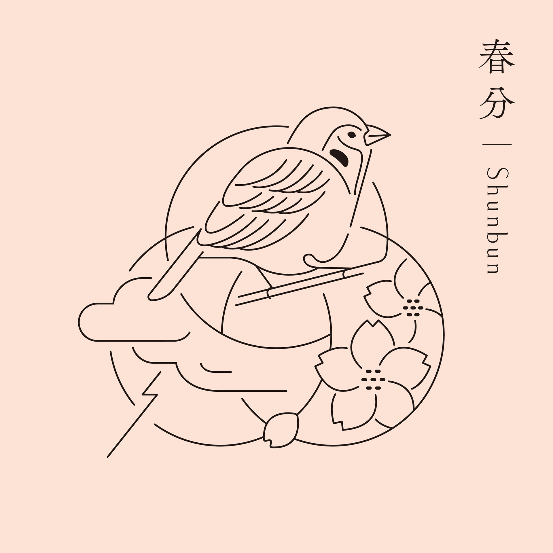
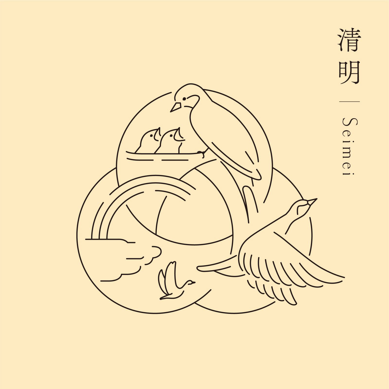
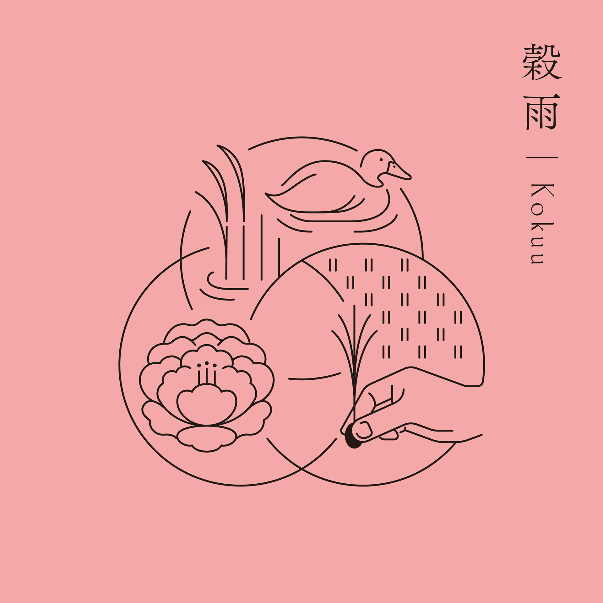
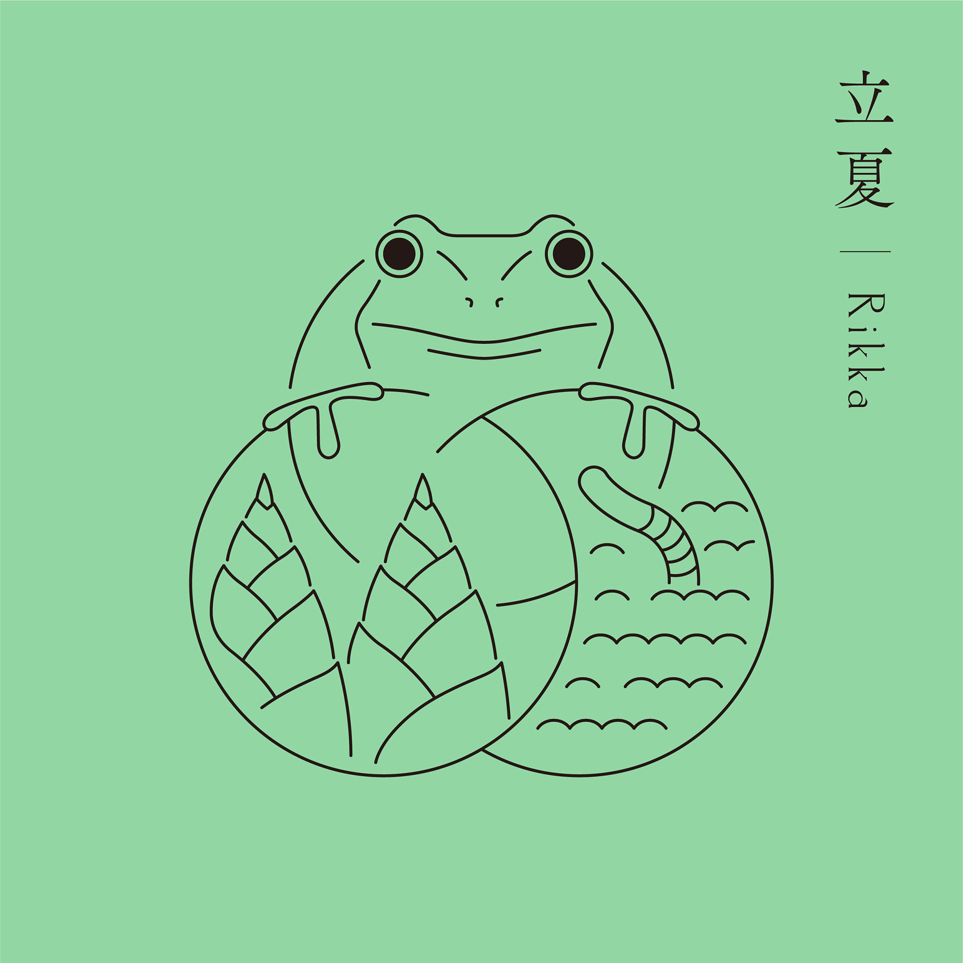
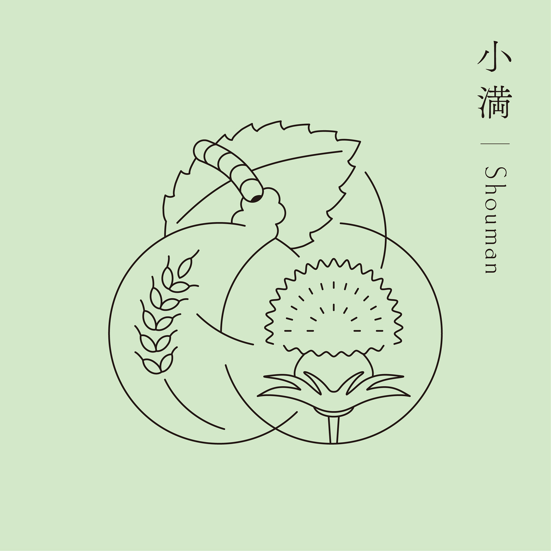
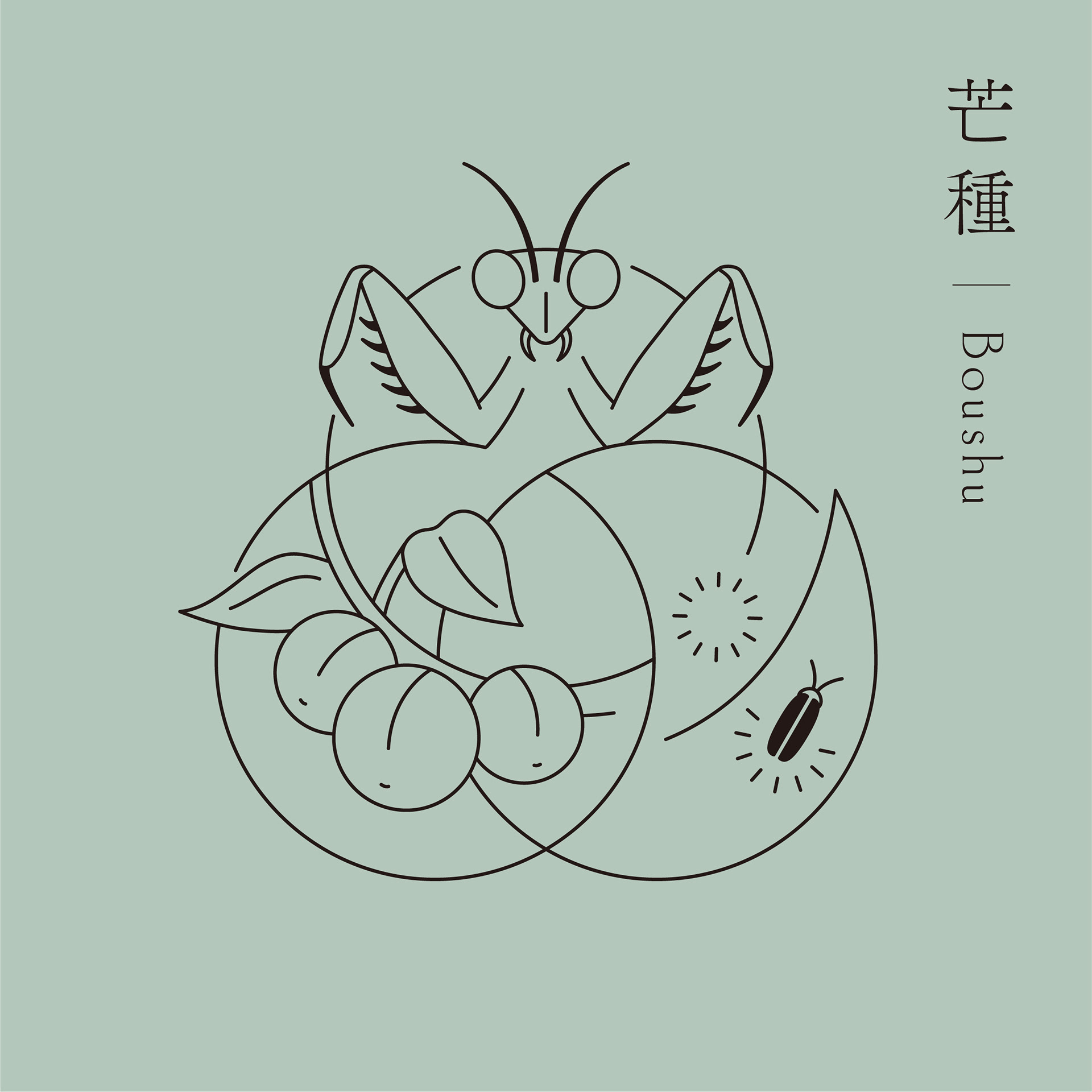
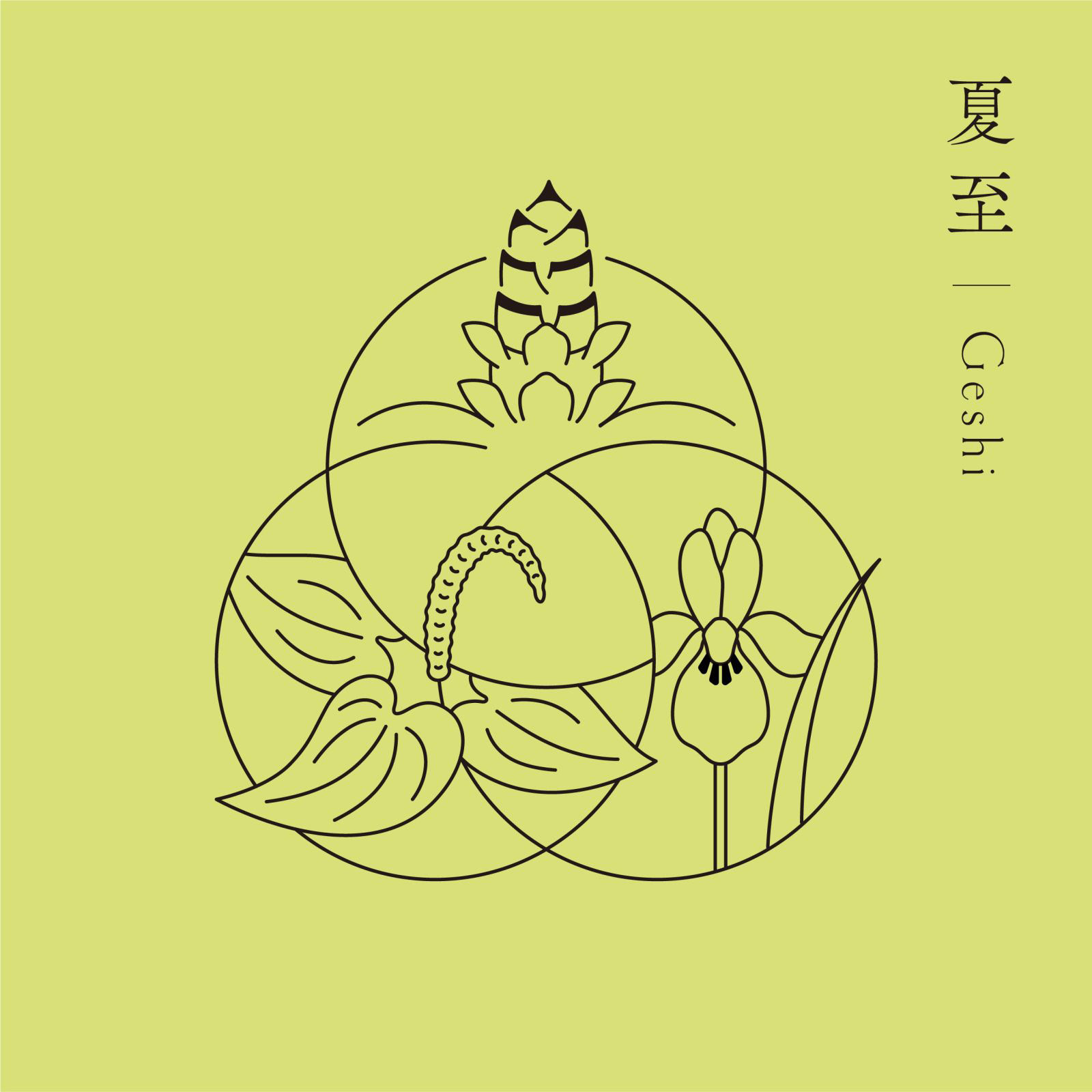
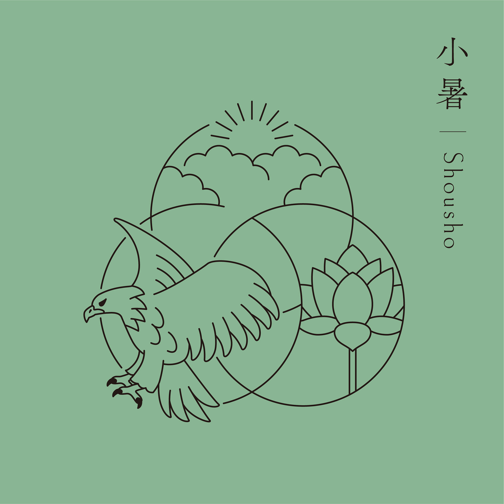
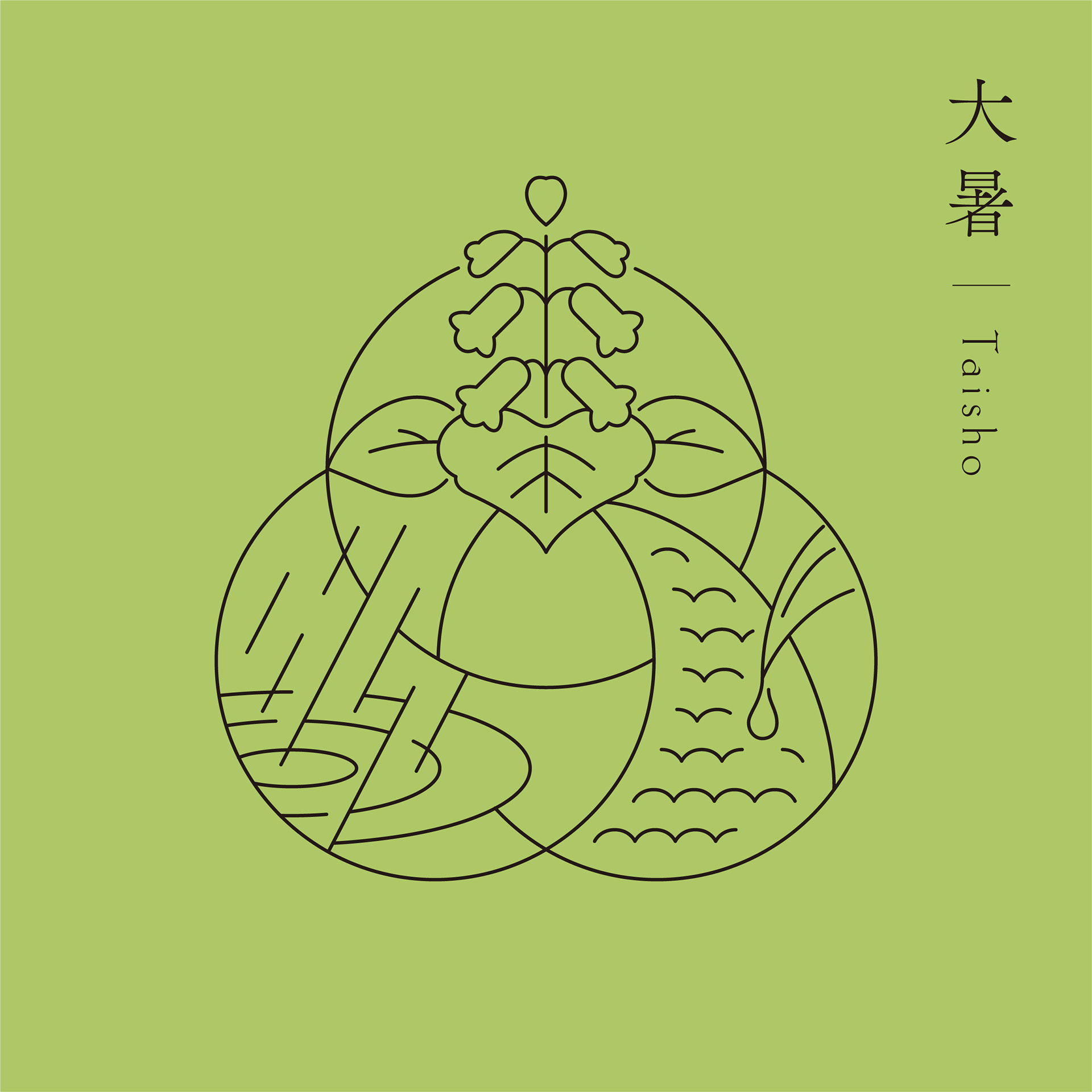
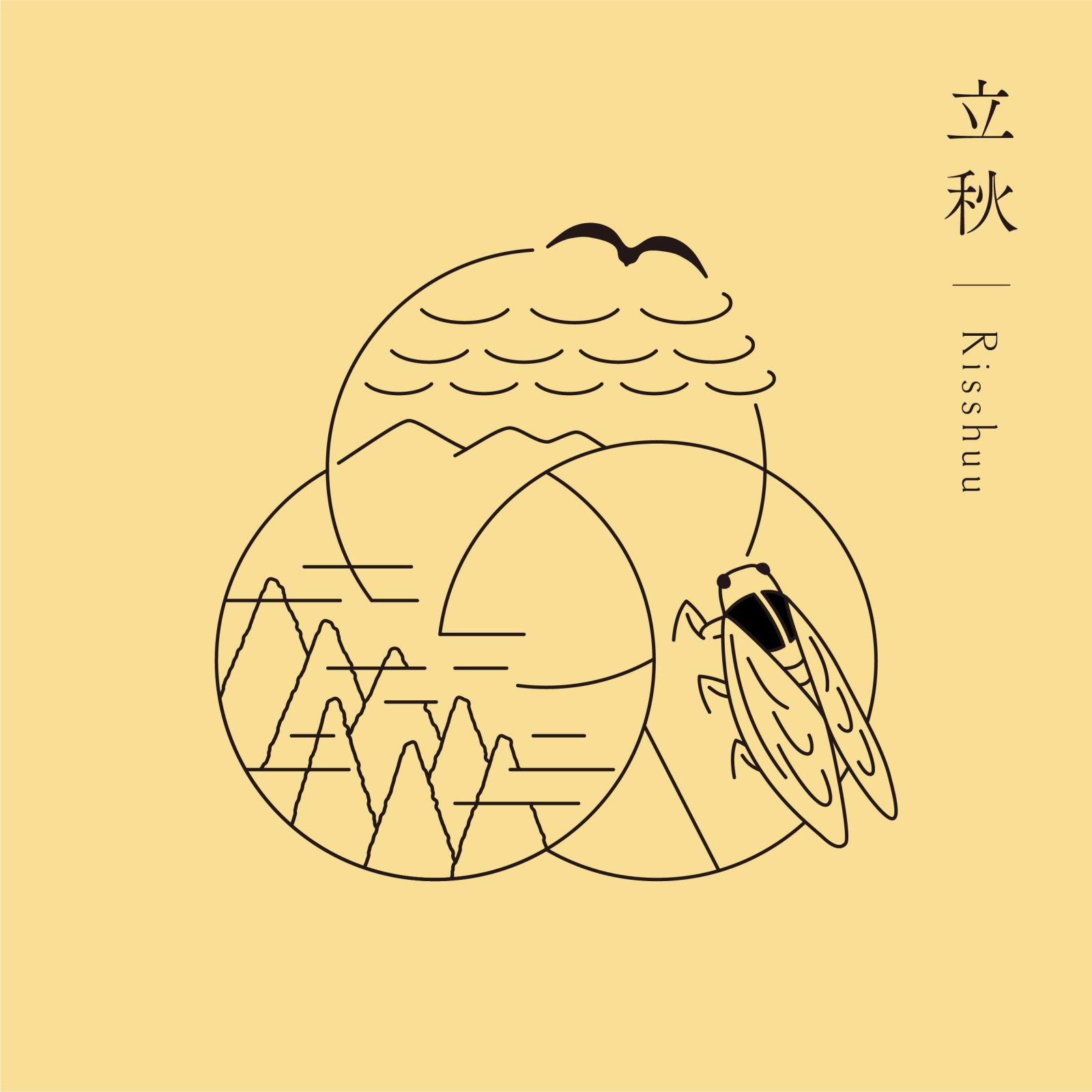
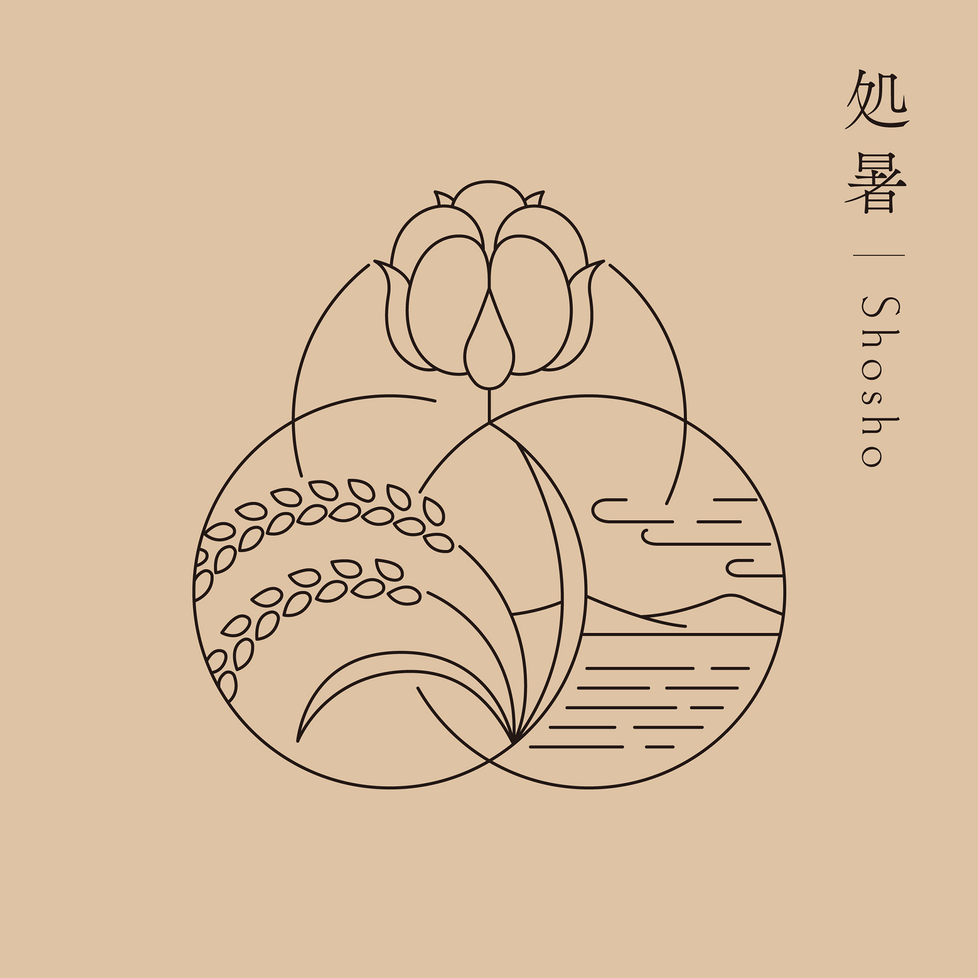
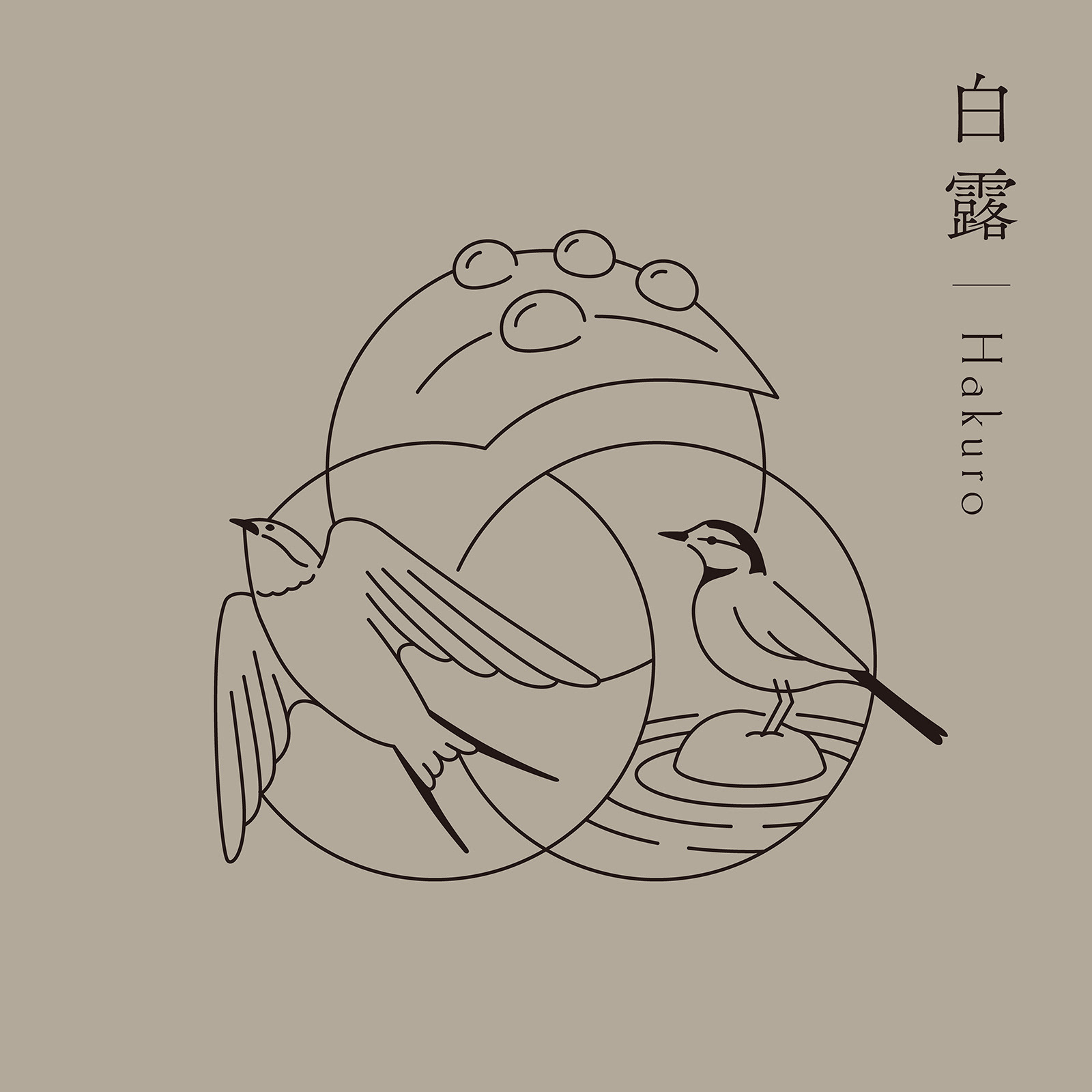
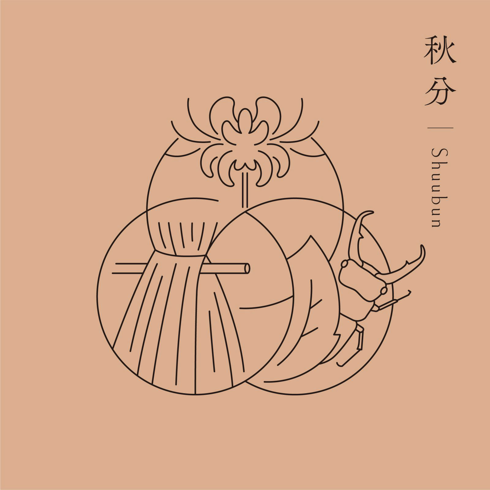
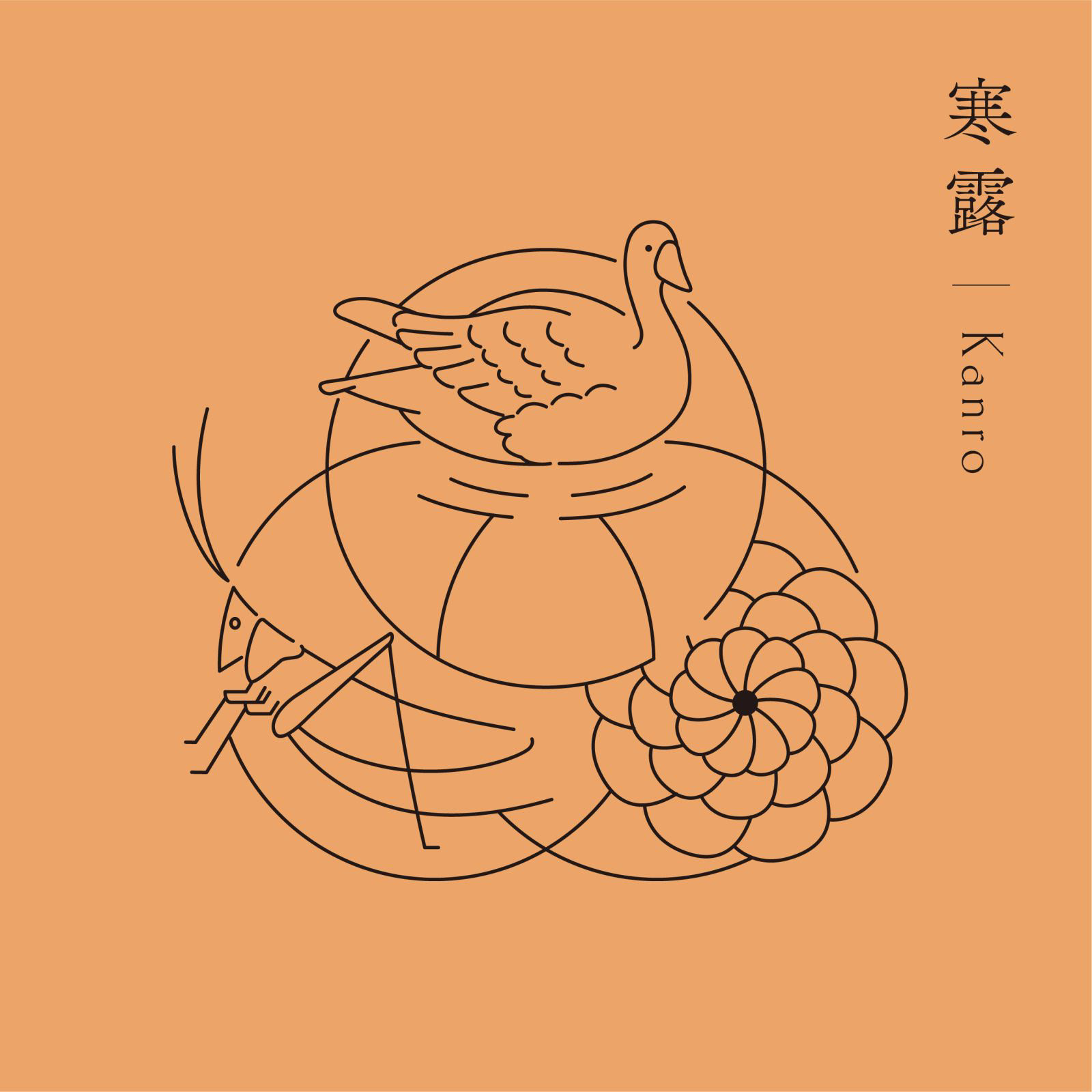
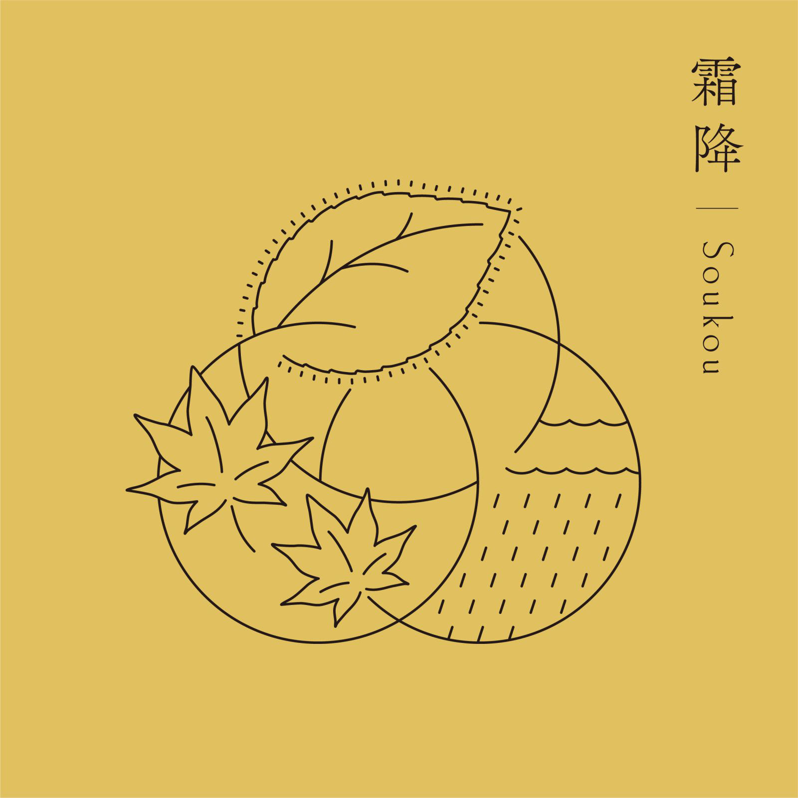
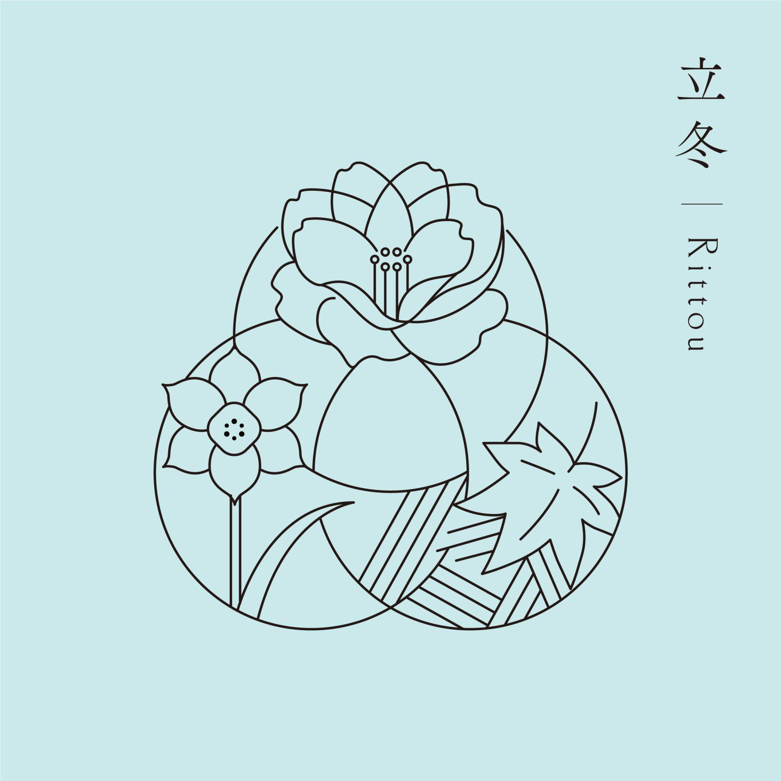
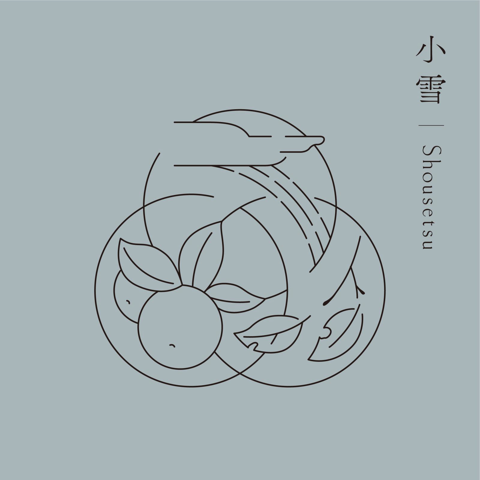
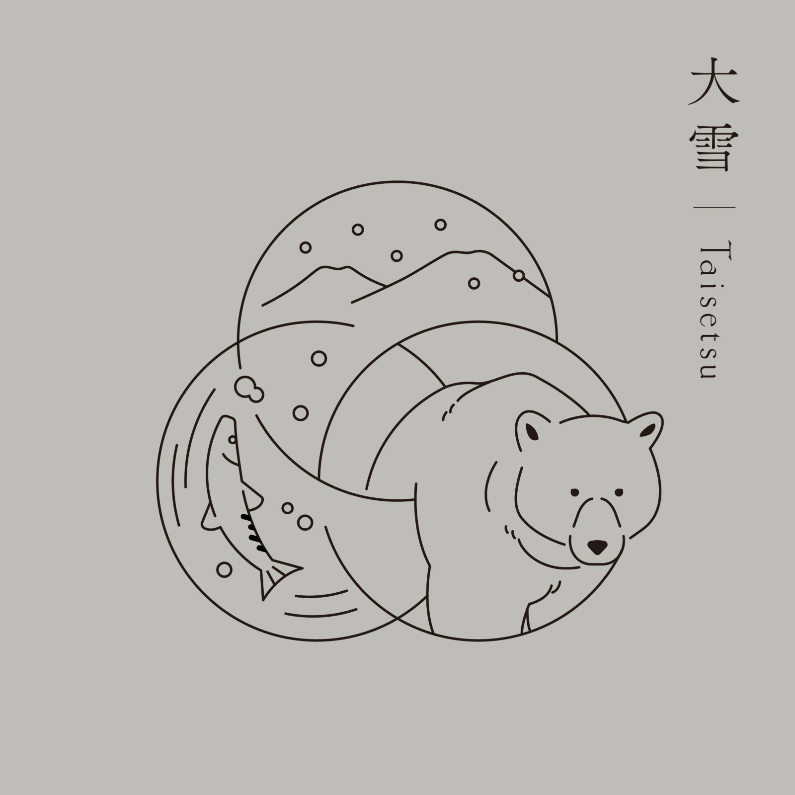
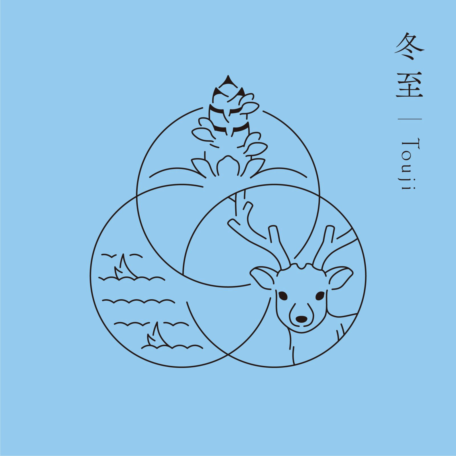
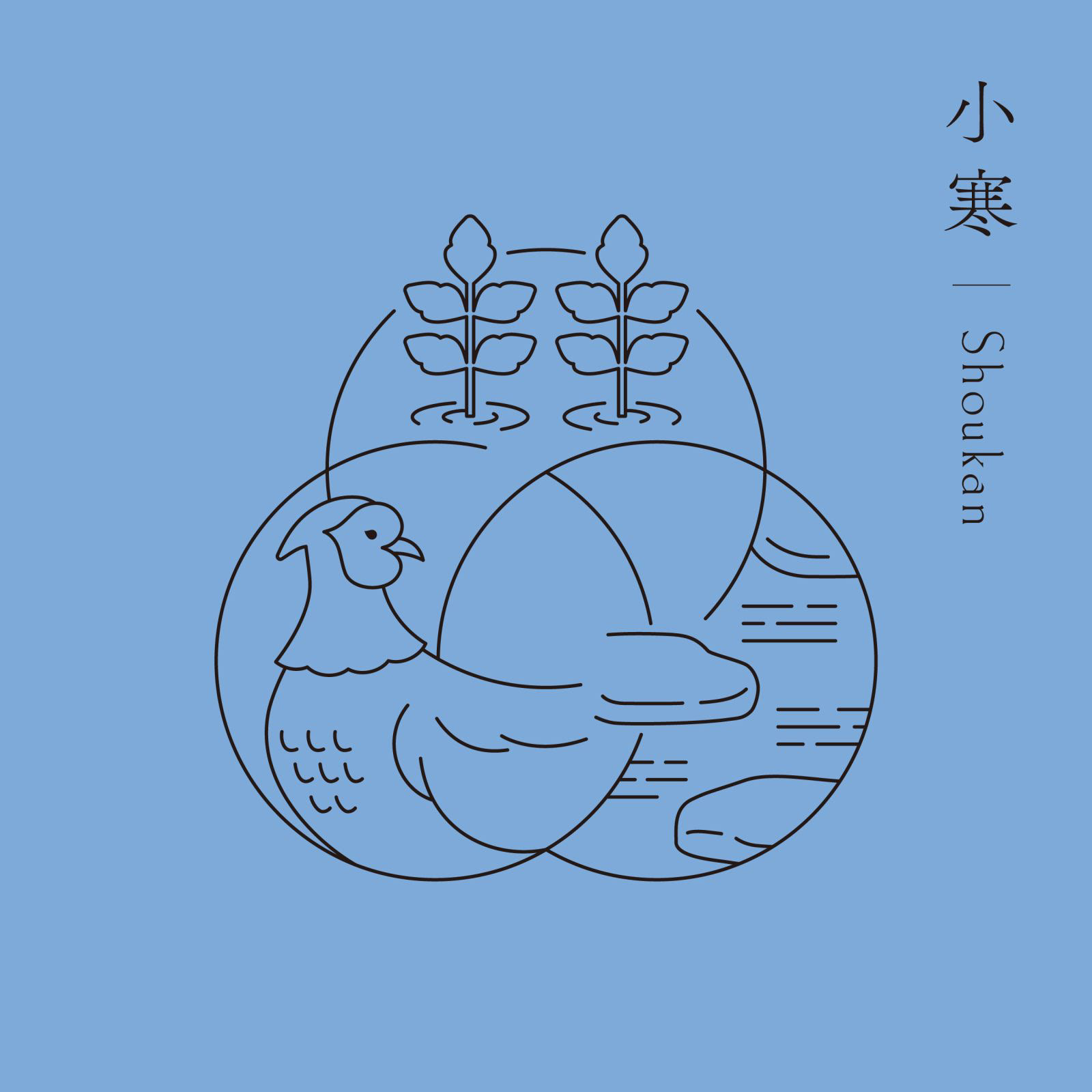
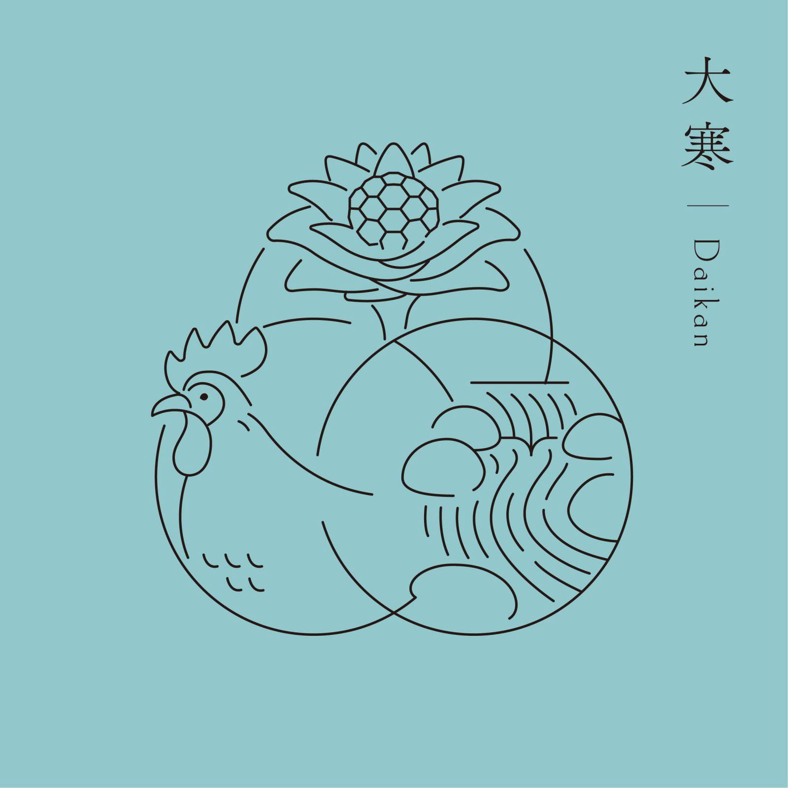
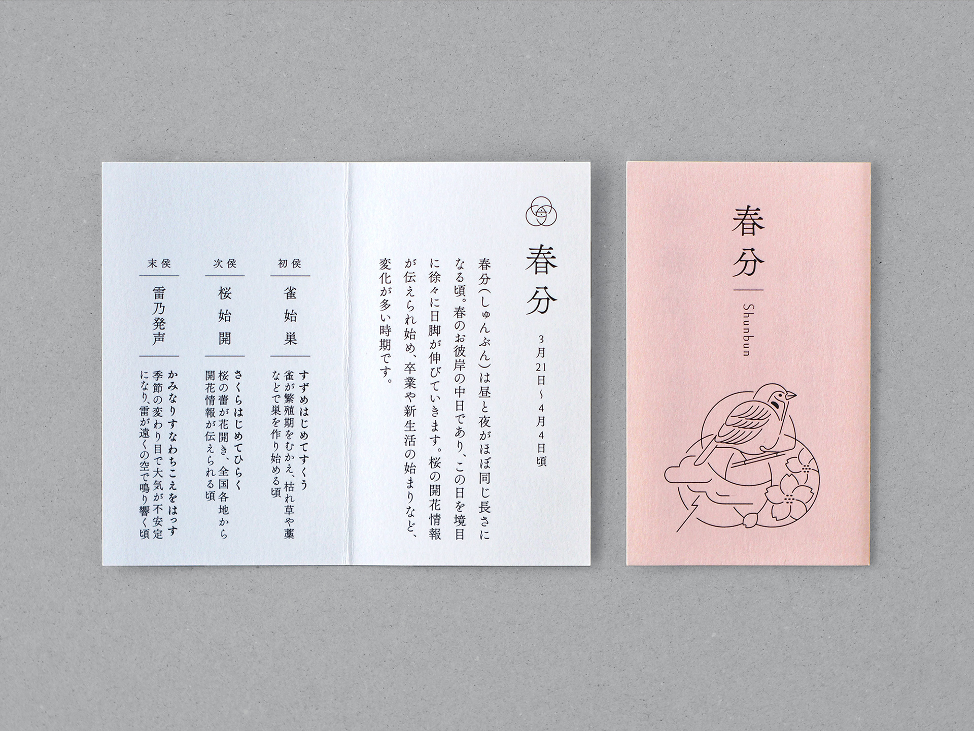
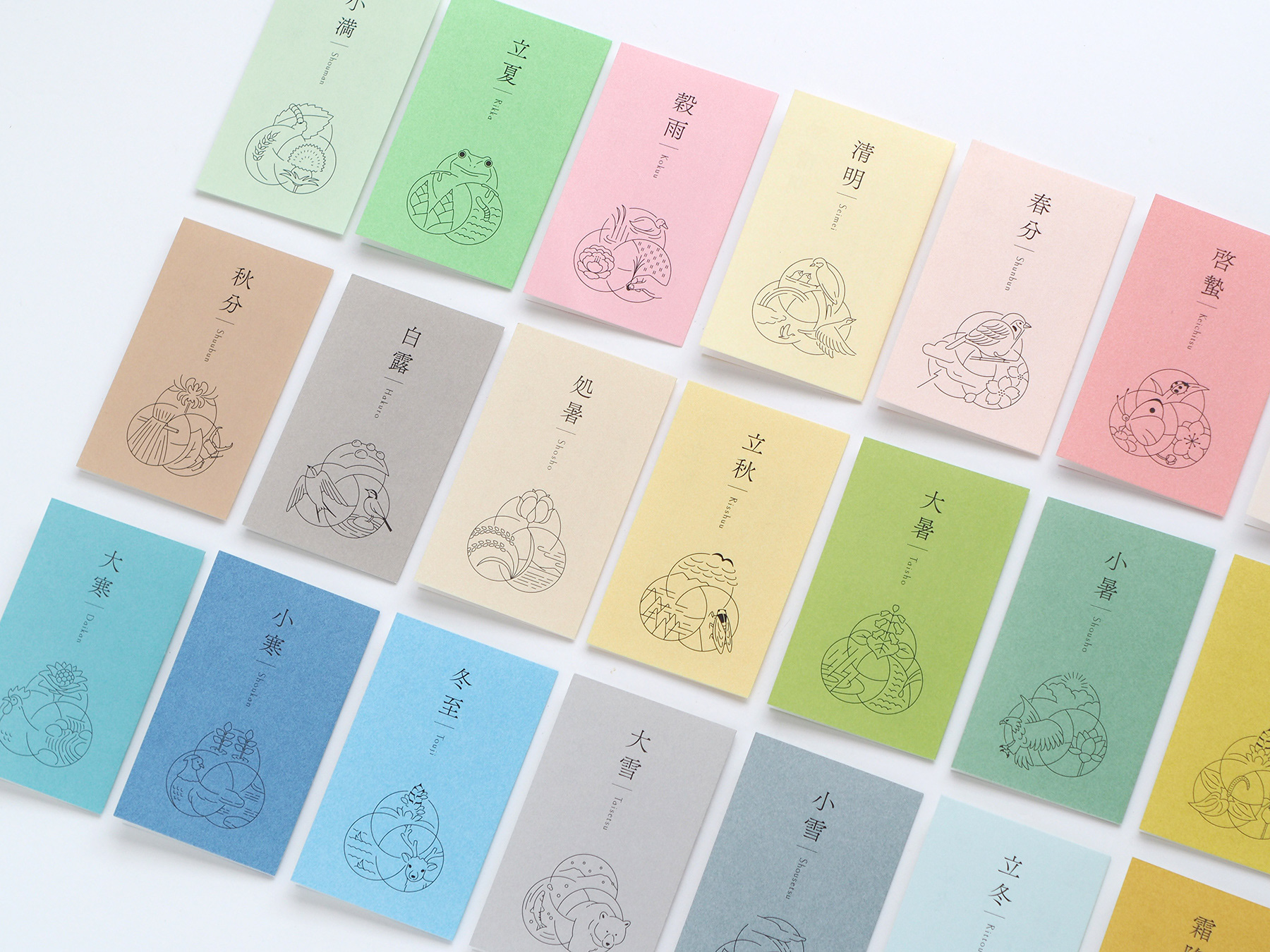
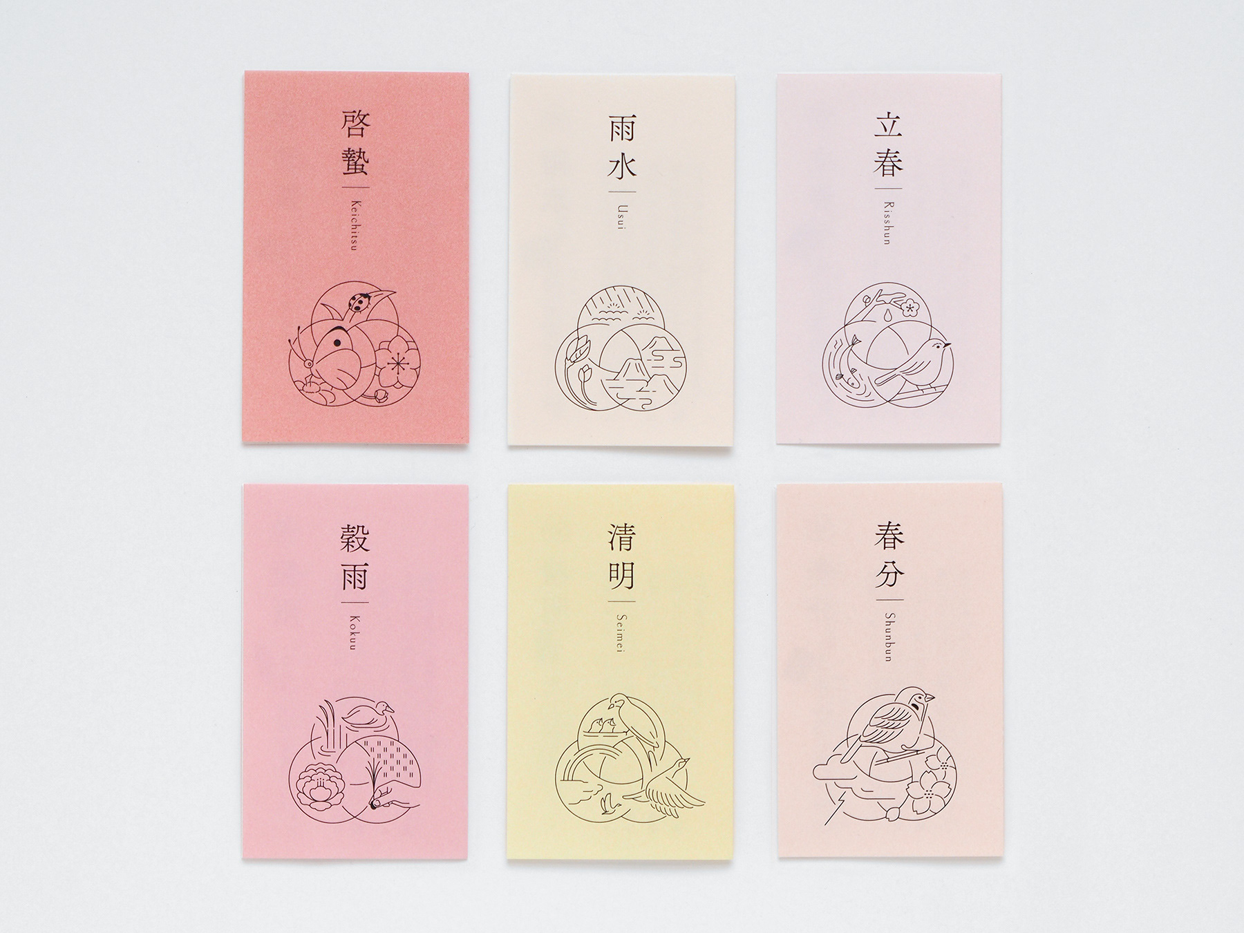
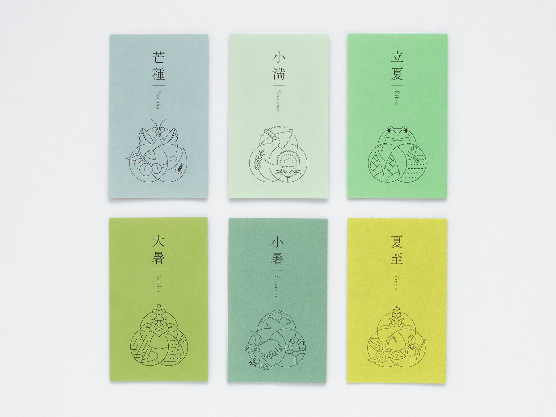
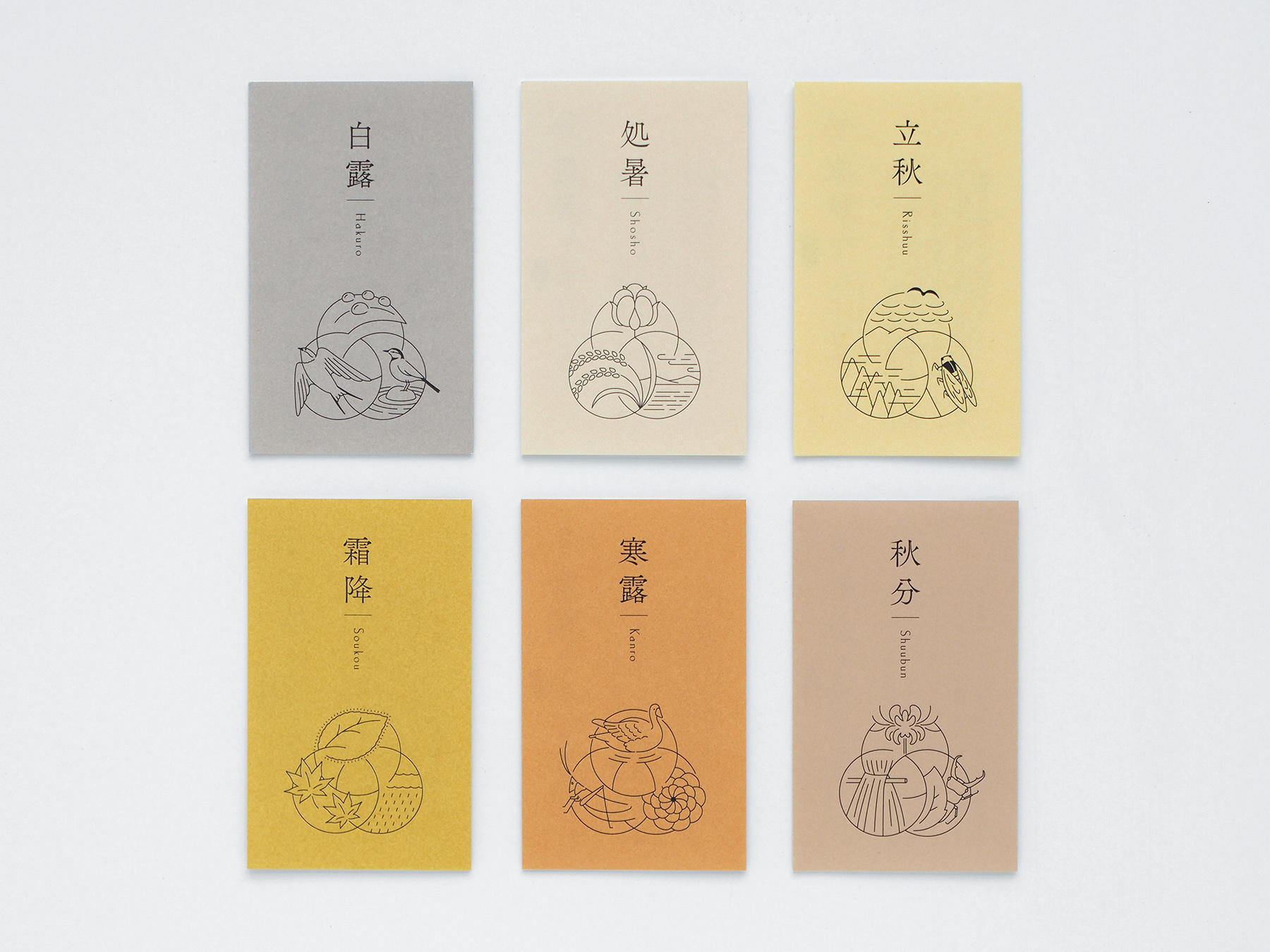
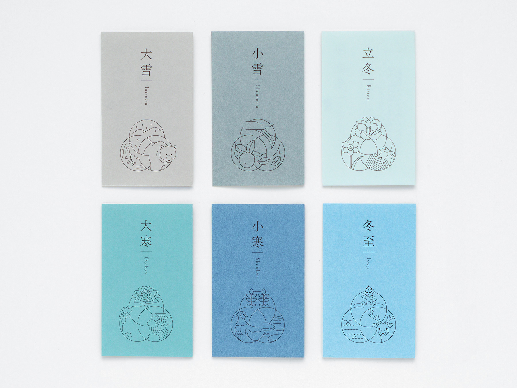
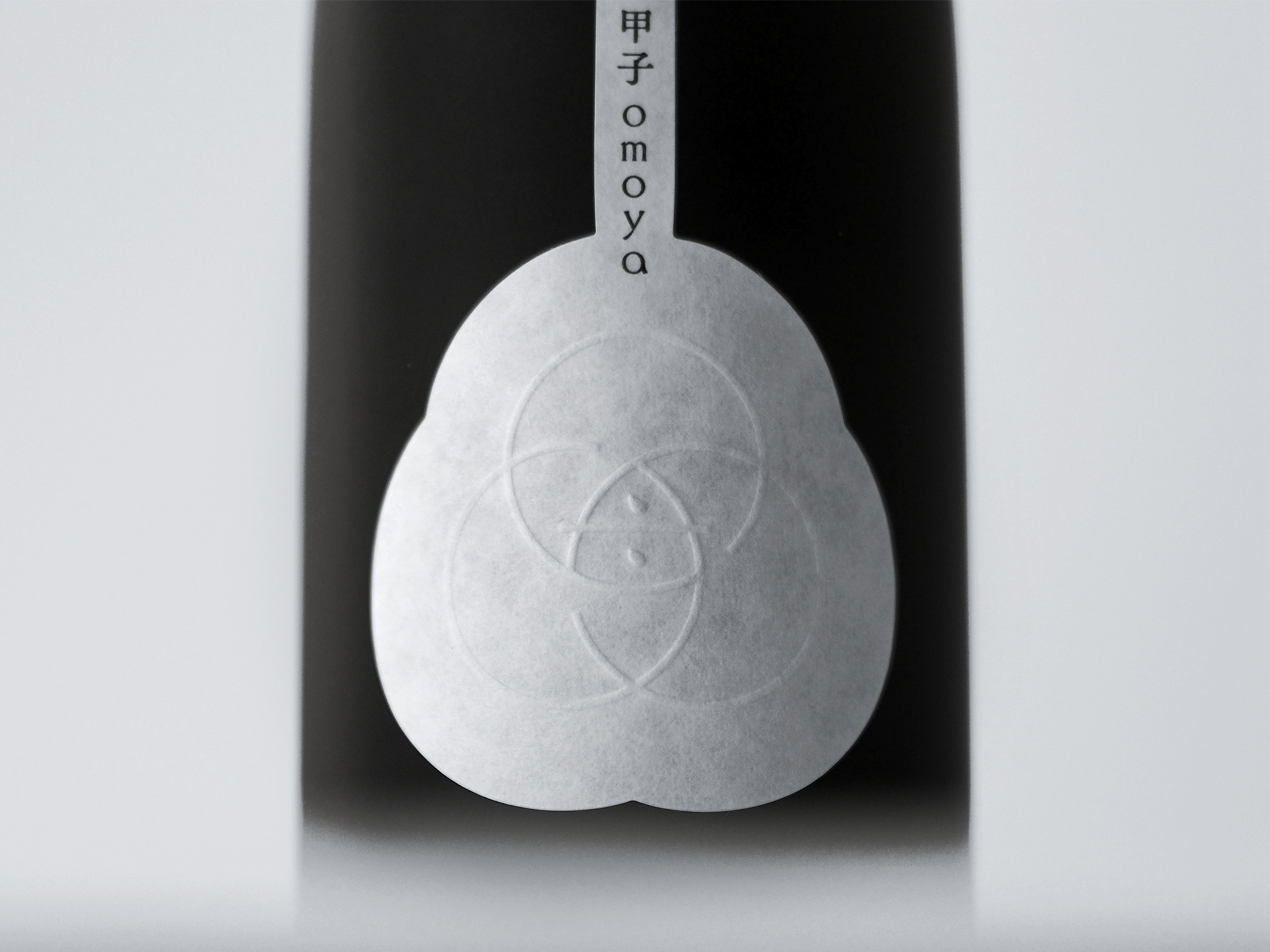
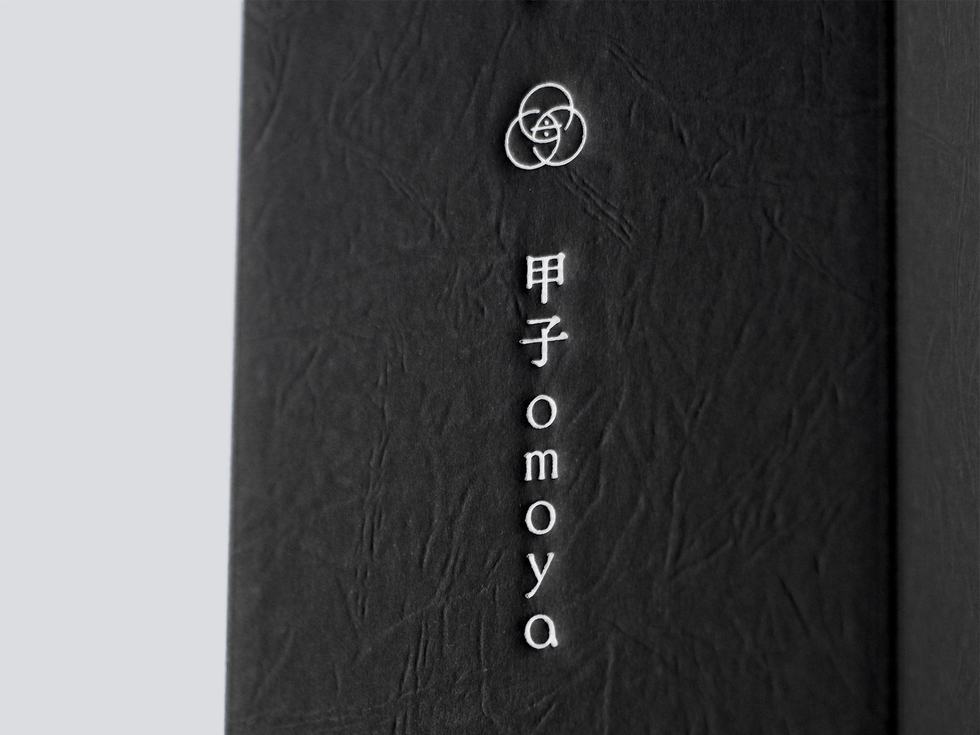
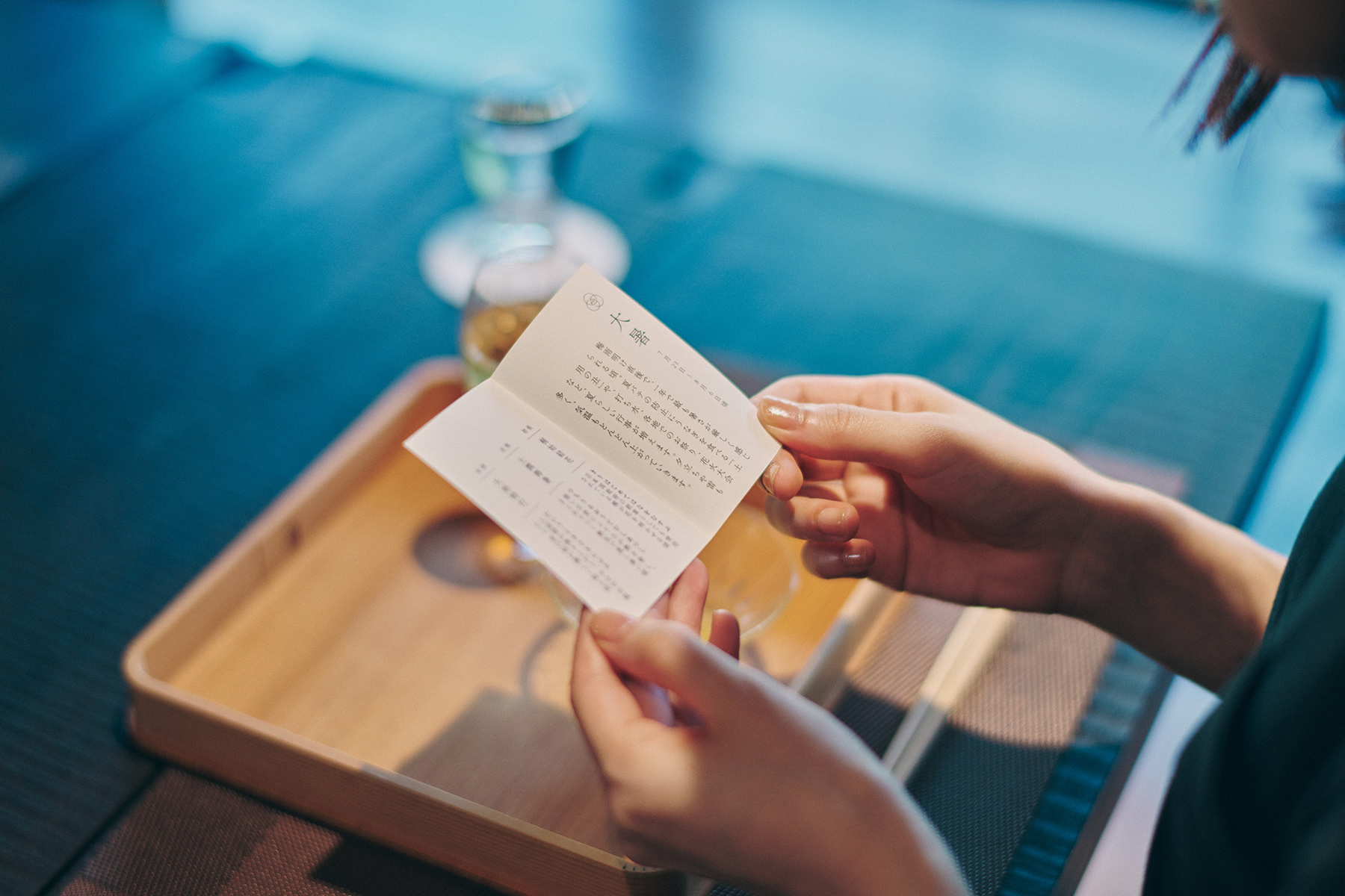
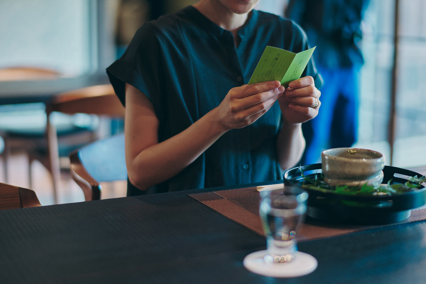
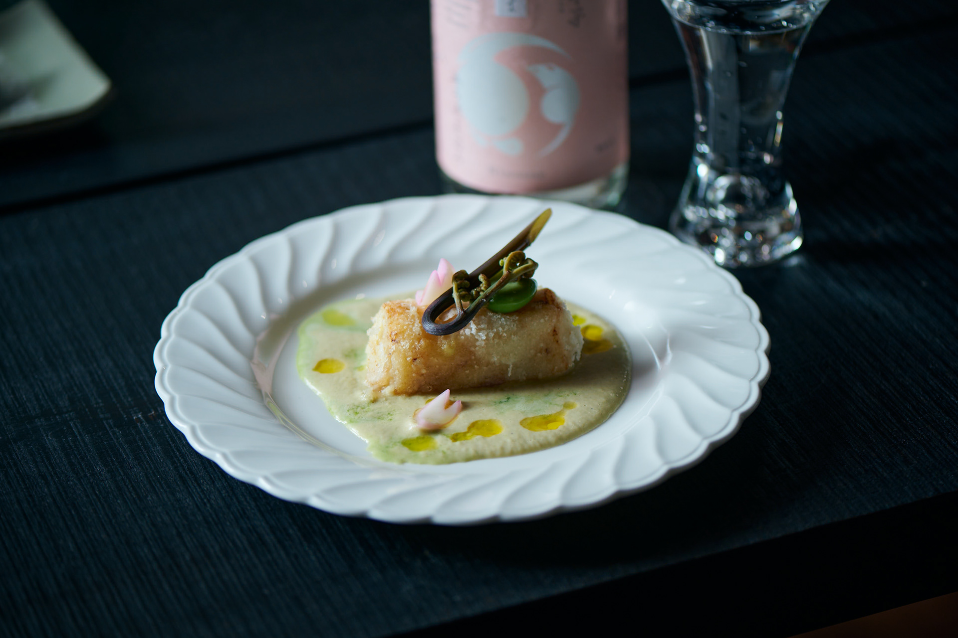
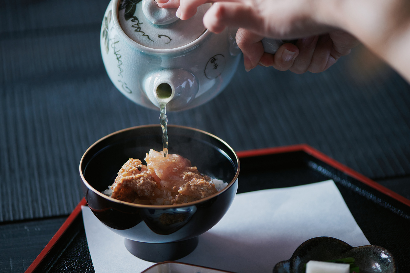
きのえねomoyaで提供されるのは、酒造りとも密接な関わりがある二十四節気を表現した料理です。二十四節気とは、1年を約15日ごとに24の節気で区分し、季節の移り変わりを表したもの。古代中国で考案され、日本でも古くから農業や季節行事の目安とされてきました。一つの節気は、初候・次候・末候という3つの候で構成され、気象の動きや動植物の変化が細かく定義づけられており、これらの総称を「七十二候」といいます。きのえねomoyaのシンボルは、「omoya」の文字を構成する三つの円を初候・次候・末候と定義し、これらを組み合わせ、中心に「母屋(おもや)」の母の文字を加えてデザインしています。
The dishes served at "Kinoene omoya" express the 24 seasonal divisions, which are also closely related to sake brewing.
"24 sekki" is a seasonal calendar that describes the seasonal changes by dividing the year into approximately 15 days. It was invented in ancient China and has been used as a guide for agriculture and seasonal events in Japan since ancient times.
Each seasonal cycle is composed of three weather conditions: Sho ko(first term), Ji ko(second term), and Makko(last term). Each of these is defined in detail in terms of weather movements and changes in plants and animals, and is collectively referred to as the "72 Ko(72 seasons). We defined the three circles that make up the word "omoya" as the first, second, and last terms, and designed the "Kinoene omoya" symbol by combining these three circles. The shape of the center of the symbol represents the Chinese character for "母" (from name of omoya(母屋).
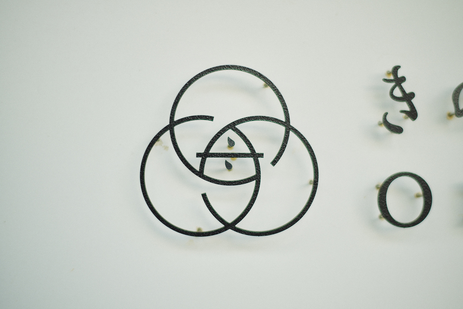
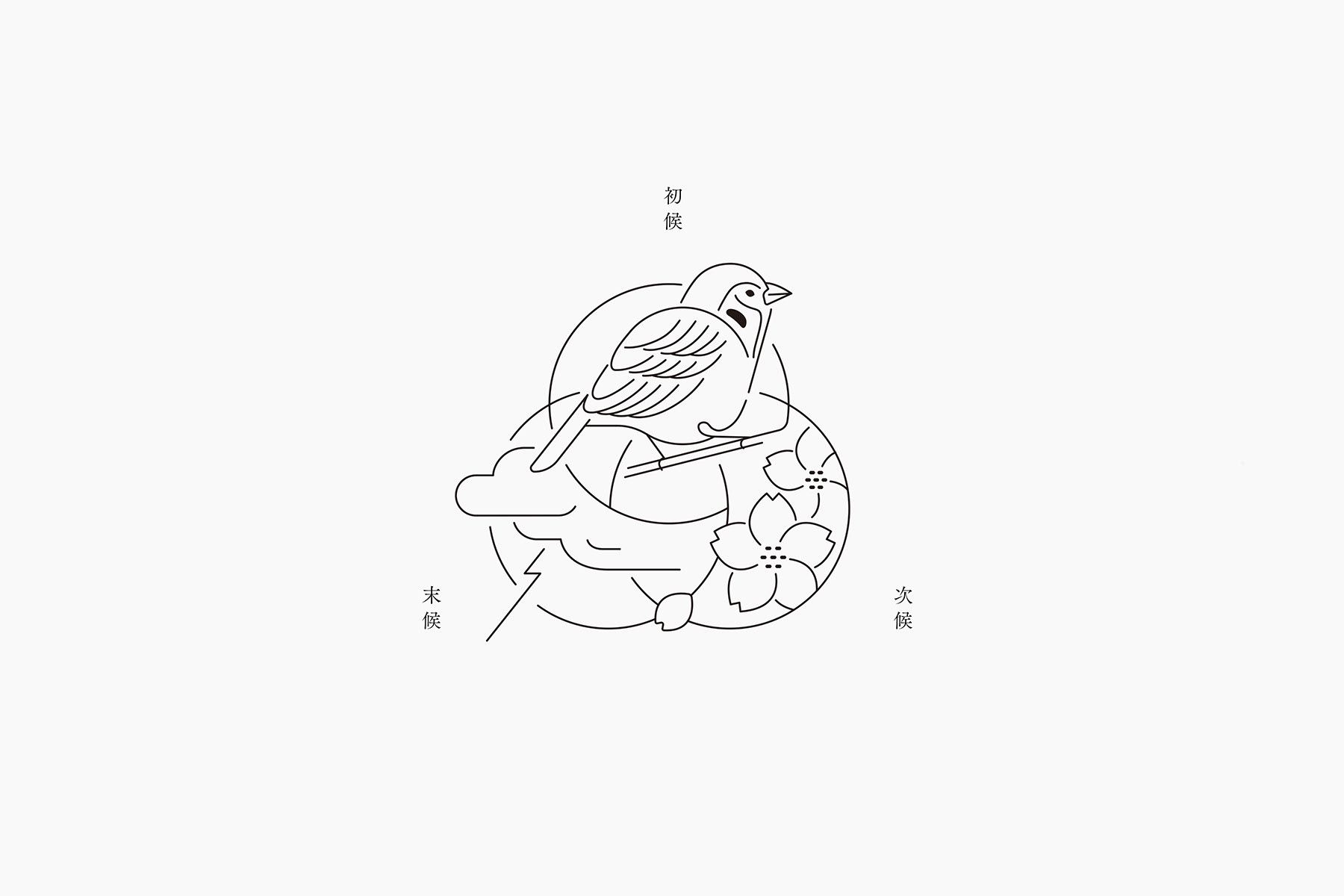
きのえねomoyaでは、料理と共に二十四節気について記されたカードを提供しています。初候・次候・末候それぞれの事象をイラストレーションとしてシンボル上に表現し、DICカラーガイドに定義された日本の伝統色を配色しています。
Kinoene omoya offers 24 sekki (24 season) card along with the seasonal cuisines. Each card is colored according to the traditional Japanese colors defined in the DIC Color Guide, and each of the first, second, and last seasons is represented on the symbol as an illustration.
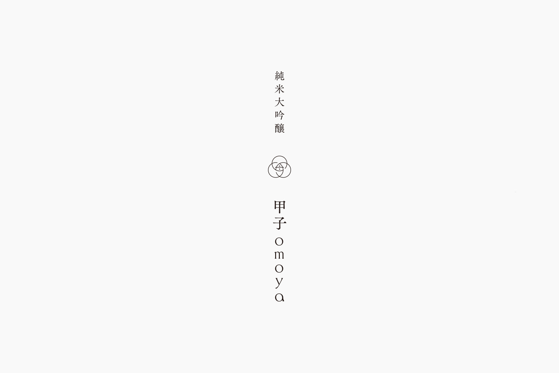
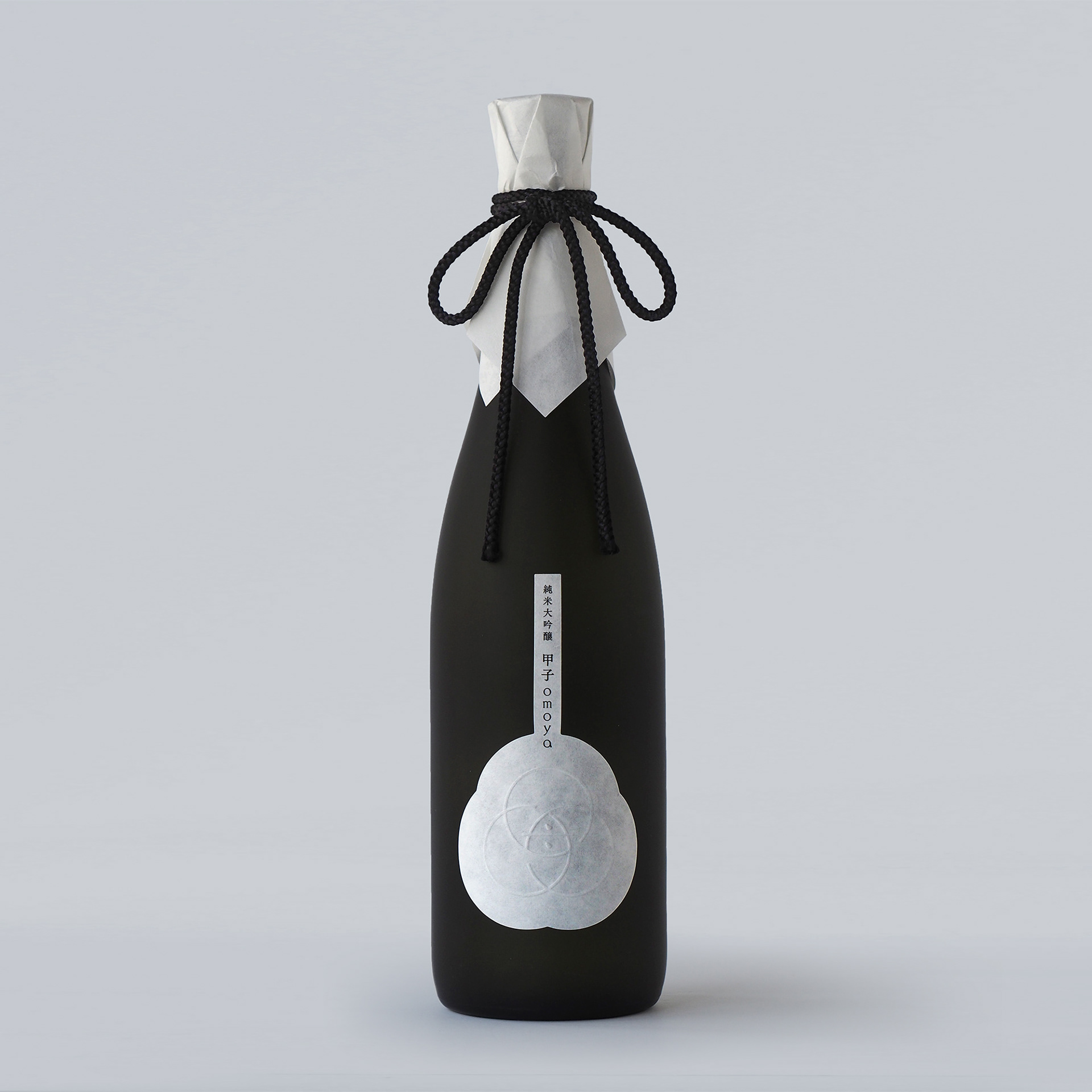
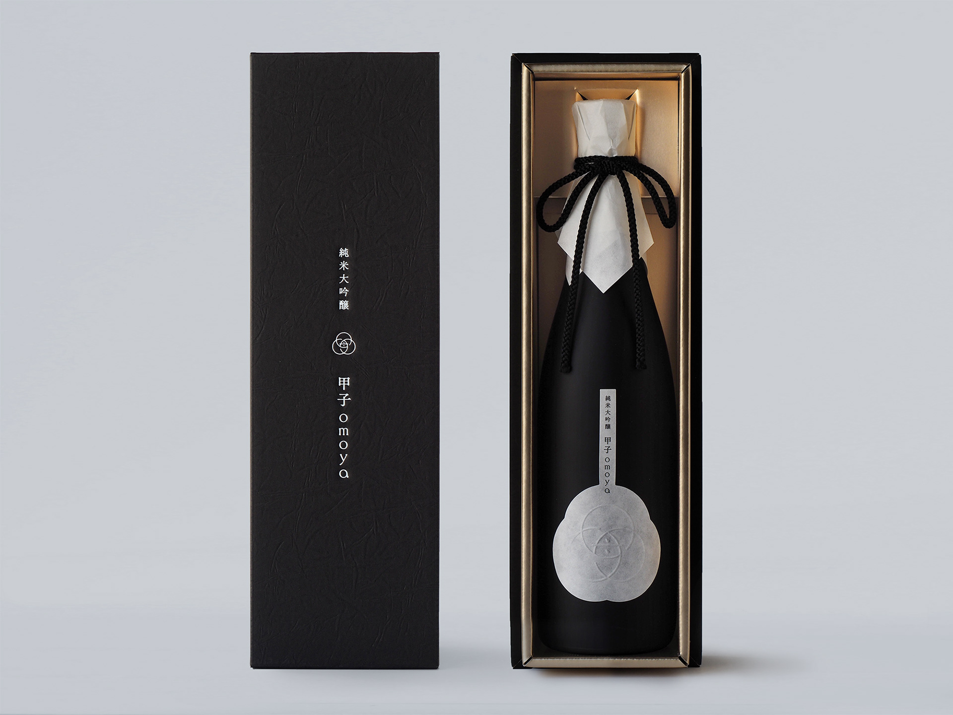
白箔を施した化粧箱、シンボルを空押しした和紙や、懐紙を用いた被せ紙によって、限定酒である「純米大吟醸 甲子omoya」をデザインしています。
The limited edition sake "Junmai Daiginjo Kinoene omoya" is designed with a white foil box, a Japanese paper label with a blank stamped symbol, and a cover made of kaishi paper.
Client : Iinumahonke Inc.
Art Direction, Graphic design : Masaomi Fujita / tegusu Inc.
Graphic Design : Ryoko Miyoshi / tegusu Inc.
Graphic design:Mami Kamiya / tegusu Inc.
Graphic Design : Ryoko Miyoshi / tegusu Inc.
Graphic design:Mami Kamiya / tegusu Inc.
Architectural Design : Yamadaya architect & associates
Construction carpenter : Iwase Architect
Lighting plan, Advise : March and store
Interior coodinate : Dropout LLC.
Photography : Masashi Nakata
--------------------
Check out our latest project :
Thank you for watching.