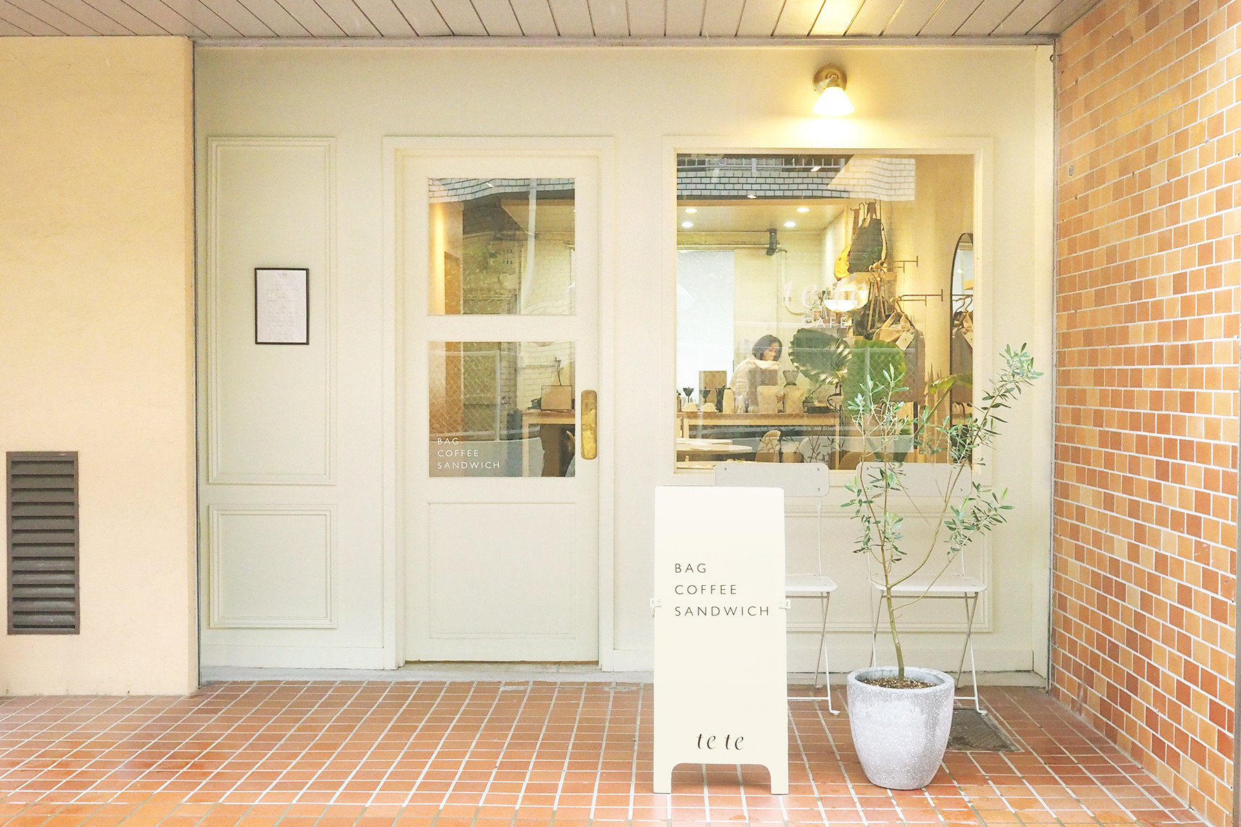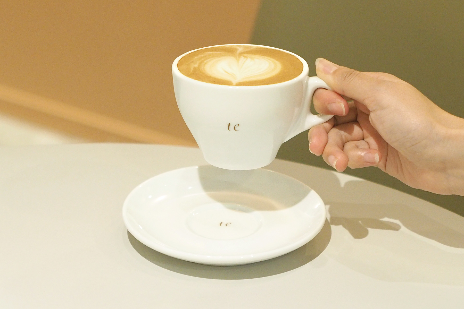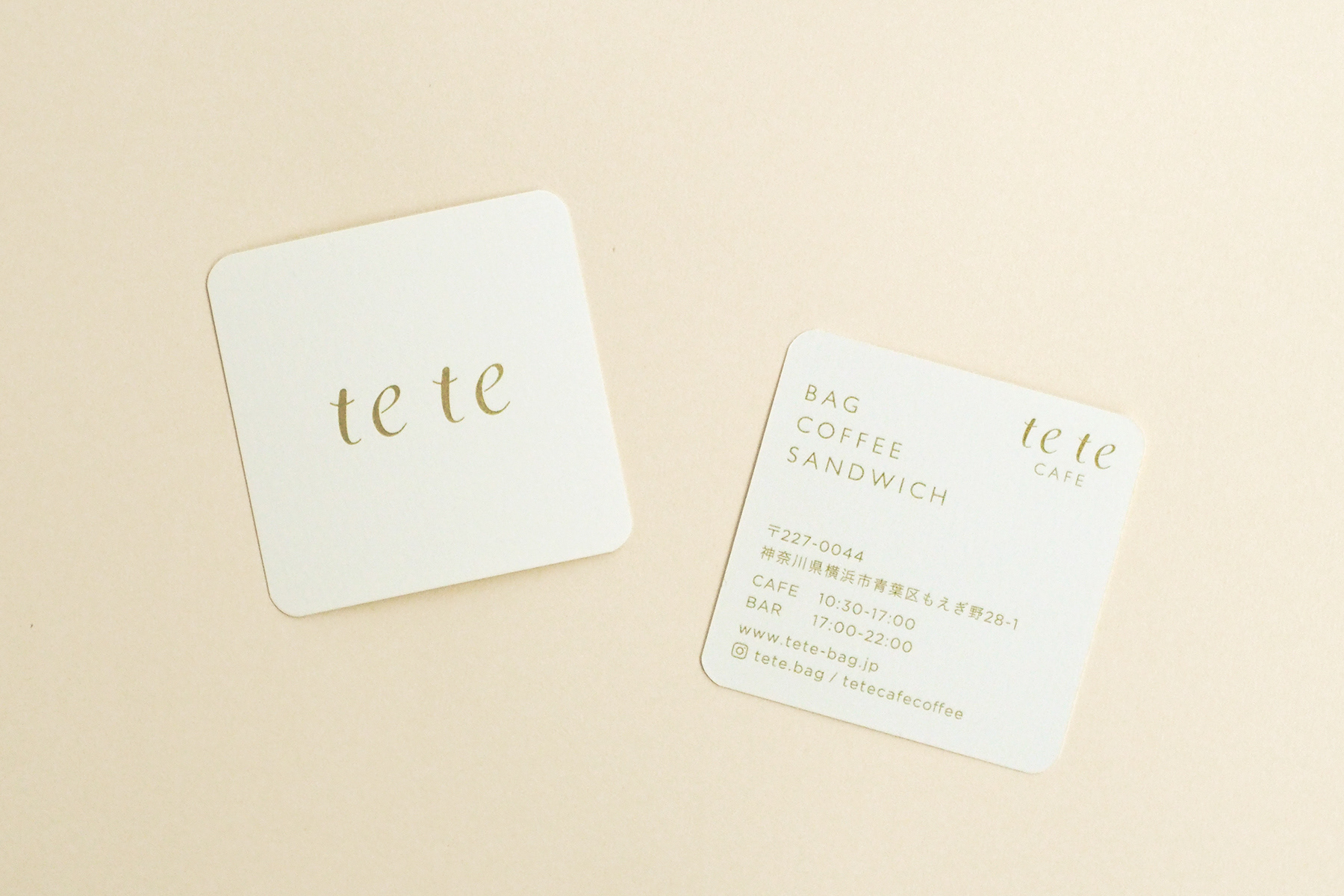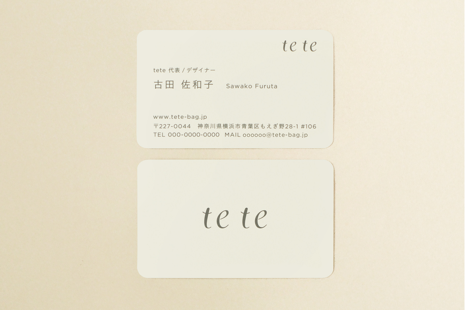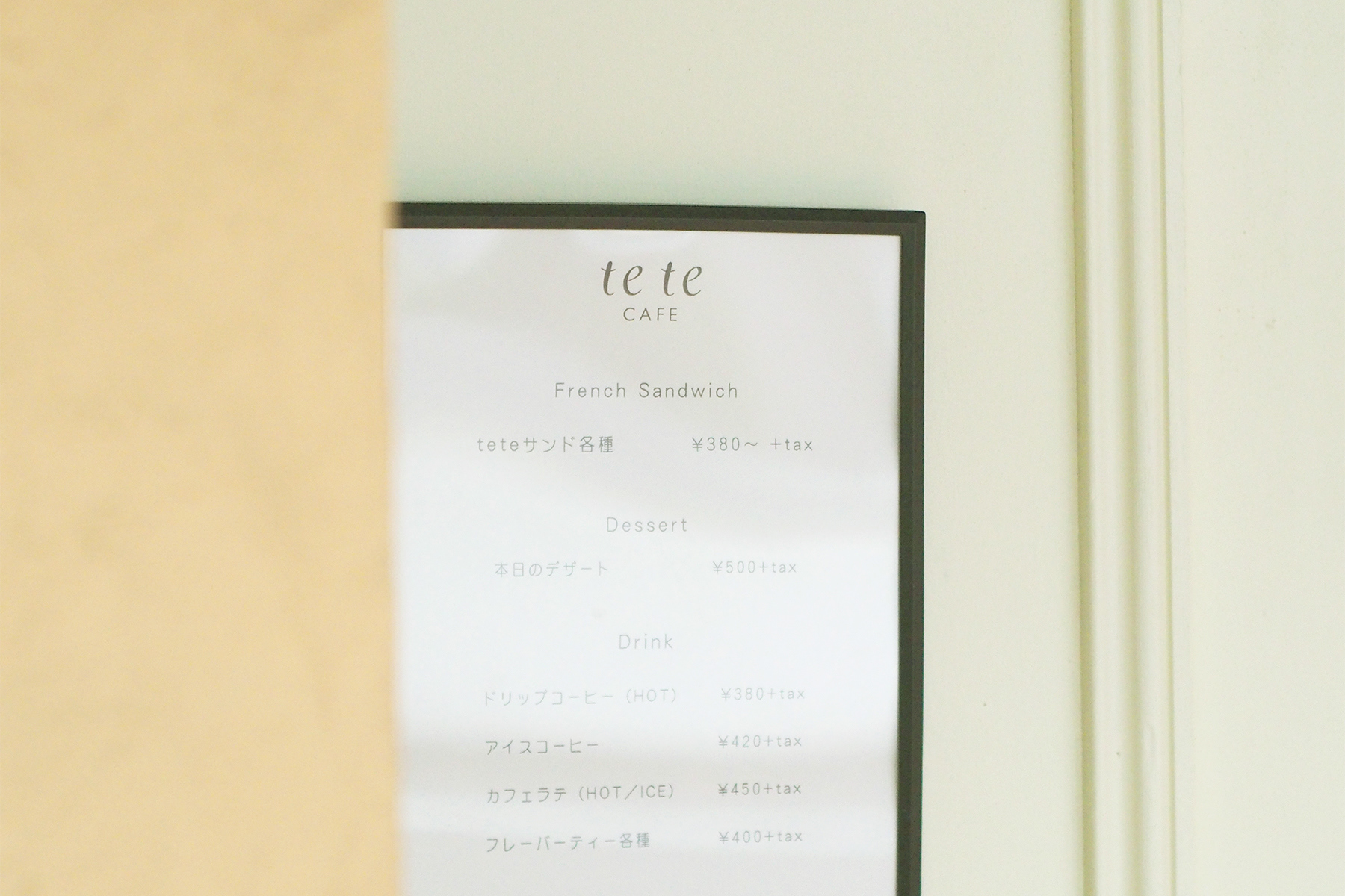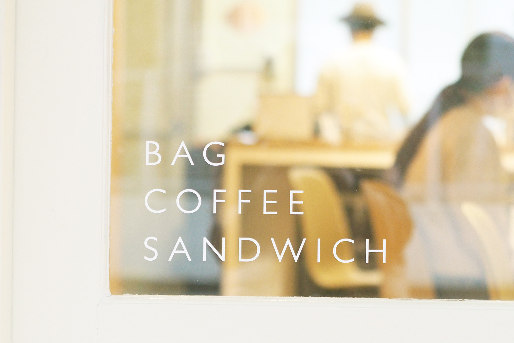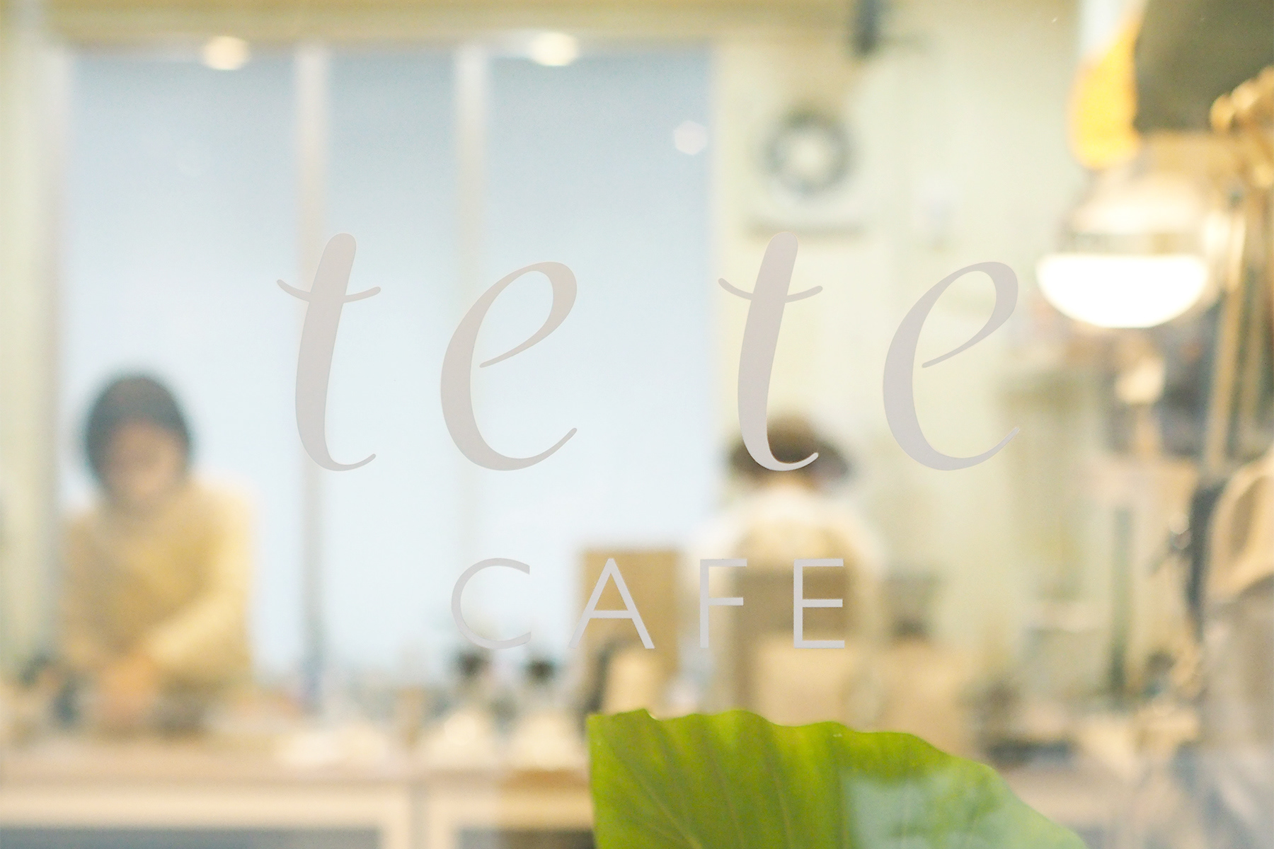
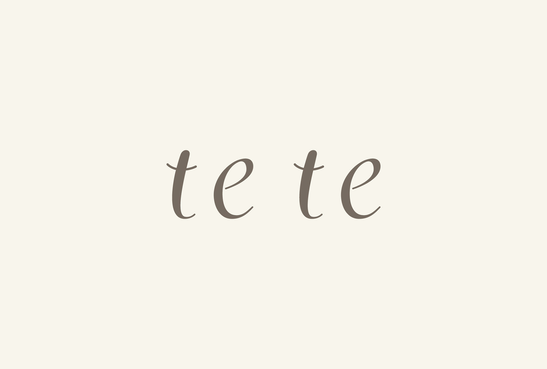
自然の中から生まれる色や形をモチーフにしたオリジナルバッグを展開する「tete」。実店舗を兼ねたカフェ「tete cafe」のオープンにあたり、ブランドロゴの刷新、ショップカード、名刺、店舗アイテム等のデザインをtegusuで行いました。
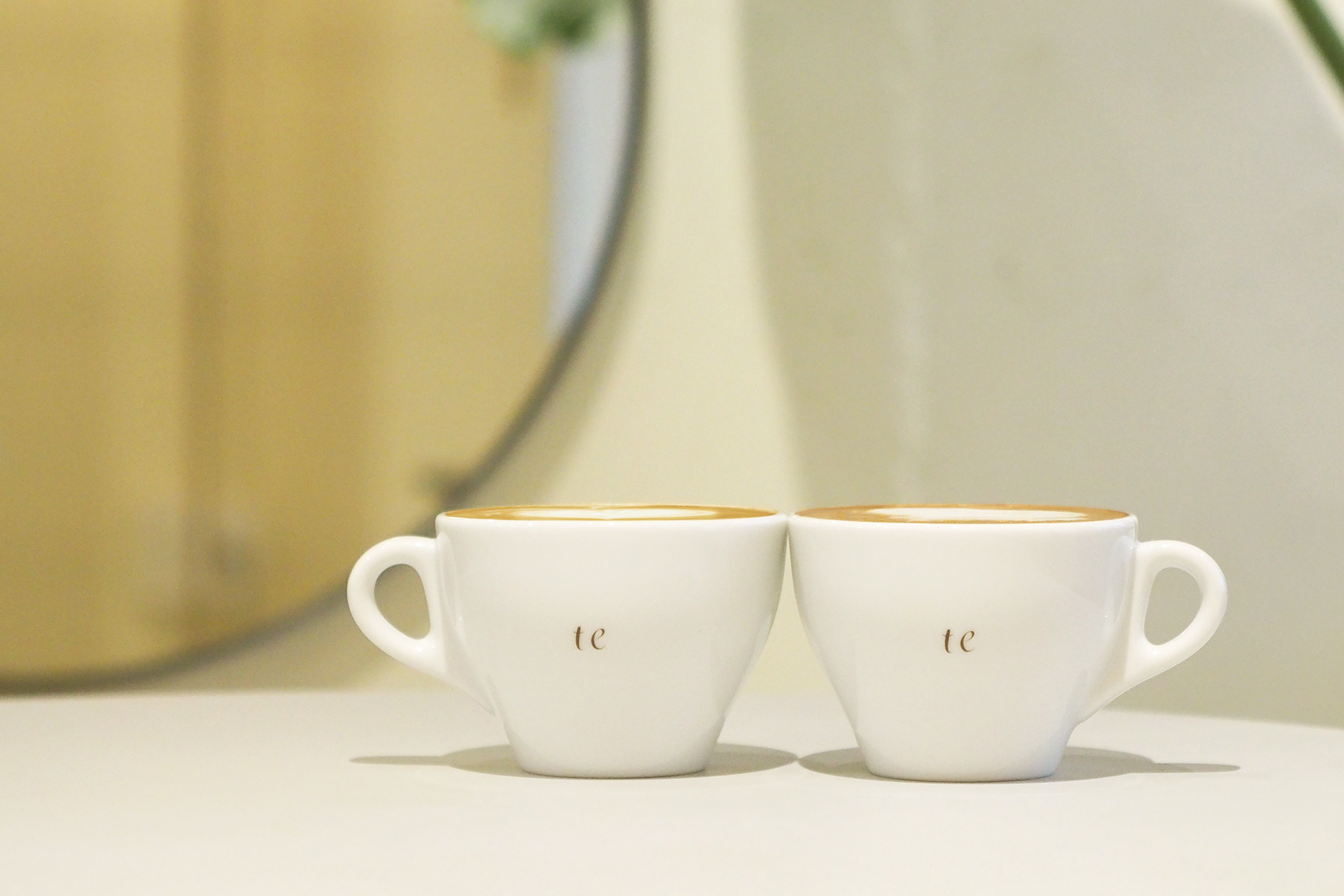
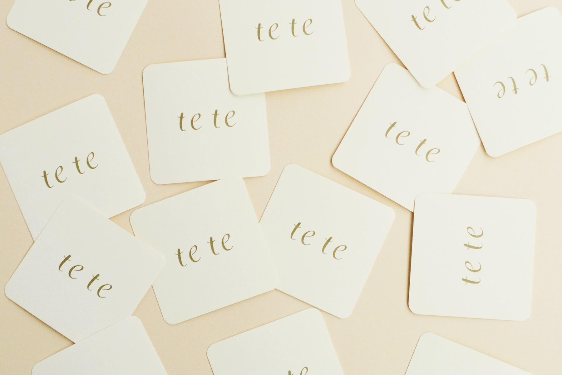
ブランド名の由来は「手と手」。バッグもカフェのメニューも、人の手と想像力から生まれることから、teとteの中心に「想像の余白」を設けることをデザインコンセプトとしています。2つのteを組み合わせてブランド名を創る仕掛けや、「て」の音の響きや連続性を楽しめるツール展開で、ブランドとユーザーのコミュニケーションにつなげています。
tete is a brand that designs original bags inspired by the colours and shapes found in nature. For the opening of the tete cafe, which also serves as an actual shop, tegusu designed a new brand logo, shop cards, business cards and shop items.
The brand name comes from the words 'hand and hand'. The design concept was to create a 'margin of imagination' at the centre of the 'te' and 'te', as both the bags and the café menu are create from the hands and imagination of designer. communication between the brand and the user. We created communication between the brand and the user by incorporating a mechanism to combine the two "te" to create the brand name 'tete', and also by designing a tool to enjoy the sound and continuity of the 'te" sound.