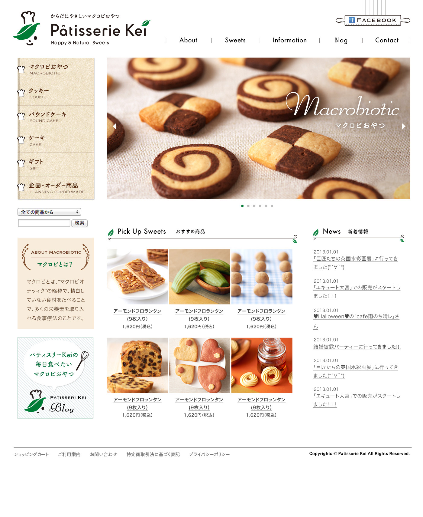
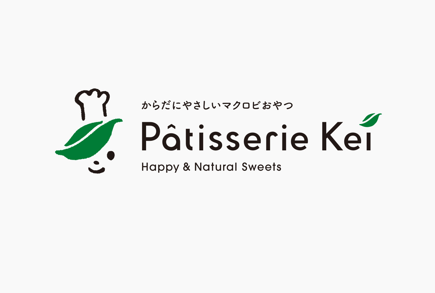
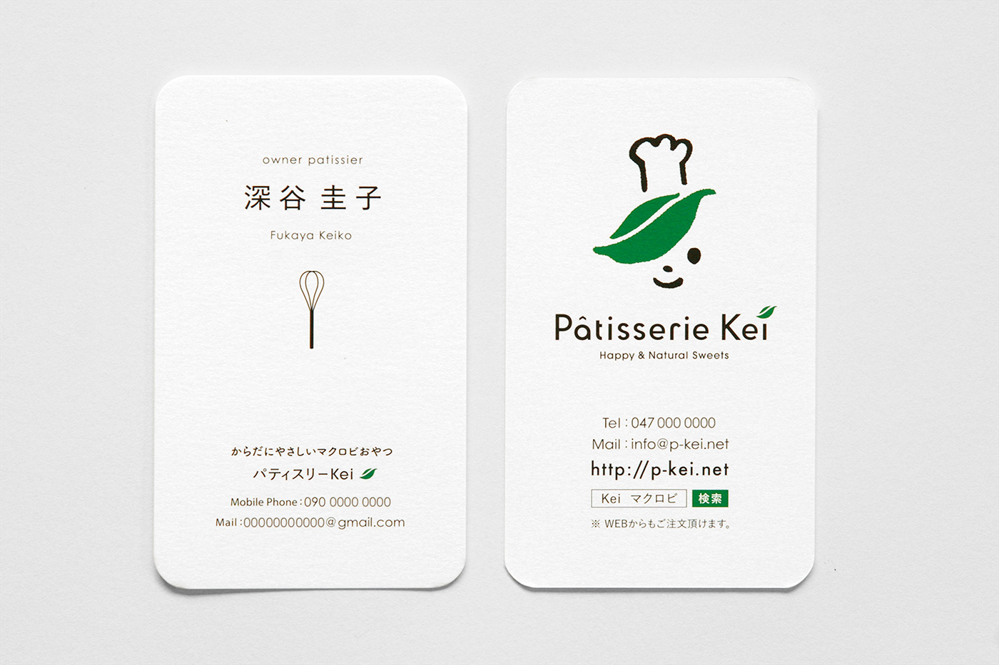
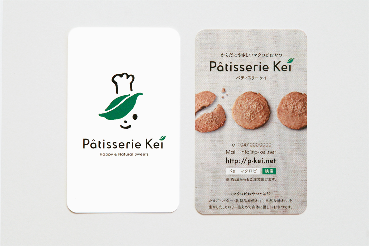
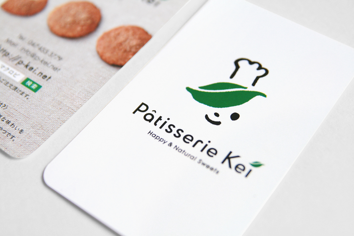
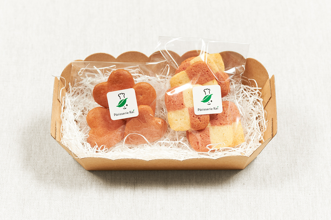
からだにやさしいマクロビおやつ「パティスリーKei」ブランドリニューアル。自然食材を使ったブランドとして「子供でも食べられる身体に優しいおやつ」としてコンセプトを再設定し、ショップカードや名刺、WEBサイトやパッケージへと展開した。
A hand-made patisserie brand that produces healthy and tasty macrobiotic sweets.
According to the brand concept: “Sweets made of natural ingredients that children can enjoy
and without parents worry”, we designed the motif of a boy with “leaf hair”.
Client:Patisserie Kei
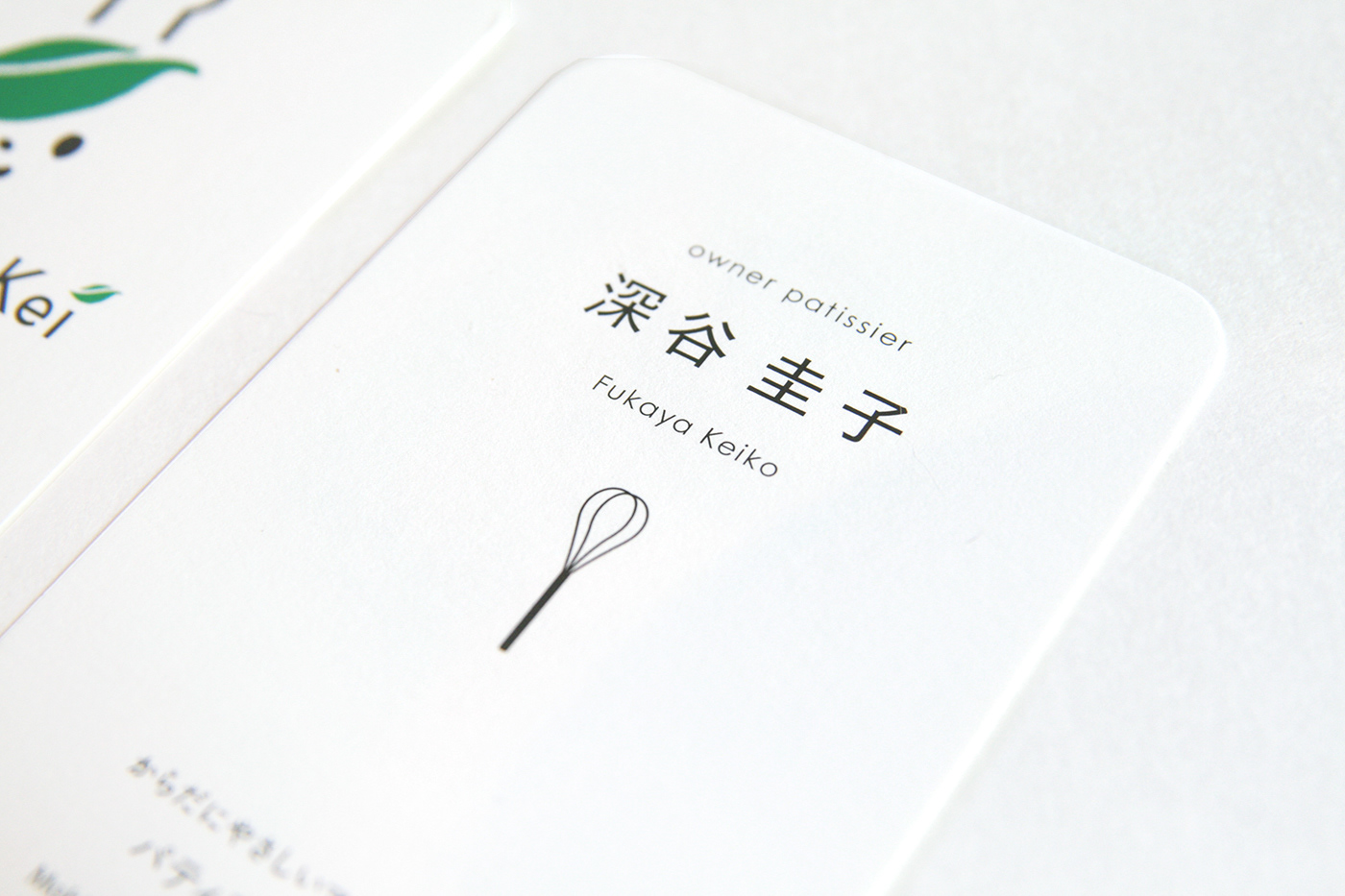
Art Direction & Design :Masaomi Fujita
Photographer:Takumi Kawaguchi
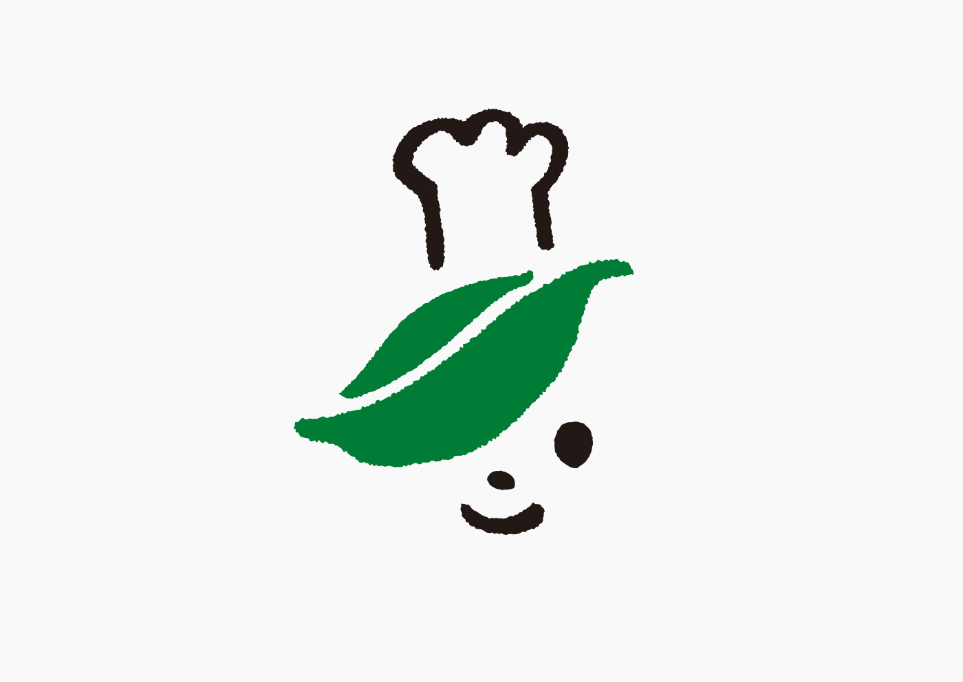
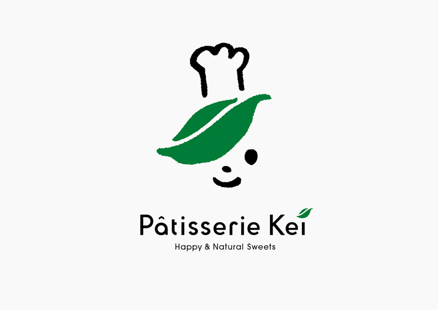
ロゴマークは、コンセプトである「子供でも安心して食べられるお菓子」であること、また植物性の原料を使用したヘルシーな食材であることを意識し、髪の部分にリーフをあしらった子供の顔をシンボルマークとし、クリーンなイメージが浸透するように配慮した。
Considering in creating the logo mark that they are “sweets that even children can eat without worry,” which is the product concept, and they are healthy food made from plant materials, we created a symbol mark expressing a child face with a leaf on the hair in order to spread a clean image.
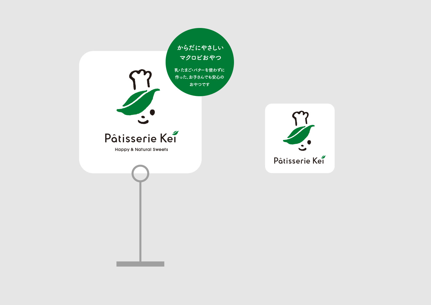

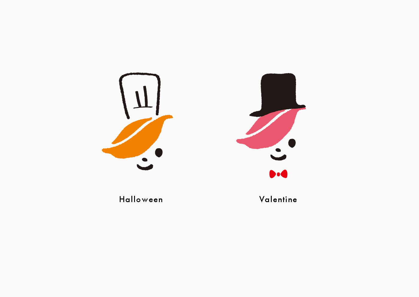
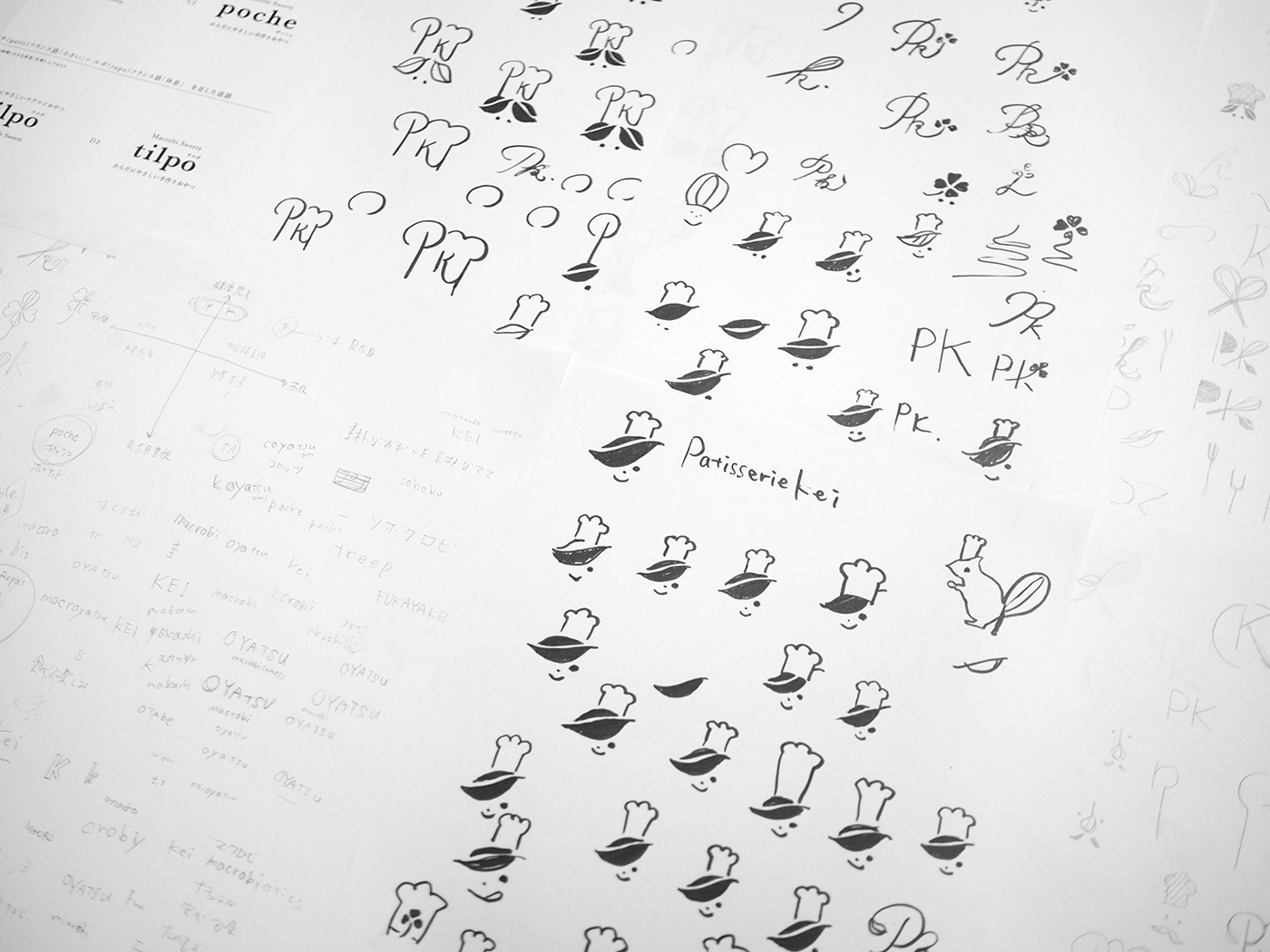
シーズンあわせてシンボルである子供の姿を変えることで、ブランドに対して親しみを持ってもらえるよう仕掛けを施している。
Besides, we contrived it so that the symbol: child face is changeable according to seasons, in order to make people feel a familiarity from the brand.


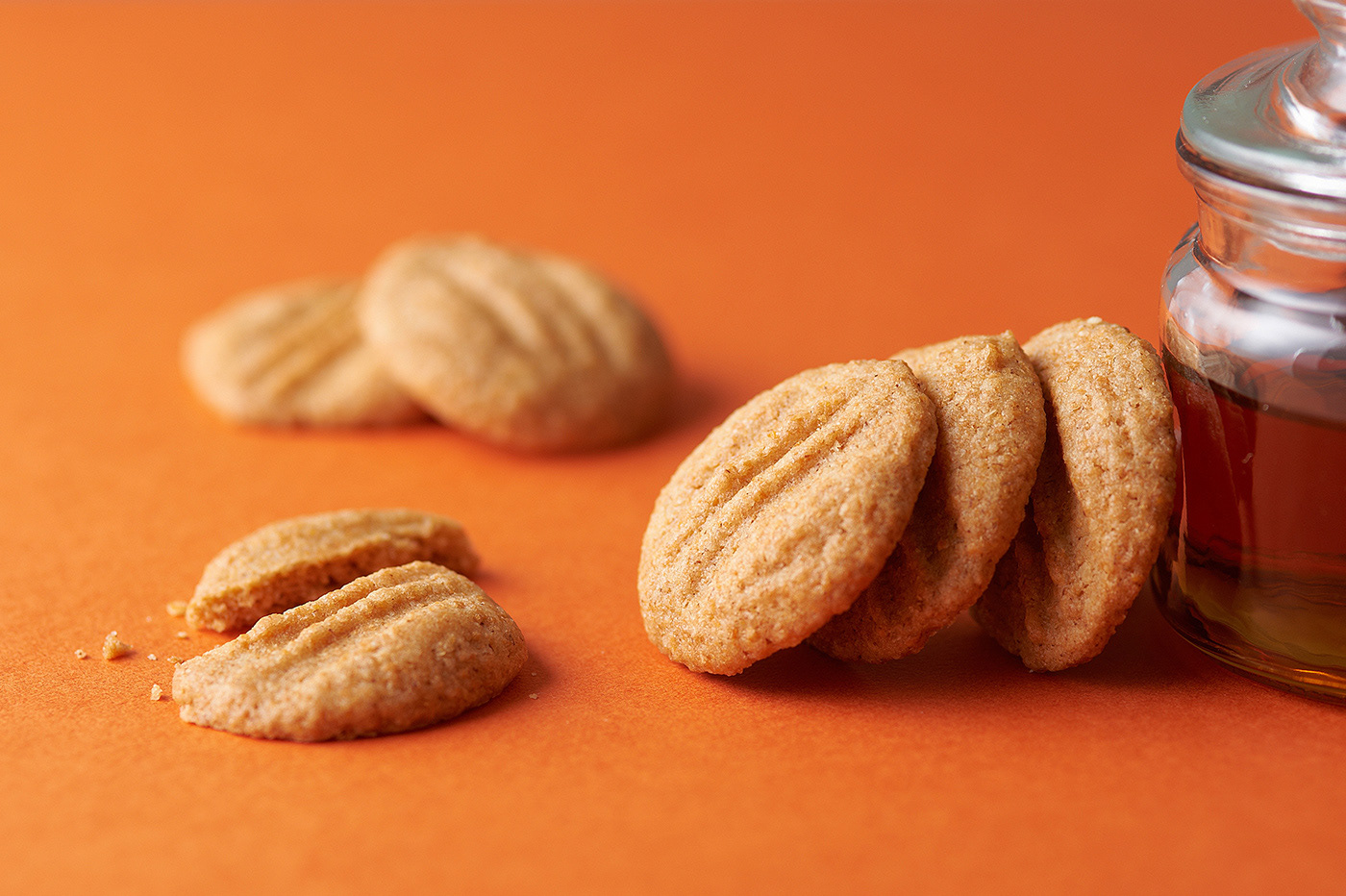
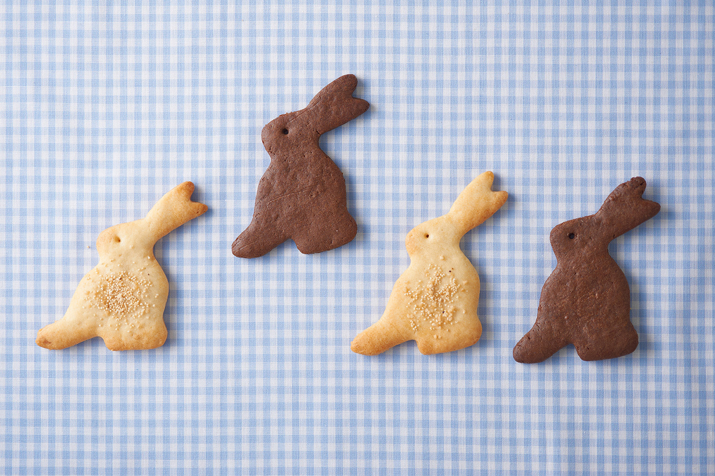
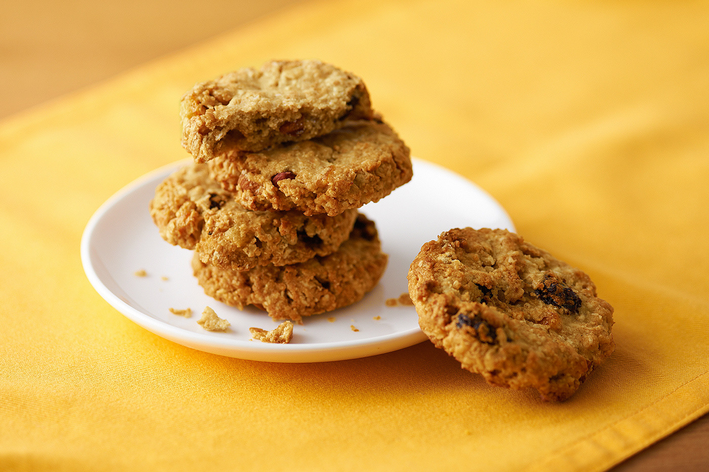
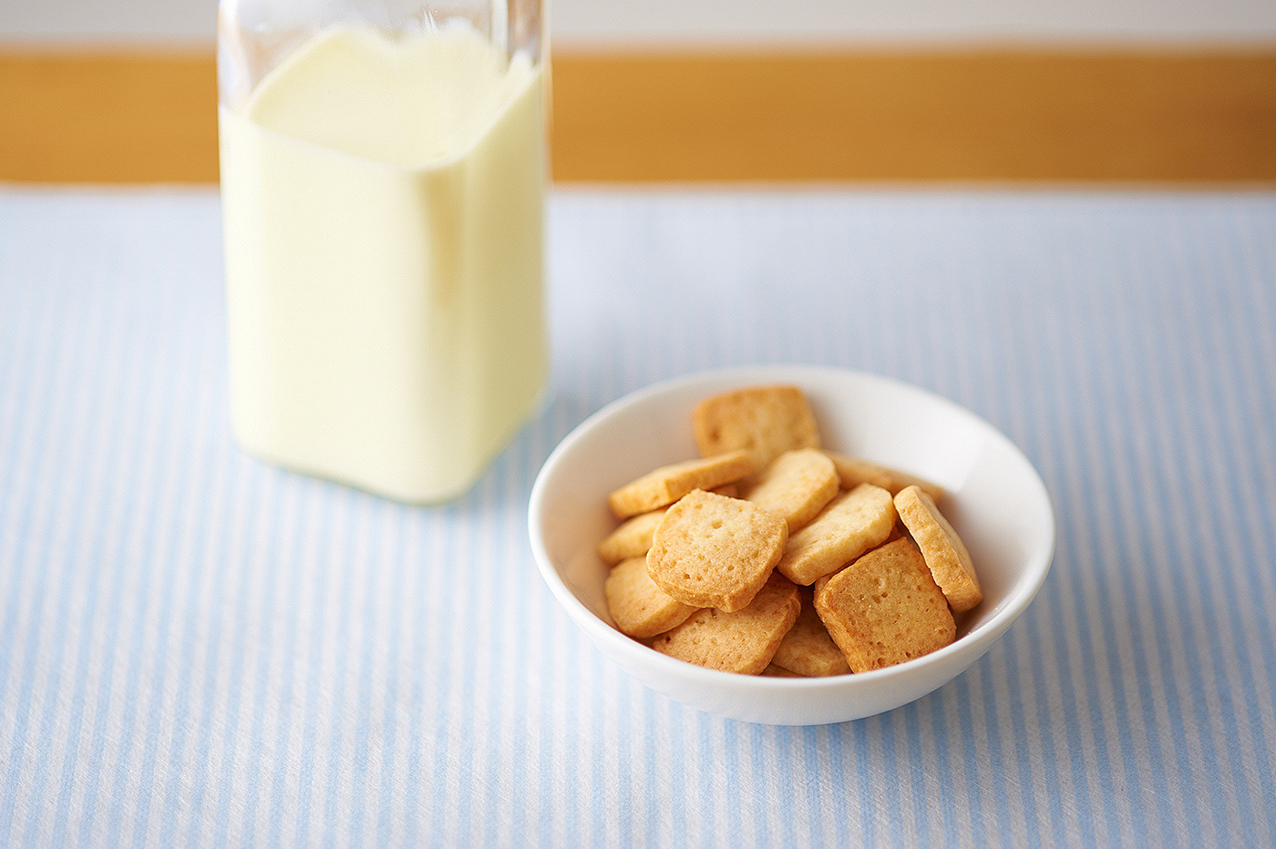
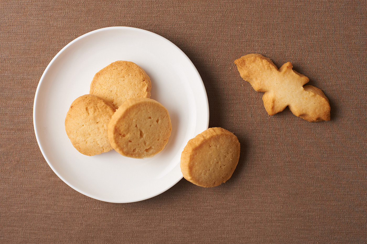
WEBサイト用のイメージカットは商品ごとに絵コンテを用意し、それぞれ魅力が適切に伝わるように配慮している。
Besides, we prepared storyboards product-by-product as images for the website so that the attraction of each product can be appropriately delivered.