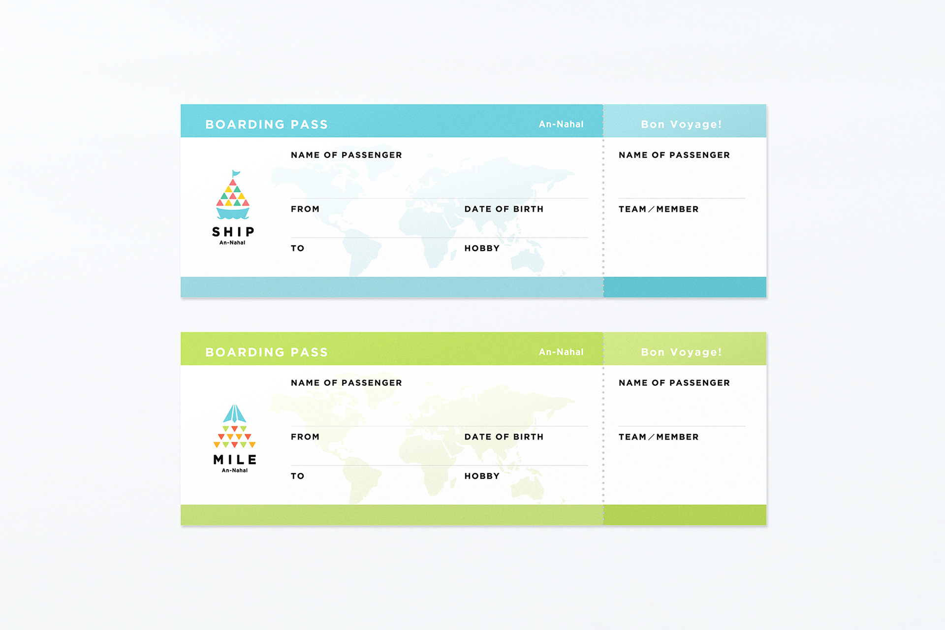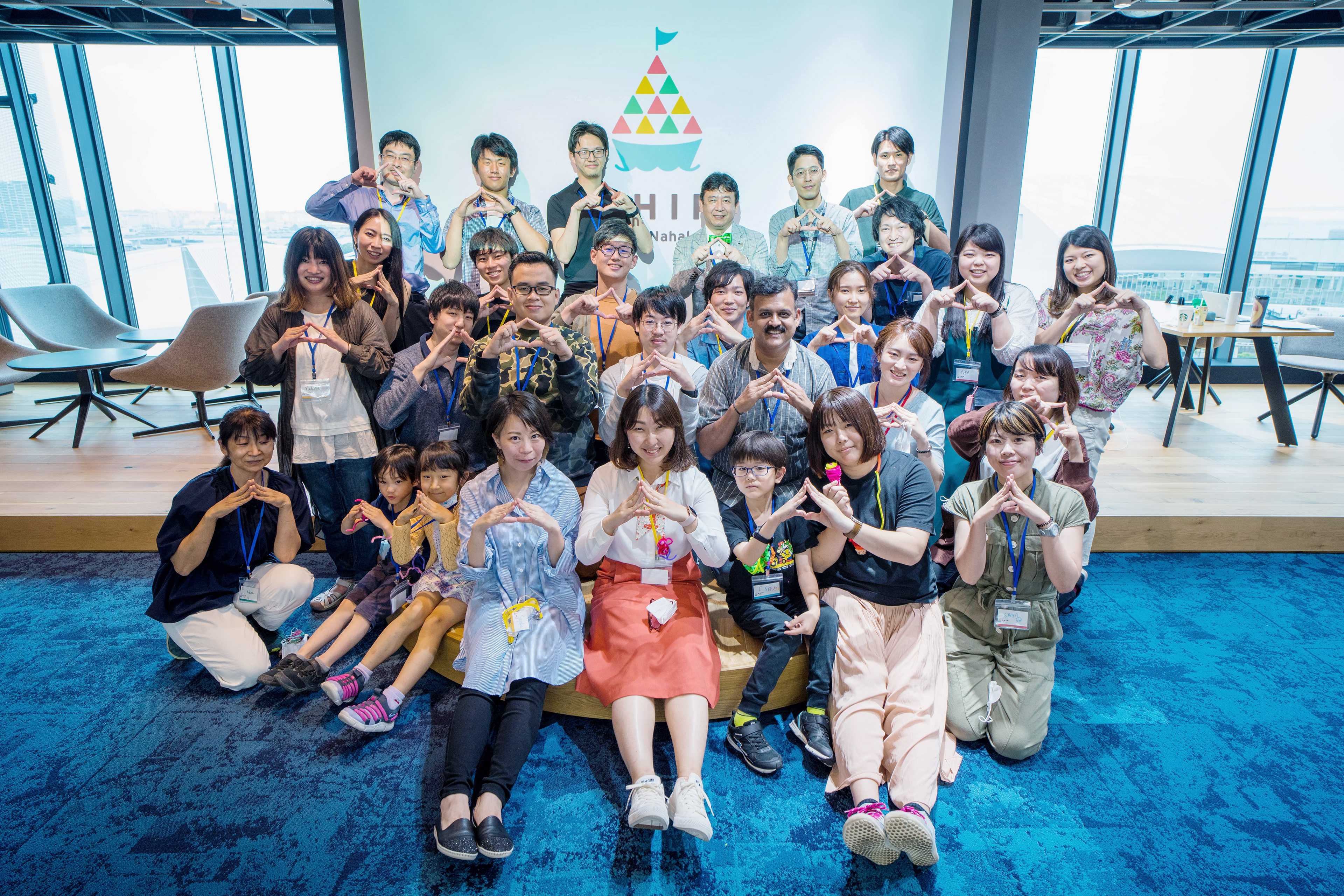
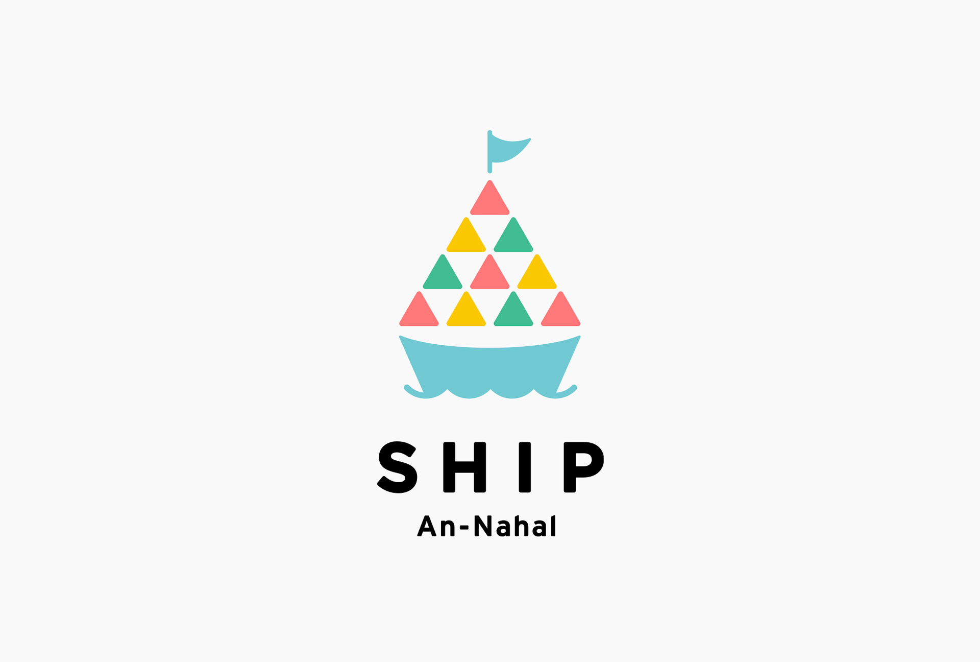
ダイバーシティ&インクルージョン推進を組織と人の側面から支援するAn-Nahal。同社の多文化協働体験プログラムである「SHIP」と、グローバルな組織を作るインクルーシブリーダー育成プログラムである「MILE」のロゴデザインをtegusuで行いました。
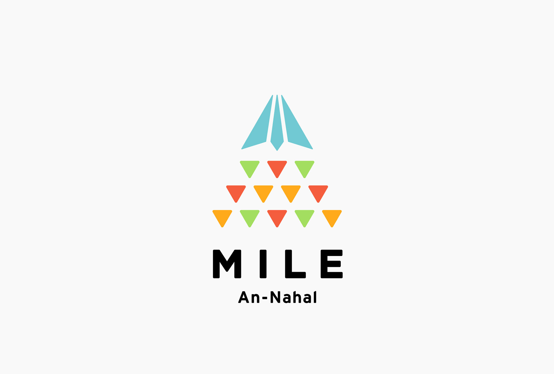
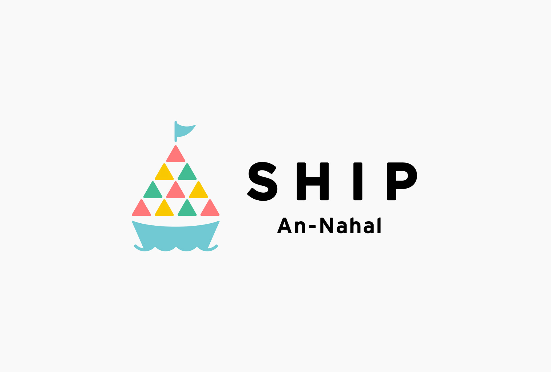
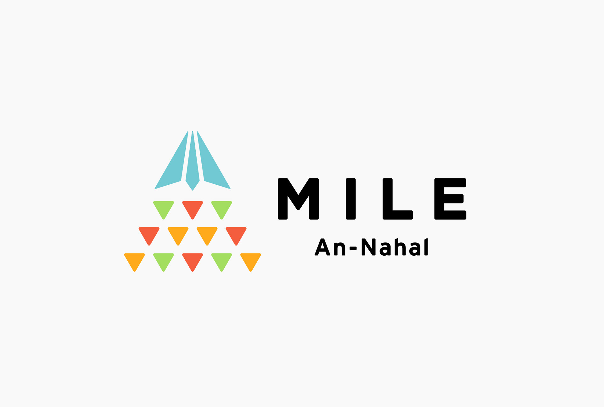
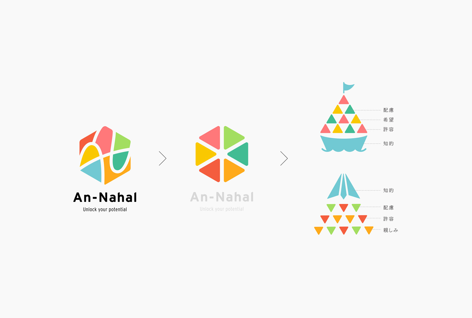
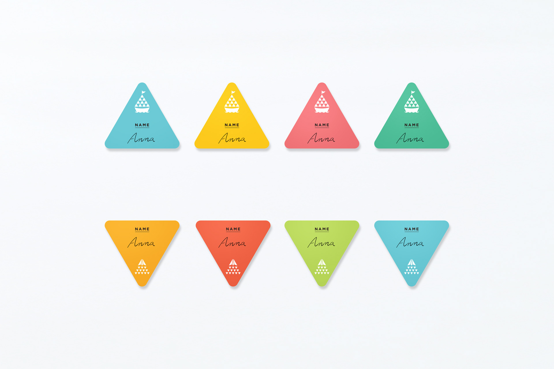
両プログラム共通して、An-NahalのVIに使用されているカラーを分解、再構築してシンボルをデザインしています。SHIPは、多種多様なバックグラウンドの人々が船に乗って一丸となって共通の目的地に進む様子を表現。またMILEは、成長や体験の積み重ねを紙飛行機の軌跡に見立て、一枚の紙が空を進む飛行機に変わるように、創造力を働かせることで日常が「多文化共生社会」となり、新たな世界へ飛び立てることを表現しています。
An-Nahal is a company that supports the promotion of diversity & inclusion from the organisational and human side.
tegusu designed the logos for SHIP, a multicultural collaborative experience program, and MILE, an inclusive leadership development programme for creating global organisations.
In common with both programs, the symbols were designed by deconstructing and reconstructing the colors used in An-Nahal's VI.
SHIP represents people from diverse backgrounds working together as one on a boat to reach a common destination. The MILE logo represents the accumulation of growth and experience through the trajectory of a paper airplane. Just as a sheet of paper is transformed into an paper airplane that travels through the sky, the logo expresses how everyday life can become a 'multicultural society' through the use of creativity, and how we can fly into a new world.